Tailwind Dark Mode Toggle with HTML & JS: A Complete Tutorial
Hey there, pro coder! If you’ve ever wanted to build a super smooth Tailwind Dark Mode Toggle but felt a bit lost, you are absolutely in the right place. We’re going to create a fantastic, user-controlled dark mode feature together today. It’s a game-changer for any modern website. Plus, it gives your users a truly excellent and personalized experience! Get ready to make your projects shine, day or night.
What We Are Building
Today, we are crafting an awesome Tailwind Dark Mode Toggle. Imagine giving your website visitors the power right in their hands! They can switch between a bright light theme and a cozy dark theme with just one simple click. This isn’t just any basic button, though. Our toggle will be smart. It remembers their choice too! So, their preferred look stays consistent, even after they navigate away and come back. This persistence makes for a truly seamless interaction. It’s a key feature for modern, user-friendly sites. Get ready to add some genuine magic to your web projects!
HTML Structure
First up, let’s lay the perfect groundwork with our HTML. We will create a simple, clean page layout. This layout will include all the essential elements. Crucially, it will feature our clear and intuitive dark mode toggle button. This specific button will be the key. It will trigger our theme change functionality. Building the HTML is super straightforward, I promise. You will see how easily it all comes together.
index.html
<!DOCTYPE html>
<html lang="en">
<head>
<meta charset="UTF-8">
<meta name="viewport" content="width=device-width, initial-scale=1.0">
<title>Tailwind CSS Dark Mode Toggle</title>
<!-- Link to your compiled Tailwind CSS file -->
<!-- Make sure to compile your input.css (using `npx tailwindcss -i ./input.css -o ./output.css --watch`) -->
<link href="./output.css" rel="stylesheet">
</head>
<!--
The `dark` class is toggled on the <html> element by JavaScript.
Tailwind CSS utilities (e.g., dark:bg-slate-900) will then apply.
-->
<body class="bg-white dark:bg-slate-900 text-slate-800 dark:text-slate-200 min-h-screen flex items-center justify-center p-4 transition-colors duration-300 font-sans">
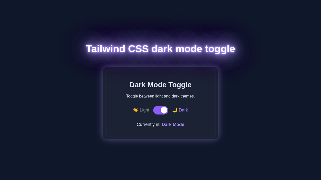
<div class="bg-white dark:bg-slate-800 rounded-xl shadow-xl p-8 max-w-md w-full text-center transition-colors duration-300 border border-slate-200 dark:border-slate-700">
<h1 class="text-3xl font-bold mb-4">Theme Switcher</h1>
<p class="mb-6 text-lg">Toggle between light and dark modes to see the magic!</p>
<div class="flex items-center justify-center gap-4 mt-6">
<span class="text-amber-500 text-xl">☀️</span>
<label for="themeToggle" class="relative inline-flex items-center cursor-pointer">
<input type="checkbox" id="themeToggle" class="sr-only peer">
<!-- The visible toggle switch track and handle -->
<div class="
w-14 h-8 bg-slate-600
peer-focus:outline-none peer-focus:ring-4 peer-focus:ring-violet-300 dark:peer-focus:ring-violet-800
rounded-full peer dark:bg-slate-700
peer-checked:after:translate-x-full peer-checked:after:border-white
after:content-[''] after:absolute after:top-[4px] after:left-[4px] after:bg-white after:border-gray-300 after:border after:rounded-full after:h-6 after:w-6 after:transition-all
dark:border-gray-600
peer-checked:bg-violet-500
"></div>
</label>
<span class="text-slate-300 dark:text-violet-400 text-xl">🌙</span>
</div>
<p id="modeStatus" class="mt-8 text-xl font-medium">
Currently in: <span class="font-bold text-violet-600 dark:text-violet-400">Light Mode</span>
</p>
</div>
<!-- Link to your JavaScript file -->
<script src="./script.js"></script>
</body>
</html>
CSS Styling
Now for the styling! We’re embracing the immense power of Tailwind CSS here. This fantastic utility-first framework means most of our styling happens right in the HTML attributes. We’ll expertly set up some default base colors. Then, we’ll smartly leverage Tailwind’s dark: variant. This special variant makes theme switching incredibly easy and efficient. It’s truly a game-changer for responsive design. No messy, redundant CSS needed. Just clean, concise utility classes!
input.css
@tailwind base;
@tailwind components;
@tailwind utilities;

/*
   This file is used by Tailwind CLI to generate your output.css.
   Run `npx tailwindcss -i ./input.css -o ./output.css --watch`
   to compile your Tailwind styles.
*/
JavaScript Logic
Here’s the truly cool part: our JavaScript makes the Tailwind Dark Mode Toggle actually spring to life! We’ll write some concise and effective code. This code will eagerly listen for clicks on our dedicated toggle button. Then, it cleverly changes a crucial theme class on our <html> element. This single change drives the entire dark mode functionality. Importantly, it also saves the user’s choice. This ensures their preference persists across sessions. You’ll love how clear and concise the logic is! It’s super empowering.
tailwind.config.js
/** @type {import('tailwindcss').Config} */
module.exports = {
  // Configure dark mode to be based on the presence of the 'dark' class on the HTML tag.
  darkMode: 'class',
  // List all files that contain Tailwind classes to enable JIT compilation.
  content: [
    "./index.html",
    "./script.js",
  ],
  theme: {
    extend: {
      // Extend Tailwind's default theme here, if needed.
      // For example, custom colors, fonts, spacing.
    },
  },
  plugins: [
    // Add any Tailwind CSS plugins here, e.g., @tailwindcss/forms.
  ],
}
script.js
document.addEventListener('DOMContentLoaded', () => {
    const themeToggle = document.getElementById('themeToggle');
    const htmlElement = document.documentElement; // Represents the <html> tag
    const modeStatus = document.getElementById('modeStatus');

    /**
     * Updates the UI (HTML class and status text) based on the current theme mode.
     * @param {boolean} isDark - True if dark mode is active, false otherwise.
     */
    const updateThemeUI = (isDark) => {
        if (isDark) {
            htmlElement.classList.add('dark');
            modeStatus.innerHTML = 'Currently in: <span class="font-bold text-violet-600 dark:text-violet-400">Dark Mode</span>';
        } else {
            htmlElement.classList.remove('dark');
            modeStatus.innerHTML = 'Currently in: <span class="font-bold text-violet-600 dark:text-violet-400">Light Mode</span>';
        }
        // Ensure the toggle switch visually matches the theme
        themeToggle.checked = isDark;
    };

    // 1. Initialize theme on page load:
    //    - Check localStorage for a saved preference.
    //    - If no preference, use the user's system preference (prefers-color-scheme).
    const savedTheme = localStorage.getItem('theme');
    if (savedTheme === 'dark' || (savedTheme === null && window.matchMedia('(prefers-color-scheme: dark)').matches)) {
        updateThemeUI(true);
    } else {
        updateThemeUI(false);
    }

    // 2. Listen for changes on the theme toggle switch
    themeToggle.addEventListener('change', () => {
        // Toggle the 'dark' class on the <html> element
        const isDark = htmlElement.classList.toggle('dark');
        // Save the new theme preference to localStorage
        localStorage.setItem('theme', isDark ? 'dark' : 'light');
        // Update the UI to reflect the change
        updateThemeUI(isDark);
    });

    // 3. (Optional but recommended) Listen for operating system theme changes
    //    This allows the website to adapt if the user changes their system theme
    //    while the page is open, but only if they haven't set an explicit preference.
    window.matchMedia('(prefers-color-scheme: dark)').addEventListener('change', (e) => {
        if (localStorage.getItem('theme') === null) {
            updateThemeUI(e.matches);
        }
    });
});
How It All Works Together
Let’s break down how these pieces combine to create our awesome dark mode experience. Each part plays a vital role. Understanding this synergy is super helpful!
The Theme Class Magic
Our dark mode system relies on a wonderfully clever trick. Tailwind CSS constantly looks for a dark class. This important class is typically applied to the <html> element of your page. When dark is present on <html>, all dark: utility classes suddenly activate. For example, bg-gray-100 dark:bg-gray-800 means a light gray background by default. But it transforms into a sleek dark gray when in dark mode. It’s incredibly powerful and efficient, isn’t it? This system keeps our CSS remarkably clean and readable. You only define the dark variant once for each utility! It’s truly a minimalist’s dream.
Toggle Button’s Role
The toggle button acts as our user’s direct control panel. It’s the primary way they interact with our theme. When this button is clicked, our JavaScript code springs into swift action. It first checks the current theme status. Is the dark class already on the <html> element? If yes, it promptly removes it. If no, it carefully adds it. This simple, elegant toggle changes the entire visual experience instantly. It’s all thanks to an event listener. It patiently waits for your every interaction. If you are curious about setting up Tailwind CSS, check out our guide on Tailwind CSS v4 Configuration: Setup Guide & Features. This will help you get started even faster!
Local Storage for Persistence
Nobody wants to manually switch themes every single time they visit your site, right? That’s precisely where localStorage truly shines. It’s like a special, persistent memory for your browser. Our clever JavaScript saves the user’s theme preference here. It uses a simple key, like ‘theme’, to store this value. When you revisit the page later, the script automatically checks this storage. It then applies the saved theme without any extra effort from the user. This provides a super smooth and seamless user experience. It perfectly remembers your choice, making your site feel much more personal. Isn’t that truly neat? You can learn even more about Web Storage APIs on MDN. It’s a fundamental concept!
Pro Tip: Local storage is absolutely fantastic for storing user preferences. It’s client-side, which means it lives directly in the user’s browser. Use it for small, non-sensitive data like theme choices, language preferences, or simple application settings. It significantly enhances the personalized feel for each visitor.
Tips to Customise It
You’ve successfully built a fully functional Tailwind Dark Mode Toggle! Now let’s explore ways to make it truly unique and personal to your projects.
- Change the Icon: Don’t limit yourself! Easily swap the default sun/moon icons for something more aligned with your brand. Font Awesome icons or beautifully crafted custom SVGs work wonderfully here.
- Add a Smooth Transition: Make the theme change feel incredibly fluid and professional. Incorporate Tailwind’s
transition-colorsutility class to your main elements. This will gracefully animate the background and text color changes. It creates a delightful and polished visual effect that users will appreciate. - Set a Default Theme Option: What happens if a user visits your site for the very first time? You could respect their system preference automatically. Or, you might choose to make dark mode the default experience for everyone. The initial look is entirely up to you!
- Beyond Just Colors: Dark mode can influence more than just colors. Consider changing entire images or showing/hiding specific elements. You can achieve this using utilities like
dark:hiddenordark:block. The customization possibilities are truly endless, limited only by your imagination!
For more layout inspiration, check out our Responsive Landing Page Tutorial: HTML & Tailwind CSS. It will give you great ideas for integrating this toggle!
Developer Insight: User interface details, no matter how small, matter a lot. A small touch, like a smooth transition effect, greatly improves overall user satisfaction and perception. Always strive to think deeply about the user’s journey and interaction.
Conclusion
Wow, you absolutely crushed it! You just built your very own amazing Tailwind Dark Mode Toggle. You now possess a fantastic and incredibly valuable skill. This adds a crucial feature to any modern website. It also powerfully shows off your front-end prowess and attention to detail. Feel truly proud of what you’ve accomplished today! Now, go ahead and confidently integrate this awesome toggle into your next exciting project. Share your amazing creations with the world! We genuinely can’t wait to see what brilliant things you build next. Keep coding, pro coder, you’re doing great! If you want to create other essential components, maybe try our comprehensive guide on building a Responsive Navbar with Tailwind CSS & HTML – Complete Guide. For advanced CSS transitions, a great practical resource is CSS-Tricks on the transition property. Expand your knowledge!