Tailwind CSS Scalability: Inline Styles & Best Practices
Hey there, awesome coder! You’ve probably heard a lot of buzz about Tailwind CSS lately. Maybe you’ve even tried it out. But if you’re like many self-taught beginners, you might have scratched your head at one specific thing: all those classes directly in your HTML. It looks a lot like traditional inline styles, right? You were taught to avoid those! So, how can Tailwind CSS get away with it? And why do its ‘inline styles’ actually lead to more robust Tailwind CSS inline styles scalability? Let’s clear up this mystery over a virtual coffee.
What Tailwind CSS Does (and Why It Matters to You)
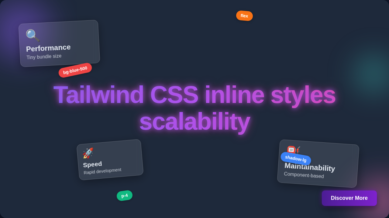
Okay, real talk. Tailwind CSS is a utility-first CSS framework. What does ‘utility-first’ even mean? It means instead of writing custom CSS rules for every single element, you apply pre-defined, single-purpose classes directly in your HTML. Think of it like a massive toolbox. Each tool does one specific job. For instance, `p-4` adds padding, `flex` makes an element a flex container, and `text-blue-500` sets text color. Simple, right?
Why does this matter to you? Because it changes how you build user interfaces. Suddenly, you’re not wrestling with custom CSS files anymore. You’re composing designs directly in your HTML. This approach can feel a bit strange at first, especially if you’re used to writing lots of separate CSS. But the benefits for your project’s long-term health are huge. Ultimately, this method supercharges your workflow.
Unpacking the ‘Inline Styles’ Misconception & Tailwind CSS Inline Styles Scalability
Let’s tackle the elephant in the room. When you see `class=”flex p-4 bg-blue-500 text-white rounded-lg”` in your HTML, it looks like old-school inline styling. You know, `style=”padding: 16px; background-color: blue; color: white; border-radius: 8px;”`. But here’s the thing: they are fundamentally different. Traditional inline styles are literal CSS properties written directly into an HTML element’s `style` attribute. They are specific to that one element. They cannot be easily reused. They override everything else. This makes them a nightmare for maintenance and consistency. Sound familiar?
Tailwind’s classes, however, are not actual inline styles. They are just regular CSS classes. The magic happens behind the scenes. Tailwind scans your HTML, finds all the classes you used, and generates a minimal CSS file. This file contains only the CSS rules for those specific classes. So, when you use `p-4`, you’re not writing `padding: 1rem;` directly. You’re applying a class that already exists in your generated stylesheet. This distinction is crucial for understanding Tailwind CSS inline styles scalability. Each utility class represents a small, single-purpose rule. These rules are part of a consistent design system. Therefore, you gain control without the usual headaches of inline styling.
How Tailwind’s Utility-First Approach Actually Works for Scalability
So, how does this utility-first setup actually make projects more scalable? Imagine building a large house. In traditional CSS, you might design custom blueprints for every single wall, window, and door. Each unique part needs a unique design. With Tailwind, it’s like having a catalog of standardized, pre-fabricated components. You pick a ‘wall type,’ a ‘window size,’ a ‘door style.’ Then, you assemble them.
Every utility class you use, like `w-full` for full width or `shadow-md` for a medium shadow, is a pre-defined building block. You don’t invent new names for styles. You don’t worry about CSS specificity conflicts. These classes are designed to be composable. You combine them to create complex designs. This means every developer on your team uses the exact same `p-4` or `text-xl`. This consistency is a superpower for scalability. It ensures your entire application looks and feels unified. Furthermore, it greatly reduces the chances of style drift over time. Imagine building a robust dark mode for your project; Tailwind makes it incredibly smooth, letting you define styles for different states right where you need them. Take a peek at how easy it can be to implement a dark mode with Tailwind CSS.
“Tailwind’s ‘inline styles’ are not a shortcut; they’re a deliberate design choice that trades verbose HTML for unparalleled consistency and maintainability across large projects.”
Common Confusions Cleared: Is My HTML Getting Bloated?
This is a big one. Many developers look at an HTML element with many Tailwind classes and think, “Wow, that’s a lot of code! My HTML is getting bloated!” It’s a valid concern. However, remember what we discussed earlier. These are just class names. Your browser handles them efficiently. More importantly, this “bloat” in HTML usually comes at the cost of much smaller CSS files. Traditional projects often ship massive, complex CSS bundles. Tailwind, by contrast, generates only the CSS you actually use. It’s like only packing the clothes you’ll definitely wear on a trip, not your entire wardrobe.
Furthermore, you don’t have to keep all those classes in your HTML forever. For reusable components, you would typically extract them. If you’re using a framework like React or Vue, you define a component once. That component then encapsulates all its styling. You use it everywhere with a simple tag, like ``. For smaller, repeating patterns, you can use Tailwind’s `@apply` directive in a separate CSS file. This lets you compose utility classes into new custom classes. For a deeper dive into the underlying philosophy, you might want to explore articles on Atomic CSS principles.
Ultimately, the tradeoff is often worth it. You get highly optimized CSS. You get a consistent UI. This makes for better Tailwind CSS inline styles scalability.
The Real Benefits of Tailwind CSS Inline Styles Scalability in Action
Let’s talk about the practical advantages. First, you get incredibly fast development. You don’t switch between HTML and CSS files constantly. Styles are right there with the component. This reduces context switching. Second, maintenance becomes much easier. Need to change a button’s padding? You change one class right in the HTML. You don’t hunt through a huge CSS file, worrying about side effects. This makes refactoring a breeze.
Third, consistency across large teams is a huge win. Because everyone uses the same utility classes, your entire application adheres to a consistent design system. There’s no guesswork. New team members can pick it up quickly. This is especially true when building complex UIs. Thinking about adding a sleek UI element, like a glassmorphism sidebar? Tailwind lets you craft these detailed components quickly, ensuring every part of your design system aligns perfectly. Lastly, the final CSS bundle size is usually tiny. Tailwind purges unused styles in production. This leads to faster loading times for your users. Everybody wins.
Best Practices for Mastering Tailwind CSS
You’re probably thinking, “Okay, I get it now. But how do I use it effectively?” Here are some pro tips:
- Embrace Componentization: If you’re using a JavaScript framework, always break your UI into reusable components. This is where Tailwind truly shines.
- Use `@apply` Wisely: For very specific, repeated elements (like a custom button variant), `@apply` can group utility classes. Don’t overdo it, though.
- Configure Your `tailwind.config.js`: Customize your color palette, spacing scale, and breakpoints. Make Tailwind truly yours.
- Read the Docs: The Tailwind CSS documentation is excellent. It explains every utility class and feature clearly.
You’ll find that even interactive elements, like building a Tailwind CSS dark mode toggle, become much more straightforward when styles are right there with the element. When you’re curious about what a utility like `flex` or `grid` is actually doing under the hood, a quick look at MDN’s CSS display property documentation can really solidify your understanding.
“Tailwind CSS encourages you to think about design as a composition of small, reusable properties, freeing you from endless custom CSS and naming conventions.”
Key Takeaways
So, to wrap things up:
- Tailwind’s classes are not traditional inline styles.
- They are atomic utility classes.
- This approach boosts Tailwind CSS inline styles scalability.
- It leads to faster development.
- You get better consistency and easier maintenance.
- It results in smaller, optimized CSS files.
Ready to Build Something Awesome?
You’ve seen how Tailwind CSS cleverly sidesteps the pitfalls of traditional inline styles. It offers a powerful, scalable way to build UIs. It might feel different at first. But stick with it. You’ll soon discover a new level of productivity and control over your designs. Start small, build a few components, and you’ll quickly get the hang of it. Your future self (and your project’s scalability) will thank you. Now go out there and create something amazing!