Hey! If you have wanted to build a Dark Mode toggle button but had no idea where to start, you are in the right place.
Here’s the cool part: Dark Mode is a great way to enhance user experience. Let me explain what’s happening here: Dark Mode is a display setting that uses a dark color scheme to reduce eye strain.
What We Are Building
We are building a Dark Mode toggle button with Tailwind CSS and JavaScript. This button will allow users to switch between light and dark modes.
HTML Structure
We will use simple HTML to create the toggle button. Don’t worry about this part, it’s easy! We will use a button element to create the toggle button.
index.html
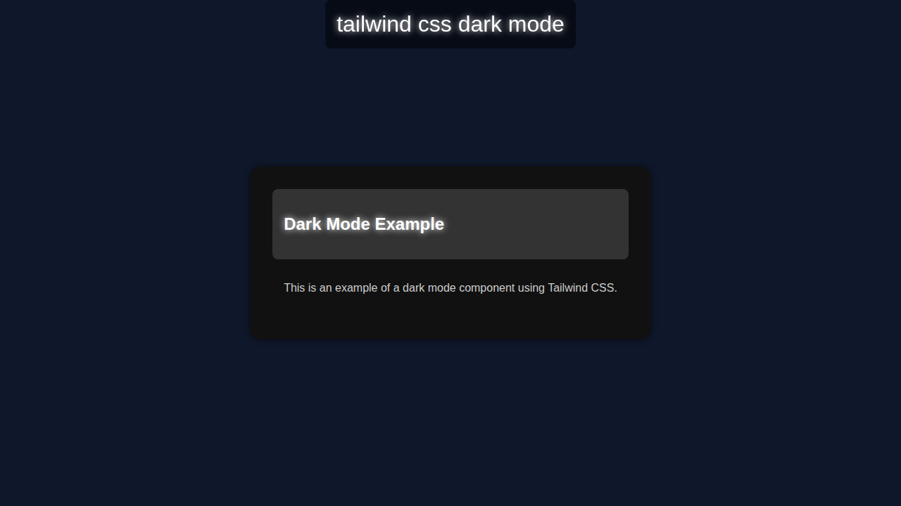
<!DOCTYPE html><html lang='en'><head><meta charset='UTF-8'><meta name='viewport' content='width=device-width, initial-scale=1.0'><title>tailwind css dark mode</title><link rel='stylesheet' href='styles.css'></head><body class='dark-mode'><div class='container'><div class='banner'>tailwind css dark mode</div><div class='card'><header><h2 class='glow'>Dark Mode Example</h2></header><main><p>This is an example of a dark mode component using Tailwind CSS.</p></main></div></div></body></html>CSS Styling with Dark Mode
We will use Tailwind CSS to style the toggle button. Here’s the cool part: Tailwind CSS makes it easy to create responsive designs. Let me explain what’s happening here: we will use classes to apply styles to the button.
styles.css
.dark-mode { background-color: #0f172a; overflow: hidden; font-family: Arial, sans-serif; margin: 0; padding: 0; } .container { display: flex; justify-content: center; align-items: center; height: 100vh; } .banner { position: fixed; top: 0; left: 50%; transform: translateX(-50%); padding: 1rem; background-color: rgba(0, 0, 0, 0.5); border-radius: 0.5rem; text-align: center; font-size: 2rem; color: #ffffff; text-shadow: 0 0 10px #ffffff; } .card { max-width: 100%; background-color: #111111; padding: 2rem; border-radius: 1rem; box-shadow: 0 0 10px rgba(0, 0, 0, 0.5); } .card header { background-color: #333333; padding: 1rem; border-radius: 0.5rem; } .card header h2 { color: #ffffff; text-shadow: 0 0 10px #ffffff; } .card main { padding: 1rem; } .card main p { color: #cccccc; } .glow { text-shadow: 0 0 10px #ffffff; }JavaScript for Dark Mode
We will use JavaScript to add functionality to the toggle button. Here’s what’s happening: we will use JavaScript to switch between light and dark modes.
How It All Works Together
Step 1: Create the Toggle Button
We will create a button element and add classes to style it. Let me explain what’s happening here: we will use the button element to create the toggle button.
Step 2: Add Functionality with JavaScript and Dark Mode
We will use JavaScript to add functionality to the toggle button. Here’s the cool part: we will use JavaScript to switch between light and dark modes.
Step 3: Style the Toggle Button with Dark Mode
We will use Tailwind CSS to style the toggle button. Let me explain what’s happening here: we will use classes to apply styles to the button.
Pro tip: use the MDN Web Docs to learn more about CSS.
Tips to Customise It with Dark Mode
We can customize the toggle button by adding more styles or functionality. Here’s the cool part: we can use Tailwind CSS vs Plain CSS: The Ultimate Comparison to learn more about Tailwind CSS.
Here are a few ideas: we can add more colors, change the button shape, or add animations. Let me explain what’s happening here: we can use Tailwind CSS classes to apply custom styles.
Check out CSS-Tricks for more web development tips and tricks.
Remember: practice makes perfect! Keep building and experimenting with different designs and features.
Conclusion
Congratulations! You just built a Dark Mode toggle button with Tailwind CSS and JavaScript. Here’s the cool part: you can now customize and extend this project to create even more amazing things. Don’t forget to check out Tailwind Custom Theme: Extend & Personalize CSS with HTML and Tailwind Custom Themes: Building with HTML & Tailwind CSS for more Tailwind CSS tips and tricks.
Share your project with us on social media and let’s see what you’ve built!