JavaScript Page Flip Effect Tutorial: HTML, CSS & Vanilla JS
Hey there, future web wizard! If you’ve ever wanted to build a stunning interactive experience, like a realistic book, but weren’t sure where to start, you’re in the right place. Today, we’re diving deep into creating an awesome JavaScript Page Flip effect. This will make your content truly jump off the screen. Get ready to impress your users with this cool 3D trick! We will build it step-by-step.
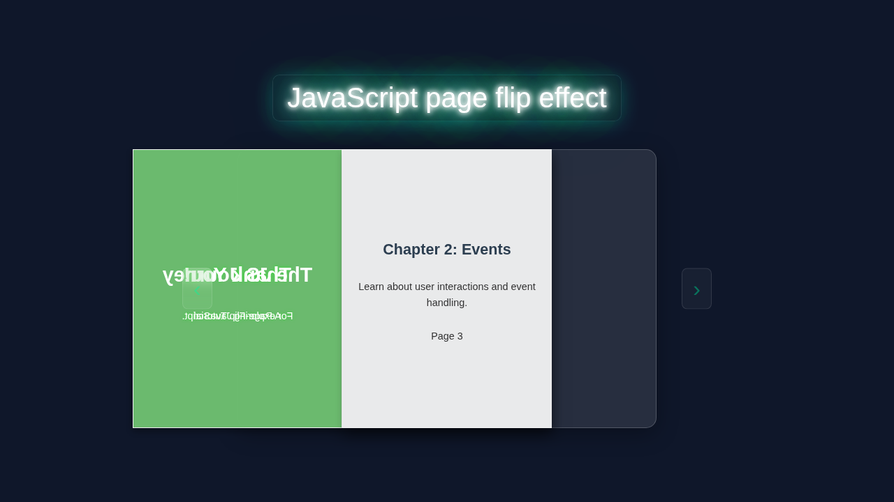
What We Are Building
Imagine a sleek digital book right on your webpage. Users can click or swipe to turn its pages. Each page turns with a smooth, realistic 3D animation. This is exactly what we’re going to create! It’s not just a visual gimmick, though. This effect is perfect for online portfolios, digital magazines, or interactive product catalogs. It adds a touch of class. Your projects will look incredibly professional. We will use plain HTML, CSS, and vanilla JavaScript for this. No fancy libraries are needed here. It’s a fantastic way to level up your front-end skills.
HTML Structure for Your JavaScript Page Flip
First, we need the basic skeleton for our book. Our HTML will define the book container and each individual page. We’ll set up a div for the entire book. Inside, we will have div elements for the pages. Each page needs a front and a back. This structure supports the 3D flip effect. It also keeps our content organized.
index.html
<!DOCTYPE html>
<html lang="en">
<head>
    <meta charset="UTF-8">
    <meta name="viewport" content="width=device-width, initial-scale=1.0">
    <title>JavaScript Page Flip Effect</title>
    <link rel="stylesheet" href="styles.css">
</head>
<body>
    <div class="book-container">
        <div class="book" id="book">
            <!-- Front Cover Page: This is the first physical page, it only has a front face content. -->
            <div class="page front-cover" data-page-index="0">
                <div class="page-content cover-front">
                    <h1>The JavaScript Journey</h1>
                    <p>A Page-Flip Tutorial</p>
                    <p>By Code Educator</p>
                </div>
            </div>

            <!-- Content Pages: Each 'div.page.sheet' represents a physical sheet of paper with a front and a back face. -->
            <div class="page sheet" data-page-index="1">
                <div class="front-face">
                    <div class="page-content">
                        <h2>Chapter 1: The DOM</h2>
                        <h3>What is the DOM?</h3>
                        <p>The Document Object Model (DOM) is a programming interface for web documents. It represents the page so that programs can change the document structure, style, and content.</p>
                        <p>It's essentially a tree-like representation of your HTML.</p>
                        <p class="page-number">Page 1</p>
                    </div>
                </div>
                <div class="back-face">
                    <div class="page-content">
                        <h2>Chapter 1: The DOM</h2>
                        <h3>Accessing Elements</h3>
                        <p>You can access elements using methods like <code>document.getElementById()</code>, <code>document.querySelector()</code>, or <code>document.getElementsByClassName()</code>.</p>
                        <pre><code>const myDiv = document.getElementById('myId');</code></pre>
                        <p class="page-number">Page 2</p>
                    </div>
                </div>
            </div>

            <div class="page sheet" data-page-index="2">
                <div class="front-face">
                    <div class="page-content">
                        <h2>Chapter 2: Events</h2>
                        <h3>Understanding Events</h3>
                        <p>Events are actions or occurrences that happen in the system you are programming, which the system tells you about so you can respond to them.</p>
                        <p>Common events include clicks, keypresses, mouseovers, and form submissions.</p>
                        <p class="page-number">Page 3</p>
                    </div>
                </div>
                <div class="back-face">
                    <div class="page-content">
                        <h2>Chapter 2: Events</h2>
                        <h3>Event Listeners</h3>
                        <p>Event listeners wait for an event to happen and then execute a callback function.</p>
                        <pre><code>myButton.addEventListener('click', function() {
    alert('Button clicked!');
});</code></pre>
                        <p class="page-number">Page 4</p>
                    </div>
                </div>
            </div>

            <!-- Back Cover Page: This is the last physical page, it only has a back face content. -->
            <div class="page back-cover" data-page-index="3">
                <div class="page-content cover-back">
                    <h1>Thank You!</h1>
                    <p>For exploring JavaScript with us.</p>
                </div>
            </div>
        </div>

        <button id="prevBtn" class="nav-btn prev-btn">‹</button>
        <button id="nextBtn" class="nav-btn next-btn">›</button>
    </div>

    <script src="script.js"></script>
</body>
</html>
CSS Styling: Bringing Your Page to Life
Next, we add the magic of CSS. This is where the 3D transformation happens. We will style our book container and its pages. We’ll define perspective for our 3D space. Each page will sit neatly within the book. Then, we’ll create the flip animation using transform properties. This makes the page rotation look so smooth. We’ll also handle the z-index to ensure pages layer correctly. This is crucial for a realistic look.
styles.css
/* Basic Reset and Body Styling */
html {
    box-sizing: border-box;
    overflow: hidden; /* Prevent scrollbars */
}

*, *::before, *::after {
    box-sizing: inherit;
    margin: 0;
    padding: 0;
}

body {
    font-family: Arial, Helvetica, sans-serif;
    display: flex;
    justify-content: center;
    align-items: center;
    min-height: 100vh;
    background-color: #f0f0f0; /* Light background */
    perspective: 1500px; /* For 3D effect on the book */
    overflow: hidden; /* Ensure no body scrollbars */
    user-select: none; /* Prevent text selection during drag/flip */
}

/* Book Container: Wraps the book and navigation buttons */
.book-container {
    position: relative;
    width: 600px; /* A bit wider than the book to accommodate buttons */
    height: 400px; /* Height of a single page */
    max-width: 90vw; /* Responsive sizing */
    max-height: 90vh;
    display: flex;
    justify-content: center;
    align-items: center;
}

/* The Book Itself: Holds all the pages */
.book {
    position: relative;
    width: 300px; /* Width of a single page */
    height: 400px;
    transform-style: preserve-3d; /* Allows 3D transformations for children */
    box-shadow: 0 4px 15px rgba(0,0,0,0.2);
}

/* Individual Pages (physical sheets of paper) */
.page {
    position: absolute;
    top: 0;
    left: 0;
    width: 100%;
    height: 100%;
    transform-origin: left center; /* Important for flipping around the left edge */
    transition: transform 0.7s ease-in-out; /* Page flip animation duration */
    box-shadow: 0 4px 10px rgba(0,0,0,0.1);
    z-index: 1; /* Default z-index, managed by JS during flip */
}

/* Front and Back Faces of each page sheet */
.page-content {
    padding: 20px;
    color: #333;
    font-size: 0.9em;
    line-height: 1.6;
    height: 100%;
    display: flex;
    flex-direction: column;
    justify-content: center;
    align-items: center;
    text-align: center;
}

.front-face, .back-face {
    position: absolute;
    top: 0;
    left: 0;
    width: 100%;
    height: 100%;
    background-color: white; /* Page background */
    backface-visibility: hidden; /* Crucial for showing only one face at a time during flip */
    border: 1px solid #ccc; /* Page border */
    overflow: hidden; /* Ensure content stays within page bounds */
}

.back-face {
    transform: rotateY(180deg); /* Initially hide the back face content */
}

/* Styling for content within pages */
.page-content h1, .page-content h2, .page-content h3 {
    color: #2c3e50;
    margin-bottom: 10px;
}

.page-content p {
    margin-bottom: 10px;
}

.page-content pre {
    background-color: #f4f4f4;
    padding: 10px;
    border-radius: 5px;
    overflow-x: auto;
    max-width: 100%;
    text-align: left;
    white-space: pre-wrap;
    word-break: break-all;
    font-size: 0.8em;
}
.page-content code {
    font-family: 'Courier New', Courier, monospace;
}

/* Specific cover styles */
.cover-front {
    background-color: #4CAF50; /* Green cover */
    color: white;
}
.cover-front h1, .cover-front p {
    color: white;
    font-size: 2.2em;
    margin-bottom: 15px;
}

.cover-back {
    background-color: #4CAF50; /* Green cover */
    color: white;
}
.cover-back h1, .cover-back p {
    color: white;
    font-size: 2.2em;
    margin-bottom: 15px;
}

/* The physical back cover is a special case: its 'back-face' is its only content */
.back-cover .back-face {
    transform: rotateY(0deg); /* The content on this face should not be rotated initially */
    backface-visibility: visible; /* Always visible from its side */
}

.page-number {
    position: absolute;
    bottom: 10px;
    right: 15px;
    font-size: 0.7em;
    color: #888;
}

/* Navigation Buttons */
.nav-btn {
    position: absolute;
    top: 50%;
    transform: translateY(-50%);
    background-color: rgba(0, 0, 0, 0.6);
    color: white;
    border: none;
    padding: 10px 15px;
    font-size: 2em;
    cursor: pointer;
    z-index: 100; /* Above the book */
    border-radius: 5px;
    transition: background-color 0.3s, opacity 0.3s;
    opacity: 0.8;
}

.nav-btn:hover {
    background-color: rgba(0, 0, 0, 0.8);
    opacity: 1;
}

.nav-btn.prev-btn {
    left: -60px; /* Position relative to book-container */
}

.nav-btn.next-btn {
    right: -60px; /* Position relative to book-container */
}

.nav-btn:disabled {
    opacity: 0.4;
    cursor: not-allowed;
}
JavaScript: Powering Your Realistic JavaScript Page Flip
Now for the exciting part: JavaScript! We will use vanilla JS to control the page flipping. Our script will listen for user interactions, like clicks on navigation buttons. When a user clicks, we will trigger the beautiful page-turn animation. We’ll manage the active page and its rotation. This involves adding and removing CSS classes dynamically. These classes are predefined in our stylesheet. We also need to carefully consider the direction of the flip. It’s all about making the interaction feel natural and intuitive. Our script carefully manages these class additions and removals. It ensures smooth transitions between states. Think of how JavaScript “remembers” the current state. This is a bit like how JS Closures allow functions to retain access to their scope. You are creating a controlled environment for your page’s behavior. Let’s make this book come alive!
script.js
document.addEventListener('DOMContentLoaded', () => {
    const book = document.getElementById('book');
    const frontCover = document.querySelector('.front-cover');
    const backCover = document.querySelector('.back-cover');
    const sheets = document.querySelectorAll('.sheet'); // These are the flippable physical sheets of paper
    const prevBtn = document.getElementById('prevBtn');
    const nextBtn = document.getElementById('nextBtn');

    // currentViewIndex represents the current 'page' state of the book:
    // -1: Viewing the front cover.
    // 0 to totalSheets-1: Viewing the front face of sheets[currentViewIndex] (which contains two content pages).
    // totalSheets: Viewing the back cover (all content sheets have been flipped).
    let currentViewIndex = -1;
    const totalSheets = sheets.length; // Number of flippable physical sheets

    // --- Initial Z-index Setup for Correct Layering ---
    // The back cover is always the lowest layer.
    // Content sheets are stacked on top of the back cover, with higher indexed sheets deeper.
    // The front cover is initially on top of everything.
    backCover.style.zIndex = 1;
    sheets.forEach((sheet, index) => {
        // Calculate z-index: sheets[0] should be on top of sheets[1], etc.
        // We add +2 to ensure z-index is higher than backCover (1) and leaves room for flipped pages.
        sheet.style.zIndex = totalSheets - index + 2;
        sheet.style.transform = 'rotateY(0deg)'; // All sheets start unflipped
    });
    frontCover.style.zIndex = totalSheets + 3; // Front cover is on top of all sheets initially
    frontCover.style.transform = 'rotateY(0deg)'; // Starts unflipped

    // Helper function to update button states (enabled/disabled)
    function updateButtonStates() {
        prevBtn.disabled = currentViewIndex === -1;       // Disable 'prev' if on front cover
        nextBtn.disabled = currentViewIndex === totalSheets; // Disable 'next' if on back cover
    }

    // --- Event Listener for 'Next' Button ---
    nextBtn.addEventListener('click', () => {
        if (currentViewIndex < totalSheets) { // Check if we can still flip forward
            let pageToFlip; // Reference to the DOM element that needs to be flipped

            if (currentViewIndex === -1) {
                // If currently viewing the front cover, flip the front cover itself.
                pageToFlip = frontCover;
            } else {
                // If currently viewing a content sheet (or about to reveal the next one),
                // flip the current content sheet to reveal its back or the next sheet.
                pageToFlip = sheets[currentViewIndex];
            }

            // Temporarily set a very high z-index to bring the page to the front during the flip animation.
            pageToFlip.style.zIndex = totalSheets + 4;
            pageToFlip.style.transform = 'rotateY(-180deg)'; // Rotate to reveal its 'back' side

            // Add an event listener to re-adjust z-index after the flip transition is complete.
            pageToFlip.addEventListener('transitionend', function handler() {
                if (pageToFlip === frontCover) {
                    // After flipping, the front cover goes behind the first content page.
                    frontCover.style.zIndex = totalSheets + 1; // It's now deeper than content sheets.
                } else {
                    // A content sheet has been flipped.
                    // It now appears 'deeper' in the stack, so its z-index should be lower than unflipped pages.
                    pageToFlip.style.zIndex = totalSheets - currentViewIndex + 1;
                }
                pageToFlip.removeEventListener('transitionend', handler); // Remove handler to prevent multiple calls
            });

            currentViewIndex++; // Move to the next view state
            updateButtonStates(); // Update button enable/disable states
        }
    });

    // --- Event Listener for 'Previous' Button ---
    prevBtn.addEventListener('click', () => {
        if (currentViewIndex > -1) { // Check if we can still flip backward
            currentViewIndex--; // Move to the previous view state first

            let pageToUnflip; // Reference to the DOM element that needs to be unflipped

            if (currentViewIndex === -1) {
                // If moving back to the front cover, target the front cover itself.
                pageToUnflip = frontCover;
            } else {
                // If moving back to a content sheet, target that content sheet.
                pageToUnflip = sheets[currentViewIndex];
            }

            // Temporarily set a very high z-index to bring the page to the front during the unflip animation.
            pageToUnflip.style.zIndex = totalSheets + 4;
            pageToUnflip.style.transform = 'rotateY(0deg)'; // Unflip to reveal its 'front' side

            // Add an event listener to re-adjust z-index after the unflip transition is complete.
            pageToUnflip.addEventListener('transitionend', function handler() {
                if (pageToUnflip === frontCover) {
                    // After unflipping, the front cover returns to its highest initial z-index.
                    frontCover.style.zIndex = totalSheets + 3;
                } else {
                    // A content sheet has been unflipped.
                    // It now appears 'higher' in the stack, so restore its original higher z-index.
                    pageToUnflip.style.zIndex = totalSheets - currentViewIndex + 2;
                }
                pageToUnflip.removeEventListener('transitionend', handler); // Remove handler
            });

            updateButtonStates(); // Update button enable/disable states
        }
    });

    // --- Initial Setup on Page Load ---
    updateButtonStates(); // Set initial button states (prev button disabled initially)
});
How It All Works Together
Setting Up the Scene
We start with our <div class="book-container">. This is our main stage. CSS applies a perspective property to it. This value, like 1000px, creates the illusion of depth. It makes objects further away appear smaller. This is crucial for realistic 3D effects. Without perspective, our rotations would look flat and unconvincing. Think of it like setting up a camera for a movie scene. Each <div class="page"> element is a separate sheet. They are positioned absolutely within the container. This precise stacking allows them to overlap perfectly. More importantly, each page has a <div class="page-front"> and a <div class="page-back">. These are crucial. They allow us to display unique content on both sides. They enable the actual visual flipping motion. We give them some base styling too.
Flipping the Pages with JavaScript
When you click a “next” or “prev” button, our JavaScript code gets busy. First, it identifies the current active page. Then, it determines exactly which page needs to turn. We add specific classes, like flipped or turning-left, to these page elements. These classes are powerful. They trigger the defined CSS animations. The transform-style: preserve-3d property on the page container is vital here. It ensures that its child elements (the front and back) participate in the 3D rotation as one unit. This creates a cohesive, single-page flip. Our script carefully manages these class additions and removals. It ensures smooth transitions between states.
Pro Tip: Understanding CSS
transformandtransitionproperties is absolutely key to mastering this effect. Explore the MDN Web Docs on CSS Transforms to dive deeper into 3D space manipulation!
Managing State and Transitions
Our JavaScript maintains the book’s “state.” It knows precisely which page is currently visible. It also carefully tracks the direction of the flip, whether it’s left or right. This state management is incredibly important for smooth and predictable navigation. It prevents pages from flipping incorrectly or getting stuck. When a page finishes its turn, our script removes the temporary flipped class. This prepares it beautifully for the next interaction. We also cleverly use transition-delay in our CSS sometimes. This ensures certain parts of the flip animation happen in a specific sequence. This small detail significantly enhances the visual realism. For more complex state management in larger applications, especially those with many interactive components, you might find similarities to concepts discussed in React Reconciliation Explained – Visual UI/UX Guide for managing UI updates.
The Role of CSS Transforms
CSS transform properties are definitely the real heroes in making this look good. We use rotateY() to spin the pages along their vertical axis. Also, translateZ() helps give the illusion of thickness to the page. This makes them feel substantial, not like paper-thin images. When a page flips, its page-front and page-back elements are rotated. The backface-visibility: hidden property is also super important. It cleverly hides the back of an element when it’s facing away from the viewer. This prevents content from showing through. It results in a much cleaner, more realistic visual. This property combines beautifully with transform-origin to dictate the exact hinge point of the flip. It controls where the page appears to pivot.
The Power of z-index
The z-index property handles the crucial stacking order of our pages. As pages turn, their z-index value needs to change dynamically. This ensures the actively flipping page always appears on top of all others. Then, it gracefully settles back into its correct position. Our JavaScript updates this property on the fly. This subtle detail dramatically improves the overall realism of the effect. Without proper z-index management, pages might awkwardly cut through each other. Or they could appear hidden behind other static pages, breaking the illusion. It is a subtle but incredibly powerful visual cue that brings the book to life.
Remember: Every great front-end effect, like this JavaScript Page Flip, relies on a solid understanding of how HTML, CSS, and JS work in harmony. Keep experimenting!
Tips to Customise It
You’ve built a fantastic foundation. Now, let’s make it truly yours!
- Dynamic Content Loading: Instead of hardcoding page content, imagine fetching it dynamically! You could load images or HTML snippets via an API. This makes your book incredibly flexible. You can update content easily. For instance, to load content dynamically, you’d use JavaScript’s Fetch API. This is a core skill, essential for building dynamic interfaces, much like how component-based structures are key to projects like a React Chat App with JSX. It all builds on fundamental web development practices.
- Add Sound Effects: A subtle “page rustle” sound can truly enhance the immersion. Trigger audio playback when pages flip. Just be mindful of user experience. Don’t overdo it with sounds!
- Mouse Drag Interaction: Implement dragging. Allow users to grab a page corner with their mouse. Then, they can visually drag it to flip. This provides a very natural interaction. It adds a touch of elegance. You could explore advanced event listeners and calculations for this. Remember to consider the user’s cursor position.
- Cover Design & Styling: Give your book a truly unique cover! Add more elaborate CSS for the front and back cover. Perhaps create a thicker spine effect. You could even integrate shadows to make it pop. For inspiration on intricate CSS designs, check out resources like CSS-Tricks. Make your book stand out beautifully!
Conclusion
Wow, you did it! You just built a truly realistic JavaScript Page Flip effect. We combined the structural power of HTML, the visual magic of CSS, and the interactive brilliance of vanilla JavaScript. You created an engaging, 3D experience right in your browser. This project showcases your ability to create dynamic web interfaces. It’s a super valuable skill. So, go ahead and integrate this into your next project! Share what you built on social media. Tag us at #procoder09 and show off your amazing work. Happy coding!