CSS Logical Properties: Visual Guide & Layout Preview
Hey there, fellow coder! Ever designed a beautiful layout, only to watch it crumble when text direction changed? You’ve probably used margin-left a thousand times. It feels natural, right? You want space on the left, so you add margin-left. Simple. But then, you imagine a site translated into Arabic. That language reads from right to left. Suddenly, your carefully crafted margin-left becomes a margin-right for the user. It looks totally wrong. Your layout breaks. This is a common headache for many new web developers. You’ve probably run into this and wondered — why does this not work? Here’s the thing: traditional CSS properties are "physical." They refer to actual directions on the screen. This works fine for English, but the web is global. That’s why understanding CSS Logical Properties is so important.
Why It Happens: The Pitfalls of Physical Properties
Physical properties like margin-left are absolute. They always mean "left side of the screen." Think of top, bottom, left, and right too. You set an element’s position using these. This works well for a fixed, single-direction layout. But modern web design needs more flexibility. What if your user reads a language written top-to-bottom? Your margin-left suddenly makes no sense. It doesn’t adapt to the reading flow. Consequently, your carefully positioned elements lose their intended spacing. This creates a really frustrating user experience. You want your website to feel intuitive. Physical properties can sometimes stop this from happening.
The Lightbulb Moment: Embracing CSS Logical Properties
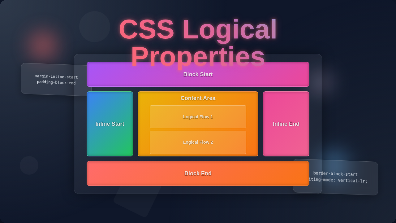
This is where CSS Logical Properties come in. They are like a breath of fresh air. Logical properties don’t care about "left" or "right." Instead, they care about the "start" and "end" of the content flow. For example, margin-inline-start replaces margin-left (or margin-right). It adds space at the beginning of the text line. margin-inline-end does the opposite. It places space at the end of the text line. Meanwhile, margin-block-start adds space before a block of text. Think of a paragraph. This would be space above it. Similarly, margin-block-end adds space after the block. So, if your page reads left-to-right, margin-inline-start behaves like margin-left. If it reads right-to-left, it acts like margin-right. It adapts automatically. How cool is that?
How to Think About It: Beyond Left and Right with CSS Logical Properties
Let’s rethink how we visualize space. Forget left and right for a moment. Instead, imagine your content has a "reading direction." This is called its "writing mode." In English, text flows inline from left to right. Blocks flow block from top to bottom. inline-start is the beginning of a line of text. inline-end is the end of it. block-start is the top of a text block. block-end is the bottom. These terms are like a universal compass. They guide your layout regardless of language. You’re giving instructions relative to the text itself. This makes your CSS incredibly resilient. Moreover, it naturally aligns with how flexbox and grid work. These layout systems already use start and end concepts. It’s all about context for CSS Logical Properties.
What to Do Next: Practical Steps to Modernize Your CSS
Don’t feel overwhelmed. You can start small. Begin by replacing specific physical properties. Look for margin-left and margin-right first. Swap them for margin-inline-start and margin-inline-end. Then, move onto padding-left and padding-right. You can change these to padding-inline-start and padding-inline-end. The same applies to border-left and border-right. They become border-inline-start and border-inline-end. This simple change makes your layouts immediately more robust. For animating custom properties, remember how valuable these logical concepts can be. You might even find similar ideas useful for CSS @property Animation: Enhance UI with Custom Property Effects (HTML/CSS). It helps you think dynamically. Furthermore, understanding these properties makes your designs truly future-proof.
Pro Tip: Start with your margins and paddings. They are often the easiest to convert to logical properties. This builds a strong foundation for global layouts.
Deeper Dive into Logical Sizing and Flow
Logical properties extend beyond just margins and paddings. They also impact sizing. You’re used to width and height, right? These are physical dimensions. But what if you need dimensions that adapt to the writing mode? That’s where inline-size and block-size come in. inline-size specifies the horizontal dimension in a horizontal writing mode. It becomes the vertical dimension in a vertical writing mode. It’s essentially the width along the "inline" axis. Similarly, block-size sets the vertical dimension in a horizontal writing mode. It’s the height along the "block" axis. These are often called "flow-relative" properties. They flow with your content. It’s like creating adaptive shapes that respond to language direction. Think of how CSS Clip-path: Create Custom Shapes with HTML & CSS allows flexible shapes. Logical sizing gives you similar flexibility for dimensions. For more advanced animations involving sizing, consider how CSS @property Transition: Animate Custom Properties with HTML/CSS could work with these logical concepts.
Wrapping Up: Your Future-Proof Layouts with CSS Logical Properties
You’ve taken a big step today. Moving from physical properties to CSS Logical Properties might seem daunting. However, it’s a powerful upgrade for your web development toolkit. You are building layouts that are truly global. Your websites will adapt beautifully to any language or writing mode. No more broken margin-left in a right-to-left layout. Instead, you’ll have resilient, flexible designs. You are now equipped to create truly modern web experiences. Keep experimenting with these new properties. You will see how they streamline your workflow.
Key Takeaway: CSS Logical Properties make your layouts adaptable and resilient across different writing modes and languages. Embrace them for a truly global web.
Want to learn more about the specifics of writing modes? Check out this MDN guide on writing-mode. Or maybe you’re curious about all the different logical properties? This CSS-Tricks article provides a comprehensive overview. You’ve got this! Keep building amazing things.