React Dark Mode Local Storage Tutorial with Hooks
Hey there, fellow coders! If you’ve wanted to add a beautiful React Dark Mode toggle to your applications, but weren’t sure where to start, you are in the perfect spot. We are going to build an awesome feature today. It will let users switch between light and dark themes. The best part? It remembers their choice, even after they close their browser! This is super cool for user experience, making your apps more personal.
What We Are Building: Your Persistent React Dark Mode Toggle
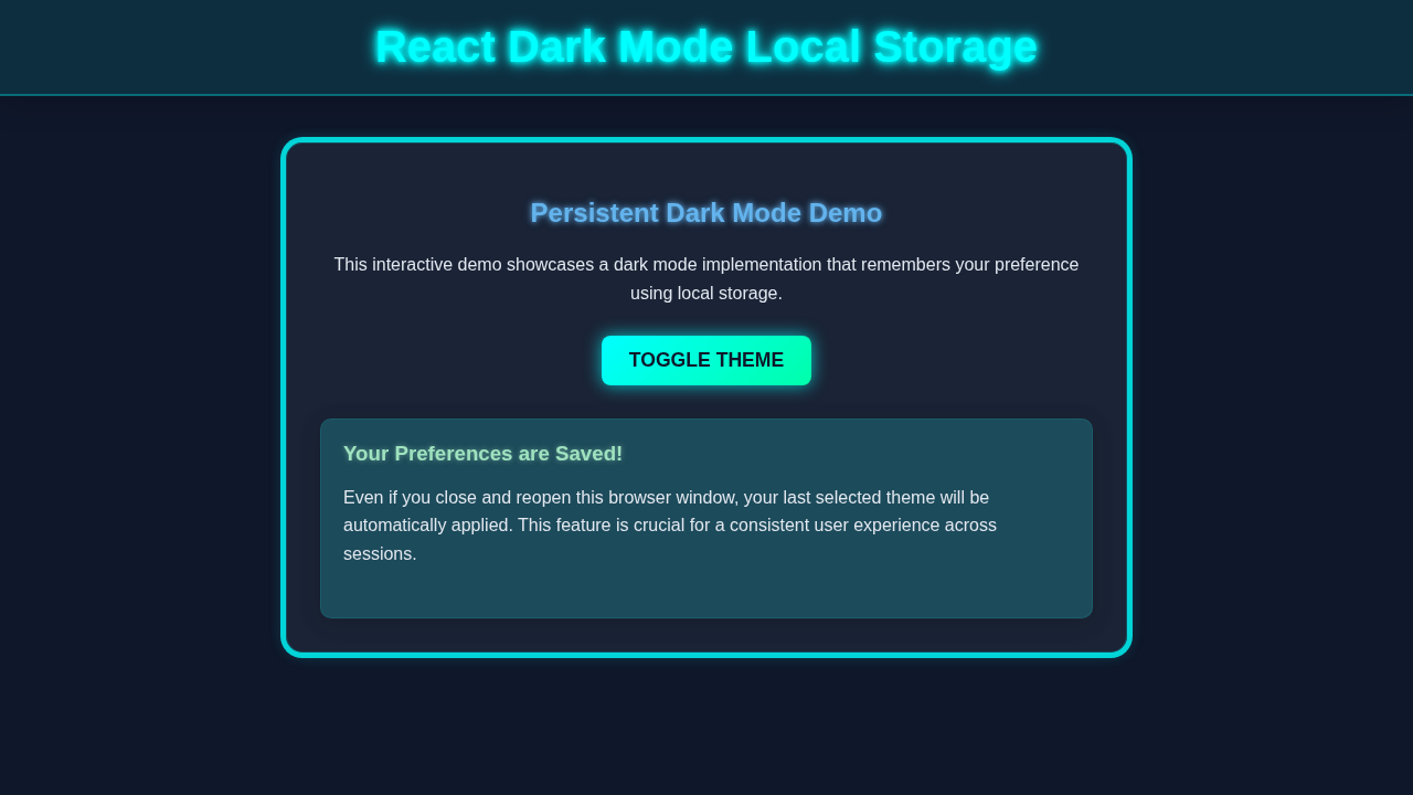
Today, we’re crafting a sleek and functional dark mode toggle for your React applications. Imagine your users visiting your site, flipping a switch, and seeing the entire interface transform! More importantly, when they return, their preferred theme is already there. No more re-toggling! This adds a touch of professionalism and a great user experience to any project. Therefore, we will use React hooks like useState and useEffect, alongside the browser’s localStorage, to make this magic happen. It’s a fundamental skill for modern web development.
Pro Tip: Persistent state, like saving dark mode preferences, is crucial for good UX. It makes your application feel smart and responsive to user needs!
HTML Structure
First, let’s look at the basic HTML for our component. We’ll need a main container, a button to toggle the theme, and some simple content to show off the styling changes. Keep it clean and simple!
public/index.html
<!DOCTYPE html>
<html lang="en">
  <head>
    <meta charset="utf-8" />
    <link rel="icon" href="%PUBLIC_URL%/favicon.ico" />
    <meta name="viewport" content="width=device-width, initial-scale=1" />
    <meta name="theme-color" content="#000000" />
    <meta
      name="description"
      content="Web site created using create-react-app"
    />
    <link rel="apple-touch-icon" href="%PUBLIC_URL%/logo192.png" />
    <link rel="manifest" href="%PUBLIC_URL%/manifest.json" />
    <title>React Dark Mode</title>
  </head>
  <body>
    <noscript>You need to enable JavaScript to run this app.</noscript>
    <div id="root"></div>
  </body>
</html>
CSS Styling
Next, we’ll define some CSS variables for our colors. This makes it super easy to switch themes by just changing a few variables. We’ll also create a .dark-theme class that overrides these variables for dark mode. This approach is very flexible!
src/index.css
/* Global CSS Reset & Base Styles */
body {
    margin: 0;
    font-family: Arial, Helvetica, sans-serif; /* Safe, widely available font */
    -webkit-font-smoothing: antialiased;
    -moz-osx-font-smoothing: grayscale;
    box-sizing: border-box; /* Ensure padding and border are included in the element's total width and height */
    overflow-x: hidden; /* Prevent horizontal scrollbars */
    transition: background-color 0.3s ease, color 0.3s ease; /* Smooth theme transitions */
}

html, body, #root {
    height: 100%; /* Ensure full height for proper layout */
}

/* CSS Variables for Themes */
/* Default (Light) Theme Variables */
:root {
    --background-color: #f0f2f5;
    --text-color: #333;
    --header-bg: #ffffff;
    --button-bg: #007bff;
    --button-text: #ffffff;
    --button-hover-bg: #0056b3;
    --card-bg: #ffffff;
    --card-border: #e0e0e0;
    --accent-color: #007bff;
}

/* Dark Theme Overrides */
/* These variables are applied when the <html> element has the 'dark-theme' class */
html.dark-theme {
    --background-color: #1a202c; /* Dark slate background */
    --text-color: #e2e8f0; /* Light gray text */
    --header-bg: #2d3748; /* Darker header */
    --button-bg: #63b3ed; /* Light blue button */
    --button-text: #1a202c;
    --button-hover-bg: #4299e1;
    --card-bg: #2d3748; /* Darker card */
    --card-border: #4a5568;
    --accent-color: #63b3ed;
}

/* Apply variables to main elements for consistent theming */
body {
    background-color: var(--background-color);
    color: var(--text-color);
}

.app-container {
    min-height: 100vh;
    display: flex;
    flex-direction: column;
}

.app-header {
    background-color: var(--header-bg);
    color: var(--text-color);
    padding: 20px;
    text-align: center;
    border-bottom: 1px solid var(--card-border); /* Subtle border */
    transition: background-color 0.3s ease, color 0.3s ease, border-color 0.3s ease;
}

.app-header h1 {
    margin-top: 0;
    margin-bottom: 15px;
    font-size: 2em;
}

.app-content {
    flex-grow: 1; /* Allows content to take available space */
    max-width: 800px;
    margin: 40px auto;
    padding: 0 20px;
}

.app-content p {
    line-height: 1.6;
    margin-bottom: 1em;
}

.theme-toggle-button {
    background-color: var(--button-bg);
    color: var(--button-text);
    border: none;
    padding: 10px 20px;
    border-radius: 5px;
    cursor: pointer;
    font-size: 1rem;
    font-weight: bold;
    transition: background-color 0.3s ease, transform 0.1s ease;
}

.theme-toggle-button:hover {
    background-color: var(--button-hover-bg);
    transform: translateY(-1px); /* Slight lift effect */
}

.theme-toggle-button:active {
    transform: translateY(0);
}

.card {
    background-color: var(--card-bg);
    border: 1px solid var(--card-border);
    border-radius: 8px;
    padding: 20px;
    margin-top: 30px;
    box-shadow: 0 4px 6px rgba(0, 0, 0, 0.1); /* Subtle shadow for depth */
    transition: background-color 0.3s ease, border-color 0.3s ease, box-shadow 0.3s ease;
}

.card h3 {
    color: var(--accent-color);
    margin-top: 0;
    margin-bottom: 10px;
}
JavaScript (React Logic for React Dark Mode)
Now, for the exciting part: the React logic! We’ll use hooks to manage our theme state and interact with localStorage. This ensures our dark mode preference sticks around. Don’t worry, we’ll break it all down step-by-step!
src/index.js
import React from 'react';
import ReactDOM from 'react-dom/client';
import './index.css'; // Global styles for the application
import App from './App'; // The main application component

// Create a root to render the React application
const root = ReactDOM.createRoot(document.getElementById('root'));

// Render the App component into the root element
root.render(
  <React.StrictMode>
    <App />
  </React.StrictMode>
);
src/App.js
import React from 'react';
import useDarkMode from './hooks/useDarkMode'; // Import our custom dark mode hook

/**
 * App Component
 * This is the main component that orchestrates the dark mode feature.
 * It uses the `useDarkMode` hook to manage theme state and provides a toggle button.
 */
function App() {
    // Use the custom hook to get the current theme and the function to toggle it
    const [theme, toggleTheme] = useDarkMode();

    return (
        <div className="app-container">
            <header className="app-header">
                <h1>React Dark Mode with Local Storage</h1>
                {/* Theme toggle button */}
                <button onClick={toggleTheme} className="theme-toggle-button">
                    Switch to {theme === 'light' ? 'Dark' : 'Light'} Mode
                </button>
            </header>
            <main className="app-content">
                <p>
                    Welcome to this demonstration of a persistent dark mode in a React application.
                    This example utilizes React hooks (<code>useState</code>, <code>useEffect</code>)
                    and the browser's <code>localStorage</code> to remember your theme preference.
                </p>
                <p>
                    Feel free to toggle the theme using the button above. Your choice will be saved
                    and automatically applied on subsequent visits, even after closing the browser tab.
                </p>
                <div className="card">
                    <h3>Adaptive Content Card</h3>
                    <p>This card's appearance seamlessly adapts to the current theme, showcasing dynamic styling based on CSS variables.</p>
                    <p>Lorem ipsum dolor sit amet, consectetur adipiscing elit. Sed do eiusmod tempor incididunt ut labore et dolore magna aliqua.</p>
                </div>
            </main>
        </div>
    );
}

export default App;
src/hooks/useDarkMode.js
import { useState, useEffect } from 'react';

/**
 * useDarkMode Custom Hook
 * Manages the dark/light theme state for the application.
 * - Initializes theme from localStorage or system preference.
 * - Applies the theme class ('light-theme' or 'dark-theme') to the document's root element (<html>).
 * - Persists the theme choice in localStorage.
 *
 * @returns {[string, function]} An array containing the current theme ('light' or 'dark')
 *                               and a function to toggle the theme.
 */
function useDarkMode() {
    // Initialize theme state. The function form of useState ensures this runs only once.
    const [theme, setTheme] = useState(() => {
        // 1. Try to retrieve theme from localStorage
        const localTheme = localStorage.getItem('theme');
        if (localTheme) {
            return localTheme; // Use stored theme if available
        }
        // 2. If no theme is stored, check user's system preference
        if (window.matchMedia && window.matchMedia('(prefers-color-scheme: dark)').matches) {
            return 'dark'; // System prefers dark mode
        }
        // 3. Default to light mode
        return 'light';
    });

    // useEffect hook to apply the theme class to the document's root element
    // and update localStorage whenever the `theme` state changes.
    useEffect(() => {
        const root = document.documentElement; // Target the <html> element

        // Remove existing theme classes to prevent conflicts
        root.classList.remove('light-theme', 'dark-theme');

        // Add the current theme class
        root.classList.add(`${theme}-theme`);

        // Persist the current theme choice in localStorage
        localStorage.setItem('theme', theme);

    }, [theme]); // Dependency array: this effect runs whenever the `theme` state changes

    /**
     * Toggles the theme between 'light' and 'dark'.
     */
    const toggleTheme = () => {
        setTheme(prevTheme => (prevTheme === 'light' ? 'dark' : 'light'));
    };

    return [theme, toggleTheme]; // Return current theme and toggle function
}

export default useDarkMode;
How Your React Dark Mode Persistence Works
Let’s dive into how all these pieces fit together to create a seamless dark mode experience. Understanding this flow is key to mastering React state management and local storage. We are building a truly interactive feature!
Initial Setup and State Management
When our React component first loads, we need to figure out if the user prefers dark mode. We achieve this by checking localStorage. If a preference is found, we use it. Otherwise, we can default to light mode. The useState hook is perfect for holding our isDarkMode boolean value. This value controls everything!
Reading and Writing to Local Storage
The useEffect hook is our best friend here. It allows us to perform side effects in functional components. We use one useEffect to read the initial theme from localStorage when the component mounts. Another useEffect is used to save the current isDarkMode state to localStorage whenever it changes. This is the ‘persistence’ part! For more on managing complex themes, consider exploring React Dark Mode with Context API: A Complete Tutorial.
Heads Up:
localStoragestores data as strings. Always remember toJSON.parse()when reading andJSON.stringify()when writing complex data types!
Toggling the Theme and Updating the DOM
Our toggle button simply updates the isDarkMode state using its setter function. When isDarkMode changes, our second useEffect fires. This effect adds or removes the 'dark-theme' class from the document.body. The CSS then springs into action, applying our dark mode styles. It’s a very efficient way to manage themes!
Dynamic Styling with CSS Variables
We’re using CSS variables (like --bg-color and --text-color) to make theme switching straightforward. The base styles define default light mode values. The .dark-theme class then redefines these variables with dark mode values. This means your CSS adapts instantly when the class is toggled. It’s a clean and powerful technique for styling dynamic applications. You can learn more about CSS variables on MDN Web Docs.
Tips to Customise It
You’ve built a solid foundation! Now, let’s think about how you can extend this project and make it even cooler:
- Multiple Themes: Instead of just light and dark, why not add a ‘blue mode’ or ‘sepia mode’? You could store a string like
'light','dark', or'blue'in state and local storage. - System Preference: Use the
window.matchMedia('(prefers-color-scheme: dark)')API to detect if the user’s operating system prefers dark mode by default. This provides an even better initial experience! - Animated Transitions: Add a smooth CSS
transitionproperty to your color properties. This will make the theme change feel more polished and less abrupt. - Global Context: For larger applications, passing the
isDarkModestate and toggle function down through props can become cumbersome. Consider using React’s Context API to make the theme globally accessible. This is a pattern we often use for broader state management in projects like a React CRUD App Tutorial: Build a Full CRUD Application with JSX.
Conclusion
Amazing job, developer! You’ve just built a robust and user-friendly persistent React Dark Mode toggle. This isn’t just a fun feature; it’s a practical skill that enhances accessibility and user satisfaction. You learned about React hooks, local storage, and dynamic CSS styling. These are powerful tools in your web development arsenal! Now, go forth and add dark mode to all your projects. Share your creations online; we’d love to see them!