CSS Container Queries Tutorial: Responsive Design with HTML & CSS
Hey there, fellow coders! Have you ever struggled with making components truly adapt? We often only think about the viewport. This post is for you!
We’re diving deep into CSS Container Queries. They are a game-changer! So, we will build a super flexible, responsive card component. It adapts gracefully to any space you put it in. This is modern CSS at its best. Therefore, get ready to level up your front-end skills!
What We Are Building
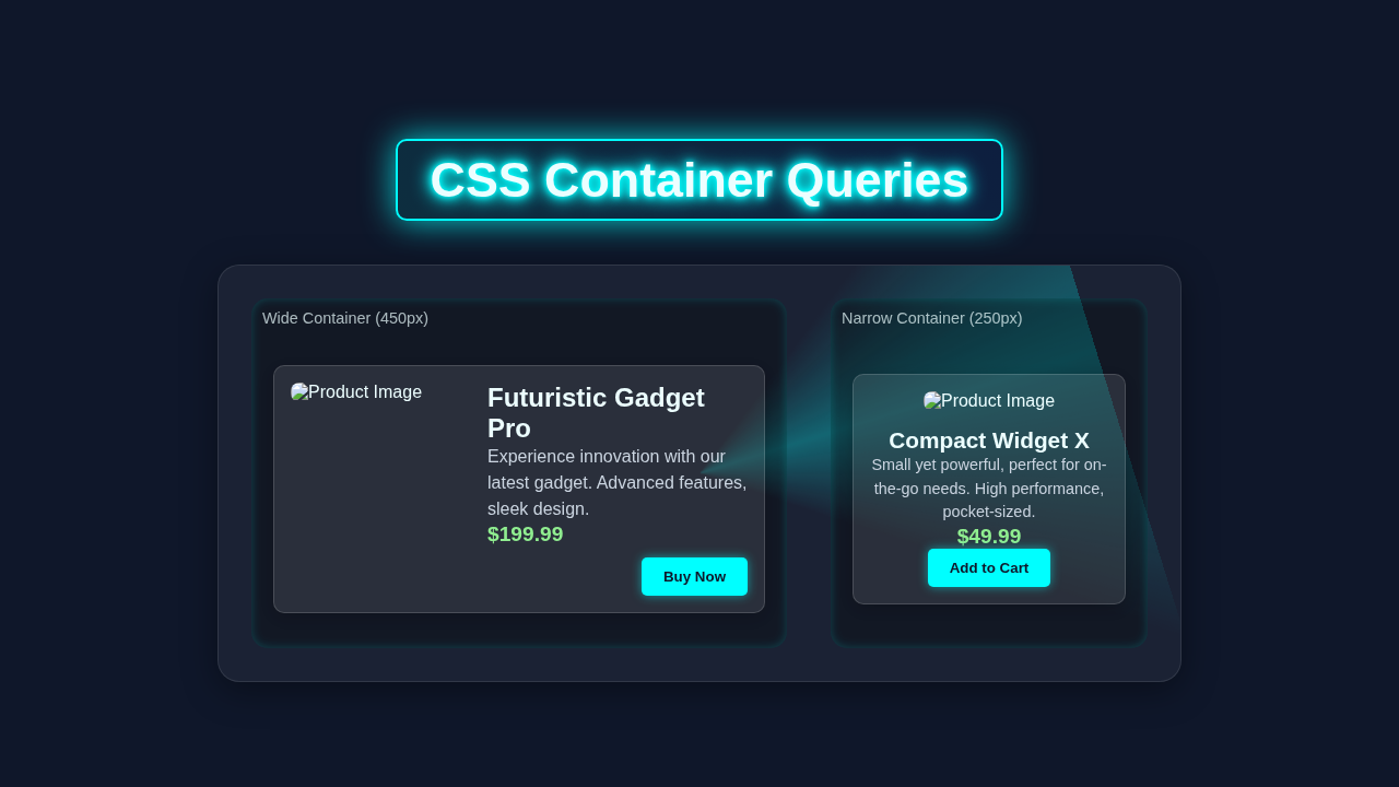
Imagine a card that changes its layout automatically. This card component will do just that. It’s not about screen size anymore. Our card cares about its own container’s size.
When the container is wide, the image and text sit side-by-side. Conversely, when the container gets narrow, the image stacks on top. This is incredibly useful for dynamic layouts. Think blog post summaries or product listings. We are making highly reusable UI elements.
Pro Tip: Building modular components like this improves maintainability. You write CSS once. It works everywhere!
HTML Structure for Our Card
Our HTML will be super clean. We’ll use semantic tags for clarity. This makes our code easier to read. It also helps with accessibility. One main container holds everything. Inside, we’ll have an image and a content area.
index.html
<!DOCTYPE html>
<html lang="en">
<head>
    <meta charset="UTF-8">
    <meta name="viewport" content="width=device-width, initial-scale=1.0">
    <title>CSS Container Queries Tutorial</title>
    <link rel="stylesheet" href="styles.css">
</head>
<body>

    <header class="page-header">
        <h1>Exploring CSS Container Queries</h1>
        <p>Responsive components based on parent container size, not just viewport.</p>
    </header>

    <main class="page-layout">
        <!-- This container is wider, the card inside will adapt to a horizontal layout -->
        <section class="main-content-area query-container">
            <h2>Main Content Area</h2>
            <div class="card-grid">
                <div class="product-card">
                    <img src="https://via.placeholder.com/200x150/007bff/ffffff?text=Product+A" alt="Product Image A">
                    <div class="content-area">
                        <h3>Mega Widget 3000</h3>
                        <p>Our flagship product, designed for peak performance and durability. Unmatched power.</p>
                        <div class="price">$299.00</div>
                        <div class="button-wrapper"><button>Learn More</button></div>
                    </div>
                </div>
                <div class="product-card">
                    <img src="https://via.placeholder.com/200x150/28a745/ffffff?text=Product+B" alt="Product Image B">
                    <div class="content-area">
                        <h3>Compact Gizmo</h3>
                        <p>The perfect companion for your daily adventures. Lightweight and ultra-portable.</p>
                        <div class="price">$79.50</div>
                        <div class="button-wrapper"><button>Add to Cart</button></div>
                    </div>
                </div>
            </div>
        </section>

        <!-- This container is narrower, the card inside will adapt to a vertical layout -->
        <aside class="sidebar-area query-container">
            <h2>Sidebar Promotions</h2>
            <div class="card-list">
                <div class="product-card">
                    <img src="https://via.placeholder.com/200x150/ffc107/333333?text=Product+C" alt="Product Image C">
                    <div class="content-area">
                        <h3>Daily Deal Item</h3>
                        <p>Grab this limited-time offer!</p>
                        <div class="price">$24.99</div>
                        <div class="button-wrapper"><button>Shop Now</button></div>
                    </div>
                </div>
            </div>
        </aside>
    </main>

</body>
</html>
CSS Styling: Unleashing Responsive Power with CSS Container Queries
Now for the exciting part: the CSS! We’ll start with some basic styling. Then, we’ll introduce the magic of Container Queries. This will make our card truly responsive. We will also use the amazing :has() pseudo-class. It adds even more flexibility!
styles.css
/* Global Resets & Base Styles */
body {
    font-family: Arial, Helvetica, sans-serif; /* Safe font stack */
    margin: 0;
    padding: 0;
    background-color: #f4f7f6; /* Light background for tutorial */
    color: #333;
    line-height: 1.6;
    box-sizing: border-box; /* Ensure padding/border included in element's total width/height */
}

*, *::before, *::after {
    box-sizing: inherit;
}

img {
    max-width: 100%;
    height: auto;
    display: block; /* Remove extra space below images */
}

/* Header Styles */
.page-header {
    background-color: #007bff; /* Primary blue */
    color: #ffffff;
    padding: 20px;
    text-align: center;
    box-shadow: 0 2px 4px rgba(0,0,0,0.1);
}

.page-header h1 {
    margin: 0 0 10px 0;
    font-size: 2.5em;
}

.page-header p {
    margin: 0;
    font-size: 1.1em;
}

/* Main Page Layout */
.page-layout {
    display: flex;
    flex-wrap: wrap; /* Allow wrapping on smaller screens */
    gap: 30px;
    padding: 30px;
    max-width: 1200px;
    margin: 30px auto;
}

.main-content-area {
    flex: 3; /* Takes up 3 parts of available space */
    min-width: 400px; /* Minimum width for main content */
    background-color: #ffffff;
    padding: 25px;
    border-radius: 8px;
    box-shadow: 0 2px 8px rgba(0,0,0,0.1);
}

.sidebar-area {
    flex: 1; /* Takes up 1 part of available space */
    min-width: 250px; /* Minimum width for sidebar */
    background-color: #e2f0fb; /* Lighter blue for sidebar */
    padding: 25px;
    border-radius: 8px;
    box-shadow: 0 2px 8px rgba(0,0,0,0.08);
}

.main-content-area h2,
.sidebar-area h2 {
    margin-top: 0;
    color: #0056b3;
    border-bottom: 2px solid #007bff;
    padding-bottom: 10px;
    margin-bottom: 20px;
}

.card-grid {
    display: grid;
    grid-template-columns: repeat(auto-fit, minmax(280px, 1fr)); /* Responsive grid for cards */
    gap: 20px;
}

.card-list {
    display: flex;
    flex-direction: column;
    gap: 20px;
}

/* --- Container Query Setup --- */
/* The parent containers for the product cards must define a container-type */
.query-container {
    container-type: inline-size; /* Allows querying based on the container's width */
    container-name: product-section; /* Optional: give it a name for targeting */
}

/* --- Product Card Component --- */
.product-card {
    background-color: #ffffff;
    border: 1px solid #ddd;
    border-radius: 8px;
    padding: 15px;
    display: flex;
    flex-direction: column; /* Default: stacked layout */
    align-items: center;
    gap: 15px;
    text-align: center;
    box-shadow: 0 1px 4px rgba(0,0,0,0.05);
    overflow: hidden; /* Ensure content doesn't spill */
    max-width: 100%;
}

.product-card img {
    border-radius: 6px;
    width: 100%; /* Image takes full width in vertical layout */
    height: auto;
    object-fit: cover;
}

.product-card .content-area {
    display: flex;
    flex-direction: column;
    gap: 5px;
}

.product-card h3 {
    margin: 0;
    font-size: 1.4em;
    color: #333;
}

.product-card p {
    margin: 0;
    font-size: 0.9em;
    color: #666;
}

.product-card .price {
    font-weight: bold;
    font-size: 1.1em;
    color: #28a745; /* Green for price */
}

.product-card button {
    background-color: #007bff; /* Primary blue button */
    color: #ffffff;
    border: none;
    padding: 10px 15px;
    border-radius: 5px;
    cursor: pointer;
    font-weight: bold;
    transition: background-color 0.2s ease;
}

.product-card button:hover {
    background-color: #0056b3;
}

/* --- Container Query Styles for .product-card --- */
/* This rule applies when the .product-card's parent container is at least 320px wide */
@container product-section (min-width: 320px) {
    .product-card {
        flex-direction: row; /* Change to horizontal layout */
        text-align: left;
        align-items: flex-start;
        padding: 20px;
    }

    .product-card img {
        width: 120px; /* Fixed width for image in horizontal layout */
        height: 100px; /* Fixed height for image */
        object-fit: cover; /* Ensure image covers the area */
        flex-shrink: 0; /* Prevent image from shrinking */
        margin-right: 20px; /* Space between image and text */
    }

    .product-card .content-area {
        flex-grow: 1; /* Allow content area to take available space */
        justify-content: space-between;
    }

    .product-card h3 {
        font-size: 1.2em; /* Slightly smaller for compact horizontal layout */
    }

    .product-card p {
        font-size: 0.85em;
    }

    .product-card .button-wrapper {
        align-self: flex-end; /* Align button to the bottom-right in horizontal layout */
        margin-top: auto; /* Push button to the bottom */
    }
}

/* Adjustments for even wider containers */
@container product-section (min-width: 450px) {
    .product-card img {
        width: 150px;
        height: 120px;
    }
    .product-card h3 {
        font-size: 1.5em;
    }
    .product-card p {
        font-size: 0.9em;
    }
}

/* Basic media query for overall page layout on small screens */
@media (max-width: 768px) {
    .page-layout {
        flex-direction: column;
        padding: 20px;
        margin: 20px auto;
    }

    .main-content-area,
    .sidebar-area {
        min-width: auto;
        width: 100%;
    }
}
How It All Works Together
Let’s break down the magic we just created. Every line of code has a purpose. We combine new CSS features for a powerful result. Understanding these concepts helps you build better layouts.
Setting Up Our Container
First, we define a container query context. We do this on our card-container element. The container-type: inline-size; property is key. It tells the browser to track changes in the inline (horizontal) dimension. Also, container-name: card; gives it a label. This lets us target it easily later. For instance, you can name your container anything you like. Just make sure it is unique for better organization.
Without these properties, container queries won’t work. Thus, this is the foundation of our responsive card. It’s like telling the browser, “Hey, watch this element’s width!” Think of it as setting up a special sensor. This sensor constantly monitors the available space. Then, your CSS can react to those changes. This makes your component truly independent.
Basic Card Styling
Our card needs some visual appeal. We add a border and padding. A subtle shadow makes it pop. display: flex; on the card lets us arrange its contents. We use gap to create space between items. These are standard CSS practices. They make our card look good from the start. We want it to be attractive even before it adapts.
Moreover, we ensure the image is responsive. max-width: 100%; and height: auto; are crucial. They stop images from overflowing. This keeps our layout tidy on all screen sizes. The object-fit: cover; property is also very useful here. It ensures the image fills its designated space without distortion. For more design ideas, perhaps you could check out this Pure CSS Illustration: Create Scenic Art with HTML & CSS Only tutorial! It shows how much you can do with pure CSS.
Introducing @container Queries
Here’s the cool part! We use @container card (min-width: 450px). This query targets our card container by its name. It applies styles only when the container is at least 450 pixels wide. This is very different from traditional media queries. Media queries look at the viewport size. Conversely, container queries look at the parent element’s size. This distinction is vital for component-driven design.
When the container is wide enough, for example, we change the image’s width. We also adjust the flex-direction to row. This puts the image and content side-by-side. Otherwise, they stack vertically by default. It’s like having a mini-media query just for our component! This allows for incredible layout flexibility. It empowers your components to make their own layout decisions. They no longer rely on global viewport changes.
Remember: Modern browsers support container queries well. Check Can I Use for up-to-date compatibility information. This helps you understand browser support for new features.
Leveraging the :has() Pseudo-class
The :has() pseudo-class is another amazing modern CSS feature. It’s often called a “parent selector,” but it’s much more versatile! For instance, article:has(.special-tag) selects an article element. This article must contain an element with the class special-tag. This adds incredible power to your CSS. You can conditionally style elements based on their descendants.
In our card, body:has(.dark-mode) .card-container is an example. If the body element has a .dark-mode class, then our .card-container styles change. This is perfect for theme switching or dynamic content. Perhaps a card could highlight itself if it contains a premium badge. We are making components even smarter with this feature. Its possibilities are truly vast. You can learn much more about its potential in this excellent CSS-Tricks article on :has(). It explores many practical use cases.
Tips to Customise It
You’ve built a fantastic responsive card! Now, let’s make it your own. Here are some ideas to push your creativity:
- Add more variants: Create a “featured” card. Use
:has()to detect a.featuredclass within the card. Apply different colors or a unique border. - Experiment with different breakpoints: Change the
min-widthvalue in the@containerquery. See how it affects the layout. Find the sweet spot for your content. - Integrate a dark mode toggle: Build a simple JavaScript toggle. Add or remove a
.dark-modeclass on thebody. Watch your cards instantly adapt! - Nested containers: Place this card inside another container-query-enabled element. See how nested responsiveness works. It’s mind-blowing!
- Beyond cards: Apply
container-typeto other components. Think navigation bars or sidebars. Imagine a truly adaptive layout system. - Animations: Add subtle transitions to the layout changes. Make the switch between narrow and wide smoother.
If you loved this, you might enjoy exploring more pure CSS fun with this CSS Pie Slice Art Tutorial: HTML & CSS Only (No JS)!
Conclusion
Wow, you did it! You just built a truly responsive card component. You mastered two powerful modern CSS features. You learned about CSS Container Queries and the amazing :has() pseudo-class. These tools will change how you approach responsive design forever.
Gone are the days of relying solely on viewport-based media queries. Now, your components can be smart. They adapt to their own context. This makes your UI more robust and reusable. Share your creations online! Show off your new skills. Keep experimenting, and happy coding!