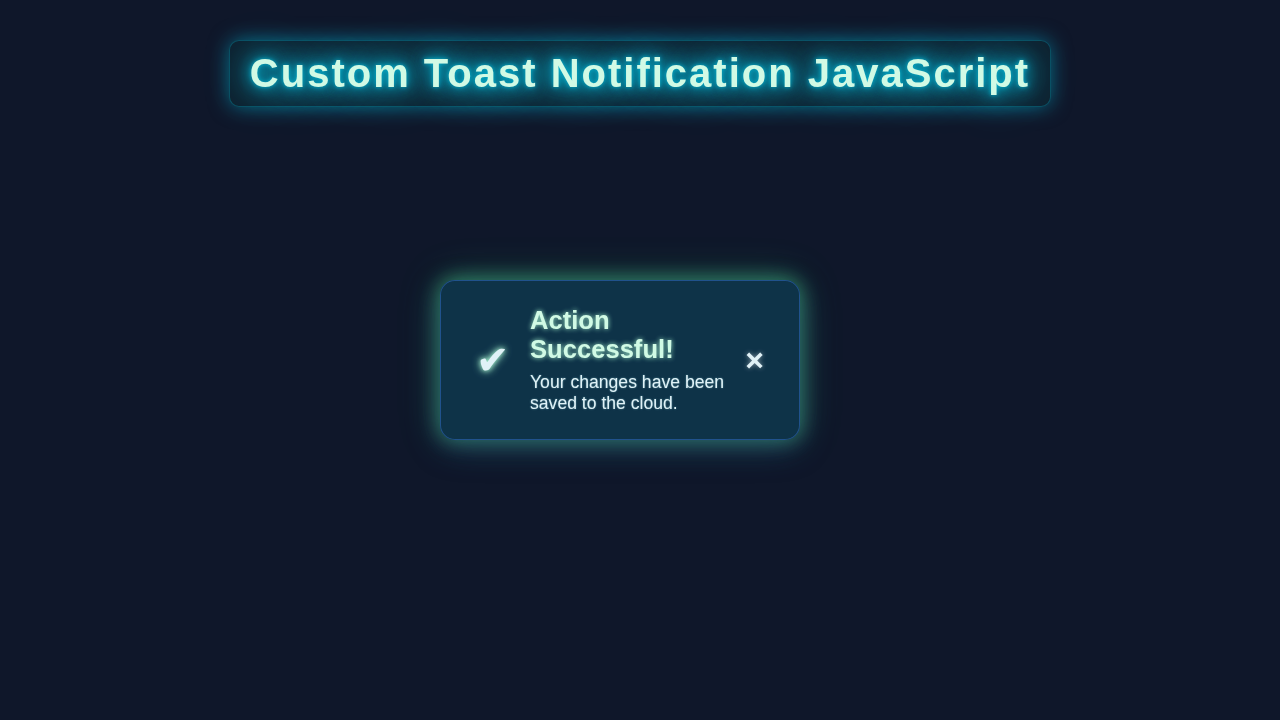
Hey there, fellow coder! If you’ve wanted to build a Custom Toast Notification but felt a bit lost, you are absolutely in the right place. We all interact with these neat little pop-ups daily. They subtly confirm actions like “Item added to cart!” or “Settings saved successfully.” Today, we are going to build our very own dynamic toast component. This will elevate the user experience on your websites. It adds a professional touch that users truly appreciate. Let’s dive in and create something genuinely amazing!
What We Are Building: A Dynamic Custom Toast Notification
We’re about to craft an exciting, interactive notification system. Imagine a sleek box that gracefully slides onto the screen. It delivers a concise message, then smoothly fades away. Our custom toast notifications will be incredibly versatile. You can effortlessly change their appearance. Think about different colors, unique icons, and even the display duration. These notifications provide essential user feedback. Importantly, they do it without interrupting the user’s workflow. This seemingly small component adds immense professionalism to any web application. It is definitely a fantastic skill to master for your development journey!
HTML Structure: The Foundation of Our Toast System
First things first, we need the foundational HTML to house our future toast messages. This initial setup is wonderfully straightforward. We will establish a primary container element. This container will elegantly hold all of our individual toast notifications. Following that, each specific toast message will have its own distinct structure within this main container. This modular approach keeps things tidy. It makes managing multiple toasts much easier. Here’s a look at the lean markup we’ll use to get started.
index.html
<!DOCTYPE html>
<html lang="en">
<head>
    <meta charset="UTF-8">
    <meta name="viewport" content="width=device-width, initial-scale=1.0">
    <title>Custom Toast Notification</title>
    <link rel="stylesheet" href="styles.css">
</head>
<body>
    <div class="toast-container" id="toastContainer">
        <!-- Toasts will be appended here by JavaScript -->
    </div>

    <h1>Custom Toast Notifications</h1>
    <p>Click the buttons below to see different types of toast notifications.</p>

    <div class="button-group">
        <button onclick="showToast('This is a success message!', 'success')">Show Success Toast</button>
        <button onclick="showToast('Something went wrong. Please try again.', 'error')">Show Error Toast</button>
        <button onclick="showToast('Just an informational message.', 'info')">Show Info Toast</button>
        <button onclick="showToast('A warning! Be careful with that action.', 'warning')">Show Warning Toast</button>
        <button onclick="showToast('This is a custom message with a very long text that demonstrates how the toast handles longer content without breaking the layout. It should wrap nicely.', 'info')">Show Long Info Toast</button>
    </div>

    <script src="script.js"></script>
</body>
</html>
CSS Styling: Making Our Toasts Look Absolutely Stunning
Now, let’s inject some visual flair and make our custom toast notifications truly shine with CSS! We’ll meticulously style the main container. This ensures it’s perfectly positioned on your screen. Furthermore, each individual toast notification will receive its own unique visual treatment. We’ll also integrate smooth CSS animations. These will handle the toast’s entrance and exit. This thoughtful attention to detail dramatically enhances the user experience. It makes interactions feel fluid and modern. Don’t worry about the complexity; we’ll dissect each styling choice together!
styles.css
/* Basic Reset & Body Styling */
body {
    font-family: Arial, Helvetica, sans-serif;
    margin: 0;
    padding: 20px;
    background-color: #f4f7fa; /* Light background for the tutorial */
    color: #333;
    line-height: 1.6;
    box-sizing: border-box; /* Ensure padding and border are included in the element's total width and height */
    overflow-x: hidden; /* Prevent horizontal scrollbar */
}

h1 {
    color: #2c3e50;
    text-align: center;
    margin-bottom: 30px;
}

p {
    text-align: center;
    margin-bottom: 20px;
}

.button-group {
    display: flex;
    flex-wrap: wrap; /* Allow buttons to wrap on smaller screens */
    gap: 15px;
    justify-content: center;
    margin-top: 30px;
}

.button-group button {
    padding: 12px 25px;
    font-size: 1rem;
    cursor: pointer;
    border: none;
    border-radius: 8px;
    transition: all 0.2s ease-in-out;
    color: #fff;
    font-weight: bold;
    box-shadow: 0 4px 15px rgba(0, 0, 0, 0.1);
}

.button-group button:hover {
    transform: translateY(-2px);
    box-shadow: 0 6px 20px rgba(0, 0, 0, 0.15);
}

/* Specific button styles */
.button-group button:nth-child(1) { background-color: #28a745; } /* Success */
.button-group button:nth-child(2) { background-color: #dc3545; } /* Error */
.button-group button:nth-child(3) { background-color: #007bff; } /* Info */
.button-group button:nth-child(4) { background-color: #ffc107; color: #333; } /* Warning */
.button-group button:nth-child(5) { background-color: #6c757d; } /* Default */


/* Toast Container */
.toast-container {
    position: fixed;
    top: 20px;
    right: 20px;
    z-index: 1000;
    display: flex;
    flex-direction: column;
    gap: 15px; /* Space between multiple toasts */
    max-width: 350px; /* Limit width of individual toasts */
    width: 100%; /* Ensure it takes full width up to max-width */
    box-sizing: border-box;
}

/* Individual Toast */
.toast {
    display: flex;
    align-items: center;
    padding: 15px 20px;
    border-radius: 8px;
    color: #fff;
    background-color: #333; /* Default background */
    box-shadow: 0 6px 20px rgba(0, 0, 0, 0.2);
    opacity: 0;
    transform: translateX(100%);
    animation: slideIn 0.4s forwards cubic-bezier(0.25, 0.46, 0.45, 0.94); /* Ease-out cubic-bezier */
    position: relative;
    overflow: hidden; /* Ensure content stays within borders */
    box-sizing: border-box;
}

/* Toast types */
.toast.success {
    background-color: #28a745;
}
.toast.error {
    background-color: #dc3545;
}
.toast.info {
    background-color: #007bff;
}
.toast.warning {
    background-color: #ffc107;
    color: #333; /* Darker text for better contrast on yellow */
}

.toast-icon {
    font-size: 1.5rem;
    margin-right: 15px;
    line-height: 1; /* Ensure icon aligns well */
}

.toast.warning .toast-icon {
    color: #333; /* Darker icon for warning */
}

.toast-content {
    flex-grow: 1;
    margin-right: 10px;
}

.toast-title {
    font-size: 1.1rem;
    font-weight: bold;
    margin: 0 0 5px 0;
}

.toast-message {
    font-size: 0.95rem;
    margin: 0;
    word-wrap: break-word; /* Ensure long messages wrap */
}

.toast-close {
    background: none;
    border: none;
    color: inherit; /* Inherit color from toast for consistency */
    font-size: 1.5rem;
    font-weight: bold;
    cursor: pointer;
    margin-left: auto; /* Push close button to the right */
    padding: 0;
    line-height: 1;
    transition: color 0.2s ease;
}

.toast-close:hover {
    color: rgba(255, 255, 255, 0.8);
}
.toast.warning .toast-close:hover {
    color: rgba(0, 0, 0, 0.8);
}


/* Animations */
@keyframes slideIn {
    from {
        opacity: 0;
        transform: translateX(100%);
    }
    to {
        opacity: 1;
        transform: translateX(0);
    }
}

@keyframes fadeOut {
    from {
        opacity: 1;
        transform: translateX(0);
    }
    to {
        opacity: 0;
        transform: translateX(100%);
        height: 0; /* Collapse element height after fade */
        padding: 0; /* Remove padding to collapse fully */
        margin: 0; /* Remove margin to collapse fully */
        border: none; /* Remove border to collapse fully */
    }
}

.toast.hide {
    animation: fadeOut 0.6s forwards cubic-bezier(0.6, -0.28, 0.735, 0.045); /* Ease-in cubic-bezier */
}

/* Responsive adjustments */
@media (max-width: 600px) {
    .toast-container {
        top: 10px;
        right: 10px;
        left: 10px; /* Make it stretch across the screen on small devices */
        max-width: unset; /* Remove max-width on smaller screens */
    }

    .toast {
        padding: 12px 15px;
    }

    .toast-icon {
        font-size: 1.3rem;
        margin-right: 10px;
    }

    .toast-title {
        font-size: 1rem;
    }

    .toast-message {
        font-size: 0.9rem;
    }

    .toast-close {
        font-size: 1.3rem;
    }

    .button-group {
        flex-direction: column;
        align-items: center;
    }

    .button-group button {
        width: 80%; /* Make buttons wider on small screens */
        max-width: 300px;
    }
}
JavaScript Magic: Bringing Our Custom Toast Notification to Life
Here’s where the real excitement begins! JavaScript will infuse life and interactivity into our custom toast notifications. We’ll craft clever functions to dynamically create, elegantly display, and gracefully remove toasts. You can trigger these powerful messages based on various user actions. Consider scenarios like successful form submissions or critical data saves. We will also implement support for different message types. This includes crucial alerts like ‘success’, ‘error’, and ‘warning’ states. This JavaScript engine makes our component incredibly robust and responsive!
script.js
const toastContainer = document.getElementById('toastContainer');

/**
 * Displays a custom toast notification.
 * @param {string} message - The message to display in the toast.
 * @param {'success'|'error'|'info'|'warning'} type - The type of toast (determines color and icon).
 * @param {number} duration - How long the toast should be visible in milliseconds. Default is 5000ms.
 */
function showToast(message, type = 'info', duration = 5000) {
    // Create toast element
    const toast = document.createElement('div');
    toast.classList.add('toast', type);

    // Determine icon and title based on type
    let icon = '';
    let title = '';
    switch (type) {
        case 'success':
            icon = '✔'; // Checkmark
            title = 'Success!';
            break;
        case 'error':
            icon = '✖'; // Cross
            title = 'Error!';
            break;
        case 'warning':
            icon = '⚠'; // Warning sign
            title = 'Warning!';
            break;
        case 'info':
        default:
            icon = 'i'; // Info circle
            title = 'Info';
            break;
    }

    toast.innerHTML = `
        <div class="toast-icon">${icon}</div>
        <div class="toast-content">
            <h3 class="toast-title">${title}</h3>
            <p class="toast-message">${message}</p>
        </div>
        <button class="toast-close">×</button>
    `;

    // Append toast to container
    toastContainer.appendChild(toast);

    // Add event listener to close button
    const closeButton = toast.querySelector('.toast-close');
    closeButton.addEventListener('click', () => hideToast(toast));

    // Automatically hide toast after duration
    const timeoutId = setTimeout(() => hideToast(toast), duration);

    // Clear timeout if toast is manually closed before duration
    // This prevents the hideToast function from being called twice
    // if the user clicks close button before the timeout.
    closeButton.addEventListener('click', () => clearTimeout(timeoutId));

    // Optionally, pause timeout on mouseover and resume on mouseout
    // For simplicity, we'll just clear it if interacted with.
}

/**
 * Hides and removes a toast notification with an animation.
 * @param {HTMLElement} toastElement - The toast element to hide.
 */
function hideToast(toastElement) {
    toastElement.classList.add('hide'); // Add hide animation class

    // Remove the toast from the DOM after the animation completes
    toastElement.addEventListener('animationend', () => {
        toastElement.remove();
    }, { once: true }); // Ensure this listener runs only once
}
How It All Works Together: Connecting HTML, CSS, and JavaScript Seamlessly
Let’s weave all these threads together into a cohesive, functional unit. We’ve diligently prepared the structural groundwork with HTML. We’ve also meticulously crafted its beautiful appearance with CSS. Now, JavaScript steps into its pivotal role. It acts as the intelligent conductor, orchestrating precisely when and how our toast notifications gracefully appear. We will explore each critical step of this process in detail below. You’ll quickly see how a simple combination of these technologies yields such a powerful result.
The Toast Container: Your Dynamic Notification Hub
Our HTML begins with a foundational <div> element. This element, often identified with an id like toast-container, serves a crucial purpose. It functions as the primary parent element, gracefully housing all our individual toast messages. In our CSS, we precisely position this container. You have full flexibility here; place it confidently at the top-right, bottom-left, or any desired screen location. For instance, applying position: fixed; ensures it remains anchored. We also utilize z-index to guarantee it visually floats above other page content. Remember, a higher z-index value means it takes precedence in layering. You can deepen your understanding of z-index positioning on MDN Web Docs. It truly is a fundamental concept for managing element hierarchy.
Generating a New Toast: The JavaScript Core Engine
The very heart of our dynamic system resides within a powerful JavaScript function. Let’s affectionately call it showToast(). This ingenious function dynamically creates a brand new <div> element right in your browser. This newly minted <div> instantly becomes our individual toast notification. We then apply specific CSS classes to it. These classes, thoughtfully defined earlier, immediately give it our custom styling. The function subsequently appends this fresh toast element directly to our main toast-container. This action makes it instantly visible and vibrant on the page. We are actively creating user interfaces dynamically! For a broader perspective on dynamic UI updates, our article on the React Element Size Hook might be insightful, even if it focuses on React, as the underlying principles of responsive UI manipulation are very similar.
Pro Tip: Always prioritize accessibility! Ensure your custom toast notifications are designed not to obstruct vital content. Also, consider users who rely on screen readers. Provide clear, concise, and easily dismissible messages for everyone.
Customizing Toast Content: Tailoring Messages and Types
Our versatile showToast() function happily accepts various parameters. These include the crucial message text you want to display. You can also pass in a type parameter. This type could be a descriptive string like ‘success’, ‘error’, ‘warning’, or ‘info’. Based on the received type, we intelligently apply different CSS classes. For example, a ‘success’ toast might gracefully appear in green. Conversely, an ‘error’ toast could prominently display in red. This simple yet effective approach allows for crystal-clear visual feedback. Furthermore, we dynamically inject the actual message text into the toast’s inner HTML. This makes our toast component incredibly flexible and adaptable to diverse scenarios.
Auto-Dismissal: Making Toasts Gracefully Fade Away
Most toast notifications, by design, should elegantly disappear on their own. Our JavaScript skillfully manages this essential feature too. As soon as a new toast is created, we initiate a precise timer using setTimeout(). After a pre-determined number of seconds, this timer triggers its action. It then carefully removes the toast element from the Document Object Model (DOM). This intelligent auto-dismissal strategy keeps our web interface consistently clean and uncluttered. Concurrently, our CSS includes beautifully crafted fade-out animations. This ensures the toast’s disappearance is smooth and visually harmonious, never jarring. It’s all meticulously designed for an outstanding user experience.
User Interaction: Empowering Manual Toast Closure
Occasionally, users may wish to dismiss a toast notification sooner than its automatic timeout. We thoughtfully address this by adding a small, intuitive close button, perhaps an ‘X’ icon, to each toast. When this button is clicked, our JavaScript attentively listens for that specific event. An event listener then promptly and precisely removes that particular toast from the display. This vital feature provides users with complete control over their notification experience. We could even explore making the toast disappear on hover for more advanced user interaction possibilities, though that’s a bonus challenge!
Educator’s Note: Mastering event listeners is absolutely fundamental for creating interactive and responsive web pages. They empower your code to intelligently react to every user action, making your applications dynamic. Explore more examples and practical tips on CSS-Tricks on Event Listeners!
Understanding how data flows and how functions interact is incredibly important for building robust features. Our detailed discussion on JavaScript Closures could provide you with an even deeper understanding of how scope and functions operate behind the scenes in similar dynamic JavaScript scenarios.
Tips to Customise It: Make Your Custom Toast Notification Truly Unique!
You’ve successfully built an amazing foundation for your toast system. Now, let’s spark some creativity! Think about personalizing your custom toast notification system further. Make it perfectly fit your project’s aesthetic and needs. Here are some exciting ideas:
- Integrate Different Icons: Elevate your toasts by using a popular font icon library, such as Font Awesome. Display visually relevant icons for success, error, or warning messages. This simple addition significantly enhances visual appeal and clarity!
- Experiment with Positions: Effortlessly modify the CSS properties for your
toast-container. You can easily move it to the bottom-right, top-left, or even elegantly center it on the screen. Play around to find the perfect spot! - Craft Custom Animations: Dive deeper into CSS
keyframes! Create truly unique entrance and exit animations for your toasts. Make them bounce, slide from unexpected directions, or even gently flip into view. - Implement Persistent Toasts: Some crucial notifications might require explicit user interaction to dismiss. Add an optional setting to make certain toasts “sticky.” This means they won’t auto-dismiss.
- Develop a Smart Queue System: What if multiple toasts need to appear simultaneously? Challenge yourself to implement a queuing mechanism. Show them one by one in an orderly fashion. This prevents visual overload and improves user experience. It’s a slightly more advanced but rewarding challenge!
The customization possibilities are truly endless! Keep experimenting, keep building, and make this component uniquely your own for all your future projects.
Conclusion: You Just Built Your Own Custom Toast Notification!
Wow, give yourself a huge pat on the back, developer! You have just successfully built a fully functional and beautiful custom toast notification component. This is a genuinely massive achievement. You skillfully mastered HTML for solid structure, CSS for stunning visual appeal, and JavaScript for dynamic, intelligent behavior. This particular skill is incredibly valuable for any aspiring web developer. It clearly demonstrates your ability to create interactive, user-friendly features completely from scratch. Share what you’ve proudly created with us! We would absolutely love to see your unique implementations and creative customizations. Keep coding, keep building amazing things, and most importantly, keep learning every single day!