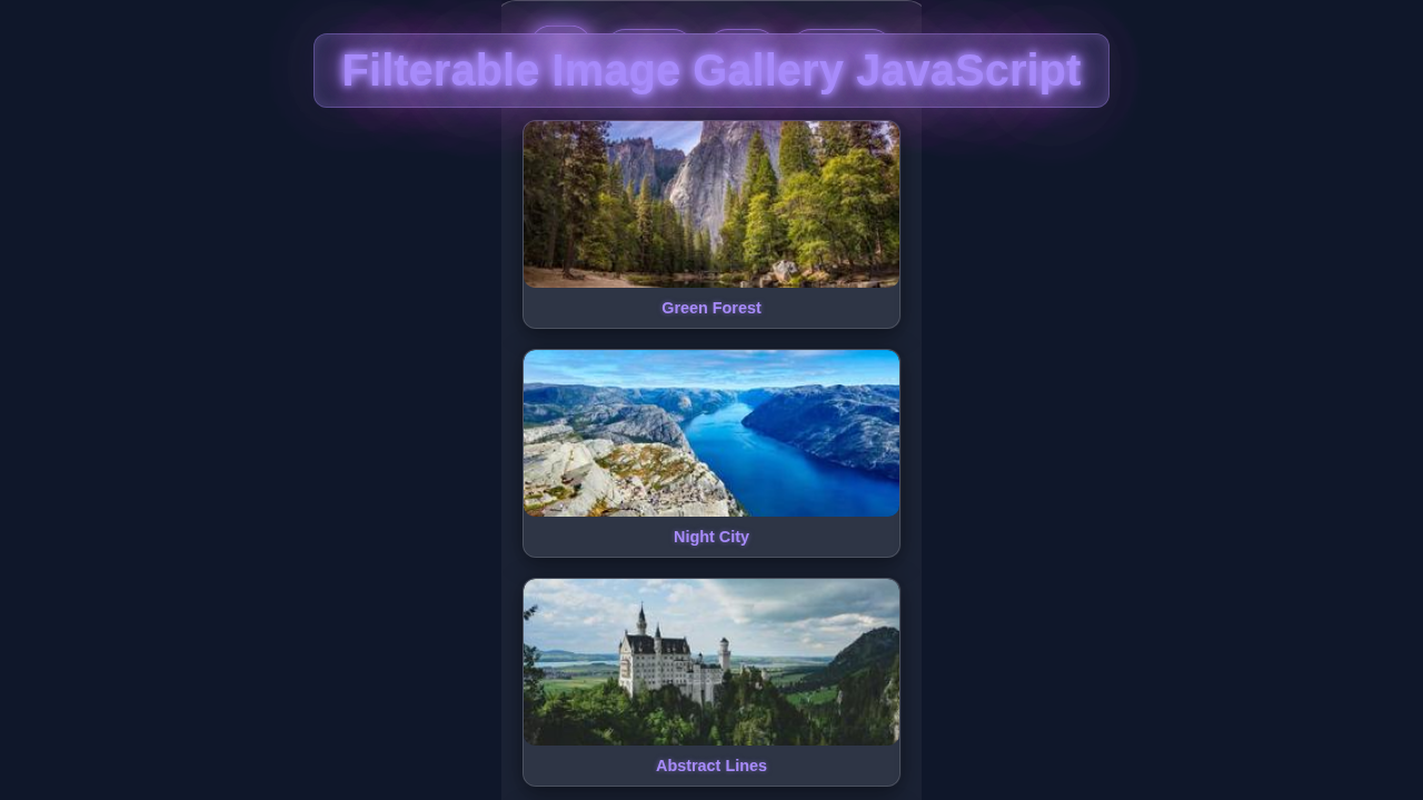
Hey there, awesome developers! If you’ve ever wanted to build a captivating Filterable Image Gallery but weren’t sure where to start, you are in the perfect spot. We’re going to create something truly interactive and beautiful today. This tutorial will guide you through building a dynamic image gallery. It will respond to your clicks and show exactly what you want to see. Get ready to impress your visitors!
What We Are Building: A Dynamic Filterable Image Gallery
Today, we’re building a sleek, responsive, and interactive image gallery. Imagine a collection of photos, perhaps of different categories. You will have buttons above them. When you click a button, only images from that category appear. It’s a fantastic way to showcase portfolios, product catalogs, or even personal photo albums. This project will teach you fundamental web development concepts. Plus, you’ll have a super cool component for your next website!
Pro Tip: Interactive elements like filterable galleries greatly enhance user experience. They keep visitors engaged longer on your site!
HTML Structure: The Skeleton of Our Gallery
First, we need to lay down the foundational HTML. This sets up all the containers for our filter buttons and the image grid. Think of it as the robust skeleton of our gallery. We will use semantic elements for better organization. We’ll also add data attributes to our images for easy filtering later on. This is where we define what each image belongs to.
index.html
<!DOCTYPE html>
<html lang="en">
<head>
    <meta charset="UTF-8">
    <meta name="viewport" content="width=device-width, initial-scale=1.0">
    <title>Filterable Image Gallery</title>
    <!-- Link to the external CSS file -->
    <link rel="stylesheet" href="styles.css">
</head>
<body>
    <div class="gallery-wrapper">
        <h1>Our Creative Showcase</h1>
        <div class="filter-buttons">
            <!-- Filter buttons with data-filter attributes -->
            <button class="filter-btn active" data-filter="all">All</button>
            <button class="filter-btn" data-filter="nature">Nature</button>
            <button class="filter-btn" data-filter="city">City</button>
            <button class="filter-btn" data-filter="animals">Animals</button>
            <button class="filter-btn" data-filter="food">Food</button>
        </div>
        <div class="gallery-grid">
            <!-- Gallery Items with data-category attributes -->
            <div class="gallery-item" data-category="nature">
                <img src="https://picsum.photos/id/1043/400/250" alt="Leafy greens">
                <div class="item-title">Green Forest</div>
            </div>
            <div class="gallery-item" data-category="city">
                <img src="https://picsum.photos/id/1015/400/250" alt="Cityscape at night">
                <div class="item-title">Night City</div>
            </div>
            <div class="gallery-item" data-category="animals">
                <img src="https://picsum.photos/id/237/400/250" alt="Puppy looking up">
                <div class="item-title">Cute Puppy</div>
            </div>
            <div class="gallery-item" data-category="food">
                <img src="https://picsum.photos/id/1084/400/250" alt="Pasta dish">
                <div class="item-title">Delicious Pasta</div>
            </div>
            <div class="gallery-item" data-category="nature">
                <img src="https://picsum.photos/id/10/400/250" alt="Snowy mountains">
                <div class="item-title">Snow Peaks</div>
            </div>
            <div class="gallery-item" data-category="city">
                <img src="https://picsum.photos/id/1016/400/250" alt="New York street">
                <div class="item-title">Urban Vibes</div>
            </div>
            <div class="gallery-item" data-category="animals">
                <img src="https://picsum.photos/id/1025/400/250" alt="Deer in a forest">
                <div class="item-title">Forest Deer</div>
            </div>
            <div class="gallery-item" data-category="food">
                <img src="https://picsum.photos/id/1080/400/250" alt="Assorted pastries">
                <div class="item-title">Sweet Treats</div>
            </div>
            <div class="gallery-item" data-category="nature">
                <img src="https://picsum.photos/id/1040/400/250" alt="Ocean waves">
                <div class="item-title">Ocean View</div>
            </div>
            <div class="gallery-item" data-category="city">
                <img src="https://picsum.photos/id/1039/400/250" alt="Golden Gate Bridge">
                <div class="item-title">Golden Gate</div>
            </div>
        </div>
    </div>

    <!-- Link to the external JavaScript file -->
    <script src="script.js"></script>
</body>
</html>
CSS Styling: Making Our Gallery Shine
Next, we will add some stylish CSS magic. This makes our gallery look amazing and responsive across different devices. We want it to be beautiful, well-organized, and pleasant to look at. We’ll arrange our filter buttons neatly. Then we’ll create a flexible grid for our images. Get ready for some visual flair!
styles.css
/* Universal Box-Sizing and Font Reset */
*, *::before, *::after {
    box-sizing: border-box;
}

/* Body Styling */
body {
    margin: 0;
    padding: 0;
    font-family: Arial, Helvetica, sans-serif; /* Safe font */
    background-color: #f4f7f6; /* Light background */
    color: #333;
    line-height: 1.6;
    display: flex;
    justify-content: center;
    align-items: flex-start; /* Align to top, not center vertically */
    min-height: 100vh;
    padding: 40px 20px; /* Padding for the entire page */
}

/* Gallery Wrapper */
.gallery-wrapper {
    max-width: 1200px;
    width: 100%;
    background-color: #fff;
    padding: 30px;
    border-radius: 12px;
    box-shadow: 0 10px 30px rgba(0, 0, 0, 0.1);
    text-align: center;
}

.gallery-wrapper h1 {
    font-size: 2.5em;
    color: #2c3e50;
    margin-bottom: 30px;
}

/* Filter Buttons Container */
.filter-buttons {
    display: flex;
    flex-wrap: wrap;
    justify-content: center;
    gap: 10px;
    margin-bottom: 40px;
}

/* Individual Filter Button */
.filter-btn {
    background-color: #e0e6ed;
    color: #555;
    border: none;
    padding: 10px 20px;
    border-radius: 25px;
    cursor: pointer;
    font-size: 1em;
    font-weight: bold;
    transition: all 0.3s ease; /* Smooth transitions for hover/active states */
    outline: none; /* Remove outline on focus */
}

.filter-btn:hover {
    background-color: #d1d9e0;
    color: #333;
}

.filter-btn.active {
    background-color: #007bff; /* Primary blue for active button */
    color: #fff;
    box-shadow: 0 4px 10px rgba(0, 123, 255, 0.3); /* Subtle shadow for active state */
}

/* Gallery Grid Layout */
.gallery-grid {
    display: grid;
    grid-template-columns: repeat(auto-fit, minmax(280px, 1fr)); /* Responsive grid columns */
    gap: 20px; /* Space between grid items */
    width: 100%;
}

/* Gallery Item */
.gallery-item {
    position: relative;
    overflow: hidden; /* Ensures image corners are rounded */
    border-radius: 10px;
    box-shadow: 0 4px 15px rgba(0, 0, 0, 0.1); /* Soft shadow */
    background-color: #fff;
    border: 1px solid #eee;
    cursor: pointer;
    /* Initial state for items, will be overridden by .hidden */
    opacity: 1;
    transform: scale(1);
    max-height: 500px; /* A value larger than the actual item height */
    margin-bottom: 20px; /* Default margin */
    padding: 0; /* Default padding */
    transition: opacity 0.4s ease, transform 0.4s ease, max-height 0.4s ease-in, margin 0.4s ease-in, padding 0.4s ease-in; /* Smooth transitions for show/hide */
}

.gallery-item img {
    width: 100%;
    height: 200px; /* Fixed height for consistent image display */
    object-fit: cover; /* Cover the area without distorting aspect ratio */
    display: block;
    border-top-left-radius: 10px;
    border-top-right-radius: 10px;
    transition: transform 0.3s ease; /* Smooth zoom on hover */
    border-bottom: 1px solid #eee;
}

.gallery-item:hover {
    transform: translateY(-8px); /* Lift effect on hover */
    box-shadow: 0 8px 25px rgba(0, 0, 0, 0.2); /* Enhanced shadow on hover */
}

.gallery-item:hover img {
    transform: scale(1.05); /* Slight zoom on image hover */
}

.item-title {
    padding: 15px;
    font-size: 1.1em;
    font-weight: bold;
    color: #333;
    text-align: left;
}

/* Hidden State for Gallery Items */
.gallery-item.hidden {
    opacity: 0;
    transform: scale(0.8); /* Shrink slightly */
    pointer-events: none; /* Disable interaction when hidden */
    max-height: 0; /* Collapse height */
    margin-bottom: 0; /* Remove vertical space */
    padding-top: 0;
    padding-bottom: 0;
    /* Transition for hiding items: opacity and transform happen immediately, height/margin/padding collapse */
    transition: opacity 0.4s ease, transform 0.4s ease, max-height 0.4s ease-out, margin 0.4s ease-out, padding 0.4s ease-out;
}

/* Responsive Adjustments */
@media (max-width: 768px) {
    .gallery-wrapper {
        padding: 20px;
    }
    .gallery-wrapper h1 {
        font-size: 2em;
    }
    .filter-btn {
        padding: 8px 15px;
        font-size: 0.9em;
    }
    .gallery-grid {
        grid-template-columns: repeat(auto-fit, minmax(200px, 1fr)); /* Smaller items on smaller screens */
    }
    .gallery-item img {
        height: 150px;
    }
}

@media (max-width: 480px) {
    .filter-buttons {
        flex-direction: column;
        align-items: stretch; /* Stretch buttons to full width */
    }
    .filter-btn {
        width: 100%; /* Full width buttons */
    }
}
JavaScript: Bringing Interactivity to Life
Finally, JavaScript is the hero that brings our gallery to life. It handles all the user interactions. This means the images will filter dynamically as you click the category buttons. We’ll listen for clicks, determine which filter is active, and then show or hide images accordingly. It’s truly the cool part that makes everything interactive!
script.js
document.addEventListener('DOMContentLoaded', () => {
    // Select all filter buttons and gallery items
    const filterButtons = document.querySelectorAll('.filter-btn');
    const galleryItems = document.querySelectorAll('.gallery-item');

    // Add click event listener to each filter button
    filterButtons.forEach(button => {
        button.addEventListener('click', () => {
            // Remove 'active' class from currently active button
            filterButtons.forEach(btn => btn.classList.remove('active'));
            // Add 'active' class to the clicked button
            button.classList.add('active');

            // Get the filter category from the button's data-filter attribute
            const filterValue = button.dataset.filter;

            // Iterate over all gallery items
            galleryItems.forEach(item => {
                // Get the category of the current gallery item
                const itemCategory = item.dataset.category;

                // Check if the item should be visible based on the filter
                if (filterValue === 'all' || itemCategory === filterValue) {
                    // If it matches the filter or 'all' is selected, remove the 'hidden' class
                    // This makes the item visible with its transition effect
                    item.classList.remove('hidden');
                } else {
                    // If it doesn't match the filter, add the 'hidden' class
                    // This makes the item disappear with its transition effect
                    item.classList.add('hidden');
                }
            });
        });
    });
});
How It All Works Together: Unpacking Our Filterable Image Gallery
Let’s break down how these three technologies collaborate. They create a seamless and dynamic user experience. Understanding this synergy is key. It helps you build even more complex web applications in the future!
Setting Up Our Foundation with HTML
Our HTML file acts as the blueprint. We have a main container for the entire gallery. Inside, there’s a section for our filter buttons. Each button will have a data-filter attribute. This attribute matches a category, like “nature” or “city.” Then, we have our image grid container. Each image within this grid is wrapped in a div. Importantly, each image wrapper also has a data-category attribute. This tells us which filter that image belongs to. For example, an image of a mountain might have data-category="nature". This structure is simple, yet very powerful for our filtering logic.
Making It Look Great with CSS
Our CSS handles all the visual aspects. We use Flexbox for our filter buttons. This keeps them centered and nicely spaced. For the image grid itself, we employ CSS Grid. Grid is perfect for creating responsive layouts. It arranges images into columns and rows beautifully. We also add some basic styling to our images. They get a border and some padding. When an image is hidden, we use display: none;. When it’s shown, we revert to display: block; or similar. This creates the filtering effect. Moreover, we add a subtle transition effect. This makes the show/hide action much smoother. You can learn more about CSS Grid on MDN Web Docs.
Bringing It to Life with JavaScript
Here’s where the magic happens! Our JavaScript waits for you to click a filter button. First, we get references to all our filter buttons and all our image items. When you click a button, the script grabs its data-filter value. This value tells us which category to show. If the value is “all,” it shows every image. Otherwise, it loops through each image item. It compares the image’s data-category to the active filter. If they match, the image becomes visible. If not, it gets hidden. We also manage an “active” class on the buttons. This highlights the currently selected filter. You can also explore how JavaScript interacts with other elements, like in this Responsive Portfolio project.
Fun Fact: JavaScript’s ability to manipulate the DOM (Document Object Model) is what makes web pages truly dynamic. It’s how elements appear, disappear, and change based on user input!
Tips to Customise Your Filterable Image Gallery
You’ve built a fantastic foundation. Now it’s time to make it truly your own! Here are some ideas to extend your new gallery:
- Add More Categories and Images: Simply add more buttons with new
data-filtervalues. Then add images with matchingdata-categoryattributes. The more, the merrier! - Implement a Search Bar: Can you add an input field? Users could type keywords. Then the gallery would show images whose titles or descriptions match.
- Animate the Filtering: Use CSS transitions or JavaScript animations for a smoother filter effect. Instead of instant show/hide, make images fade in or slide.
- Lazy Loading for Images: For galleries with many images, implement lazy loading. This means images only load when they scroll into view. It drastically improves page performance. This is similar to how you might optimize React components for performance.
Conclusion: Your Interactive Filterable Image Gallery Awaits!
Wow, you just built a fully functional and interactive Filterable Image Gallery! Give yourself a huge pat on the back. You’ve mastered core HTML for structure, CSS for stunning looks, and JavaScript for dynamic interactivity. This project is a fantastic addition to any portfolio. It showcases real-world web development skills. Take this knowledge and build something amazing. Don’t be shy; share your creations with us! We can’t wait to see what you come up with.