Hey there, awesome dev! If you’ve been wanting to build a sleek React Cart Drawer component, you’re in for a treat. Today, we’re not just making a basic element. Instead, we’ll craft an animated, accessible, and truly modern cart drawer. This component will slide gracefully into view. It will also provide a fantastic user experience for your web projects.
What We Are Building: Your Animated React Cart Drawer
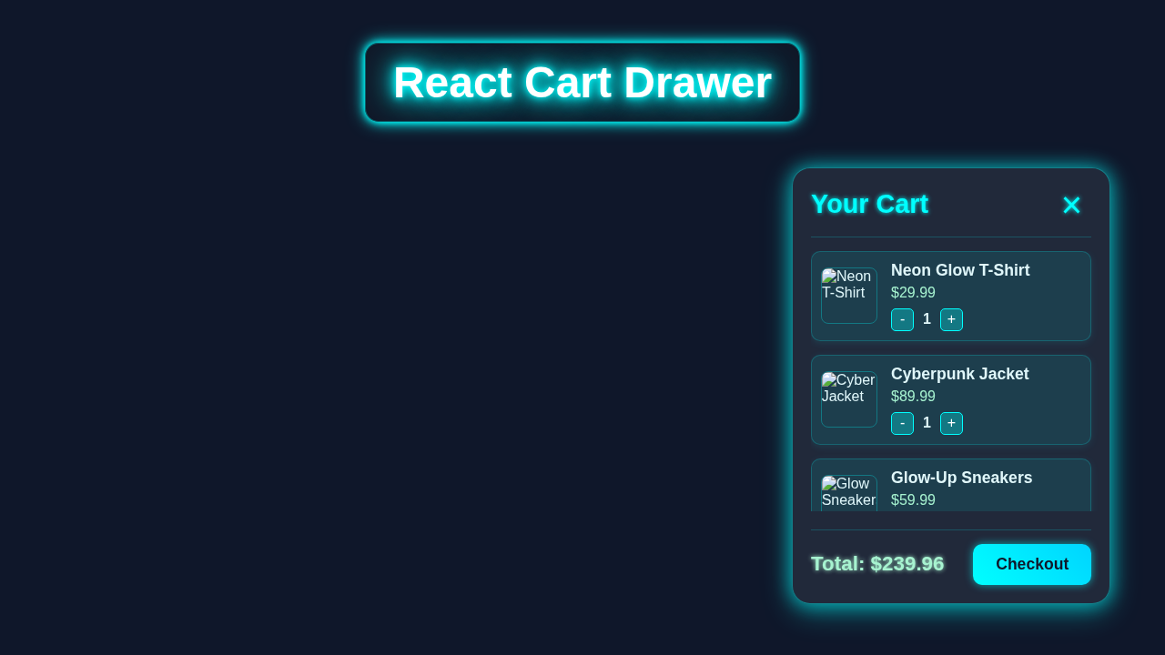
Imagine your users adding items to a cart. Then, with a click, a beautiful panel slides in from the side. This is your shopping cart summary. It shows current items, totals, and checkout options. Our React Cart Drawer will offer exactly this smooth interaction. It will boast smooth transitions and keyboard navigation too. This is super useful for any e-commerce site or product display. It makes managing selected items a breeze. So, let’s dive into making this practical UI element!
HTML Structure for Our Cart Drawer
First, we need a solid foundation for our drawer. The HTML structure will be quite simple yet effective. We’ll have a main container for the drawer itself. There will also be an overlay to dim the background. This overlay helps users focus on the cart content. Plus, we’ll include clear buttons for closing the drawer. This ensures great usability. Here is the basic structure we’ll use in our React component:
public/index.html
<!DOCTYPE html>
<html lang="en">
  <head>
    <meta charset="utf-8" />
    <link rel="icon" href="%PUBLIC_URL%/favicon.ico" />
    <meta name="viewport" content="width=device-width, initial-scale=1" />
    <meta name="theme-color" content="#000000" />
    <meta
      name="description"
      content="React Cart Drawer Tutorial"
    />
    <link rel="apple-touch-icon" href="%PUBLIC_URL%/logo192.png" />
    <link rel="manifest" href="%PUBLIC_URL%/manifest.json" />
    <title>React Cart Drawer</title>
  </head>
  <body>
    <noscript>You need to enable JavaScript to run this app.</noscript>
    <div id="root"></div>
  </body>
</html>
CSS Styling for a Smooth React Cart Drawer
Now, for the visual magic! Our CSS will bring this drawer to life. We’ll use CSS transforms for the slide-in and slide-out effects. The overlay will fade in gently with opacity changes. We need to position the drawer fixed on the screen. This ensures it stays put when scrolling. Importantly, we’ll add transition properties. These make all our animations incredibly smooth. Don’t worry, we’ll handle responsive design too!
src/styles.css
/* Global Styles & Resets */
body {
  margin: 0;
  font-family: Arial, Helvetica, sans-serif;
  background-color: #0f172a; /* Dark slate background */
  color: #e2e8f0;
  min-height: 100vh;
  box-sizing: border-box;
  overflow-x: hidden;
}

*, *::before, *::after {
  box-sizing: inherit;
}

#root {
  min-height: 100vh;
  display: flex;
  flex-direction: column;
}

/* App Header */
.app-header {
  display: flex;
  justify-content: space-between;
  align-items: center;
  padding: 15px 30px;
  background: rgba(17, 24, 39, 0.8);
  backdrop-filter: blur(8px);
  border-bottom: 1px solid rgba(0, 255, 255, 0.2);
  color: #fff;
  box-shadow: 0 4px 15px rgba(0, 255, 255, 0.1);
  z-index: 10;
}

.app-header h1 {
  margin: 0;
  font-size: 2em;
  color: #0ff;
  text-shadow: 0 0 8px rgba(0, 255, 255, 0.6);
}

.cart-toggle-button {
  background: linear-gradient(45deg, #0ff, #00d4ff);
  border: none;
  color: #0f172a;
  padding: 10px 20px;
  border-radius: 8px;
  font-size: 1em;
  font-weight: bold;
  cursor: pointer;
  display: flex;
  align-items: center;
  gap: 8px;
  transition: all 0.3s ease;
  box-shadow: 0 0 10px rgba(0, 255, 255, 0.4);
}

.cart-toggle-button:hover {
  background: linear-gradient(45deg, #00d4ff, #0ff);
  box-shadow: 0 0 15px rgba(0, 255, 255, 0.6);
  transform: translateY(-2px);
}

.cart-icon {
  font-size: 1.2em;
}

/* Product Grid */
.product-grid {
  display: grid;
  grid-template-columns: repeat(auto-fit, minmax(280px, 1fr));
  gap: 30px;
  padding: 40px;
  max-width: 1200px;
  margin: 20px auto;
  flex-grow: 1;
}

/* Product Card */
.product-card {
  background: rgba(255, 255, 255, 0.08);
  backdrop-filter: blur(10px);
  border-radius: 15px;
  border: 1px solid rgba(0, 255, 255, 0.3);
  box-shadow: 0 8px 32px 0 rgba(0, 255, 255, 0.37),
              0 0 15px rgba(0, 255, 255, 0.2);
  padding: 20px;
  display: flex;
  flex-direction: column;
  align-items: center;
  text-align: center;
  transition: transform 0.3s ease, box-shadow 0.3s ease;
}

.product-card:hover {
  transform: translateY(-8px);
  box-shadow: 0 12px 40px 0 rgba(0, 255, 255, 0.45),
              0 0 20px rgba(0, 255, 255, 0.4);
}

.product-image {
  width: 100%;
  max-width: 200px;
  height: 180px;
  object-fit: cover;
  border-radius: 10px;
  margin-bottom: 15px;
  border: 2px solid rgba(0, 255, 255, 0.5);
}

.product-name {
  font-size: 1.5em;
  margin: 10px 0;
  color: #e0f7fa;
  text-shadow: 0 0 3px #0ff;
}

.product-price {
  font-size: 1.2em;
  color: #a7f3d0;
  font-weight: bold;
  margin-bottom: 20px;
}

.add-to-cart-btn {
  background: linear-gradient(45deg, #0ff, #00d4ff);
  border: none;
  color: #0f172a;
  padding: 12px 25px;
  border-radius: 8px;
  font-size: 1.1em;
  font-weight: bold;
  cursor: pointer;
  transition: all 0.3s ease;
  box-shadow: 0 0 10px rgba(0, 255, 255, 0.6);
}

.add-to-cart-btn:hover {
  background: linear-gradient(45deg, #00d4ff, #0ff);
  box-shadow: 0 0 15px rgba(0, 255, 255, 0.8);
  transform: translateY(-2px);
}

/* Cart Drawer */
.drawer-overlay {
  position: fixed;
  top: 0;
  left: 0;
  width: 100%;
  height: 100%;
  background: rgba(0, 0, 0, 0.6);
  z-index: 100;
}

.cart-drawer {
  position: fixed;
  top: 0;
  right: -400px; /* Hidden by default */
  width: 380px;
  height: 100%;
  background: rgba(17, 24, 39, 0.95); /* Slightly darker glass background */
  backdrop-filter: blur(20px);
  border-left: 1px solid rgba(0, 255, 255, 0.4);
  box-shadow: -10px 0 30px rgba(0, 255, 255, 0.5);
  transition: right 0.4s ease-out;
  z-index: 101;
  display: flex;
  flex-direction: column;
  padding: 25px;
  box-sizing: border-box;
  color: #e0f7fa;
}

.cart-drawer.open {
  right: 0; /* Slide in when open */
}

.drawer-header {
  display: flex;
  justify-content: space-between;
  align-items: center;
  padding-bottom: 20px;
  border-bottom: 1px solid rgba(0, 255, 255, 0.2);
  margin-bottom: 20px;
}

.drawer-header h2 {
  margin: 0;
  font-size: 2em;
  color: #0ff;
  text-shadow: 0 0 8px rgba(0, 255, 255, 0.5);
}

.close-btn {
  background: none;
  border: none;
  font-size: 3em;
  color: #0ff;
  cursor: pointer;
  padding: 0 10px;
  line-height: 1;
  text-shadow: 0 0 5px #0ff;
  transition: color 0.3s ease, transform 0.3s ease;
}
.close-btn:hover {
  color: #fff;
  transform: rotate(90deg);
}

.drawer-items {
  flex-grow: 1;
  overflow-y: auto;
  padding-right: 15px; /* Space for scrollbar */
  margin-right: -15px; /* Compensate for padding */
  scrollbar-width: thin;
  scrollbar-color: #0ff #1a202c;
}

.drawer-items::-webkit-scrollbar {
  width: 10px;
}

.drawer-items::-webkit-scrollbar-track {
  background: #1a202c;
  border-radius: 10px;
}

.drawer-items::-webkit-scrollbar-thumb {
  background-color: #0ff;
  border-radius: 10px;
  border: 2px solid #1a202c;
}

.empty-cart-message {
  text-align: center;
  color: #a7f3d0;
  font-size: 1.2em;
  margin-top: 50px;
}

.cart-item {
  display: flex;
  align-items: center;
  margin-bottom: 20px;
  padding: 15px;
  background: rgba(0, 255, 255, 0.1);
  border-radius: 12px;
  border: 1px solid rgba(0, 255, 255, 0.2);
  box-shadow: 0 2px 15px rgba(0, 255, 255, 0.15);
  transition: transform 0.2s ease;
}

.cart-item:hover {
  transform: translateX(5px);
}

.item-image {
  width: 70px;
  height: 70px;
  border-radius: 10px;
  object-fit: cover;
  margin-right: 18px;
  border: 1px solid rgba(0, 255, 255, 0.3);
}

.item-details {
  flex-grow: 1;
  display: flex;
  flex-direction: column;
}

.item-name {
  font-weight: bold;
  font-size: 1.2em;
  color: #e0f7fa;
  margin-bottom: 5px;
}

.item-price {
  color: #a7f3d0;
  font-weight: bold;
  margin-bottom: 10px;
}

.quantity-controls {
  display: flex;
  align-items: center;
  gap: 10px;
}

.quantity-controls button {
  background: rgba(0, 255, 255, 0.2);
  border: 1px solid #0ff;
  color: #fff;
  width: 30px;
  height: 30px;
  border-radius: 6px;
  font-size: 1.1em;
  display: flex;
  justify-content: center;
  align-items: center;
  cursor: pointer;
  transition: background 0.3s ease, border-color 0.3s ease;
}

.quantity-controls button:hover {
  background: #0ff;
  border-color: #fff;
  color: #0f172a;
}

.quantity-controls span {
  color: #e0f7fa;
  font-weight: bold;
  min-width: 20px;
  text-align: center;
}

.remove-item-btn {
  background: rgba(255, 0, 0, 0.3);
  border: 1px solid #ff0000;
  color: #fff;
  padding: 5px 10px;
  border-radius: 6px;
  font-size: 0.9em;
  cursor: pointer;
  transition: background 0.3s ease;
  margin-left: auto; /* Push to the right */
}

.remove-item-btn:hover {
  background: #ff0000;
  border-color: #fff;
}

.drawer-footer {
  margin-top: 25px;
  padding-top: 20px;
  border-top: 1px solid rgba(0, 255, 255, 0.2);
  display: flex;
  justify-content: space-between;
  align-items: center;
}

.total {
  font-size: 1.6em;
  font-weight: bold;
  color: #a7f3d0;
  text-shadow: 0 0 8px rgba(167, 243, 208, 0.6);
}

.checkout-btn {
  background: linear-gradient(45deg, #0ff, #00d4ff);
  border: none;
  color: #0f172a;
  padding: 15px 30px;
  border-radius: 10px;
  font-size: 1.2em;
  font-weight: bold;
  cursor: pointer;
  transition: all 0.3s ease;
  box-shadow: 0 0 10px rgba(0, 255, 255, 0.6);
}

.checkout-btn:hover:not(:disabled) {
  background: linear-gradient(45deg, #00d4ff, #0ff);
  box-shadow: 0 0 15px rgba(0, 255, 255, 0.8);
  transform: translateY(-2px);
}

.checkout-btn:disabled {
  background: #4a5568;
  cursor: not-allowed;
  opacity: 0.7;
  box-shadow: none;
}
Bringing Your React Cart Drawer to Life with JavaScript
This is where React Hooks shine! We’ll use useState to manage whether our drawer is open or closed. Furthermore, useEffect will handle all our side effects. This includes closing the drawer with the escape key. It also manages focus for better accessibility. We are aiming for a highly interactive component. This approach makes our code clean and easy to understand. Here’s how we set up the core logic:
src/index.js
import React from 'react';
import ReactDOM from 'react-dom/client'; // For React 18+
import './styles.css'; // Import global styles
import App from './App';

// Get the root DOM element where the React app will be mounted
const root = ReactDOM.createRoot(document.getElementById('root'));

// Render the main App component into the root
root.render(
  <React.StrictMode>
    <App />
  </React.StrictMode>
);
src/App.js
import React, { useState } from 'react';
import CartDrawer from './CartDrawer';
import ProductCard from './ProductCard';

// Sample product data for display
const products = [
  {
    id: 1,
    name: 'Neon Glow T-Shirt',
    price: 29.99,
    image: 'https://via.placeholder.com/150/00ffff/0f172a?text=T-Shirt',
  },
  {
    id: 2,
    name: 'Cyberpunk Jacket',
    price: 89.99,
    image: 'https://via.placeholder.com/150/00ffff/0f172a?text=Jacket',
  },
  {
    id: 3,
    name: 'Glow-Up Sneakers',
    price: 59.99,
    image: 'https://via.placeholder.com/150/00ffff/0f172a?text=Sneakers',
  },
  {
    id: 4,
    name: 'LED Visor Hat',
    price: 39.99,
    image: 'https://via.placeholder.com/150/00ffff/0f172a?text=Visor',
  },
];

function App() {
  // State to manage whether the cart drawer is open or closed
  const [isCartOpen, setIsCartOpen] = useState(false);
  // State to store items currently in the cart
  const [cartItems, setCartItems] = useState([]);

  // Function to add a product to the cart
  const addToCart = (product) => {
    setCartItems((prevItems) => {
      const existingItem = prevItems.find((item) => item.id === product.id);
      if (existingItem) {
        // If item already exists, increase its quantity
        return prevItems.map((item) =>
          item.id === product.id ? { ...item, quantity: item.quantity + 1 } : item
        );
      } else {
        // Otherwise, add new item with quantity 1
        return [...prevItems, { ...product, quantity: 1 }];
      }
    });
    setIsCartOpen(true); // Open the cart drawer when an item is added
  };

  // Function to remove an item from the cart
  const removeFromCart = (itemId) => {
    setCartItems((prevItems) => prevItems.filter((item) => item.id !== itemId));
  };

  // Function to update the quantity of an item in the cart
  const updateQuantity = (itemId, newQuantity) => {
    setCartItems((prevItems) =>
      prevItems.map((item) =>
        item.id === itemId ? { ...item, quantity: Math.max(1, newQuantity) } : item
      )
    );
  };

  // Function to toggle the cart drawer's visibility
  const toggleCart = () => {
    setIsCartOpen((prev) => !prev);
  };

  return (
    <div className="App">
      {/* Header section with cart toggle button */}
      <header className="app-header">
        <h1>Neon-Store</h1>
        <button onClick={toggleCart} className="cart-toggle-button">
          Cart ({cartItems.reduce((total, item) => total + item.quantity, 0)})
          <span className="cart-icon">🛒</span>
        </button>
      </header>

      {/* Main product display area */}
      <main className="product-grid">
        {products.map((product) => (
          <ProductCard key={product.id} product={product} onAddToCart={addToCart} />
        ))}
      </main>

      {/* Cart Drawer component, conditionally rendered */}
      <CartDrawer
        isOpen={isCartOpen}
        onClose={() => setIsCartOpen(false)}
        cartItems={cartItems}
        onRemoveFromCart={removeFromCart}
        onUpdateQuantity={updateQuantity}
      />
    </div>
  );
}

export default App;
src/CartDrawer.js
import React from 'react';

/**
 * CartDrawer Component
 * A slide-in drawer displaying cart items, with quantity controls and total.
 *
 * @param {boolean} isOpen - Controls the visibility of the drawer.
 * @param {function} onClose - Callback function to close the drawer.
 * @param {Array<Object>} cartItems - An array of objects, each representing a cart item.
 *                                  Each item object should have: id, name, price, quantity, image.
 * @param {function} onRemoveFromCart - Callback function to remove an item by its ID.
 * @param {function} onUpdateQuantity - Callback function to update an item's quantity by its ID and new quantity.
 */
function CartDrawer({ isOpen, onClose, cartItems, onRemoveFromCart, onUpdateQuantity }) {
  // Calculate the total price of all items in the cart
  const total = cartItems.reduce((sum, item) => sum + item.price * item.quantity, 0);

  return (
    <>
      {/* Overlay: clickable area to close the drawer when open */}
      {isOpen && <div className="drawer-overlay" onClick={onClose}></div>}

      {/* Cart Drawer: The main sliding panel */}
      <div className={`cart-drawer ${isOpen ? 'open' : ''}`}>
        <div className="drawer-header">
          <h2>Your Cart</h2>
          <button onClick={onClose} className="close-btn">×</button>
        </div>

        {/* Display cart items or an empty message */}
        <div className="drawer-items">
          {cartItems.length === 0 ? (
            <p className="empty-cart-message">Your cart is empty. Start shopping!</p>
          ) : (
            cartItems.map((item) => (
              <div key={item.id} className="cart-item">
                <img src={item.image} alt={item.name} className="item-image" />
                <div className="item-details">
                  <span className="item-name">{item.name}</span>
                  <span className="item-price">${item.price.toFixed(2)}</span>
                  <div className="quantity-controls">
                    <button onClick={() => onUpdateQuantity(item.id, item.quantity - 1)}>-</button>
                    <span>{item.quantity}</span>
                    <button onClick={() => onUpdateQuantity(item.id, item.quantity + 1)}>+</button>
                    <button onClick={() => onRemoveFromCart(item.id)} className="remove-item-btn">Remove</button>
                  </div>
                </div>
              </div>
            ))
          )}
        </div>

        {/* Cart footer with total and checkout button */}
        <div className="drawer-footer">
          <div className="total">Total: ${total.toFixed(2)}</div>
          <button className="checkout-btn" disabled={cartItems.length === 0}>
            Checkout
          </button>
        </div>
      </div>
    </>
  );
}

export default CartDrawer;
src/ProductCard.js
import React from 'react';

/**
 * ProductCard Component
 * Displays a single product with an "Add to Cart" button.
 *
 * @param {Object} product - The product object containing id, name, price, and image.
 * @param {function} onAddToCart - Callback function to add the product to the cart.
 */
function ProductCard({ product, onAddToCart }) {
  return (
    <div className="product-card">
      <img src={product.image} alt={product.name} className="product-image" />
      <h3 className="product-name">{product.name}</h3>
      <p className="product-price">${product.price.toFixed(2)}</p>
      <button onClick={() => onAddToCart(product)} className="add-to-cart-btn">
        Add to Cart
      </button>
    </div>
  );
}

export default ProductCard;
How Your React Cart Drawer Comes Alive
Let’s connect all the pieces now. Building a component means thinking about state. It also means managing user interactions. We combine our HTML, CSS, and JavaScript. This creates a powerful and user-friendly experience.
Setting Up Your Component State
At the heart of our drawer is a simple state variable. We use React’s useState hook for this. This variable, perhaps named isOpen, will be a boolean. It tracks if the cart drawer is currently visible or hidden. When isOpen is true, the drawer appears. When it’s false, the drawer hides away. This simple state controls everything. It’s truly a fundamental concept in React development.
Toggling the Drawer
Users need a way to open and close the drawer. We’ll attach event listeners to a button. This button might be a shopping cart icon in your header. When clicked, it toggles our isOpen state. Similarly, a close button inside the drawer will set isOpen to false. Also, clicking the overlay should close the drawer. These interactions ensure a natural user flow. It makes the component very intuitive.
Pro Tip: Event Bubbling! When setting up click handlers, be mindful of event bubbling. You might prevent clicks inside the drawer from closing it. Use
event.stopPropagation()for this. It stops the click event from reaching the overlay. This keeps your drawer open when users interact with its content.
Animation with CSS and State
Here’s the cool part about connecting state and styles. When isOpen changes, we dynamically add or remove a CSS class. For example, an .is-open class. This class activates our CSS transitions. The drawer slides in smoothly from the side. The overlay fades in gently. Our CSS takes care of the animation details. This approach keeps our JavaScript focused on logic. It makes the animations performant and smooth. Plus, it’s easy to customize later!
Enhancing Accessibility
A truly great component is accessible to everyone. We will use ARIA attributes. For example, aria-modal="true" tells screen readers this is a modal. We also add role="dialog" for context. Furthermore, we need to manage focus. When the drawer opens, focus should move inside. When closed, focus returns to the element that opened it. The React useEffect Hook: Master Side Effects in Components is perfect for managing these focus changes. It ensures our drawer works well for keyboard users too. Check out MDN’s guide on ARIA live regions for more details on advanced accessibility!
Handling Outside Clicks and Escape Key
For convenience, we want the drawer to close when a user clicks outside. This means clicking on the overlay element. We also want the drawer to close when the Escape key is pressed. These are common expectations for modal dialogs. Both behaviors are handled efficiently using useEffect. The hook allows us to add global event listeners. Then, we clean them up when the component unmounts. This prevents memory leaks. It’s a clean and robust solution. Thus, your users will love the intuitive experience.
Tips to Customise It
You’ve just built an amazing React Cart Drawer! But don’t stop here. There are so many ways to make it even better. Here are a few ideas to get you started:
- Dynamic Cart Items: Instead of static content, pass an array of product objects to your drawer. Map over these to display real items, quantities, and prices. This brings your cart to life!
- Global State Management: Integrate your cart state with a global state manager. Think React Context API or Redux. This allows any component to add items or open the cart. You can also explore building a full Shopping Cart Drawer in React: Functional Components & Hooks with more advanced features.
- Different Animations: Experiment with various CSS
transformproperties. Maybe slide from the top or bottom? Fade in from the center? Learn more about CSS transforms on CSS-Tricks to unleash your creativity. - Add More Features: Include a checkout button, clear cart functionality, or even quantity selectors for each item. Perhaps you want to display dynamic content, like a mini-feed, within your drawer, similar to how you might render a React RSS feed with JSX.
Keep Learning, Keep Building! Every component you build adds to your developer toolkit. Don’t be afraid to experiment with new ideas. Share your creations with the community. That’s how we all grow!
Conclusion
Wow, you did it! You’ve successfully built an animated and accessible React Cart Drawer. This is not a small feat. You’ve tackled state management, smooth animations, and crucial accessibility features. These skills are incredibly valuable. They will help you create delightful user interfaces. Now you have a powerful tool for your next e-commerce project. Go ahead and show it off. Keep pushing those boundaries. You’ve truly leveled up your React skills!