Tailwind CSS Dark Mode Toggle: HTML & JS Tutorial
Hey there, fellow coder! If you have wanted to build a seamless Dark Mode Toggle but had no idea where to start, you are in the right place. We are going to create something really useful today. Imagine a website that remembers your preference. No more blinding flashes of light mode! We’ll make it smooth, persistent, and super easy to implement.
What We Are Building
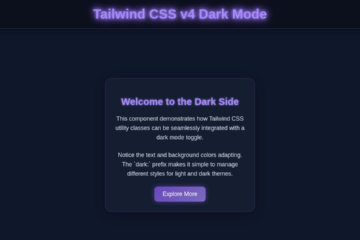
Today, we’re crafting a sleek Dark Mode Toggle. This toggle will let users switch between light and dark themes. More importantly, it will remember their choice! When they revisit your site, their preferred theme will load instantly. No flickers, no delays, just pure user comfort. We will achieve this magic with Tailwind CSS for styling and a tiny bit of JavaScript for logic. It’s practical, looks great, and enhances user experience significantly.
HTML Structure
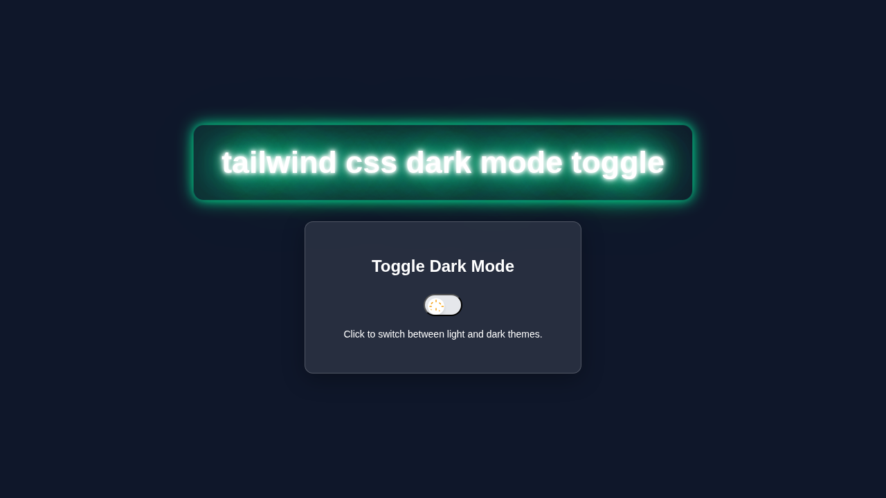
First, let’s lay the groundwork with our HTML. We will create a simple button element. This button will trigger our dark mode functionality. We’ll also need a container for our example content. This will show off the theme changes. Remember, Tailwind CSS lets us do most styling directly in the markup!
index.html
<!DOCTYPE html>
<html lang="en">
<head>
    <meta charset="UTF-8">
    <meta name="viewport" content="width=device-width, initial-scale=1.0">
    <title>Tailwind CSS Dark Mode Toggle</title>
    <!-- Link to your compiled Tailwind CSS file.
         Run `npx tailwindcss -i ./input.css -o ./dist/output.css --watch`
         in your terminal to compile. -->
    <link href="./dist/output.css" rel="stylesheet">
</head>
<body class="bg-white dark:bg-gray-900 text-gray-900 dark:text-white min-h-screen flex items-center justify-center transition-colors duration-300 p-4">
    <div class="bg-gray-100 dark:bg-gray-800 p-8 rounded-xl shadow-lg w-full max-w-md text-center transition-colors duration-300">
        <h1 class="text-3xl font-bold mb-6">Dark Mode Toggle</h1>

        <p class="mb-4 text-lg">
            This is some sample content. Its background and text color
            will adapt based on the current theme, thanks to Tailwind's dark mode utilities.
        </p>

        <div class="flex items-center justify-center space-x-4 mb-6">
            <span class="text-xl font-medium">Light</span>
            <button id="themeToggle" class="relative flex items-center w-14 h-8 rounded-full bg-gray-200 dark:bg-gray-700 transition-colors duration-300 cursor-pointer p-1" aria-label="Toggle theme">
                <span class="absolute left-1 top-1 w-6 h-6 bg-white rounded-full shadow-md transform transition-transform duration-300 ease-in-out">
                    <!-- SVG for Sun/Moon Icon (from Heroicons) -->
                    <svg class="w-full h-full text-yellow-500 fill-current transition-colors duration-300 dark:text-indigo-600" viewBox="0 0 24 24">
                        <!-- Sun icon path -->
                        <path id="sun-icon" d="M12 2.25a.75.75 0 01.75.75v2.25a.75.75 0 01-1.5 0V3a.75.75 0 01.75-.75zM7.485 5.86a.75.75 0 01-.089 1.051l-1.597 1.597a.75.75 0 11-1.06-1.06l1.596-1.597a.75.75 0 011.051.089zM2.25 12c0-.414.336-.75.75-.75h2.25a.75.75 0 010 1.5H3a.75.75 0 01-.75-.75zM16.401 7.485a.75.75 0 011.06-1.06l1.597 1.596a.75.75 0 01-1.06 1.06l-1.597-1.597zM12 18a.75.75 0 01-.75-.75v-2.25a.75.75 0 011.5 0v2.25a.75.75 0 01-.75.75zM19.5 12c0-.414.336-.75.75-.75h2.25a.75.75 0 010 1.5h-2.25a.75.75 0 01-.75-.75zM6.341 16.401a.75.75 0 01-1.06-1.06l-1.597 1.597a.75.75 0 011.06 1.06l1.597-1.597zM18.106 18.106a.75.75 0 01-1.06-1.06l-1.597 1.597a.75.75 0 011.06 1.06l1.597-1.597z" />
                        <!-- Moon icon path -->
                        <path id="moon-icon" class="hidden" d="M9.525 3.322a.75.75 0 01.103.885 8.653 8.653 0 00-1.875 4.923c0 4.192 3.407 7.6 7.6 7.6a7.662 7.662 0 004.923-1.875.75.75 0 01.885.103 10.124 10.124 0 01-3.322 3.322C13.251 22.952 7.045 17.51 7.045 10A10.124 10.124 0 019.525 3.322z" />
                    </svg>
                </span>
            </button>
            <span class="text-xl font-medium">Dark</span>
        </div>

        <p class="text-sm text-gray-600 dark:text-gray-400">
            Your theme preference will be saved in your browser for your next visit.
        </p>
    </div>

    <!-- Link to your JavaScript file -->
    <script src="./src/script.js"></script>
</body>
</html>
CSS Styling
You might be wondering about the CSS part. The really cool thing about Tailwind CSS is that it’s a utility-first framework. This means we apply most of our styles directly in our HTML with classes. We do not need a separate CSS file for most of our design. However, we will ensure our html element correctly handles the dark class. Tailwind then magically takes care of the rest!
Tailwind provides a powerful way to handle dark mode. You simply prefix utility classes with dark:. For instance, dark:bg-gray-900 means "apply a dark gray background when the dark class is present on the html tag." This makes managing themes incredibly clean.
input.css
@tailwind base;
@tailwind components;
@tailwind utilities;

/*
  Add any custom global styles here.
  This file will be processed by Tailwind CSS to generate your final CSS.
*/
body {
  font-family: Arial, Helvetica, sans-serif; /* Safe font stack */
  -webkit-font-smoothing: antialiased;
  -moz-osx-font-smoothing: grayscale;
  box-sizing: border-box; /* Ensure consistent box model */
}

*,
::before,
::after {
  box-sizing: inherit;
}
JavaScript
Now, for the brain of our operation: JavaScript! This small script will manage the state of our dark mode. It will detect user preferences and save them. Most importantly, it will prevent that annoying "flash of unstyled content." We want our theme to load right away. We will place this script carefully in our HTML.
tailwind.config.js
/** @type {import('tailwindcss').Config} */
module.exports = {
  // Enable dark mode based on the 'dark' class applied to the HTML element
  darkMode: 'class',
  content: [
    "./index.html",
    // Add paths to all your files that contain Tailwind classes
    "./src/**/*.{js,ts,jsx,tsx}",
  ],
  theme: {
    extend: {
      // You can extend Tailwind's default theme here, e.g., custom colors, fonts, etc.
    },
  },
  plugins: [],
}
src/script.js
// Get references to the theme toggle button and the HTML element
const themeToggle = document.getElementById('themeToggle');
const htmlElement = document.documentElement; // This is the <html> tag
const toggleKnob = themeToggle.children[0]; // The draggable part of the toggle button
const sunIcon = document.getElementById('sun-icon');
const moonIcon = document.getElementById('moon-icon');

/**
 * Sets the theme for the page by adding/removing the 'dark' class on the html element
 * and updating the toggle switch's visual state.
 * @param {boolean} isDark - True to apply dark mode, false for light mode.
 */
function setTheme(isDark) {
    if (isDark) {
        htmlElement.classList.add('dark');
        // Move the toggle knob to the right (100% of its parent's remaining width)
        toggleKnob.style.transform = 'translateX(100%)';
        // Show the moon icon and hide the sun icon
        sunIcon.classList.add('hidden');
        moonIcon.classList.remove('hidden');
    } else {
        htmlElement.classList.remove('dark');
        // Move the toggle knob to the left
        toggleKnob.style.transform = 'translateX(0)';
        // Show the sun icon and hide the moon icon
        sunIcon.classList.remove('hidden');
        moonIcon.classList.add('hidden');
    }
}

// --- Initialize Theme on Page Load ---

// 1. Check for a previously saved theme preference in the user's local storage
const savedTheme = localStorage.getItem('theme');

// 2. Check for the user's system (OS) theme preference (e.g., Windows/macOS dark mode setting)
const systemPrefersDark = window.matchMedia('(prefers-color-scheme: dark)').matches;

// 3. Apply the initial theme:
//    - If a theme is explicitly saved ('dark' or 'light'), use that.
//    - Otherwise (no saved theme), use the system's preference.
if (savedTheme === 'dark' || (!savedTheme && systemPrefersDark)) {
    setTheme(true); // Apply dark mode
} else {
    setTheme(false); // Apply light mode
}

// --- Event Listener for Theme Toggle ---

// Add a click event listener to the toggle button
themeToggle.addEventListener('click', () => {
    // Determine the current theme state
    const isCurrentlyDark = htmlElement.classList.contains('dark');

    // Toggle the theme to the opposite state
    setTheme(!isCurrentlyDark);

    // Save the new theme preference to local storage for future visits
    localStorage.setItem('theme', !isCurrentlyDark ? 'dark' : 'light');
});

// --- Optional: Listen for System Theme Changes ---

// This allows the page to automatically update if the user changes their OS theme preference
// *while* the page is open, but only if they haven't manually set a preference on the site.
window.matchMedia('(prefers-color-scheme: dark)').addEventListener('change', (e) => {
    // If no specific theme is saved by the user, update based on system preference
    if (!localStorage.getItem('theme')) {
        setTheme(e.matches);
    }
});
How It All Works Together
This section is where all the pieces connect. It’s pretty neat how HTML, Tailwind, and JavaScript collaborate. Let’s break down each step. You will see the elegance of this solution!
The HTML Foundation
Our HTML provides the basic structure. We have a button that users will click. This button needs an id so JavaScript can find it. We also have a few content elements. These elements will clearly display our theme changes. They have Tailwind classes like bg-white and text-gray-900. Crucially, they also have dark: prefixed classes. For example, dark:bg-gray-800 ensures they adapt automatically. This is the power of Tailwind CSS vs Plain CSS: The Ultimate Comparison.
Tailwind CSS Magic
Tailwind’s utility classes are doing a lot of heavy lifting. When the html element has the dark class, all dark: prefixed classes activate. If it does not, the default classes apply. This system is incredibly efficient. It allows us to define both light and dark styles for every element right in our HTML. Consequently, our page responds instantly to theme changes. No complex CSS overrides are necessary.
Pro Tip: Tailwind’s dark mode strategy is based on applying a
darkclass to the root HTML element. This simple approach makes theme switching incredibly efficient and easy to manage without bulky stylesheets.
The JavaScript Brain
Our JavaScript handles persistence and the flash-free experience. First, it checks if a user preference is saved in localStorage. If a preference exists, it applies the dark class to the html element immediately. This happens before the page even renders fully. This prevents any visible flicker. The script also listens for clicks on our toggle button. When clicked, it flips the dark class on the html element. Then, it updates localStorage. This ensures the preference is saved for future visits. It’s a small script, but it performs crucial tasks.
Preventing the Flash
The key to a "flash-free" experience is the early execution of our JavaScript. We place a small script tag right after the opening <head> tag. This script runs before the browser paints anything significant. It checks for the user’s saved theme preference. Then, it adds or removes the dark class from the html element. This ensures the page renders with the correct theme from the very first pixel. This tiny detail makes a huge difference in user experience. For more on localStorage, check out MDN Web Docs on localStorage.
Tips to Customise It
You have just built a fantastic Dark Mode Toggle! Now, let’s make it truly yours:
- Different Icons: Instead of simple text, use SVG icons for the toggle. A moon for dark mode, a sun for light mode. This adds a nice visual touch.
- Theme Switcher Animation: Add subtle transitions to your background or text colors. Use Tailwind’s
transition-colorsclass. This makes the change feel smoother. - Auto-Follow System Preference: Enhance your JavaScript. Make it check
window.matchMedia('(prefers-color-scheme: dark)'). This will default to the user’s OS preference if no local storage preference exists. - More Themed Elements: Apply
dark:classes to more components. Think about navigation bars, footers, or even form inputs. Dive deeper into Tailwind Custom Theme: Extend & Personalize CSS with HTML to define your own color palettes for these.
Challenge Yourself: Try implementing a third theme, like a "sepia" mode, using similar logic! Expand on what you have learned about adding classes dynamically.
Conclusion
Wow, you did it! You have successfully built a persistent and flash-free Dark Mode Toggle using Tailwind CSS and JavaScript. That’s a huge win! You learned about HTML structure, smart Tailwind styling, and crucial JavaScript logic. Your website can now offer a much better experience. Feel proud of this accomplishment. Go ahead and show off your new dark mode!