CSS Grid Masonry Gallery: Pure HTML & CSS Layout Tutorial
Hey there, future coding superstar! If you’ve ever wanted to build a super cool, dynamic image gallery but felt stuck, you’re in the right spot. Today, we’re diving deep into CSS Grid Masonry. We’ll create a beautiful, responsive gallery with pure HTML and CSS. No fancy JavaScript needed here! This layout technique will make your images look absolutely stunning. Get ready to build something awesome!
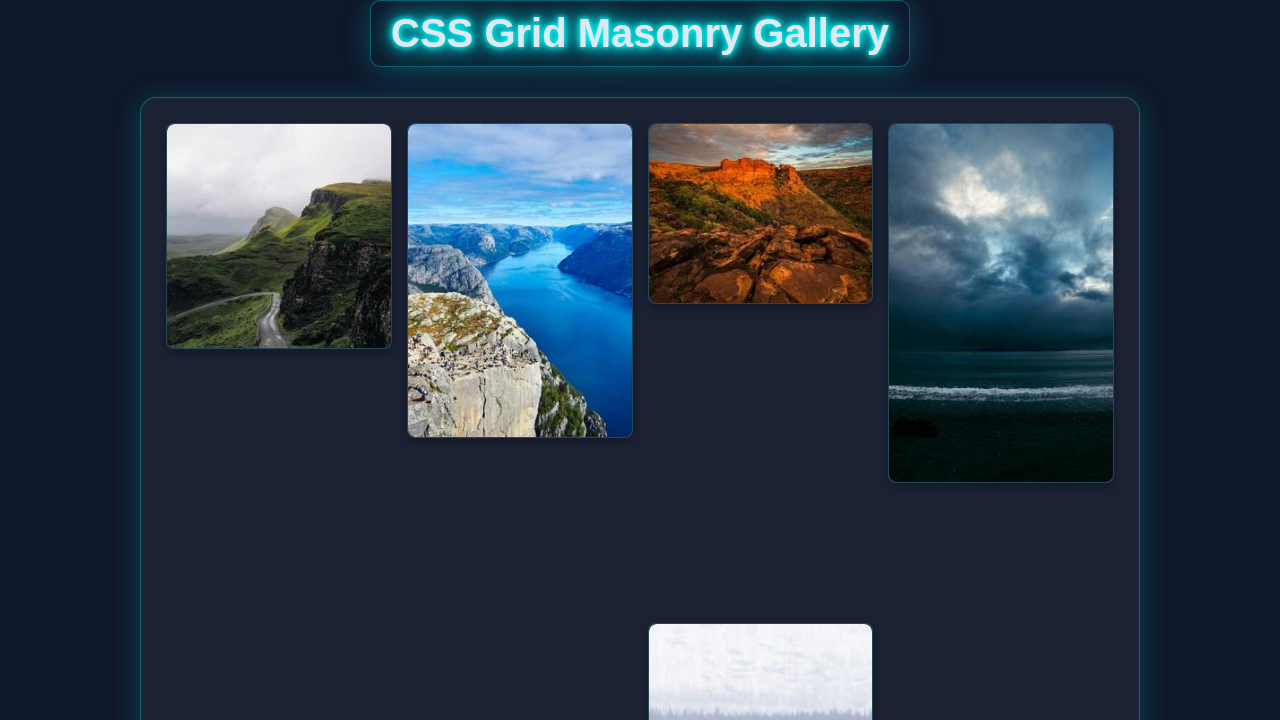
What We Are Building
Imagine a gallery where your images flow naturally. Tall images, wide images, all fit perfectly. That’s a Masonry layout! We are building exactly that today. Our gallery will be fully responsive, too. It will look amazing on any screen size. This project is perfect for portfolios, blog posts, or showcasing your photography. You’ll master powerful CSS Grid properties. Get ready to impress!
HTML Structure
First, we need some basic HTML to hold our images. It’s really straightforward! We will have a main container for our grid. Inside, each image will live within its own div. Each div will hold an img tag. This structure keeps everything organized.
index.html
<!DOCTYPE html>
<html lang="en">
<head>
    <meta charset="UTF-8">
    <meta name="viewport" content="width=device-width, initial-scale=1.0">
    <title>CSS Grid Masonry Gallery</title>
    <link rel="stylesheet" href="styles.css">
</head>
<body>
    <div class="gallery-container">
        <!--
            Masonry items. For a true masonry layout with dynamically varying image heights
            using pure CSS Grid, you typically need to manually set 'grid-row-end' based
            on each image's intrinsic height relative to the 'grid-auto-rows' value.
            This example demonstrates how to achieve the visual effect by pre-defining
            row spans for different common image heights/aspect ratios. In a real dynamic
            scenario with unknown image heights, these span values would often be calculated
            and applied via JavaScript after the images have loaded.

            Here, images are from picsum.photos with their second dimension (height) matching
            the approximate pixel height for the corresponding 'item-span-X' class:
            - item-span-15: ~150px tall
            - item-span-20: ~200px tall
            - item-span-25: ~250px tall
            - item-span-30: ~300px tall
            - item-span-35: ~350px tall
            - item-span-40: ~400px tall
            (This assumes 'grid-auto-rows' is set to 10px in styles.css)
        -->
        <div class="gallery-item item-span-25">
            <img src="https://picsum.photos/id/1018/300/250" alt="Mountain stream">
        </div>
        <div class="gallery-item item-span-35">
            <img src="https://picsum.photos/id/1015/300/350" alt="Abstract cityscape">
        </div>
        <div class="gallery-item item-span-20">
            <img src="https://picsum.photos/id/1016/300/200" alt="Forest path">
        </div>
        <div class="gallery-item item-span-40">
            <img src="https://picsum.photos/id/1019/300/400" alt="Northern lights">
        </div>
        <div class="gallery-item item-span-30">
            <img src="https://picsum.photos/id/1020/300/300" alt="City at night">
        </div>
        <div class="gallery-item item-span-25">
            <img src="https://picsum.photos/id/1021/300/250" alt="Lake reflection">
        </div>
        <div class="gallery-item item-span-15">
            <img src="https://picsum.photos/id/1022/300/150" alt="Rocky beach">
        </div>
        <div class="gallery-item item-span-30">
            <img src="https://picsum.photos/id/1023/300/300" alt="Desert landscape">
        </div>
        <div class="gallery-item item-span-20">
            <img src="https://picsum.photos/id/1024/300/200" alt="Mountain road">
        </div>
        <div class="gallery-item item-span-35">
            <img src="https://picsum.photos/id/1025/300/350" alt="Sunset over water">
        </div>
        <div class="gallery-item item-span-25">
            <img src="https://picsum.photos/id/1026/300/250" alt="Snowy peaks">
        </div>
        <div class="gallery-item item-span-40">
            <img src="https://picsum.photos/id/1027/300/400" alt="Urban art">
        </div>
        <div class="gallery-item item-span-30">
            <img src="https://picsum.photos/id/1028/300/300" alt="Coastal view">
        </div>
    </div>
</body>
</html>
CSS Styling
Now for the fun part: making it beautiful with CSS! We’ll use the power of CSS Grid to arrange our images. We will set up our grid columns and rows. Then, we’ll tell each image how to span those rows. This is where the magic happens!
styles.css
/*
 * CSS Grid Masonry Gallery
 * Pure HTML & CSS Layout Tutorial
 *
 * This stylesheet creates a masonry-like gallery layout using CSS Grid.
 * For truly dynamic content with varying heights, calculating 'grid-row-end'
 * values often requires JavaScript. This pure CSS example demonstrates
 * the technique by pre-defining row spans for different item heights.
 */

/* Universal Box-Sizing */
*, *::before, *::after {
    box-sizing: border-box;
}

/* Basic Body Styles & Safe Font */
body {
    margin: 0;
    padding: 20px;
    font-family: Arial, Helvetica, sans-serif; /* Safe font stack */
    background-color: #f0f2f5; /* Light background for the tutorial */
    color: #333;
    line-height: 1.6;
}

/* Gallery Container */
.gallery-container {
    display: grid;
    /*
     * Define responsive columns:
     * - 'auto-fill' creates as many columns as possible based on item width.
     * - 'minmax(250px, 1fr)' ensures columns are at least 250px wide and
     *   distribute available space equally. Adjust 250px for desired minimum column width.
     */
    grid-template-columns: repeat(auto-fill, minmax(250px, 1fr));
    /*
     * Set a fixed, small height for implicit grid rows. This acts as a base unit.
     * For example, if grid-auto-rows is 10px, an item spanning 25 rows
     * will occupy 25 * 10px = 250px of vertical space.
     */
    grid-auto-rows: 10px;
    grid-gap: 15px; /* Space between grid items */
    /*
     * 'dense' algorithm: This is crucial for a masonry look. It allows the grid
     * to attempt to fill any empty spaces with smaller items, minimizing gaps.
     */
    grid-auto-flow: dense;
    /*
     * Aligns items to the start of their grid cell vertically. This prevents
     * shorter items from stretching to fill the full height of a row if they
     * don't explicitly span multiple rows, creating the staggered masonry effect.
     */
    align-items: start;
    max-width: 1200px; /* Maximum width for the entire gallery to prevent overstretching */
    margin: 0 auto; /* Center the gallery on the page */
    padding: 15px;
    background-color: #fff; /* White background for the gallery card */
    border-radius: 8px;
    box-shadow: 0 4px 15px rgba(0, 0, 0, 0.1); /* Subtle shadow for depth */
}

/* Gallery Item Styling */
.gallery-item {
    max-width: 100%; /* Ensures items don't overflow their grid cells */
    overflow: hidden; /* Hides any overflowing content, though typically not an issue with images */
    border-radius: 8px;
    box-shadow: 0 2px 8px rgba(0, 0, 0, 0.1); /* Shadow for individual items */
    transition: transform 0.2s ease-in-out, box-shadow 0.2s ease-in-out; /* Smooth hover effects */
    background-color: #f9f9f9; /* Light background for item cards */
    display: flex; /* Ensures image fills item vertically if image is smaller than container */
    flex-direction: column;
}

.gallery-item:hover {
    transform: translateY(-5px); /* Lifts the item slightly on hover */
    box-shadow: 0 6px 15px rgba(0, 0, 0, 0.15); /* Enhances shadow on hover */
}

.gallery-item img {
    width: 100%; /* Image takes full width of its container */
    height: auto; /* Maintains the image's aspect ratio */
    display: block; /* Removes any extra space below the image */
    vertical-align: middle; /* Ensures no unintended spacing */
    border-radius: 8px; /* Applies border-radius to the image inside the item */
}

/*
 * Masonry Row Spans:
 * These classes define how many of the 'grid-auto-rows' units each item spans.
 * The values are derived by dividing the desired item height (in pixels) by the
 * 'grid-auto-rows' value (e.g., 10px) and rounding up if necessary (ceil()).
 *
 * For a dynamic application where image heights are unknown until loaded,
 * these 'span' values would be calculated and applied to the elements,
 * typically using JavaScript. For this pure CSS tutorial, we manually apply
 * them to demonstrate the visual effect of masonry.
 */
.item-span-15 { grid-row-end: span 15; } /* Approximately 150px tall (15 * 10px) */
.item-span-20 { grid-row-end: span 20; } /* Approximately 200px tall */
.item-span-25 { grid-row-end: span 25; } /* Approximately 250px tall */
.item-span-30 { grid-row-end: span 30; } /* Approximately 300px tall */
.item-span-35 { grid-row-end: span 35; } /* Approximately 350px tall */
.item-span-40 { grid-row-end: span 40; } /* Approximately 400px tall */

/* Basic Responsiveness for Smaller Screens */
@media (max-width: 768px) {
    .gallery-container {
        grid-template-columns: repeat(auto-fill, minmax(180px, 1fr)); /* Adjust columns for tablets */
        grid-gap: 10px;
        padding: 10px;
    }
}

@media (max-width: 480px) {
    .gallery-container {
        grid-template-columns: repeat(auto-fill, minmax(150px, 1fr)); /* Adjust columns for mobile */
        grid-gap: 8px;
        padding: 8px;
    }
    body {
        padding: 10px;
    }
}
How It All Works Together
Let’s break down the code we just wrote. Understanding these pieces will make you a CSS Grid master! We will look at both the HTML and CSS. You’ll see how they combine to create our awesome gallery.
Setting Up Our Grid Container
We start by making our main gallery element a grid. This is the first essential step.
.gallery {
    display: grid;
    grid-template-columns: repeat(auto-fill, minmax(200px, 1fr));
    grid-auto-rows: 10px; /* Smallest row unit */
    gap: 10px;
}
Here’s what these properties do. display: grid; turns our container into a grid. Then, grid-template-columns defines our columns. repeat(auto-fill, minmax(200px, 1fr)) is super cool. It creates as many columns as can fit. Each column will be at least 200px wide. It will also grow to fill available space. Learn more about grid-template-columns on MDN. Furthermore, grid-auto-rows: 10px; is crucial. This sets a very small, fixed height for our grid rows. This small unit allows us to be precise. We can make images span multiple row units. Finally, gap: 10px; adds space between our grid items. This makes the gallery look clean.
Positioning Images within the Grid
Now, we need to tell our individual images how to behave. This is where the Masonry effect truly comes alive.
.gallery-item img {
    width: 100%;
    height: 100%;
    object-fit: cover;
}

.gallery-item {
    grid-row-end: span 20; /* Example: spans 20 units (20 * 10px = 200px) */
}
Each .gallery-item div holds an image. The img itself gets width: 100%; and height: 100%. This ensures it fills its parent div. object-fit: cover; is important. It crops the image to cover the entire area. It avoids distortion, which is great! The grid-row-end: span 20; property is our secret sauce. It tells a grid item to end 20 row units from its start. Since our grid-auto-rows is 10px, this item will span 20 * 10px, or 200px. You can change this number for different image heights. This creates the varying heights you see in a Masonry layout.
Pro Tip: To create different image heights, you can add different classes to your
.gallery-itemelements, like.item-tallor.item-short, and apply differentgrid-row-endvalues to them! This offers great flexibility.
Achieving Responsiveness
Our gallery is automatically responsive. This is thanks to grid-template-columns. The repeat(auto-fill, minmax(200px, 1fr)) handles everything. As your screen size changes, the number of columns adjusts. If there is more space, more columns appear. If there is less space, columns gracefully reduce. This means your gallery looks perfect everywhere. No extra media queries are needed for column layout! How cool is that? You can also combine this with other responsive techniques. For instance, check out this guide on building a responsive navbar for more ideas!
Another Pro Tip: While CSS Grid handles the column responsiveness, you might still want to adjust
grid-auto-rowsorgapat different breakpoints using media queries for fine-tuning. This allows even more control over your layout.
Understanding grid-auto-rows for CSS Grid Masonry
Let’s quickly re-emphasize grid-auto-rows. This property defines the height of implicitly created grid rows. Find more details on MDN here. We set it to a small 10px value. This creates a fine-grained “grid track” system. Our images then span these small tracks. If an image is 300px tall, it would span 30 of our 10px rows (grid-row-end: span 30;). This is how we get the beautiful, staggered effect. This technique is what makes our CSS Grid Masonry layout work so well without JavaScript!
Tips to Customise It
You’ve built an amazing gallery! Now, let’s make it truly yours. Here are some ideas to extend your project.
- Vary Image Spans: Experiment with different
grid-row-endvalues. Create classes like.tall,.medium, and.short. Apply these classes to your image items. This will give your gallery a truly dynamic feel. - Add Hover Effects: Make your images interactive! Use CSS transitions for subtle hover effects. You could make images scale slightly or show an overlay. This adds a polished touch.
- Implement Captions: Place a
figcaptionor a simpleptag inside each.gallery-item. Style it to appear on hover or always. This can add context to your beautiful photos. - Explore
display: contents;: For advanced users, you might explore usingdisplay: contents;on the.gallery-itemif you want theimgitself to be the direct grid item, though this has specific use cases. It helps when you want to use the child elements to participate in the grid layout directly. - Dynamic UI Improvements: Think about how you could make aspects of this gallery dynamic. Perhaps integrate techniques learned from mastering CSS :has() & :is() selectors to show captions or controls only when an image is hovered over.
- Loading States: For images that take a moment to load, you could add simple CSS loading animations. This provides a better user experience while images fetch.
Conclusion
Wow, you did it! You just built a fully responsive CSS Grid Masonry image gallery. You used pure HTML and CSS, no tricky JavaScript! You now understand the power of display: grid. You also mastered grid-template-columns and grid-row-end. This is a fantastic skill to add to your web development toolkit. Feel proud of what you’ve created. Go ahead and share your amazing work! We can’t wait to see it. Keep coding and keep building!