Dynamic Button Loading States with HTML, CSS & JavaScript
Hey there, fellow coders! If you’ve wanted to build a captivating user experience but felt unsure where to start, you are in the right place. Today, we’re diving into the exciting world of Dynamic Button Loading states. You know those cool buttons that show a spinner, then a success message, or even an error? We will build exactly that! This project will make your forms feel much more alive. Let’s make your web apps truly shine!
What We Are Building
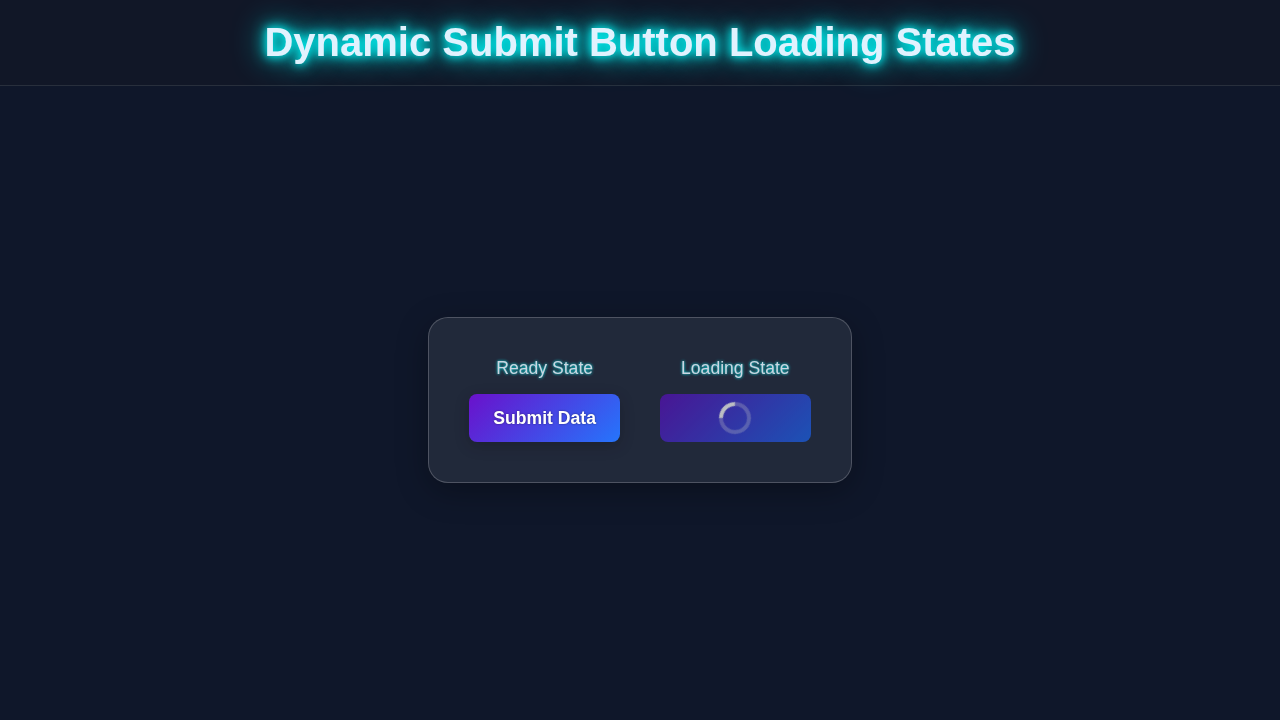
We are going to craft an awesome submit button. This button will transform! It starts as a simple ‘Submit’ button. Then, it changes to a loading spinner. This shows your users that something is happening. After a brief wait, it either displays a ‘Success!’ message or an ‘Error!’ message. This provides instant feedback. It is a fundamental UI/UX pattern. Your users will love this smooth, interactive experience. It really enhances user trust and engagement.
HTML Structure
First, let’s lay the groundwork with our HTML. We will create a simple button element. Inside it, we’ll have a span for the text. We will also add some dedicated elements for our loading spinner, success icon, and error icon. These will be hidden by default. The JavaScript will then toggle their visibility. This keeps our HTML clean and semantic.
index.html
<!DOCTYPE html>
<html lang="en">
<head>
    <meta charset="UTF-8">
    <meta name="viewport" content="width=device-width, initial-scale=1.0">
    <title>Dynamic Submit Button Loading States</title>
    <link rel="stylesheet" href="styles.css">
</head>
<body>
    <div class="container">
        <h1>Submit Your Data</h1>
        <form id="myForm">
            <div class="form-group">
                <label for="username">Username:</label>
                <input type="text" id="username" name="username" placeholder="Enter your username" required>
            </div>
            <div class="form-group">
                <label for="email">Email:</label>
                <input type="email" id="email" name="email" placeholder="Enter your email" required>
            </div>
            <button type="submit" id="submitButton">
                <span class="button-text">Submit</span>
                <span class="spinner"></span>
            </button>
            <p id="responseMessage" class="response-message"></p>
        </form>
    </div>

    <script src="script.js"></script>
</body>
</html>
CSS Styling
Now for the fun part: making it look great! Our CSS will handle all the visual transformations. We will style the button itself. Then, we will create the spinner animation. We will also define styles for the success and error states. This ensures smooth transitions. We will use CSS variables for easy customization. You will see how clean and modular our approach is. It is quite powerful!
styles.css
/* Universal Box-Sizing and Safe Fonts */
*, *::before, *::after {
    box-sizing: border-box;
}

body {
    font-family: Arial, Helvetica, sans-serif; /* Safe font stack */
    margin: 0;
    padding: 0;
    display: flex;
    justify-content: center;
    align-items: center;
    min-height: 100vh;
    background-color: #f0f2f5; /* Light background for tutorial */
    color: #333;
    line-height: 1.6;
}

.container {
    background-color: #fff;
    padding: 40px;
    border-radius: 10px;
    box-shadow: 0 4px 15px rgba(0, 0, 0, 0.1);
    width: 100%;
    max-width: 450px; /* Constrain width */
    text-align: center;
}

h1 {
    color: #333;
    margin-bottom: 30px;
    font-size: 2em;
}

.form-group {
    margin-bottom: 20px;
    text-align: left;
}

label {
    display: block;
    margin-bottom: 8px;
    font-weight: bold;
    color: #555;
}

input[type="text"],
input[type="email"] {
    width: 100%;
    padding: 12px;
    border: 1px solid #ddd;
    border-radius: 5px;
    font-size: 1em;
    transition: border-color 0.3s ease;
}

input[type="text"]:focus,
input[type="email"]:focus {
    border-color: #007bff;
    outline: none;
    box-shadow: 0 0 0 3px rgba(0, 123, 255, 0.25);
}

button {
    /* Base Button Styles */
    position: relative; /* For spinner positioning */
    display: flex;
    justify-content: center;
    align-items: center;
    width: 100%;
    min-height: 50px; /* Ensure consistent height */
    padding: 12px 25px;
    background-color: #007bff; /* Primary button color */
    color: #fff;
    border: none;
    border-radius: 5px;
    font-size: 1.1em;
    font-weight: bold;
    cursor: pointer;
    overflow: hidden; /* Hide overflowing spinner */
    transition: background-color 0.3s ease, transform 0.2s ease, box-shadow 0.2s ease;
    -webkit-appearance: none; /* Reset button appearance for consistency */
    -moz-appearance: none;
    appearance: none;
}

button:hover:not(:disabled) {
    background-color: #0056b3; /* Darker on hover */
    transform: translateY(-2px);
    box-shadow: 0 5px 15px rgba(0, 0, 0, 0.2);
}

button:focus {
    outline: none;
    box-shadow: 0 0 0 3px rgba(0, 123, 255, 0.5);
}

/* Disabled State */
button:disabled {
    background-color: #a0cffc; /* Lighter disabled color */
    cursor: not-allowed;
    opacity: 0.8;
    transform: none;
    box-shadow: none;
}

/* Button Text */
.button-text {
    display: block; /* Ensures text takes up space */
    transition: opacity 0.3s ease;
    white-space: nowrap; /* Prevent text wrapping */
}

/* Spinner Styles */
.spinner {
    position: absolute; /* Position relative to button */
    border: 4px solid rgba(255, 255, 255, 0.3); /* Light border */
    border-top: 4px solid #fff; /* White part of spinner */
    border-radius: 50%;
    width: 24px;
    height: 24px;
    animation: spin 0.8s linear infinite; /* Spin animation */
    opacity: 0; /* Hidden by default */
    transition: opacity 0.3s ease;
}

/* Loading State: When the button has the 'loading' class */
button.loading .button-text {
    opacity: 0; /* Hide text */
}

button.loading .spinner {
    opacity: 1; /* Show spinner */
}

/* Spinner Animation */
@keyframes spin {
    0% { transform: rotate(0deg); }
    100% { transform: rotate(360deg); }
}

.response-message {
    margin-top: 20px;
    padding: 10px;
    border-radius: 5px;
    font-weight: bold;
    opacity: 0; /* Hidden by default */
    transition: opacity 0.3s ease;
}

.response-message.success {
    background-color: #d4edda;
    color: #155724;
    border: 1px solid #c3e6cb;
    opacity: 1;
}

.response-message.error {
    background-color: #f8d7da;
    color: #721c24;
    border: 1px solid #f5c6cb;
    opacity: 1;
}
JavaScript for Dynamic Button Loading
Here’s where the magic truly happens! Our JavaScript will manage the button’s states. It will listen for clicks. Then, it will simulate an asynchronous action. Finally, it updates the button’s appearance. We’ll add classes dynamically. This swaps out the text, spinner, and icons. It makes our button truly interactive. You will love seeing it in action!
script.js
document.addEventListener('DOMContentLoaded', () => {
    const form = document.getElementById('myForm');
    const submitButton = document.getElementById('submitButton');
    const buttonText = submitButton.querySelector('.button-text');
    const spinner = submitButton.querySelector('.spinner');
    const responseMessage = document.getElementById('responseMessage');

    /**
     * Toggles the loading state of the submit button.
     * @param {boolean} isLoading - True to set loading state, false to revert.
     * @param {string} [originalText="Submit"] - The text to display when not loading.
     */
    function setLoading(isLoading, originalText = "Submit") {
        if (isLoading) {
            submitButton.disabled = true; // Disable button to prevent multiple submissions
            submitButton.classList.add('loading'); // Add loading class for CSS styling
            buttonText.textContent = "Processing..."; // Optional: change text
            // The CSS will handle showing the spinner and hiding the text
        } else {
            submitButton.disabled = false; // Enable button
            submitButton.classList.remove('loading'); // Remove loading class
            buttonText.textContent = originalText; // Revert text
            // The CSS will handle hiding the spinner and showing the text
        }
    }

    /**
     * Displays a response message (success or error).
     * @param {string} message - The message to display.
     * @param {string} type - 'success' or 'error' for styling.
     */
    function showResponseMessage(message, type) {
        responseMessage.textContent = message;
        responseMessage.className = `response-message ${type}`; // Apply class for styling
        // Make sure it's visible, CSS transition will handle fade-in
        setTimeout(() => {
            responseMessage.style.opacity = '1';
        }, 10); // Small delay to trigger transition

        // Hide message after a few seconds
        setTimeout(() => {
            responseMessage.style.opacity = '0';
            // Clear text and class after transition for clean reset
            setTimeout(() => {
                responseMessage.textContent = '';
                responseMessage.className = 'response-message';
            }, 300); // Match CSS transition duration
        }, 5000); // Message visible for 5 seconds
    }

    form.addEventListener('submit', async (event) => {
        event.preventDefault(); // Prevent default form submission

        // Clear any previous messages
        responseMessage.style.opacity = '0';
        responseMessage.className = 'response-message';
        responseMessage.textContent = '';

        setLoading(true, 'Submit'); // Set button to loading state

        try {
            // Simulate an asynchronous operation (e.g., API call)
            const response = await new Promise(resolve => setTimeout(() => {
                // Simulate a random success or failure
                const success = Math.random() > 0.3; // 70% chance of success
                if (success) {
                    resolve({ status: 'success', message: 'Data submitted successfully!' });
                } else {
                    resolve({ status: 'error', message: 'Submission failed. Please try again.' });
                }
            }, 2500)); // Simulate a 2.5 second network request

            if (response.status === 'success') {
                showResponseMessage(response.message, 'success');
                form.reset(); // Clear the form on success
            } else {
                showResponseMessage(response.message, 'error');
            }

        } catch (error) {
            console.error('Submission error:', error);
            showResponseMessage('An unexpected error occurred.', 'error');
        } finally {
            setLoading(false, 'Submit'); // Always revert button to original state
        }
    });
});
How It All Works Together
Let me explain what’s happening here. We are orchestrating a smooth user interface dance. Every step is carefully designed. It gives instant, clear feedback to your users. This prevents confusion. It also enhances the overall experience. Let’s break it down into smaller parts. You will grasp it in no time.
Providing clear visual feedback is key to a smooth user experience. Your users will appreciate knowing exactly what’s happening behind the scenes!
The Initial Setup
When the page loads, our button looks simple. It has default styling. The ‘Submit’ text is visible. All other elements, like the spinner, success, and error icons, are hidden. They wait patiently in the background. Our CSS handles this initial hiding. It sets their opacity to 0 and often pointer-events to none. This makes them completely inert. So, only the button text is interactive.
Handling the Click Event
We attach an event listener to our button. This listener waits for a ‘click’. When you click the button, our JavaScript springs into action. First, it disables the button. This prevents multiple submissions. Then, it transitions the button into its loading state. It adds a CSS class. This class triggers the spinner. It hides the original button text. It also shows the loading indicator. This visual cue is super important. It tells your user that something is processing. It’s a key part of great UI. For more on event listeners, check out the MDN Web Docs on addEventListener. This is a core JavaScript concept.
Simulating an Asynchronous Task
In a real application, you would send data. This might be to a server API. Our example simulates this server call. We use setTimeout. This function delays execution. It mimics network latency. We set a delay of about two seconds. During this time, the spinner keeps spinning. You could integrate actual fetch API calls here. That would connect your button to a real backend. After the delay, we randomly decide the outcome. It’s either success or failure. This helps us demonstrate both states.
The Success and Error States
Once our simulated task completes, the button updates. If it’s a success, we remove the loading state classes. We then add a ‘success’ class. This changes the button’s background. It also shows the success icon. The text changes to ‘Success!’. If an error occurs, we do something similar. We add an ‘error’ class instead. This changes the background to red. It shows the error icon. The text becomes ‘Error!’. Both states are temporary. After a short display, the button resets. It goes back to its original ‘Submit’ state. This prepares it for another action. It keeps the user flow seamless.
Tips to Customise It
You have just built an amazing Dynamic Button Loading feature! But don’t stop there. Here are some ideas to make it even more awesome:
Don’t be afraid to experiment! Customizing elements like this is how you develop your unique front-end style and truly master the craft.
- Different Animations: Try different loading spinners. You could use a pulse animation. Or maybe a simple dot animation. CSS-Tricks has great examples for pure CSS loaders. Experiment with
transformandkeyframes. - Custom Icons: Replace the Font Awesome icons. Use SVG icons instead. You can design them yourself. Or find free ones online. This adds a unique touch. It makes your button stand out.
- Specific Error Messages: Instead of a generic ‘Error!’, display specific feedback. The API might return an error message. Show that message to the user. This improves user experience greatly.
- Progress Bar: For longer operations, add a progress bar. It can fill up as the task progresses. This keeps users informed. It is very useful for large file uploads. It gives them confidence in the process.
- Integrate with a Form: Connect this button to an actual form submission. When the form data is valid, trigger the loading state. Then, send the data. Handle the server’s response. This is a real-world application. It really brings your projects to life. You might even use techniques from a product card layout to display form results.
Conclusion
Wow, you did it! You just built a truly interactive button. This button provides fantastic feedback. It improves the user experience significantly. You now understand HTML, CSS, and JavaScript working together. This is a crucial skill. It opens up so many possibilities. Feel proud of your accomplishment! Keep practicing these concepts. You could apply similar logic to complex tasks, like those in a React TypeScript Tasks App. Or even for conditional logic, like you’d find in Python Loops Conditionals. Share what you have created with us! We can’t wait to see your dynamic buttons in action. Happy coding!