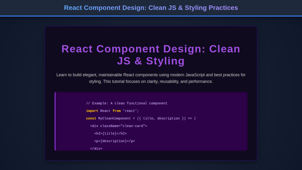
React Component Design: Clean JS & Styling Practices
Welcome, fellow developers! If you’ve ever found yourself lost in a sea of messy, unmanageable code, you know the struggle is real. Today, we’re diving deep into the art of React Component Design. Crafting clean, efficient, and reusable components in React is not just about writing code; it’s about engineering a maintainable and scalable user interface. We’ll explore how thoughtful JavaScript practices and smart styling choices can transform your development workflow, making your projects a joy to work on.
What We Are Building
Imagine a dynamic, interactive profile card component. This isn’t just any card; it’s a versatile building block, perfect for user directories, team pages, or even as a contact widget on a blog. Our inspiration comes from the sleek, minimalist designs prevalent across modern web applications. Think about platforms like GitHub or LinkedIn, where individual user profiles are presented cleanly and consistently.
This type of component is always trending because user experience demands immediate, digestible information. Furthermore, its modular nature makes it incredibly useful. You can deploy it within various contexts without rewriting large chunks of code. This adaptability significantly boosts development speed and ensures design consistency across your application.
We are not just building a component; we are building a foundation. The principles we apply here – separation of concerns, reusability, and readability – are universally applicable. Therefore, mastering this fundamental building block will empower you to tackle more complex UI challenges with confidence. It’s about creating something beautiful and functional that truly stands the test of time.
HTML Structure
Our React component’s ‘HTML’ (JSX, in this case) will define the core structure of our profile card. It typically involves a main container, an image wrapper, textual elements, and perhaps some action buttons. This structural blueprint provides the semantic foundation before any styling is applied.
index.html
<!DOCTYPE html>
<html lang="en">
<head>
    <meta charset="UTF-8">
    <meta name="viewport" content="width=device-width, initial-scale=1.0">
    <title>Clean React Component</title>
    <link rel="stylesheet" href="styles.css">
    <!-- For local development, you might add script tags for React and ReactDOM,
         or use a build tool like Vite/CRA which handles this. -->
    <!-- Example using CDN for quick demo (not for production with complex builds): -->
    <!-- <script crossorigin src="https://unpkg.com/react@18/umd/react.development.js"></script> -->
    <!-- <script crossorigin src="https://unpkg.com/react-dom@18/umd/react-dom.development.js"></script> -->
</head>
<body>
    <div id="root"></div>
    <!-- Script needs to be type="module" to use import/export if not bundled -->
    <!-- If using a bundler (recommended for React), this will be just <script src="bundle.js"></script> -->
    <script type="module" src="script.js"></script>
</body>
</html>
script.js
// A production React setup typically involves JSX compilation (e.g., Babel)
// and a module bundler (e.g., Webpack, Vite).
// This script assumes such an environment or a browser that supports ES modules
// and JSX transformed to React.createElement calls.

// If running directly in a browser without a build step:
// 1. Link React and ReactDOM UMD builds from a CDN in index.html (as commented there).
// 2. Use `React.createElement` directly instead of JSX, or use a Babel in-browser transform (not recommended for production).
// For demonstration, we'll write JSX and assume a modern dev setup.

import React from 'react';
import ReactDOM from 'react-dom/client';

/**
 * CleanCard Component
 * A functional React component for displaying a card with a title and description.
 * Demonstrates:
 * - Functional component structure.
 * - Destructuring props for clear access.
 * - Clean JSX without excessive inline styles.
 * - Semantic HTML.
 */
const CleanCard = ({ title, description }) => {
    // Input validation or default props can be added here
    if (!title || !description) {
        console.warn("CleanCard received missing props: title or description.");
        // Optionally render nothing or a placeholder
        // return null;
    }

    return (
        <div className="clean-card">
            <h2>{title}</h2>
            <p>{description}</p>
        </div>
    );
};

/**
 * App Component
 * The main application component that renders a list of CleanCard components.
 */
const App = () => {
    const cardData = [
        { id: 1, title: "Modular Component Structure", description: "Break down your UI into small, reusable, and independent components for better maintainability and scalability." },
        { id: 2, title: "Props for Data Flow", description: "Pass data down to child components using props, ensuring a clear, unidirectional data flow and predictable component behavior." },
        { id: 3, title: "External Styling with CSS", description: "Separate your component's presentation from its logic using external CSS files or CSS-in-JS solutions for clean separation of concerns." },
        { id: 4, title: "Functional Components & Hooks", description: "Utilize modern functional components with React Hooks for state management and side effects, leading to more concise and readable code." }
    ];

    return (
        <div className="clean-card-container">
            {cardData.map(card => (
                <CleanCard
                    key={card.id}
                    title={card.title}
                    description={card.description}
                />
            ))}
        </div>
    );
};

// Render the App component to the DOM
const rootElement = document.getElementById('root');
if (rootElement) {
    ReactDOM.createRoot(rootElement).render(
        <React.StrictMode>
            <App />
        </React.StrictMode>
    );
} else {
    console.error('Root element not found! Ensure an element with id="root" exists in index.html.');
}
CSS Styling
For styling, we will adopt a modern, mobile-first approach. This strategy ensures our profile card looks fantastic on any device, from a small smartphone to a large desktop monitor. We will utilize flexbox for layout, ensuring elements align perfectly and adapt gracefully. Expect to see custom properties for easy theme management and consistency. You can find excellent resources on flexible box layout on MDN Web Docs.
styles.css
/* General Reset & Base Styles */
body {
    margin: 0;
    padding: 20px;
    font-family: Arial, Helvetica, sans-serif; /* Safe fonts */
    background-color: #f4f7f6;
    color: #333;
    line-height: 1.6;
    box-sizing: border-box; /* Crucial for consistent sizing */
    overflow-x: hidden; /* Prevent horizontal scroll */
}

#root {
    display: flex;
    justify-content: center;
    align-items: flex-start; /* Align items to start (top) */
    min-height: calc(100vh - 40px); /* Adjust for body padding */
    max-width: 100%; /* Ensure root does not overflow */
    box-sizing: border-box;
}

/* Component Specific Styles */
.clean-card-container {
    padding: 20px;
    display: grid;
    grid-template-columns: repeat(auto-fit, minmax(280px, 1fr)); /* Responsive grid */
    gap: 25px;
    max-width: 1200px;
    width: 100%;
    box-sizing: border-box;
}

.clean-card {
    background-color: #fff;
    border-radius: 8px;
    box-shadow: 0 4px 15px rgba(0, 0, 0, 0.1);
    padding: 25px;
    transition: transform 0.3s ease, box-shadow 0.3s ease;
    border: 1px solid #e0e0e0;
    overflow: hidden; /* Ensure content within does not overflow */
    box-sizing: border-box;
    max-width: 100%; /* Important for inner component */
}

.clean-card:hover {
    transform: translateY(-5px);
    box-shadow: 0 8px 25px rgba(0, 0, 0, 0.15);
}

.clean-card h2 {
    color: #007bff;
    margin-top: 0;
    font-size: 1.8em;
    margin-bottom: 15px;
    line-height: 1.2;
    overflow: hidden;
    text-overflow: ellipsis;
    white-space: nowrap;
    max-width: 100%;
}

.clean-card p {
    color: #555;
    font-size: 1em;
    margin-bottom: 0;
    line-height: 1.5;
    overflow: hidden;
    text-overflow: ellipsis;
    display: -webkit-box;
    -webkit-line-clamp: 3; /* Limit description to 3 lines */
    -webkit-box-orient: vertical;
    max-width: 100%;
}
Step-by-Step Breakdown: Mastering React Component Design
Now for the heart of our discussion: how we bring our profile card to life with clean JavaScript and thoughtful React Component Design principles. We will focus on functional components and hooks, ensuring our code is both declarative and easy to understand.
Establishing a Component Folder Structure
A well-organized project begins with a smart folder structure. We recommend a ‘feature-based’ or ‘atomic design’ approach. For our profile card, you might have a components/ProfileCard directory containing index.js (the component itself), ProfileCard.module.css (for scoped styling), and perhaps a ProfileCard.stories.js (for Storybook integration). This keeps related files together, improving discoverability and maintenance. Consequently, finding what you need becomes much simpler.
Leveraging Functional Components and Hooks
In modern React, functional components paired with hooks are the gold standard. They offer a simpler, more concise way to manage state and side effects. For instance, the useState hook allows us to manage internal state, such as a ‘followed’ status on our profile card. Similarly, useEffect helps us handle side effects, like fetching user data or saving preferences. Using useCallback and useMemo can further optimize performance, especially with complex operations or frequently rendered components. This thoughtful application of hooks leads to less boilerplate and more readable code.
“The most important property of a program is whether it accomplishes the intention of its user.” – C.A.R. Hoare
When you focus on intent, your code naturally becomes cleaner and more purposeful. This philosophy directly applies to how we structure our React components.
Props, State, and Component Composition
Clean components are primarily driven by props and state. Our ProfileCard component will receive user data (name, avatar, title) via props. It might manage its own internal state for interactive elements, like a toggleable ‘details’ section. For a more advanced setup, consider component composition: pass children components or render props. This approach enables incredible flexibility. You are essentially building a component that can render *any* content within a predefined layout. Take a look at this Weather App UI: HTML, CSS & JavaScript Design Tutorial for another great example of component organization.
Handling Events and User Interactions
React makes handling events straightforward. For example, an ‘onclick’ handler on a ‘Follow’ button can update the component’s state or trigger an action in a parent component. By defining event handlers directly within our functional component, we keep related logic encapsulated. It means less searching through different files to understand how an interaction works. Furthermore, this also supports better testing practices, as handlers are easier to isolate. Always strive to make event handlers as pure and concise as possible.
Making It Responsive
A truly clean design isn’t just about code; it’s about user experience across all devices. We employ CSS media queries to adapt our profile card’s layout and styling based on screen size. This typically involves adjusting font sizes, padding, and potentially reordering elements using flexbox or grid properties. A mobile-first strategy means we design for the smallest screen first, then progressively enhance for larger viewports. This ensures a solid baseline experience for everyone. This approach provides a robust foundation, making future adaptations much easier. For more insights on responsive design elements, consider this helpful guide on Pagination Design: HTML, CSS & JS Component Guide, which also focuses on adaptability.
Final Output
After applying these principles, our final profile card component will be a testament to clean design. It will feature a circular avatar, clearly displayed name and title, a concise bio, and interactive action buttons. Visually, it will be clean, modern, and inviting. More importantly, its underlying code will be a joy to read, debug, and extend. This visual clarity is directly mirrored by the clarity of its code. Hence, you get a beautiful component both inside and out.
Conclusion: Elevating Your React Component Design Skills
We’ve journeyed through the essentials of crafting beautiful and efficient React Component Design. From structured JSX to thoughtful CSS and the power of modern JavaScript hooks, every choice contributes to a better developer and user experience. Remember, clean code is an ongoing practice, not a destination. It involves constant learning and refinement.
Applying these principles will not only make your current projects more robust but will also set you up for success in future endeavors. Whether you’re building a complex dashboard or a simple landing page, the ability to design clean, reusable React components is invaluable. You can also explore building more intricate components by checking out resources like this Markdown Editor Design with HTML, CSS & JavaScript tutorial. For more styling inspiration, visit CSS-Tricks, a fantastic resource for all things CSS.
“Programs must be written for people to read, and only incidentally for machines to execute.” – Harold Abelson and Gerald Jay Sussman
Keep this quote in mind as you continue your coding journey. Your future self, and your teammates, will thank you for investing in clean component design. Happy coding!