Hello, ProCoders!
Hey there! If you've been wanting to build a sleek User Profile Card but weren't sure where to begin, you've landed in just the right spot. We're going to craft a beautiful, responsive profile card today. This project will look fantastic on any device. Plus, it will include a cool dark mode toggle. Get ready to level up your UI skills!
What We Are Building
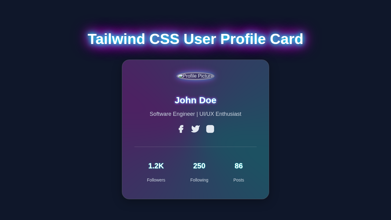
Today, we're creating a modern and functional user profile card. Imagine a clean, stylish box displaying a user's avatar, name, title, and a brief bio. It's a common element on social media sites or personal dashboards. This card isn't just pretty; it's fully responsive. It will look great on phones, tablets, and desktops alike. The real “wow” factor? A simple button will switch between light and dark modes. This adds a polished, professional touch to your projects. It's a fantastic way to show off your front-end prowess!
HTML Structure
Our HTML will lay the groundwork for our profile card. We'll define containers for the image, text, and the dark mode toggle. Don't worry about all the classes right now; we'll explain them later. This setup is logical and easy to follow. Here is the basic HTML we'll be using:
index.html
<!DOCTYPE html>
<html lang="en">
<head>
    <meta charset="UTF-8">
    <meta name="viewport" content="width=device-width, initial-scale=1.0">
    <title>Tailwind CSS User Profile Card</title>
    <!-- Link to your compiled Tailwind CSS.
         Ensure you have Tailwind CSS set up and compiled into styles.css.
         For example, using PostCSS and a tailwind.config.js.
         If you are not using a build process, you can include the Tailwind CDN
         (though not recommended for production due to performance and customization limitations).
    -->
    <link href="./styles.css" rel="stylesheet">
    <!-- Using a safe, universally available font stack -->
    <style>
        body { font-family: Arial, Helvetica, sans-serif; }
    </style>
</head>
<!--
    The `body` element sets up the dark background and centers the card using Flexbox.
    `min-h-screen` ensures it takes full viewport height.
    `p-4` adds some padding around the edges on smaller screens.
-->
<body class="bg-slate-900 flex justify-center items-center min-h-screen p-4">

    <!--
        User Profile Card Container
        - `relative` is needed for the absolute positioned glow effect.
        - `w-full max-w-sm mx-auto` makes it responsive, taking full width on small screens
          up to a max of `sm` (approx. 384px) and centering it.
        - `bg-white/10 backdrop-blur-lg` creates the glassmorphism effect.
        - `rounded-xl shadow-lg border border-white/20` adds styling and a subtle border.
        - `p-8 text-center` provides inner spacing and centers content.
        - `overflow-hidden` clips the inner glow effect at the card's boundaries.
    -->
    <div class="relative w-full max-w-sm mx-auto bg-white/10 backdrop-blur-lg rounded-xl shadow-lg border border-white/20 p-8 text-center overflow-hidden">
        <!--
            Optional: A subtle background glow effect inside the card.
            - `absolute inset-0 z-0` positions it to cover the entire card.
            - `bg-gradient-to-br from-cyan-400/30 via-fuchsia-500/30 to-purple-400/30` creates a colorful gradient.
            - `opacity-30 blur-xl` softens the glow.
            - `animate-gradient-pulse` applies a custom animation defined in `styles.css`.
        -->
        <div class="absolute inset-0 z-0 bg-gradient-to-br from-cyan-400/30 via-fuchsia-500/30 to-purple-400/30 opacity-30 blur-xl animate-gradient-pulse"></div>

        <!--
            Profile Card Content
            - `relative z-10` ensures the content stays above the glow effect.
        -->
        <div class="relative z-10">
            <!-- Profile Picture -->
            <img class="w-32 h-32 rounded-full object-cover mx-auto mb-6 border-4 border-white/40 shadow-xl"
                 src="https://via.placeholder.com/128/334155/f8fafc?text=JD"
                 alt="John Doe's Profile Picture">

            <!-- User Name -->
            <h2 class="text-3xl font-bold text-white mb-2">John Doe</h2>

            <!-- User Title/Bio -->
            <p class="text-lg text-slate-300 mb-6">Software Engineer | UI/UX Enthusiast</p>

            <!--
                Social Links Section
                - `flex justify-center space-x-5` arranges icons horizontally with spacing.
            -->
            <div class="flex justify-center space-x-5 mb-8">
                <!-- Each social link is a simple anchor with an SVG icon -->
                <a href="#" class="text-slate-200 hover:text-cyan-400 transition-colors duration-200" aria-label="Facebook">
                    <svg class="h-7 w-7" viewBox="0 0 24 24" fill="none" stroke="currentColor" stroke-width="2" stroke-linecap="round" stroke-linejoin="round">
                        <path d="M18 2h-3a5 5 0 0 0-5 5v3H7v4h3v8h4v-8h3l1-4h-4V7a1 1 0 0 1 1-1h3z"></path>
                    </svg>
                </a>
                <a href="#" class="text-slate-200 hover:text-fuchsia-400 transition-colors duration-200" aria-label="Twitter">
                    <svg class="h-7 w-7" viewBox="0 0 24 24" fill="none" stroke="currentColor" stroke-width="2" stroke-linecap="round" stroke-linejoin="round">
                        <path d="M23 3a10.9 10.9 0 0 1-3.14 1.53 4.48 4.48 0 0 0-7.86 3v1A10.66 10.66 0 0 1 3 4s-4 9 5 13a11.64 11.64 0 0 1-7 2c9 5 20 0 20-11.5a4.5 4.5 0 0 0-.08-.83A7.72 7.72 0 0 0 23 3z"></path>
                    </svg>
                </a>
                <a href="#" class="text-slate-200 hover:text-purple-400 transition-colors duration-200" aria-label="Instagram">
                    <svg class="h-7 w-7" viewBox="0 0 24 24" fill="none" stroke="currentColor" stroke-width="2" stroke-linecap="round" stroke-linejoin="round">
                        <rect x="2" y="2" width="20" height="20" rx="5" ry="5"></rect>
                        <path d="M16 11.37A4 4 0 1 1 12.63 8 4 4 0 0 1 16 11.37z"></path>
                        <line x1="17.5" y1="6.5" x2="17.51" y2="6.5"></line>
                    </svg>
                </a>
            </div>

            <!--
                Stats Grid
                - `flex justify-around items-center` distributes stats evenly.
                - `pt-6 border-t border-white/20` creates a top border as a separator.
            -->
            <div class="flex justify-around items-center pt-6 border-t border-white/20">
                <!-- Each stat item -->
                <div class="flex flex-col items-center">
                    <p class="text-2xl font-bold text-white">1.2K</p>
                    <p class="text-sm text-slate-300">Followers</p>
                </div>
                <div class="flex flex-col items-center">
                    <p class="text-2xl font-bold text-white">250</p>
                    <p class="text-sm text-slate-300">Following</p>
                </div>
                <div class="flex flex-col items-center">
                    <p class="text-2xl font-bold text-white">86</p>
                    <p class="text-sm text-slate-300">Posts</p>
                </div>
            </div>
        </div>
    </div>
</body>
</html>
CSS Styling
For styling, we're leveraging the power of Tailwind CSS. This means most of our “CSS” is actually applied directly within our HTML. We're using utility-first CSS, which makes styling super fast. Tailwind provides pre-built classes for everything. Think of spacing, colors, fonts, and responsiveness. Therefore, we will only need a tiny bit of custom CSS for the dark mode transition, if any. This approach keeps your stylesheets minimal and tidy!
styles.css
/*
    Tailwind CSS Directives
    These are processed by PostCSS and Tailwind to generate all necessary utility classes.
    Ensure you have `tailwind.config.js` and a build process (e.g., `npx tailwindcss -i ./src/input.css -o ./styles.css --watch`)
    running to compile your Tailwind styles.
*/
@tailwind base;
@tailwind components;
@tailwind utilities;

/*
    Base styles for production readiness
    - `font-family`: Using a safe, universally available font stack.
    - `box-sizing: border-box`: Essential for consistent layout behavior.
    - `overflow-x: hidden`: Prevents horizontal scrollbars, common issue with responsive layouts.
*/
body {
    font-family: Arial, Helvetica, sans-serif;
    box-sizing: border-box;
    overflow-x: hidden;
}

/*
    Image responsiveness rule
    - Ensures images never overflow their containers.
*/
img {
    max-width: 100%;
    height: auto;
    box-sizing: border-box;
}

/*
    Custom Keyframe Animation for the card's inner glow effect.
    This provides a subtle, pulsing gradient background animation.
*/
@keyframes gradient-pulse {
    0% {
        transform: scale(1) rotate(0deg);
        opacity: 0.3;
    }
    50% {
        transform: scale(1.05) rotate(5deg); /* Slightly larger scale and rotation */
        opacity: 0.4;
    }
    100% {
        transform: scale(1) rotate(0deg);
        opacity: 0.3;
    }
}

/* Apply the custom animation using a Tailwind arbitrary property (or create a plugin) */
.animate-gradient-pulse {
    animation: gradient-pulse 6s ease-in-out infinite alternate;
}
JavaScript for Interactivity
To bring our dark mode toggle to life, we'll add a dash of JavaScript. This script will listen for clicks on our toggle button. Then, it will dynamically add or remove a “dark” class from our HTML element. This simple script enables the magic of theme switching. It remembers your preference too, thanks to local storage. It's surprisingly straightforward!
How It All Works Together
Let's break down how these pieces combine to form our awesome User Profile Card. Each part plays a vital role. We'll explore the structure, styles, and dynamic features. It's all about synergy!
The HTML Foundation
First, our HTML provides the content and structure. We have a main <div> that acts as our card container. Inside, there's a spot for the user's avatar image. We also include sections for their name, title, and a short description. Furthermore, a button handles our dark mode toggle. Each element gets semantic tags where appropriate. This makes our code readable and accessible. It's the skeleton of our design.
Pro Tip: Always strive for semantic HTML. It helps screen readers and improves SEO. Use tags like
<img>for images and<button>for buttons. It makes a big difference!
Tailwind's Magic for Styling
Now, for the visual flair! Tailwind CSS makes our card look fantastic. We apply classes directly in our HTML. For instance, bg-white sets the background to white. rounded-lg gives us nice rounded corners. We use Tailwind's utility classes for padding, margins, shadows, and text styles. Responsiveness is built-in too. Classes like md:flex change layout on medium screens. This means our card adapts beautifully to different screen sizes without extra media queries. It's incredibly efficient and powerful!
For the dark mode styles, Tailwind shines again. We simply use the dark: prefix. For example, dark:bg-gray-800 means “when the parent element has the ‘dark’ class, apply a gray-800 background.” This makes managing themes super intuitive. You can learn more about this in our Tailwind Dark Mode tutorial. It's all handled by Tailwind's intelligent class system.
Dark Mode Superpowers with JavaScript
Our JavaScript ties the theme switching together. When you click the toggle button, the script springs into action. It grabs the <html> element. Then, it checks if the ‘dark’ class is present. If it is, the script removes it. If not, it adds it. This simple toggle changes all the dark: prefixed Tailwind styles. Furthermore, the script saves your preference in your browser's local storage. So, if you refresh the page, your chosen theme persists. It's a smooth user experience!
Pro Tip: Local storage is perfect for saving user preferences like theme settings. It remembers small pieces of data across browser sessions. Check out MDN's documentation on localStorage for more!
Seamless Responsiveness
We designed this User Profile Card to be responsive from the ground up. Tailwind's mobile-first approach is key here. We style for small screens first. Then, we add responsive prefixes like sm:, md:, and lg: for larger screens. This ensures our layout adjusts gracefully. The card might stack elements vertically on mobile. It then displays them side-by-side on larger screens. Your profile card will look fantastic, no matter the device. This attention to detail makes a professional impression.
Tips to Customise It
You've built an awesome card! Now, how about making it uniquely yours? Here are some ideas:
- Change Colors: Experiment with Tailwind's color palette. Update
bg-blue-500tobg-purple-600. You can easily modify border colors too. - Add Social Links: Include small icon links to social media profiles. Use Font Awesome or another icon library.
- Animated Transitions: Enhance the dark mode switch with smoother animations. You can add
transition-colors duration-500to elements. - More User Details: Expand the card to show more information. Perhaps add a “Follow” button or a skill set.
Conclusion
Wow, you did it! You've successfully built a fully responsive User Profile Card with a dynamic dark mode toggle. You used HTML for structure, Tailwind CSS for beautiful styling, and JavaScript for interactivity. This project showcases practical front-end skills. It also demonstrates how powerful modern CSS frameworks can be. Take pride in what you've created. Now, go forth and integrate this card into your next amazing project! Don't forget to share your creations with the ProCoder community. Happy coding!