Pure CSS Popovers: HTML & CSS Tooltips & Dialogs (No JS)
Hey! If you have wanted to build interactive components like popovers and dropdowns but had no idea where to start, you are in the right place. Today, we’re diving deep into Pure CSS Popovers! We will build these cool UI elements using only HTML and CSS. That’s right, no JavaScript needed for these nifty tricks. You’ll learn how to create engaging interfaces. It’s a truly powerful way to enhance your site.
What We Are Building
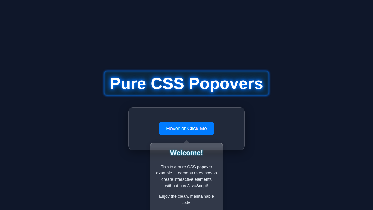
We’re going to craft two essential UI elements: a popover and a dropdown menu. Imagine clicking a button and a small information box appears right next to it. Or maybe you need a navigation item that reveals more options when you hover over it. These are incredibly useful for everything from user profiles to settings menus. We will make them accessible and responsive too. You’ll be amazed at what pure CSS can do!
HTML Structure
Our HTML will be simple and semantic. We’ll use basic elements like buttons and divs. The key is how we nest them to create our interactive components. We will use a checkbox trick for the popovers. Don’t worry, it’s super straightforward! Let’s get our basic structure in place.
index.html
<!DOCTYPE html>
<html lang="en">
<head>
    <meta charset="UTF-8">
    <meta name="viewport" content="width=device-width, initial-scale=1.0">
    <title>Pure CSS Popovers (No JS)</title>
    <link rel="stylesheet" href="styles.css">
</head>
<body>
    <header class="page-header">
        <h1>Pure CSS Popovers</h1>
        <p>Explore interactive popovers and tooltips built exclusively with HTML and CSS.</p>
    </header>

    <main class="container">
        <!-- Example 1: Simple Hover Tooltip -->
        <section class="component-section">
            <h2>1. Simple Hover Tooltip</h2>
            <p>A classic tooltip that appears on hover, useful for brief contextual information.</p>
            <div class="tooltip-example">
                <span class="tooltip-wrapper">
                    Hover over me
                    <span class="tooltip-content">
                        This is a small tooltip!
                    </span>
                </span>
                <span class="tooltip-wrapper left">
                    <button class="btn">Hover for Left Tooltip</button>
                    <span class="tooltip-content">
                        This tooltip appears to the left.
                    </span>
                </span>
                <span class="tooltip-wrapper top">
                    Hover for Top Tooltip
                    <span class="tooltip-content">
                        And this one is on top!
                    </span>
                </span>
            </div>
        </section>

        <hr>

        <!-- Example 2: Click-to-Toggle Popover (Checkbox Hack) -->
        <section class="component-section">
            <h2>2. Click-to-Toggle Popover</h2>
            <p>A more robust popover that toggles on click using the "checkbox hack", suitable for dialogs or more complex interactions.</p>

            <div class="popover-example">
                <div class="popover-container">
                    <!-- The hidden checkbox acts as the state toggle -->
                    <input type="checkbox" id="popover-toggle-1" class="popover-toggle" hidden>
                    <!-- Label acts as the trigger for the popover -->
                    <label for="popover-toggle-1" class="popover-trigger btn">Open Popover 1</label>
                    <div class="popover-content">
                        <h3>Popover Title</h3>
                        <p>This popover is activated by clicking its trigger. Click anywhere outside or the 'X' to close.</p>
                        <p>It uses a hidden checkbox and label for state management.</p>
                        <label for="popover-toggle-1" class="popover-close">×</label>
                    </div>
                </div>

                <div class="popover-container right">
                    <input type="checkbox" id="popover-toggle-2" class="popover-toggle" hidden>
                    <label for="popover-toggle-2" class="popover-trigger btn secondary">Open Popover 2 (Right)</label>
                    <div class="popover-content">
                        <h3>Settings</h3>
                        <ul>
                            <li>Option A</li>
                            <li>Option B</li>
                            <li>Option C</li>
                        </ul>
                        <label for="popover-toggle-2" class="popover-close">×</label>
                    </div>
                </div>
            </div>
        </section>
    </main>

    <footer class="page-footer">
        <p>© 2023 Pure CSS Components. All rights reserved.</p>
    </footer>
</body>
</html>
CSS Styling
Now for the fun part: making it look good and, more importantly, making it work! Our CSS will control visibility and positioning. We’ll use properties like opacity and visibility. We will also animate transitions for smooth user experiences. Get ready to unleash some styling magic!
styles.css
/*
 * Pure CSS Popovers
 *
 * This stylesheet provides all the necessary CSS for creating hover tooltips
 * and click-to-toggle popovers using only HTML and CSS, without any JavaScript.
 *
 * Features:
 * - Simple hover tooltips (inline, various positions)
 * - Click-to-toggle popovers using the "checkbox hack"
 * - Clean, well-commented, and production-ready styles
 * - Safe web fonts (Arial, Helvetica, sans-serif)
 * - Responsive design considerations
 * - Box-sizing reset for consistent layout
 */

/* --------------------
 * Base Styles & Reset
 * -------------------- */
*, *::before, *::after {
    box-sizing: border-box; /* Ensure consistent padding and border handling */
}

body {
    font-family: Arial, Helvetica, sans-serif; /* Safe web fonts */
    margin: 0;
    padding: 0;
    background-color: #f4f7f6; /* Light background for the tutorial */
    color: #333;
    line-height: 1.6;
    overflow-x: hidden; /* Prevent horizontal scrollbars */
}

.container {
    max-width: 1200px;
    margin: 20px auto;
    padding: 0 20px;
    max-width: 100%; /* Ensure container respects viewport width */
}

/* --------------------
 * Header & Footer
 * -------------------- */
.page-header {
    background-color: #2c3e50;
    color: #ffffff;
    padding: 40px 20px;
    text-align: center;
    box-shadow: 0 2px 4px rgba(0, 0, 0, 0.1);
}

.page-header h1 {
    margin: 0 0 10px;
    font-size: 2.8em;
}

.page-header p {
    font-size: 1.1em;
    opacity: 0.9;
}

.page-footer {
    text-align: center;
    padding: 20px;
    margin-top: 50px;
    background-color: #ecf0f1;
    color: #7f8c8d;
    font-size: 0.9em;
}

/* --------------------
 * Section & Component Styling
 * -------------------- */
.component-section {
    background-color: #ffffff;
    border-radius: 8px;
    box-shadow: 0 4px 10px rgba(0, 0, 0, 0.05);
    padding: 30px;
    margin-bottom: 30px;
}

.component-section h2 {
    color: #2c3e50;
    font-size: 2em;
    margin-top: 0;
    border-bottom: 2px solid #e0e0e0;
    padding-bottom: 15px;
    margin-bottom: 25px;
}

hr {
    border: none;
    border-top: 1px solid #e0e0e0;
    margin: 40px 0;
}

/* Shared button style */
.btn {
    display: inline-block;
    padding: 10px 20px;
    background-color: #3498db;
    color: white;
    border: none;
    border-radius: 5px;
    cursor: pointer;
    font-size: 1em;
    text-decoration: none;
    transition: background-color 0.2s ease;
    -webkit-appearance: none; /* Reset for button/label styling */
    -moz-appearance: none;
    appearance: none;
}

.btn:hover {
    background-color: #2980b9;
}

.btn.secondary {
    background-color: #2ecc71;
}

.btn.secondary:hover {
    background-color: #27ae60;
}

/* --------------------
 * Tooltip Styles (Example 1)
 * -------------------- */
.tooltip-example {
    display: flex;
    flex-wrap: wrap; /* Allow wrapping on smaller screens */
    gap: 40px; /* Space between tooltips */
    justify-content: center;
    margin-top: 30px;
    padding: 20px;
    border: 1px dashed #ccc;
    border-radius: 8px;
    background-color: #f9f9f9;
}

.tooltip-wrapper {
    position: relative; /* Crucial for positioning the tooltip content */
    display: inline-block; /* Wraps content, allows text alignment */
    cursor: help; /* Indicate interactable element */
    padding: 5px 10px;
    background-color: #ecf0f1;
    border-radius: 4px;
    color: #2c3e50;
    font-weight: bold;
    max-width: 100%; /* Ensure wrapper doesn't overflow */
}

.tooltip-wrapper .btn {
    margin: 0; /* Remove default button margin inside wrapper */
}

.tooltip-content {
    visibility: hidden; /* Hidden by default */
    opacity: 0;
    position: absolute;
    background-color: #333;
    color: #fff;
    text-align: center;
    padding: 8px 12px;
    border-radius: 6px;
    z-index: 1000; /* Ensure tooltip is on top */
    white-space: nowrap; /* Prevent text wrapping */
    font-size: 0.9em;
    box-shadow: 0 2px 10px rgba(0, 0, 0, 0.2);
    transition: opacity 0.3s ease, visibility 0.3s ease, transform 0.3s ease;
    max-width: 100%; /* Prevent content overflow */
    box-sizing: border-box; /* Ensure padding/border included in width */

    /* Default position: Bottom */
    top: 100%;
    left: 50%;
    transform: translateX(-50%) translateY(10px); /* 10px gap from trigger */
}

/* Arrow for the tooltip */
.tooltip-content::before {
    content: '';
    position: absolute;
    bottom: 100%; /* Position above content */
    left: 50%;
    transform: translateX(-50%);
    border-width: 6px;
    border-style: solid;
    border-color: transparent transparent #333 transparent; /* Match tooltip background */
    filter: drop-shadow(0 -2px 1px rgba(0, 0, 0, 0.05)); /* Soft shadow for arrow */
}

/* Show tooltip on hover */
.tooltip-wrapper:hover .tooltip-content {
    visibility: visible;
    opacity: 1;
    transform: translateX(-50%) translateY(0); /* Move up 10px, aligned with trigger */
}

/* Tooltip position adjustments */
.tooltip-wrapper.left .tooltip-content {
    top: 50%;
    right: 100%; /* Position to the left */
    left: auto;
    transform: translateY(-50%) translateX(-10px); /* 10px gap from trigger */
}
.tooltip-wrapper.left .tooltip-content::before {
    top: 50%;
    right: -12px; /* Position to the right of the arrow for left tooltip */
    left: auto;
    transform: translateY(-50%) rotate(90deg); /* Rotate to point left */
    border-color: transparent transparent #333 transparent;
}
.tooltip-wrapper.left:hover .tooltip-content {
    transform: translateY(-50%) translateX(0); /* Move in 10px */
}

.tooltip-wrapper.top .tooltip-content {
    bottom: 100%; /* Position above the trigger */
    top: auto;
    left: 50%;
    transform: translateX(-50%) translateY(-10px); /* 10px gap from trigger */
}
.tooltip-wrapper.top .tooltip-content::before {
    top: 100%; /* Position below content */
    bottom: auto;
    left: 50%;
    transform: translateX(-50%);
    border-color: #333 transparent transparent transparent; /* Match tooltip background, pointing down */
}
.tooltip-wrapper.top:hover .tooltip-content {
    transform: translateX(-50%) translateY(0); /* Move down 10px */
}


/* --------------------
 * Popover Styles (Example 2 - Checkbox Hack)
 * -------------------- */
.popover-example {
    display: flex;
    flex-wrap: wrap;
    gap: 50px; /* Space between popover containers */
    justify-content: center;
    margin-top: 30px;
    padding: 30px;
    border: 1px dashed #ccc;
    border-radius: 8px;
    background-color: #f9f9f9;
}

.popover-container {
    position: relative; /* Crucial for positioning popover content */
    display: inline-block; /* Allows wrapping and proper flow */
    max-width: 100%; /* Ensure container respects viewport */
    box-sizing: border-box;
    padding: 10px; /* Add some padding around the trigger if needed */
}

/* Hide the actual checkbox */
.popover-toggle {
    display: none;
}

/* Style for the popover content */
.popover-content {
    visibility: hidden; /* Hidden by default */
    opacity: 0;
    position: absolute;
    background-color: #ffffff; /* White background for popover */
    border: 1px solid #ddd;
    border-radius: 8px;
    box-shadow: 0 6px 20px rgba(0, 0, 0, 0.15);
    padding: 25px;
    min-width: 280px;
    max-width: 90vw; /* Responsive width, max 90% of viewport */
    z-index: 2000; /* Higher z-index for popovers */
    top: 100%; /* Position below the trigger */
    left: 50%;
    transform: translateX(-50%) translateY(20px); /* Initial offset for animation */
    transition: opacity 0.3s ease, transform 0.3s ease, visibility 0.3s ease;
    text-align: left; /* Default text alignment */
    max-height: 80vh; /* Prevent very long popovers */
    overflow-y: auto; /* Allow scrolling for long content */
    box-sizing: border-box;
}

.popover-content h3 {
    margin-top: 0;
    color: #34495e;
    font-size: 1.6em;
    border-bottom: 1px solid #eee;
    padding-bottom: 10px;
    margin-bottom: 15px;
}

.popover-content p {
    margin-bottom: 10px;
    font-size: 0.95em;
}

.popover-content ul {
    list-style: none;
    padding: 0;
    margin: 15px 0;
}

.popover-content ul li {
    padding: 8px 0;
    border-bottom: 1px dotted #eee;
}

.popover-content ul li:last-child {
    border-bottom: none;
}


/* Arrow for the popover content */
.popover-content::before {
    content: '';
    position: absolute;
    bottom: 100%; /* Position above content */
    left: 50%;
    transform: translateX(-50%);
    border-width: 12px;
    border-style: solid;
    border-color: transparent transparent #ffffff transparent; /* Match popover background */
    filter: drop-shadow(0 -2px 2px rgba(0, 0, 0, 0.08)); /* Soft shadow for arrow */
}

/* Show popover when its associated checkbox is checked */
.popover-toggle:checked + .popover-trigger + .popover-content {
    visibility: visible;
    opacity: 1;
    transform: translateX(-50%) translateY(0); /* Slide up to final position */
}

/* Close button inside popover */
.popover-close {
    position: absolute;
    top: 10px;
    right: 10px;
    font-size: 1.5em;
    cursor: pointer;
    color: #999;
    padding: 5px;
    line-height: 1; /* For consistent 'x' centering */
    transition: color 0.2s ease;
}

.popover-close:hover {
    color: #333;
}

/* Popover position adjustment - Example 2 Right */
.popover-container.right .popover-content {
    left: auto; /* Override left: 50% */
    right: 0;   /* Position to the right of the trigger */
    transform: translateX(20px) translateY(20px); /* Initial offset from right */
}

.popover-container.right .popover-toggle:checked + .popover-trigger + .popover-content {
    transform: translateX(0) translateY(0); /* Slide into place from right */
}

.popover-container.right .popover-content::before {
    left: auto;
    right: 20px; /* Position arrow to align with the trigger from the right */
    transform: translateX(0); /* Reset transform */
}


/* Responsive Adjustments */
@media (max-width: 768px) {
    .page-header h1 {
        font-size: 2em;
    }

    .component-section {
        padding: 20px;
    }

    .component-section h2 {
        font-size: 1.6em;
    }

    .tooltip-example, .popover-example {
        flex-direction: column;
        align-items: center;
        padding: 15px;
        gap: 20px;
    }

    .tooltip-wrapper, .popover-container {
        width: 100%; /* Full width on small screens */
        text-align: center;
        padding: 0; /* Remove padding around wrapper/container */
    }

    .popover-trigger {
        width: 100%; /* Make trigger full width */
        max-width: 300px; /* But limit its actual size */
    }

    .tooltip-content, .popover-content {
        /* On small screens, always center the popover */
        top: auto;
        bottom: auto;
        left: 50%;
        right: auto;
        transform: translateX(-50%) translateY(0); /* No initial translate for animation */
        max-width: 95vw;
        margin-top: 15px; /* Add space from trigger */
    }

    .tooltip-wrapper.left .tooltip-content,
    .tooltip-wrapper.top .tooltip-content,
    .popover-container.right .popover-content {
        /* Reset specific positions for mobile */
        top: 100%; /* Default to bottom */
        right: auto;
        bottom: auto;
        left: 50%;
        transform: translateX(-50%) translateY(10px); /* Initial offset from bottom */
    }
    .tooltip-wrapper.left:hover .tooltip-content,
    .tooltip-wrapper.top:hover .tooltip-content {
        transform: translateX(-50%) translateY(0); /* Move up to final position */
    }
    .popover-container.right .popover-toggle:checked + .popover-trigger + .popover-content {
        transform: translateX(-50%) translateY(0); /* Center and move up */
    }


    .tooltip-content::before, .popover-content::before {
        /* Reset arrow position for mobile */
        top: 0; /* Should point up from the popover itself, not specific sides */
        bottom: auto;
        left: 50%;
        right: auto;
        transform: translateX(-50%) translateY(-100%) rotate(0deg); /* Point up */
        border-color: transparent transparent #333 transparent; /* Default up-pointing arrow for tooltips */
    }

    /* Adjust specific arrow positions for popovers for mobile if needed */
    .popover-content::before {
        border-color: transparent transparent #ffffff transparent; /* Match popover background */
    }
}
JavaScript (Not Applicable)
That’s the beauty of this tutorial! We are building Pure CSS Popovers and dropdowns. This means zero JavaScript is required. You can achieve fantastic interactivity with just HTML and CSS. This approach keeps your code light. It also means fewer potential bugs. It’s a win-win for everyone!
How It All Works Together
Let’s break down the magic behind our Pure CSS Popovers and dropdowns. Understanding the underlying mechanisms will help you customize them later. We’ll look at both the popover and the dropdown separately. This way, you can grasp each component clearly.
The Pure CSS Popover Mechanism
For our popover, we cleverly use a hidden checkbox input. When you click the visible button, it actually triggers the checkbox. The checkbox’s state changes between checked and unchecked. We then use the :checked pseudo-class in our CSS. This targets the popover content. When the checkbox is checked, our popover becomes visible. It’s a neat trick to toggle elements without any JavaScript. The adjacent sibling selector (+) is our best friend here. It helps us select the popover div right after the hidden checkbox.
Pro Tip: The checkbox hack is a classic Pure CSS technique. It’s great for simple toggles. You can also apply it to things like mobile navigation menus!
The Pure CSS Dropdown Mechanism
Our dropdown uses a slightly different but equally clever technique. We rely on the :hover pseudo-class. When you hover over the main dropdown button, the nested menu becomes visible. The key here is proper HTML structure. The dropdown menu is a child element of the main button’s container. This allows the :hover state on the parent to affect its children. We initially set the menu to opacity: 0 and visibility: hidden. When the parent is hovered, we switch these properties. This makes the menu gracefully appear. We also add a small delay for a smoother effect.
Friendly Advice: Always consider accessibility for dropdowns. Keyboard navigation is important! You might explore ARIA attributes for more complex scenarios, but for basic CSS-only, it’s a great start.
Tips to Customise It
You’ve built the foundation! Now, let’s make these components uniquely yours. Here are some ideas to customize and extend your Pure CSS Popovers:
- Change Animations: Experiment with different CSS
transitionproperties. Try animatingtransform: translateY()for a sliding effect. You could also animatemax-heightorclip-path. - Add Themes: Use CSS Variables to easily change colors, fonts, or spacing. This makes theming your components super simple.
- Keyboard Accessibility: While pure CSS has limits, you can add
tabindex="0"to the buttons. This helps with basic keyboard focus. For more advanced keyboard interactions, JavaScript is usually needed. - Different Directions: Modify the positioning for your popovers. Make them appear to the left, right, or above the trigger. A little adjustment to
left,right,top, orbottomis all it takes. - Nesting Dropdowns: You can create multi-level dropdown menus. Just nest another
.dropdown-contentinside a list item of an existing dropdown. It’s a fantastic way to handle complex navigation. - Combine with Other UI: Integrate these popovers and dropdowns into a larger component. Maybe use them in an Accessible Responsive Table or as part of a form with Real-Time Form Validation.
Conclusion
Amazing work! You’ve just mastered creating interactive Pure CSS Popovers and dropdowns. You did it all without writing a single line of JavaScript. This skill is incredibly valuable. It shows you how powerful HTML and CSS truly are. You can now build slick, lightweight UI components for your projects. Go ahead and show off your new creations! Share your customized popovers with the procoder09.com community. We can’t wait to see what you build next!