Responsive Navbar Tailwind CSS: Build a Modern HTML Menu
Hey! If you have wanted to build a Responsive Navbar Tailwind menu but had no idea where to start, you are in the right place. We’re going to create a sleek, modern navigation bar. It will look fantastic on any device. Plus, we’ll use Tailwind CSS for lightning-fast styling. This tutorial makes it super easy! Get ready to impress with your new skills.
What We Are Building: Your Next Responsive Navbar Tailwind Masterpiece!
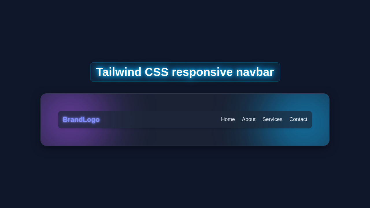
Imagine a navigation bar that just *works*. It’s clean on desktops. It cleverly transforms into a mobile-friendly menu. That’s exactly what we’re building today! This Responsive Navbar Tailwind component will be a cornerstone for your projects. It’s not just functional. It’s stylish too. Moreover, it’s a perfect showcase for Tailwind CSS’s power. You’ll learn essential responsiveness techniques. It will also elevate your web development skills. Think about the professional look it gives your site. This menu will adapt perfectly from huge monitors to tiny phone screens. So, get ready to build something truly useful and impressive!
Crafting the HTML Structure for Our Responsive Navbar
First, let’s lay the groundwork with our HTML. This structure defines all the elements of our navbar. It includes our brand logo. It also holds our main navigation links. And critically, it contains the essential mobile menu button. We will arrange everything logically within semantic HTML tags. This makes our code clean. It also ensures it’s easy to style later. A well-organized HTML foundation is key. It helps both developers and search engines understand your content better. You will see how simple and clean this base is.
index.html
<!DOCTYPE html>
<html lang="en">
<head>
    <meta charset="UTF-8">
    <meta name="viewport" content="width=device-width, initial-scale=1.0">
    <title>Responsive Navbar with Tailwind CSS</title>
    <!-- Include Tailwind CSS via CDN for quick setup. -->
    <!-- For production, consider using PostCSS for a local build process. -->
    <script src="https://cdn.tailwindcss.com"></script>
    <style>
        /* Ensures all elements use the border-box model for consistent sizing */
        *, *::before, *::after {
            box-sizing: border-box;
        }
        /* Basic font styling for the whole page */
        body {
            font-family: Arial, Helvetica, sans-serif;
            margin: 0;
            /* Prevent horizontal scroll issues, especially with transitions */
            overflow-x: hidden;
        }
    </style>
</head>
<body class="bg-gray-900 text-gray-100 min-h-screen">

    <!-- Responsive Navbar Component -->
    <!-- The 'sticky' class makes the navbar stay at the top when scrolling -->
    <nav class="bg-slate-800 p-4 shadow-lg sticky top-0 z-50">
        <div class="container mx-auto flex justify-between items-center">
            <!-- Logo / Brand Name -->
            <div>
                <a href="#" class="text-2xl font-bold text-indigo-400 hover:text-indigo-300 transition duration-300 ease-in-out">
                    BrandLogo
                </a>
            </div>

            <!-- Desktop Navigation Links (Visible on medium screens and larger) -->
            <div class="hidden md:flex space-x-6">
                <a href="#" class="text-lg text-gray-200 hover:text-white transition duration-300 ease-in-out">Home</a>
                <a href="#" class="text-lg text-gray-200 hover:text-white transition duration-300 ease-in-out">About</a>
                <a href="#" class="text-lg text-gray-200 hover:text-white transition duration-300 ease-in-out">Services</a>
                <a href="#" class="text-lg text-gray-200 hover:text-white transition duration-300 ease-in-out">Contact</a>
            </div>

            <!-- Mobile Menu Button (Hamburger Icon) (Hidden on medium screens and larger) -->
            <div class="md:hidden">
                <button id="mobile-menu-button" class="text-gray-200 hover:text-white focus:outline-none focus:text-white">
                    <!-- SVG for a typical hamburger icon -->
                    <svg class="w-8 h-8" fill="none" stroke="currentColor" viewBox="0 0 24 24" xmlns="http://www.w3.org/2000/svg">
                        <path stroke-linecap="round" stroke-linejoin="round" stroke-width="2" d="M4 6h16M4 12h16M4 18h16"></path>
                    </svg>
                </button>
            </div>
        </div>

        <!-- Mobile Navigation Links (Hidden by default, toggled by JavaScript) -->
        <!-- This menu slides down/up with a transition -->
        <div id="mobile-menu" class="md:hidden hidden absolute top-16 left-0 w-full bg-slate-700 shadow-md py-4
                    transform transition-transform duration-300 ease-in-out -translate-y-full">
            <div class="flex flex-col space-y-4 px-4">
                <a href="#" class="block text-lg text-gray-200 hover:text-white transition duration-300 ease-in-out py-2">Home</a>
                <a href="#" class="block text-lg text-gray-200 hover:text-white transition duration-300 ease-in-out py-2">About</a>
                <a href="#" class="block text-lg text-gray-200 hover:text-white transition duration-300 ease-in-out py-2">Services</a>
                <a href="#" class="block text-lg text-gray-200 hover:text-white transition duration-300 ease-in-out py-2">Contact</a>
            </div>
        </div>
    </nav>

    <!-- Main Content Area (for demonstration purposes) -->
    <div class="container mx-auto p-8 mt-8">
        <h1 class="text-4xl font-bold mb-6 text-center">Welcome to Our Website</h1>
        <p class="text-lg text-gray-300 leading-relaxed max-w-3xl mx-auto text-center">
            This is a demonstration of a responsive navbar built with Tailwind CSS and a touch of JavaScript.
            Resize your browser window to see how the navigation adapts for different screen sizes.
            On smaller screens, a hamburger menu icon will appear, allowing you to toggle the mobile navigation.
            The design prioritizes a clean, modern aesthetic with excellent responsiveness.
        </p>
        <!-- Add some dummy content to make the page scrollable and demonstrate sticky navbar -->
        <div class="h-[1000px] bg-gray-800 rounded-lg mt-12 p-8 flex items-center justify-center">
            <p class="text-3xl text-gray-400">Scroll down for more content...</p>
        </div>
        <div class="h-[500px] bg-gray-700 rounded-lg mt-8 p-8 flex items-center justify-center">
            <p class="text-3xl text-gray-400">More content here...</p>
        </div>
    </div>

    <!-- Link to your JavaScript file -->
    <script src="script.js"></script>
</body>
</html>
Styling Our Navbar with Tailwind CSS
Now for the fun part: styling with Tailwind CSS! We’ll apply powerful utility classes directly in our HTML. This approach makes styling incredibly fast. You will see how simple responsive design becomes. Tailwind handles all the heavy lifting for us. We just add classes like `flex`, `justify-between`, and `p-4`. These classes control layout, alignment, and spacing. For responsiveness, we use prefixes like `md:` and `lg:`. These tell Tailwind to apply styles only above certain screen sizes. Furthermore, we’ll ensure our navbar looks great on every screen. No complex custom CSS files are needed here! It’s all about rapid development.
Adding Interactivity with JavaScript
Finally, we’ll add some interactivity with a tiny bit of JavaScript. This script will handle our mobile menu toggle. When users click the burger icon, the hidden menu will appear or disappear. It’s a small piece of code. Yet, it makes a huge difference in user experience. We will use plain JavaScript. There are no fancy libraries needed. This allows for a lightweight and fast solution. Don’t worry, it’s straightforward! We’ll explain each line. So, you’ll understand exactly how it brings our menu to life.
script.js
// Ensure the DOM (Document Object Model) is fully loaded before executing the script
document.addEventListener('DOMContentLoaded', () => {
    // Get references to the mobile menu button and the mobile menu element itself
    const mobileMenuButton = document.getElementById('mobile-menu-button');
    const mobileMenu = document.getElementById('mobile-menu');

    // Add an event listener to the mobile menu button for click events
    mobileMenuButton.addEventListener('click', () => {
        // Toggle the 'hidden' class on the mobile menu.
        // 'hidden' is a Tailwind CSS utility class that sets display: none;
        mobileMenu.classList.toggle('hidden');

        // Toggle classes for a smooth slide-down/slide-up animation.
        // '-translate-y-full' moves the element entirely upwards, out of view.
        // 'translate-y-0' moves it back to its original position.
        // The 'transition-transform duration-300 ease-in-out' classes in HTML handle the animation speed.
        mobileMenu.classList.toggle('-translate-y-full');
        mobileMenu.classList.toggle('translate-y-0');
    });

    // Optional: Close the mobile menu automatically when a link inside it is clicked.
    // This improves user experience on mobile devices by not requiring a second click on the hamburger.
    const mobileMenuLinks = mobileMenu.querySelectorAll('a');
    mobileMenuLinks.forEach(link => {
        link.addEventListener('click', () => {
            // Check if the menu is currently visible (not hidden)
            if (!mobileMenu.classList.contains('hidden')) {
                mobileMenu.classList.add('hidden');
                mobileMenu.classList.add('-translate-y-full');
                mobileMenu.classList.remove('translate-y-0');
            }
        });
    });

    // Optional: Close the mobile menu if the window is resized to a desktop size.
    // This prevents the mobile menu from being stuck open when a user resizes their browser
    // from a mobile to a desktop view without closing the menu first.
    window.addEventListener('resize', () => {
        // 768px is Tailwind's default 'md' (medium) breakpoint for desktop views
        if (window.innerWidth >= 768) {
            // Check if the menu is currently visible (not hidden)
            if (!mobileMenu.classList.contains('hidden')) {
                mobileMenu.classList.add('hidden');
                mobileMenu.classList.add('-translate-y-full');
                mobileMenu.classList.remove('translate-y-0');
            }
        }
    });
});
How It All Works Together: Unpacking Our Responsive Navbar Tailwind
The Basic Layout of Your Navigation Bar
Our navbar starts as a main `nav` element. It acts as a container for everything. Inside, we typically have two main sections. First, our brand logo or site title. This often sits on the left. Second, our navigation links. These usually sit on the right. We use Tailwind’s `flex` utility class on the `nav` element. This makes its children align in a row. The `justify-between` class then pushes the logo to one end. It pushes the links to the other. Also, `items-center` perfectly vertically aligns everything. We apply `space-x-4` to create consistent horizontal spacing between our links. This makes them look neat and readable. We also add `padding` (like `p-4`) for visual balance around the content. Tailwind’s `bg-gray-800` gives it a sleek dark background. So, it immediately stands out. It’s truly a functional and attractive base.
For more examples of building great components with Tailwind, check out our tutorial on a Tailwind Article Card: Responsive HTML & CSS Tutorial. It’s another great starting point for practical builds!
Desktop vs. Mobile Views: The Magic of Responsiveness
Here’s the cool part about responsiveness! On larger screens, all navigation links are fully visible. We achieve this with a combination of `hidden` and `md:flex` classes. The `hidden` class hides the navigation links by default on small screens. But `md:flex` makes them visible and uses flexbox layout from medium-sized screens upwards. This means on a desktop, you see the full menu. Conversely, the mobile menu button (the “hamburger” icon) is `hidden md:block`. It is hidden on medium and larger screens. It only appears on smaller screens. This clever use of Tailwind’s responsive utility classes creates seamless transitions. So, your navbar adapts effortlessly. It truly provides an optimal experience for all users. This is a core concept in modern web development.
“Pro Tip: Always think about accessibility! Using `aria` attributes makes your web components usable for everyone, including those using screen readers. It’s a small effort with a huge impact on your users and overall site quality.”
Toggling the Mobile Menu with JavaScript
The JavaScript takes charge when we’re on mobile devices. It specifically targets our mobile menu button and the mobile menu container itself. First, we get references to these elements using `document.querySelector()`. When you click the burger button, an `addEventListener` triggers a function. This function then toggles the `hidden` class on the mobile menu. So, the menu gracefully slides into view or hides away. This creates a smooth user experience. We also update the `aria-expanded` attribute. This attribute tells screen readers if the menu is open or closed. It is vital for inclusive design. Learning about event listeners is a fundamental skill. A great resource for understanding event listeners in more detail is MDN Web Docs on addEventListener.
“You’re doing great! Building responsive components might seem tricky at first. However, breaking it down into HTML structure, Tailwind CSS classes, and simple JavaScript makes it much easier to grasp and master.”
Comparing utility-first CSS to traditional methods, you’ll find Tailwind super efficient and powerful. Read our in-depth comparison to understand the benefits: Tailwind CSS vs Plain CSS: The Ultimate Comparison.
Tips to Customise Your Responsive Navbar
You’ve built a solid Responsive Navbar Tailwind component. Now, let’s make it truly yours! Customizing your creations is one of the most rewarding parts of learning web development. Here are a few ideas to extend and personalise your new navbar:
- Change Colours and Fonts: Simply tweak the `bg-` and `text-` classes. Explore Tailwind’s extensive colour palette for different vibes. You can even configure custom fonts in your `tailwind.config.js` file for unique typography. Try a vibrant blue background or a modern sans-serif font!
- Add Dropdown Menus: Integrate `hover` states and more nested `div` elements for advanced navigation. Create dynamic dropdowns for more complex sections of your site. For click-based dropdowns, you might need a little extra JavaScript to manage their open/closed states effectively.
- Animate the Toggle Icon: Instead of a simple `hidden` toggle, animate the burger icon itself. Make it transform into an ‘X’ symbol when the menu is open. This adds a polished and professional touch. There are many simple CSS animations you can find online to achieve this effect.
- Implement a Sticky Navbar: Make your navbar always visible as users scroll down the page. Just add `fixed top-0 w-full z-50` to your main `nav` element. The `z-50` ensures it stays on top of other content. This enhances user experience by keeping navigation accessible.
- Integrate a Search Bar: Add an input field and a search icon within your navbar. This can be either within the main desktop navigation or as a mobile overlay. It boosts functionality and helps users find content faster on your site.
If you want to explore more about responsive design patterns and general web UI enhancements, CSS-Tricks has excellent guides. They offer a wealth of information for developers of all levels. For more inspiration on building dynamic UI elements, consider building a Glassmorphism Card: Build with Tailwind CSS and HTML with interactive elements. It’s another fun project!
Conclusion: You Just Built an Amazing Responsive Navbar!
Wow, you did it! You just built a fully functional and beautiful Responsive Navbar Tailwind component. You now understand how to combine HTML, Tailwind CSS utility classes, and a dash of JavaScript for interactivity. This is a crucial skill for any aspiring web developer. This navbar is robust, adaptable, and ready for your next big project. Feel incredibly proud of what you’ve accomplished today. You’ve tackled a common web development challenge and succeeded! Keep experimenting with different styles and functionalities. Keep building awesome things. Most importantly, keep learning! Share your amazing creation with us on social media; we’d absolutely love to see it in action. Happy coding!