CSS Variables Theming: Dynamic Themes with HTML & CSS
Hey there, fellow coders! If you’ve ever wanted to add a touch of magic to your web projects, you’re in for a treat. Today, we’re diving deep into CSS Variables Theming. It’s a super cool way to make your designs dynamic and interactive. We will build a beautiful, theme-switching card, all powered by HTML and CSS variables. Get ready to impress yourself!
What We Are Building
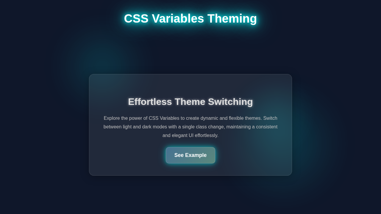
Imagine a stylish card on your webpage. Now, imagine clicking a button and seeing that card instantly transform! Its colors change, maybe even its fonts. That’s exactly what we will build. This isn’t just a fun trick; it’s a powerful technique. You can use it for dark mode, brand color switching, or user-preferred themes. Our card will be a perfect example of this. It will adapt with just a few lines of code. You will love how simple yet effective it is!
HTML Structure
Every great project starts with solid HTML. Our card will be simple yet semantic. We will create a div for our card and some elements inside it. This provides the foundation for our styling and dynamic changes. Here’s what our basic structure looks like:
index.html
<!DOCTYPE html>
<html lang="en">
<head>
    <meta charset="UTF-8">
    <meta name="viewport" content="width=device-width, initial-scale=1.0">
    <title>CSS Variables Theming</title>
    <link rel="stylesheet" href="styles.css">
</head>
<body>
    <!-- To switch to the light theme, add the class "light-theme" to the body tag:
         e.g., <body class="light-theme">
    -->
    <div class="theme-container">
        <h1>Dynamic Theming with CSS Variables</h1>
        <p>
            This example demonstrates how to implement a theme switcher using only CSS variables.
            By defining a set of variables in the <code>:root</code> selector and overriding them
            within a theme-specific class (e.g., <code>.light-theme</code>), you can easily
            change the look and feel of your website.
        </p>
        <p>
            Currently, the dark theme is active. To switch to the light theme, simply add the class
            <code>light-theme</code> to the <code><body></code> tag in your HTML file.
        </p>
        <a href="#" class="theme-button">Learn More</a>
    </div>
</body>
</html>
CSS Styling: Mastering CSS Variables Theming
Now for the truly exciting part: the CSS! This is where the magic of CSS Variables Theming shines. We will set up our base styles first. Then, we will define our CSS variables. These variables will hold our theme colors. We will also create different theme groups later. This lets us swap entire color palettes instantly. It’s truly game-changing for responsive design and user experience. Watch how easily we control our card’s appearance!
styles.css
/*
 * styles.css - CSS Variables Theming
 * A complete, working example for dynamic theming using only HTML and CSS variables.
 */

/* 1. Basic Reset & Box Sizing */
*, *::before, *::after {
    box-sizing: border-box; /* Ensures consistent padding and border behavior */
}

body {
    margin: 0;
    font-family: Arial, Helvetica, sans-serif; /* Safe, widely available fonts */
    line-height: 1.6;
    color: var(--text-color); /* Uses CSS variable for text color */
    background-color: var(--background-color); /* Uses CSS variable for background */
    transition: background-color 0.3s ease, color 0.3s ease; /* Smooth theme transition */
}

/* 2. CSS Variables for Theming */
/* Default Theme (Dark Theme) */
:root {
    --background-color: #1a1a2e;
    --card-background: #16213e;
    --text-color: #e0e0e0;
    --accent-color: #0f3460;
    --button-background: #e94560;
    --button-text: #ffffff;
    --border-color: #0f3460;
}

/* Light Theme Overrides */
/* Apply this class to the <body> tag to activate the light theme.
   e.g., <body class="light-theme"> */
.light-theme {
    --background-color: #f0f2f5;
    --card-background: #ffffff;
    --text-color: #333333;
    --accent-color: #b0c4de;
    --button-background: #6a5acd;
    --button-text: #ffffff;
    --border-color: #cccccc;
}

/* 3. Component Styling using CSS Variables */
.theme-container {
    max-width: 800px;
    width: 90%; /* Responsive width */
    margin: 50px auto;
    padding: 30px;
    background-color: var(--card-background); /* Uses card background variable */
    border-radius: 12px;
    box-shadow: 0 4px 20px rgba(0, 0, 0, 0.2);
    border: 1px solid var(--border-color); /* Uses border color variable */
    transition: background-color 0.3s ease, border-color 0.3s ease, box-shadow 0.3s ease;
}

h1, h2, h3 {
    color: var(--text-color); /* Uses text color variable */
    margin-top: 0;
    transition: color 0.3s ease;
}

p {
    color: var(--text-color); /* Uses text color variable */
    transition: color 0.3s ease;
}

.theme-button {
    display: inline-block;
    padding: 10px 20px;
    margin-top: 20px;
    background-color: var(--button-background); /* Uses button background variable */
    color: var(--button-text); /* Uses button text color variable */
    text-decoration: none;
    border-radius: 8px;
    font-weight: bold;
    transition: background-color 0.3s ease, color 0.3s ease, transform 0.2s ease;
    border: none;
    cursor: pointer;
}

.theme-button:hover {
    transform: translateY(-2px); /* Subtle hover effect */
    box-shadow: 0 4px 8px rgba(0, 0, 0, 0.2);
}
JavaScript to Bring Themes to Life
Of course, we need a way to actually switch those themes! That’s where a little JavaScript comes in. Don’t worry if JS feels new; we will keep it simple. We’ll add some buttons to our page. When you click a button, our JavaScript will change a class on our main HTML element. This class change will trigger our CSS variables to update. It’s a neat trick to connect user actions with visual updates. Let me explain what’s happening here:
How It All Works Together
You’ve built all the pieces. Now let’s see how they dance together! Understanding the flow is key. We start with our basic structure. Then, CSS adds beauty and defines the theme options. Finally, JavaScript provides the interaction. It’s a perfect example of front-end harmony.
The HTML Foundation
Our HTML provides the canvas for our creation. We have a div with the class card. Inside, there’s an image, a heading, and some paragraph text. There’s also a container for our theme-switching buttons. Each button will have a data-theme attribute. This attribute will tell our JavaScript which theme to activate. It’s a clean way to manage our theme choices. The body element is important too. We will use it to apply our theme classes. This helps us cascade our theme variables throughout the page.
Styling with CSS Variables Theming
Here’s the cool part about CSS Variables Theming! In our CSS, we first define our --primary-bg, --text-color, and other variables. These are custom properties. You can think of them as placeholders for values. We then apply these variables to our card’s elements. For example, background-color: var(--primary-bg);. This makes our card’s background use the value of --primary-bg.
Now, for the themes! We create different CSS rules for our theme classes. For instance, .theme-dark will redefine --primary-bg to a dark color. When the body gets the theme-dark class, these new variable values take over. This instantly changes all elements using those variables. This is incredibly powerful and efficient. You can learn more about CSS Custom Properties on MDN Web Docs. It makes styling dynamic with ease.
Pro Tip: CSS Variables (also called custom properties) allow you to store specific values. You can reuse these values throughout your stylesheet. They make your CSS much more maintainable and flexible!
Bringing Themes to Life with JavaScript
Our JavaScript is the conductor of this themed orchestra. First, it finds all our theme buttons. It then adds an ‘event listener’ to each one. This listener waits for a click. When a button is clicked, our JavaScript does two main things. It gets the data-theme attribute value from the clicked button. This tells us which theme to apply. Then, it updates the class attribute of our document.documentElement. This refers to the <html> tag.
Why the <html> tag? Because it’s the root of our document! Applying a class like theme-light or theme-dark there makes the theme variables defined within that class cascade down. This ensures all elements, like our card, pick up the new variable values. It’s a simple, effective way to switch global themes. You can read more about document.documentElement on MDN’s document.documentElement page.
We also make sure to remove any other theme classes first. This way, only one theme is active at a time. It keeps our styling clean and predictable.
Tips to Customise It
You’ve built an awesome dynamic card! But don’t stop here. The possibilities are endless!
- Add More Themes: Create a
theme-blue,theme-green, or even atheme-retro! Just define new variable values for each. - Save User Preference: Use
localStorageto remember the user’s last chosen theme. Your page will load with their preferred look! - Animate Transitions: Add a
transitionproperty to your CSS variables. This makes theme changes smooth and elegant. - Fluid Typography: Combine this with our CSS Clamp Fluid Typography Tutorial: HTML & CSS Only or CSS Clamp, Fluid Typography & Responsive Text Design lessons. Imagine a card where both colors and text sizes adapt! This makes your design truly responsive.
- Interactive Elements: Think about using an Accessible HTML Accordion: Pure CSS Details Element Design inside your card. It could reveal more content with themed styling.
Remember: Practice is key! Experiment with new colors, fonts, and layouts. The more you build, the more confident you’ll become. Keep coding!
Conclusion
Wow, you did it! You just built a fantastic dynamic themed card. You mastered the power of CSS Variables Theming. You now understand how HTML, CSS variables, and a little JavaScript work together. This creates a responsive and interactive user experience. This skill is incredibly valuable for any web developer. Share your themed cards with us! Show off your creativity. We can’t wait to see what you build next. Keep learning, keep experimenting, and happy coding!