Hey there, fellow coders! Have you ever wanted to add a sleek Tailwind Dark Mode toggle to your website? Maybe you felt overwhelmed by the thought of it. Well, guess what? You’re in the perfect spot! Today, we’re building a super cool dark mode switch. It uses HTML, Tailwind CSS, and a sprinkle of JavaScript. Get ready to give your users an awesome viewing experience!
What We Are Building
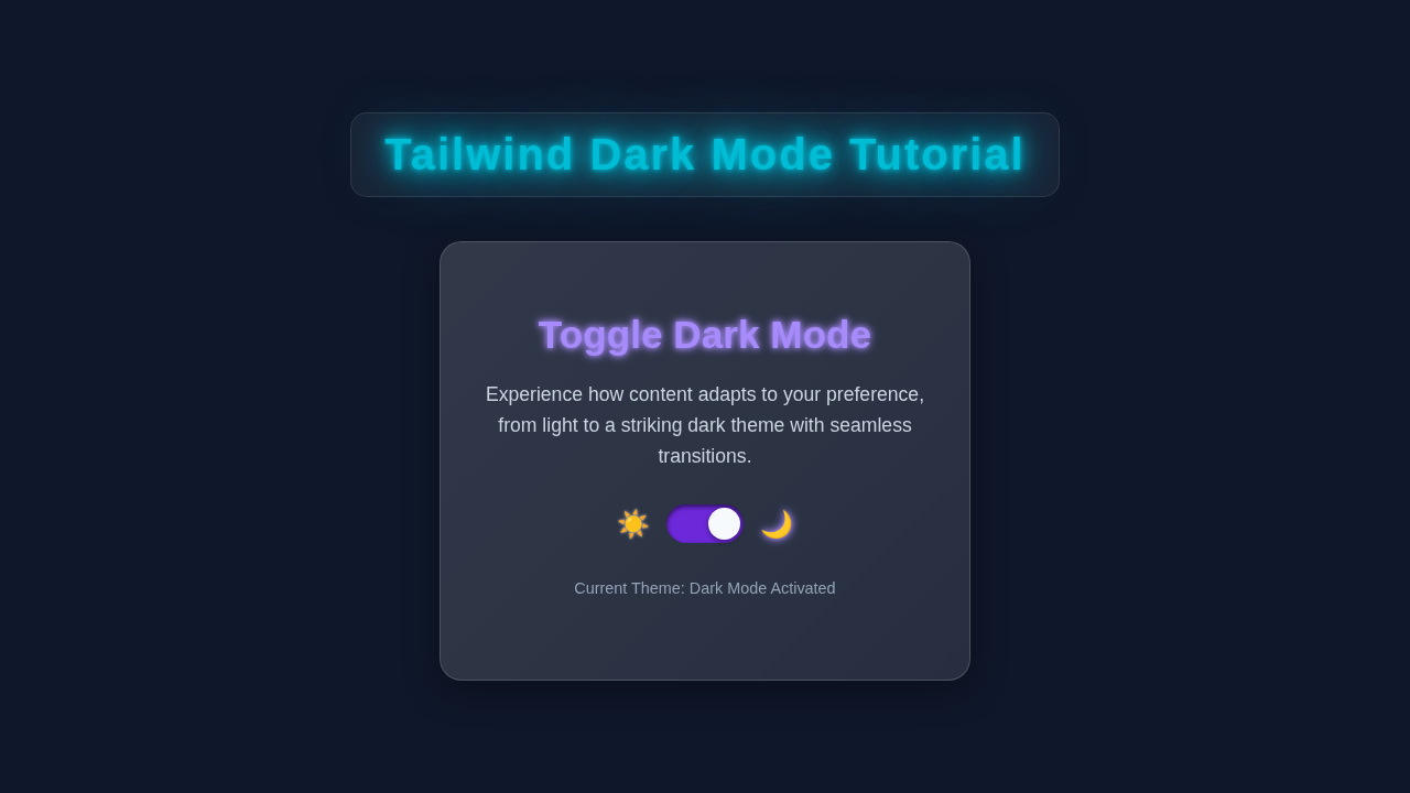
We are going to craft a stylish dark mode toggle today. Imagine a button that instantly switches your entire site from a bright, light theme to a cozy, dark one. This isn’t just a fancy trick, however. It genuinely improves user comfort. Think about late-night browsing! It also makes your website feel much more modern. We’ll make it look absolutely fantastic with Tailwind’s powerful utility classes. Furthermore, it will remember your preference. The best part? It’s surprisingly simple to implement. Let’s make your website shine, day or night!
HTML Structure
First things first, we need to lay down the basic bones of our project. This HTML file will hold all our content. It includes the main layout for our page. Most importantly, it will feature our special dark mode button. We’ll also link Tailwind CSS directly in the <head> section. This ensures all our styling is ready to go. You will see how neatly everything fits together. Get ready to see your page start to take shape!
index.html
<!DOCTYPE html>
<html lang="en">
<head>
    <meta charset="UTF-8">
    <meta name="viewport" content="width=device-width, initial-scale=1.0">
    <title>Tailwind Dark Mode Tutorial</title>
    <!-- Include Tailwind CSS CDN for easy setup -->
    <script src="https://cdn.tailwindcss.com"></script>
    <style>
        /* Ensure safe fonts and basic layout reset */
        body {
            font-family: Arial, Helvetica, sans-serif;
            box-sizing: border-box;
            margin: 0;
            padding: 0;
        }
        /* Ensure max-width and prevent horizontal scrollbars */
        .container {
            max-width: 100%;
            overflow-x: hidden;
        }
    </style>
</head>
<!--
    The `dark` class is added/removed from the <html> tag by script.js.
    Tailwind CSS uses this `dark` class to apply `dark:` utility styles.
    Transition classes add a smooth visual effect when switching themes.
-->
<body class="bg-white dark:bg-gray-900 text-gray-900 dark:text-gray-100 transition-colors duration-300">
    <div class="container mx-auto p-8 max-w-4xl min-h-screen flex flex-col justify-center items-center">
        <!-- Tutorial Title -->
        <h1 class="text-4xl font-extrabold mb-8 text-indigo-700 dark:text-indigo-400 transition-colors duration-300">
            Tailwind Dark Mode Tutorial
        </h1>

        <!-- Dark Mode Toggle Component Card -->
        <div class="bg-gray-100 dark:bg-gray-800 p-8 rounded-lg shadow-xl border border-gray-200 dark:border-gray-700 w-full max-w-md transition-all duration-300">
            <h2 class="text-2xl font-semibold mb-4 text-gray-800 dark:text-gray-200 transition-colors duration-300">
                Switch Theme
            </h2>
            <p class="mb-6 text-gray-700 dark:text-gray-300 transition-colors duration-300">
                Click the button below to toggle between light and dark themes.
            </p>

            <!-- Toggle Switch built with Tailwind CSS -->
            <div class="flex items-center justify-center space-x-4 mb-6">
                <span class="text-xl">☀️</span>
                <label for="darkModeToggle" class="relative inline-flex items-center cursor-pointer">
                    <!-- Hidden checkbox is the actual state controller -->
                    <input type="checkbox" id="darkModeToggle" class="sr-only peer">
                    <!-- Visual part of the toggle switch -->
                    <div class="w-14 h-8 bg-gray-300 peer-focus:outline-none peer-focus:ring-4 peer-focus:ring-blue-300 dark:peer-focus:ring-blue-800 rounded-full peer dark:bg-gray-700 peer-checked:after:translate-x-full peer-checked:after:border-white after:content-[''] after:absolute after:top-[6px] after:left-[6px] after:bg-white after:border-gray-300 after:border after:rounded-full after:h-5 after:w-5 after:transition-all dark:border-gray-600 peer-checked:bg-blue-600"></div>
                </label>
                <span class="text-xl">🌙</span>
            </div>

            <p class="text-sm text-gray-600 dark:text-gray-400 transition-colors duration-300">
                Your preference will be saved for your next visit.
            </p>
        </div>

        <!-- Example Content to show theme change -->
        <div class="mt-10 p-6 rounded-md bg-white dark:bg-gray-700 shadow-md w-full max-w-md transition-all duration-300 border border-gray-200 dark:border-gray-600">
            <h3 class="text-xl font-semibold mb-2 text-gray-800 dark:text-gray-200 transition-colors duration-300">
                Dynamic Content Area
            </h3>
            <p class="text-gray-700 dark:text-gray-300 transition-colors duration-300">
                This text and background will change based on the selected theme. Observe how Tailwind's dark mode utility classes (`dark:bg-`, `dark:text-`) adapt the styling.
            </p>
            <button class="mt-4 px-4 py-2 bg-blue-500 hover:bg-blue-600 text-white font-semibold rounded-md shadow-md transition-colors duration-300">
                Learn More
            </button>
        </div>

    </div>

    <!-- Link to the JavaScript file that handles the dark mode logic -->
    <script src="script.js"></script>
</body>
</html>
CSS Styling
You might be wondering, “Where is the typical CSS file for this project?” Here’s the cool part about using Tailwind CSS! We won’t be writing much, if any, custom CSS. Instead, we’ll style our elements directly in the HTML. We’ll use Tailwind’s powerful utility classes. Think of classes like bg-white for a light background. Then, for dark mode, we’ll use dark:bg-gray-800. This system allows for incredibly fast development. It keeps your styling organized and right where you need it. We even add a smooth transition property. This makes the theme switch look incredibly polished and seamless. Tailwind handles the heavy lifting!
JavaScript
Now, for the brains of our dark mode operation! JavaScript is what brings our toggle to life. It makes everything interactive. Our script will patiently wait for clicks on our special button. When a click happens, it instantly changes the site’s entire theme. But that’s not all! It also cleverly remembers your choice. This means if you prefer dark mode, the site will greet you in dark mode next time. This ensures a consistent and personalized experience for all your users. It’s truly magic in action!
script.js
// script.js

document.addEventListener('DOMContentLoaded', () => {
    // Get the dark mode toggle checkbox and the root HTML element
    const darkModeToggle = document.getElementById('darkModeToggle');
    const htmlElement = document.documentElement;

    /**
     * Sets the theme of the page.
     * @param {boolean} isDark - True to set dark mode, false for light mode.
     */
    function setTheme(isDark) {
        if (isDark) {
            htmlElement.classList.add('dark');
            darkModeToggle.checked = true; // Ensure toggle reflects the state
        } else {
            htmlElement.classList.remove('dark');
            darkModeToggle.checked = false; // Ensure toggle reflects the state
        }
    }

    // 1. Check for a saved theme preference in localStorage
    const savedTheme = localStorage.getItem('theme');
    // 2. Check for the user's system preference (e.g., OS theme settings)
    const prefersDark = window.matchMedia('(prefers-color-scheme: dark)').matches;

    // Apply theme based on preference hierarchy:
    // 1. User's explicit choice (savedTheme)
    // 2. System preference (prefersDark) if no explicit choice
    if (savedTheme === 'dark') {
        setTheme(true);
    } else if (savedTheme === 'light') {
        setTheme(false);
    } else {
        // If no saved preference, default to system preference
        setTheme(prefersDark);
    }

    // Listen for changes on the dark mode toggle
    darkModeToggle.addEventListener('change', (event) => {
        if (event.target.checked) {
            setTheme(true);
            localStorage.setItem('theme', 'dark'); // Save user's preference
        } else {
            setTheme(false);
            localStorage.setItem('theme', 'light'); // Save user's preference
        }
    });

    // Optional: Listen for system theme changes and update if no explicit preference is set
    window.matchMedia('(prefers-color-scheme: dark)').addEventListener('change', (event) => {
        // Only react to system changes if the user hasn't explicitly set a theme
        if (!localStorage.getItem('theme')) {
            setTheme(event.matches);
        }
    });
});
How It All Works Together
Let’s peel back the layers and break down the magic! Each piece of our project plays a truly vital role. Understanding this flow helps you build more dynamic and responsive sites. We’ll walk through it step-by-step. You’ll grasp the full picture in no time!
Setting the Stage: Your HTML as the Theme Master
Our HTML file acts as the foundation. It initially sets the stage for a light theme. Look closely at the <html> element. We’ll apply our theme classes right there! This element becomes the “source of truth” for our entire page’s theme. Within the HTML, we include a button. This button is what triggers the theme change. Then, Tailwind CSS steps in. It’s constantly listening for a special dark class. This class exists on that very same <html> element. When this dark class is present, Tailwind knows what to do. It then intelligently applies all the specific dark: utility styles. For instance, a background set with bg-white will instantly switch to dark:bg-gray-800. This simple yet powerful mechanism gives us our distinctive Tailwind Dark Mode look. The initial setup is therefore very important.
The Toggle Mechanic: JavaScript Makes it Dynamic
Our JavaScript truly springs into action when you click that toggle button. It’s quite efficient! The script specifically targets the <html> element. This is the global theme controller, remember? First, it checks to see if the all-important dark class is already present. If it is, that means we are currently in dark mode. The script then wisely removes the dark class. This action instantly switches the entire site back to its light mode. Conversely, if the dark class is completely absent, it means we are in light mode. The script then adds the dark class. This action immediately applies all the dark: prefixed utility classes that Tailwind provides. It’s a simple, yet incredibly powerful, toggle mechanism. This makes the theme change feel instant and responsive to the user’s interaction.
Local Storage Magic: Remembering User Preferences
This is where the real user experience comes in! After you toggle the theme, our JavaScript doesn’t forget your choice. It intelligently saves your preference. For this, it uses a built-in browser feature called localStorage. Think of localStorage as a small, personal, and persistent memory. It lives right inside your user’s web browser. If you choose dark mode, that specific preference is securely stored. It stays there even after you close the browser! So, when you visit the site again, our script performs a quick check. It looks inside localStorage for your saved theme. It then automatically applies your preferred theme right away. No more manually switching every single time you visit! This feature truly makes your site user-friendly. For more on how browser storage works, be sure to check out the official MDN Web Storage API docs. It’s a fundamental concept for modern web apps!
Tips to Customise It
You’ve just built a fantastic and functional dark mode toggle! Now, let’s explore some awesome ways to make it uniquely yours. Customization is where the fun truly begins!
- Change the Icons: Don’t stick with the default sun and moon! Swap out those SVG icons for something more unique. You could use different Tailwind SVG Icons from a library like Heroicons. Or, you might even try animated icons for extra flair!
- Add More Themes: Why stop at just dark and light? Experiment with a “sepia” or “midnight blue” theme. You would add more specific classes to your HTML. Then, you’d extend your JavaScript logic to handle these new options. It opens up a world of possibilities!
- Animate Transitions Further: Tailwind’s
transition-colorsis already pretty cool. But you can do more! Try usingtransition-allwith custom durations and easing functions. This makes the theme switch feel even smoother and more engaging for your users. For deeper dives into CSS transitions, check out this CSS-Tricks article on transitions. - Respect OS Preferences: Implement a system to check the user’s operating system preference. You can use
window.matchMedia('(prefers-color-scheme: dark)')for this. This provides an initial theme based on their system settings. It’s a thoughtful touch for an improved user experience.
Pro Tip: Don’t be afraid to break things! That’s genuinely how we learn best in coding. Experiment freely with different Tailwind classes and JavaScript logic. The more you tinker, the more you’ll understand!
Conclusion
Wow, you did it! You successfully built a dynamic and interactive Tailwind Dark Mode toggle. It’s fully functional with HTML, Tailwind CSS, and JavaScript. This is a massive achievement! You’ve gained incredibly valuable skills today. You learned about utility-first styling. You explored client-side scripting. And you mastered local storage for remembering user preferences. This is a huge, positive step in your web development journey! Now, go show off your awesome creation. Share it with your friends or online communities. We can’t wait to see what you build next on procoder09.com! Perhaps you’ll even integrate this awesome feature into a responsive navbar! The possibilities are endless!
Keep Learning: Every single line of code you write builds your expertise. Stay curious, keep exploring, and always push your coding limits! Your future self will thank you.