Hey there, future web wizard! If you’ve been curious about adding a crisp Tailwind Dark Mode toggle to your projects, but felt a bit lost, you are in the perfect spot. Today, we’re going to build something super cool together. We will create a custom dark mode switch that makes your website look fantastic day or night. It’s a powerful feature your users will absolutely love. Plus, you’ll learn a ton of great techniques along the way!
What We Are Building: Your Very Own Tailwind Dark Mode Toggle!
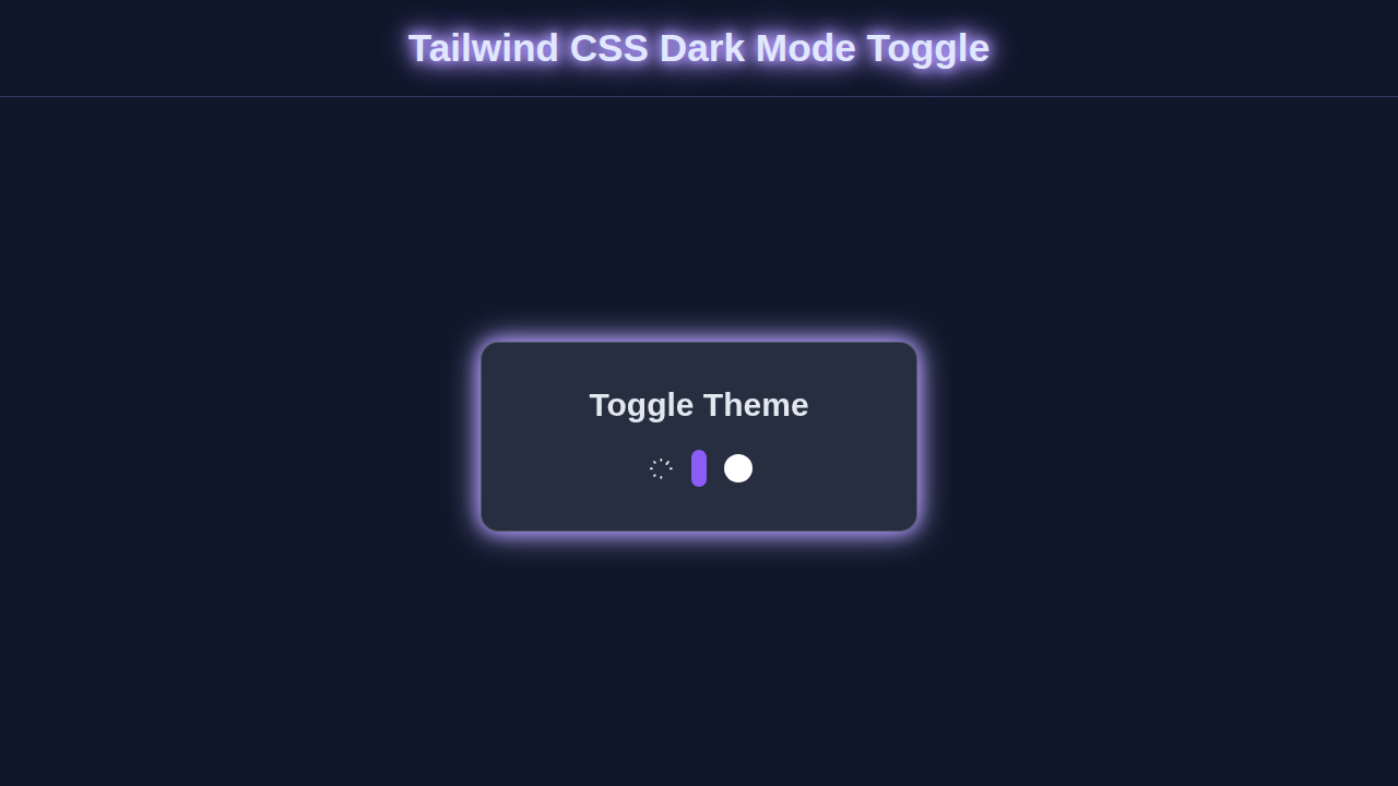
Imagine a website that gracefully shifts from a bright, airy design to a sleek, eye-friendly dark theme. That’s exactly what we’re crafting today! We’ll build a neat little toggle button. When you click it, your entire page will transform. This isn’t just about aesthetics, though. Dark mode helps reduce eye strain, especially in low-light conditions. It also saves a tiny bit of battery on OLED screens. We’re going to make this toggle super interactive and stylish using pure Tailwind CSS and a touch of JavaScript. Get ready to impress!
HTML Structure
First things first, let’s lay down the foundation with some clean HTML. We need a main container for our toggle. This div will hold everything neatly. Inside this container, we will include a clickable <button>. This button is what your users will interact with. Importantly, we’ll put two <svg> icons inside our button. One SVG will represent the sun, for light mode. The other will represent the moon, for dark mode. These icons will visually tell the user if dark mode is currently active or not. We use specific IDs for these icons. This makes it easy for our JavaScript to find and manipulate their visibility later. This clean structure helps keep our code organized and easy to understand. Here’s how we set up our basic elements:
index.html
<!DOCTYPE html>
<html lang="en">
<head>
    <meta charset="UTF-8">
    <meta name="viewport" content="width=device-width, initial-scale=1.0">
    <title>Tailwind CSS Dark Mode Toggle</title>
    <!-- Tailwind CSS CDN for rapid prototyping. For production, compile Tailwind locally. -->
    <script src="https://cdn.tailwindcss.com"></script>
    <!-- Configure Tailwind to use 'class' strategy for dark mode -->
    <script>
        tailwind.config = {
            darkMode: 'class',
            theme: {
                extend: {},
            }
        }
    </script>
    <!-- Link to your custom styles (for basic resets and safe fonts) -->
    <link href="./styles.css" rel="stylesheet">
    <!-- Optional: Add a simple favicon for better user experience -->
    <link rel="icon" href="data:image/svg+xml,<svg xmlns=%22http://www.w3.org/2000/svg%22 viewBox=%220 0 100 100%22><text y=%22.9em%22 font-size=%2290%22>💡</text></svg>">
</head>
<!--
    The `dark:` prefix applies styles only when the `dark` class is present on the `html` element.
    The `bg-white dark:bg-gray-900` ensures a white background in light mode and dark gray in dark mode.
    `transition-colors` smoothly animates background color changes.
-->
<body class="bg-white dark:bg-gray-900 transition-colors duration-500 min-h-screen flex items-center justify-center">

    <!--
        Component Container:
        - `p-8`: Padding
        - `rounded-lg`: Rounded corners
        - `shadow-xl`: Large shadow
        - `bg-gray-100 dark:bg-gray-800`: Light gray background in light mode, dark gray in dark mode.
        - `transition-colors duration-500`: Smooth transition for background.
        - `flex flex-col items-center gap-6`: Flexbox for vertical centering and spacing.
        - `max-w-sm w-full`: Responsive width, max-width 384px.
        - `border border-gray-200 dark:border-gray-700`: Subtle border for definition.
    -->
    <div class="p-8 rounded-lg shadow-xl bg-gray-100 dark:bg-gray-800 transition-colors duration-500 flex flex-col items-center gap-6 max-w-sm w-full border border-gray-200 dark:border-gray-700">
        <h1 class="text-2xl font-bold text-gray-900 dark:text-white transition-colors duration-500">
            Toggle Dark Mode
        </h1>

        <!-- Toggle Switch Group -->
        <div class="flex items-center space-x-4">
            <!-- Sun Icon (Light Mode representation) -->
            <!--
                `text-yellow-500`: Yellow in light mode.
                `dark:text-gray-400`: Muted gray in dark mode.
            -->
            <svg xmlns="http://www.w3.org/2000/svg" class="h-6 w-6 text-yellow-500 dark:text-gray-400 transition-colors duration-500" fill="none" viewBox="0 0 24 24" stroke="currentColor">
                <path stroke-linecap="round" stroke-linejoin="round" stroke-width="2" d="M12 3v1m0 16v1m9-9h1M3 12H2m15.325-4.575l.707-.707M6.071 18.325l-.707.707M18.325 6.071l.707-.707M6.071 6.071l-.707-.707" />
            </svg>

            <!-- Toggle Switch -->
            <label for="darkModeToggle" class="relative inline-flex items-center cursor-pointer">
                <!-- Hidden checkbox input -->
                <input type="checkbox" id="darkModeToggle" class="sr-only peer">

                <!--
                    Visual representation of the toggle switch (the track and thumb).
                    - `w-14 h-8`: Sets width and height for the track.
                    - `bg-gray-300 dark:bg-gray-700`: Light gray track in light mode, dark gray in dark mode.
                    - `peer-focus:ring-4`: Focus ring for accessibility.
                    - `rounded-full`: Makes the track fully rounded.
                    - `peer-checked:bg-purple-600`: Track turns purple when checked (dark mode active).

                    - `after:content-[''] after:absolute`: Creates the draggable thumb using an `::after` pseudo-element.
                    - `after:top-[4px] after:left-[4px]`: Positions the thumb within the track.
                    - `after:bg-white after:border-gray-300 after:border after:rounded-full after:h-6 after:w-6`: Styles the white circular thumb.
                    - `after:transition-all`: Animates the thumb's movement.
                    - `peer-checked:after:translate-x-full`: Moves the thumb to the right when checked.
                    - `peer-checked:after:border-white`: Thumb border turns white when checked.
                -->
                <div class="w-14 h-8 bg-gray-300 peer-focus:outline-none peer-focus:ring-4 peer-focus:ring-blue-300 dark:peer-focus:ring-blue-800 rounded-full peer dark:bg-gray-700 peer-checked:after:translate-x-full peer-checked:after:border-white after:content-[''] after:absolute after:top-[4px] after:left-[4px] after:bg-white after:border-gray-300 after:border after:rounded-full after:h-6 after:w-6 after:transition-all dark:border-gray-600 peer-checked:bg-purple-600"></div>
            </label>

            <!-- Moon Icon (Dark Mode representation) -->
            <!--
                `text-gray-400`: Muted gray in light mode.
                `dark:text-purple-400`: Highlighted purple in dark mode.
            -->
            <svg xmlns="http://www.w3.org/2000/svg" class="h-6 w-6 text-gray-400 dark:text-purple-400 transition-colors duration-500" fill="none" viewBox="0 0 24 24" stroke="currentColor">
                <path stroke-linecap="round" stroke-linejoin="round" stroke-width="2" d="M20.354 15.354A9 9 0 018.646 3.646 9.003 9.003 0 0012 21a9.003 9.003 0 008.354-5.646z" />
            </svg>
        </div>
    </div>

    <!-- Link to your JavaScript for dark mode logic -->
    <script src="./script.js"></script>
</body>
</html>
CSS Styling
Now for the exciting part – making it look good with Tailwind CSS! When working with Tailwind, most of your “styling” magic happens directly in your HTML. You apply utility classes to your elements. This keeps your styles incredibly consistent and easy to manage across your project. We won’t be writing much custom CSS in a separate file for this specific toggle. Tailwind handles almost everything we need. From setting background colors like bg-white to defining text colors like text-gray-900, we’ll ensure our elements adapt beautifully. The dark: variant in Tailwind is super powerful. It applies styles only when the dark class is present on the <html> element. This is the core of our dark mode switching!
Let me clarify for the reader: Every Tailwind project needs a main CSS file. This file usually imports Tailwind’s base styles, components, and utilities. It is where your initial Tailwind setup directives, like @tailwind base;, @tailwind components;, and @tailwind utilities;, would typically reside. For this tutorial, our styling focus will be on applying Tailwind’s amazing class system directly in our HTML, rather than adding custom CSS here.
styles.css
/*
 * styles.css
 * This file contains minimal global CSS.
 * Tailwind CSS utility classes are directly included via CDN in index.html for simplicity in this tutorial.
 * For production, you would typically compile Tailwind CSS locally into a file like this.
 */

/* Apply box-sizing globally for consistent layout */
*, *::before, *::after {
    box-sizing: border-box;
}

/* Ensure safe fonts are used */
body {
    font-family: Arial, Helvetica, sans-serif;
}
JavaScript
Next up, we add the “magic” with JavaScript. Our JavaScript code will bring our toggle to life and make it fully interactive. It will listen intently for clicks on our shiny new toggle button. When you click it, the script will instantly change the visual theme of your entire page. Even better, it remembers your preference! This means if you switch to dark mode, your site will kindly open in dark mode next time you visit. We’ll also make it smart enough to check your browser’s default preference. This ensures a great experience right from the start. We’re building a truly user-friendly feature here!
script.js
document.addEventListener('DOMContentLoaded', () => {
    const darkModeToggle = document.getElementById('darkModeToggle');
    const htmlElement = document.documentElement; // The <html> tag

    // Function to set theme
    const setTheme = (theme) => {
        if (theme === 'dark') {
            htmlElement.classList.add('dark');
            darkModeToggle.checked = true;
            localStorage.setItem('theme', 'dark');
        } else {
            htmlElement.classList.remove('dark');
            darkModeToggle.checked = false;
            localStorage.setItem('theme', 'light');
        }
    };

    // Check for saved theme in localStorage or system preference
    const savedTheme = localStorage.getItem('theme');
    const prefersDark = window.matchMedia('(prefers-color-scheme: dark)').matches;

    if (savedTheme) {
        // Apply saved theme
        setTheme(savedTheme);
    } else if (prefersDark) {
        // Apply system preference if no saved theme
        setTheme('dark');
    } else {
        // Default to light theme
        setTheme('light');
    }

    // Event listener for toggle switch
    darkModeToggle.addEventListener('change', () => {
        if (darkModeToggle.checked) {
            setTheme('dark');
        } else {
            setTheme('light');
        }
    });

    // Optional: Listen for system theme changes
    window.matchMedia('(prefers-color-scheme: dark)').addEventListener('change', (e) => {
        if (!localStorage.getItem('theme')) { // Only react if user hasn't explicitly set a theme
            setTheme(e.matches ? 'dark' : 'light');
        }
    });
});
How It All Works Together: Bringing Our Tailwind Dark Mode to Life
It’s time to connect all the pieces! We’ve got our HTML structure ready. Our elements are looking sharp with Tailwind. And our JavaScript is poised to add interactivity. Let’s break down how these parts communicate to create a seamless user experience.
The HTML Foundation
Our HTML provides the essential building blocks for our toggle. We start with a main <div> element. This <div> acts as a simple container, holding our interactive components neatly together. Inside this, we place a <button> element. This button is crucial as it’s the primary interactive element your users will click. Crucially, we’ve embedded two distinct <svg> icons within this button. One SVG icon beautifully represents the sun. This is our visual cue for light mode. The other SVG icon depicts the moon, serving as the visual indicator for dark mode. These icons are thoughtfully given unique IDs, such as sun-icon and moon-icon. These IDs are vital! They provide clear hooks for our JavaScript. Our script will use these IDs to easily find and toggle the visibility of each icon. This setup ensures your users always know which mode is active.
Styling with Tailwind CSS
This is where Tailwind CSS truly shines and makes our dark mode possible! We strategically apply Tailwind’s utility classes to our HTML elements. For instance, you will see classes like bg-white and text-gray-900 for light mode styling. Then, for dark mode, we use dark:bg-gray-800 and dark:text-gray-100. The dark: prefix is incredibly powerful. It’s a special Tailwind variant. It tells the browser to apply that specific style only when the dark class is present on the <html> element (which is document.documentElement). This is the core mechanism for switching themes! We also apply classes like transition-colors to elements. This class ensures a smooth, animated change between light and dark colors. It makes the theme switch feel polished and professional. You can learn even more about styling SVG icons with Tailwind CSS in our dedicated guide. This will help you customize your toggle’s appearance and other icons even further, adding your unique touch.
JavaScript’s Role in Theme Toggling
Our JavaScript is the unsung hero, the brain behind our dynamic theme switcher. It performs several critical tasks to make our dark mode toggle work seamlessly. First, upon page load, it intelligently checks your system’s default preference. It does this using window.matchMedia('(prefers-color-scheme: dark)'). This line of code helps your website respect your operating system’s dark mode settings right from the start. What a thoughtful feature! Next, our script looks for a previously saved theme preference. It checks your browser’s localStorage. If you’ve visited the site before and set a theme, it remembers your choice. This provides a consistent experience across visits. The real action happens when you click the toggle button. An event listener, patiently waiting, springs into action! It flips the dark class on the document.documentElement (that’s the <html> tag, remember?). As soon as this class changes, all those dark: utility classes we applied with Tailwind magically activate or deactivate. This is the core switch! Finally, after changing the theme, our JavaScript updates localStorage with your new preference. It also cleverly switches the visibility of the sun and moon icons. This gives you instant, clear visual feedback. The classList.toggle() method is a handy helper here. It’s a super efficient way to add or remove a class from an element. You can read more about the versatile classList API on MDN Web Docs. This method simplifies our theme-switching logic greatly, making our code clean and effective.
Putting it All Together
When the page first loads, our JavaScript immediately takes charge. It makes a smart decision about the initial theme. First, it peeks into localStorage to see if you have a saved preference. If not, it gracefully falls back to checking your system’s prefers-color-scheme. Based on this, it adds or removes the dark class on the main <html> element. This sets the stage. Then, the user interaction kicks in! When you click our custom toggle, the JavaScript listener detects it. It then swiftly flips that dark class on the <html> element. This single action is powerful. Tailwind CSS, which has been waiting patiently, instantly re-renders the page. It applies all the correct light or dark: prefixed styles. Meanwhile, our JavaScript also ensures that the appropriate sun or moon icon is visible. It’s a beautifully choreographed dance between HTML providing the structure, Tailwind CSS delivering the adaptive styles, and JavaScript bringing dynamic life to the entire process! We’ve explored dark mode before, and this tutorial offers a fresh, custom approach building on those ideas. For another perspective on building similar features, definitely check out our Tailwind CSS Dark Mode Toggle Tutorial with HTML & JS.
Pro Tip: Always consider accessibility! Make sure your dark mode still offers enough contrast for all users. High contrast text and elements are super important.
Tips to Customise It
You’ve built an awesome toggle! Now, let’s make it uniquely yours.
- Change the Icons: Not a fan of the sun and moon? Swap them out! You could use a lightbulb, an eye, or any other icon that fits your brand. You can even use different SVG sets or icon libraries for more variety.
- Add More Animations: Experiment with Tailwind’s animation utility classes. Make the icons spin or fade when toggled. A subtle animation can really elevate the user experience, making your site feel more dynamic.
- Theme Presets: Instead of just light/dark, why not offer multiple themes? You could have a “midnight blue” or “forest green” option for your users. This would involve using CSS variables, also known as CSS Custom Properties, and updating them with JavaScript.
- Integrate into a Navbar: This toggle is perfect for a navigation bar. Imagine integrating it seamlessly into a responsive navbar with Tailwind CSS. Your users will find it super handy right at the top of the page, making it easily accessible.
Remember: Every line of code you write is a step towards mastery. Keep experimenting, keep building, and never stop learning!
Conclusion
Wow, you did it! You just built a fully functional Tailwind Dark Mode toggle from scratch. That’s a huge achievement! You’ve learned how HTML provides structure, Tailwind CSS adds beautiful styling, and JavaScript brings it all to life. This custom toggle is a fantastic addition to any website. It shows your attention to detail and user experience. Go ahead and integrate it into your projects. Share your creations online – we’d love to see what you build! Keep coding, keep creating, and keep shining (or dimming, as per the theme)!