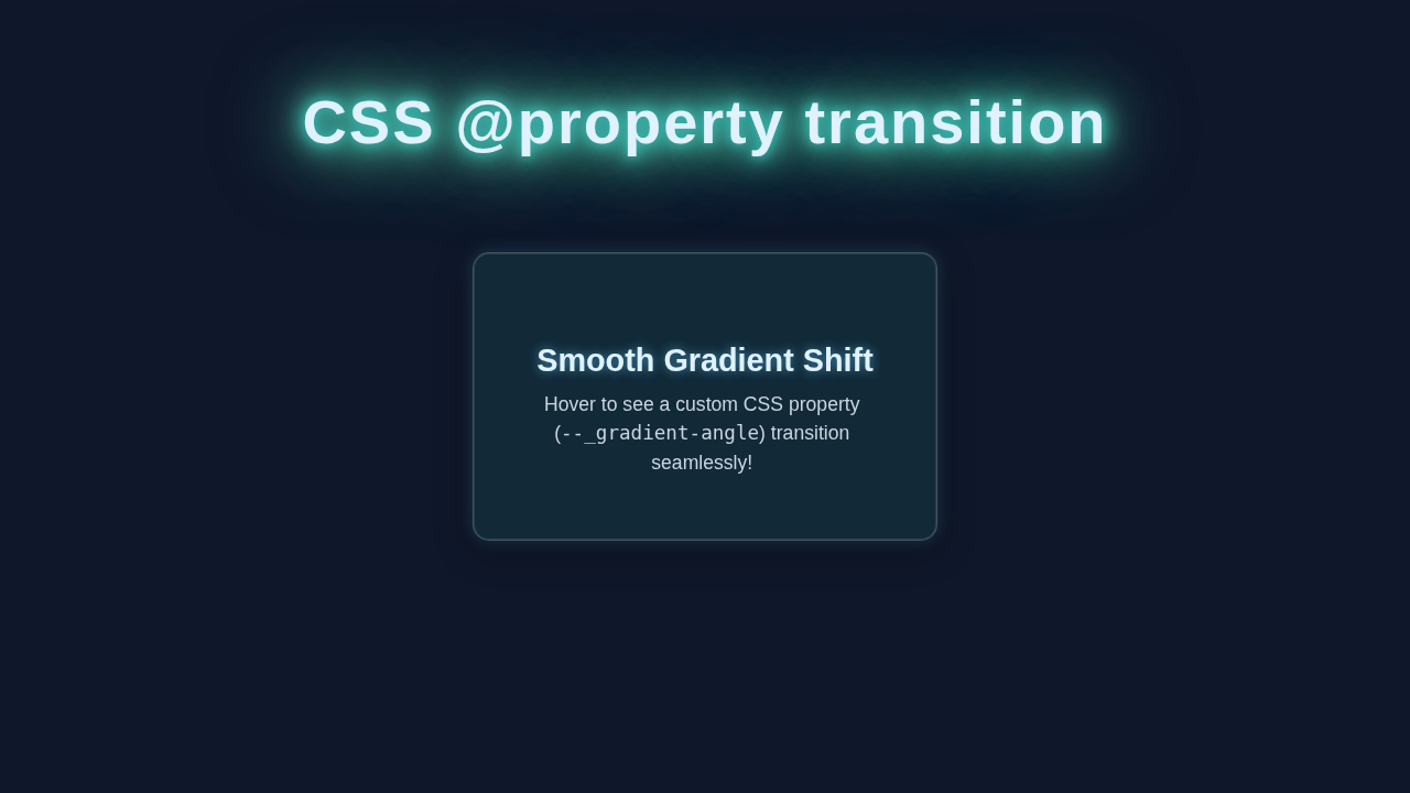
Hey there, awesome developers! If you’ve ever felt limited by CSS when trying to animate custom properties, you are in for a treat. Today, we’re diving deep into the world of CSS @property Transition. This powerful feature unlocks entirely new animation possibilities. We will build a cool interactive card that dynamically changes its appearance. Get ready to elevate your CSS game!
What We Are Building: A Dynamic Interactive Card
Imagine a sleek card that springs to life on hover. Its background color smoothly shifts, creating a delightful visual effect. We will craft a simple yet engaging component. This card demonstrates the true power of animating CSS custom properties. It’s not just a static element anymore. It becomes a fluid, responsive part of your UI. This project is useful for interactive buttons, navigation items, or even hero sections. It adds a touch of modern polish to any website.
HTML Structure: Our Simple Card Element
First, we need a basic container for our interactive card. Our HTML will be super straightforward. We will use a single div element. This div will hold all our styling and animation magic. It keeps our structure clean and easy to understand.
index.html
<!DOCTYPE html>
<html lang="en">
<head>
    <meta charset="UTF-8">
    <meta name="viewport" content="width=device-width, initial-scale=1.0">
    <title>CSS @property Transition Tutorial</title>
    <link rel="stylesheet" href="styles.css">
</head>
<body>
    <header class="page-header">
        <h1>CSS <span>@property</span> Transition Demo</h1>
        <p>Animate custom CSS properties with native browser support.</p>
    </header>

    <main class="container">
        <div class="property-card">
            <h2>Animated Border Glow</h2>
            <p>Hover over this card to witness a custom CSS property, <code>--_border-hue</code>, smoothly transition its value. This allows for dynamic and flexible animations previously only possible with JavaScript!</p>
            <div class="hover-hint">(Hover me!)</div>
        </div>
    </main>
</body>
</html>
CSS Styling: Bringing Our Card to Life with CSS @property Transition
Now for the fun part: styling our card! We will define its size, shape, and initial appearance. The real star here is the @property rule. It tells the browser how to interpret our custom CSS variables. This makes them animatable. We will set up a beautiful transition for our card. This ensures a smooth visual change on hover. Furthermore, we’ll apply some basic layout styles. This will center our card nicely on the page.
styles.css
/* Global Box Model Reset */
* {
    box-sizing: border-box;
    margin: 0;
    padding: 0;
}

/* The core of this tutorial: Defining a custom CSS property that can be transitioned. */
/* The @property rule sets up the custom property with its type, inheritance, and initial value. */
:root {
    @property --_border-hue {
        syntax: "<number>";     /* Defines the expected data type. Here, a numerical value. */
        inherits: false;        /* Specifies if the property is inherited by child elements. */
        initial-value: 0;       /* The starting value for animations or transitions. */
    }

    /* Global CSS Variables for consistent theming */
    --background-color: #1a1a2e;
    --text-color: #e0e0e0;
    --accent-color-1: #00bcd4; /* Cyan */
    --accent-color-2: #8e24aa; /* Purple */
    --card-bg: rgba(255, 255, 255, 0.08);
}

/* Body Styling */
body {
    font-family: Arial, Helvetica, sans-serif; /* Safe font stack */
    background-color: var(--background-color);
    color: var(--text-color);
    min-height: 100vh;
    display: flex;
    flex-direction: column;
    align-items: center;
    justify-content: center;
    overflow: hidden; /* Prevent scrollbars */
    padding: 20px;
}

/* Page Header Styling */
.page-header {
    text-align: center;
    margin-bottom: 40px;
    max-width: 800px;
}

.page-header h1 {
    font-size: 2.8rem;
    color: var(--accent-color-1);
    margin-bottom: 10px;
    text-shadow: 0 0 15px var(--accent-color-1);
}

.page-header h1 span {
    color: var(--accent-color-2);
    text-shadow: 0 0 15px var(--accent-color-2);
}

.page-header p {
    font-size: 1.1rem;
    color: #a0a0a0;
}

/* Main Container for the Card */
.container {
    display: flex;
    justify-content: center;
    align-items: center;
    width: 100%;
}

/* The @property Transition Card Component */
.property-card {
    background: var(--card-bg);
    border-radius: 12px;
    padding: 30px;
    width: 100%;
    max-width: 450px;
    text-align: center;
    box-shadow: 0 4px 15px rgba(0, 0, 0, 0.2);
    position: relative;
    overflow: hidden;
    cursor: pointer;
    backdrop-filter: blur(5px); /* Glassmorphism effect */
    border: 1px solid rgba(255, 255, 255, 0.1);

    /* Define all transitions, including the custom property */
    /* This line tells the browser to animate changes to --_border-hue */
    transition: transform 0.3s ease, box-shadow 0.3s ease,
                --_border-hue 1.5s ease-in-out; /* The magic happens here! */
    transform: translateZ(0); /* Promotes element to its own layer for smooth animation */
}

/* Pseudo-element for the animated border glow effect */
.property-card::before {
    content: '';
    position: absolute;
    inset: -3px; /* Positions the pseudo-element slightly outside the card */
    border-radius: 15px; /* Slightly larger radius than card for effect */
    /* Use the custom property --_border-hue to control the starting angle of the conic gradient */
    background: conic-gradient(from var(--_border-hue)deg,
                               var(--accent-color-1) 0%,
                               transparent 20%,
                               transparent 80%,
                               var(--accent-color-2) 100%);
    filter: blur(10px) opacity(0.7);
    z-index: -1;
    /* Ensure the pseudo-element also transitions its relevant properties */
    transition: filter 0.3s ease, var(--_border-hue) 1.5s ease-in-out; /* Matches card's custom property transition */
    pointer-events: none; /* Allows hover events to pass through to the main card */
}

/* Hover Effect for the Card */
.property-card:hover {
    transform: translateY(-8px) scale(1.02); /* Lifts and slightly enlarges the card */
    box-shadow: 0 10px 25px rgba(0, 0, 0, 0.3); /* Enhances the card shadow */

    /* REQUIRED: Update the custom property on hover */
    /* Because --_border-hue is defined with @property and transitioned on the card, */
    /* this change will animate smoothly over 1.5 seconds. */
    --_border-hue: 360; /* Rotates the hue value by 360 degrees */
}

/* Hover effect for the pseudo-element glow */
.property-card:hover::before {
    filter: blur(15px) opacity(1); /* Intensifies and spreads the glow */
    /* The --_border-hue change is already handled by the card's transition */
}

/* Card Content Styling */
.property-card h2 {
    font-size: 1.6rem;
    color: var(--accent-color-1);
    margin-bottom: 15px;
    text-shadow: 0 0 10px rgba(0, 188, 212, 0.3); /* Initial glow for title */
}

.property-card p {
    font-size: 0.95rem;
    line-height: 1.6;
    color: #c0c0c0;
    margin-bottom: 20px;
}

.property-card code {
    background-color: rgba(255, 255, 255, 0.15);
    padding: 3px 6px;
    border-radius: 4px;
    font-family: 'Courier New', Courier, monospace;
    color: var(--accent-color-2);
}

.hover-hint {
    font-size: 0.85rem;
    color: #888;
    margin-top: 15px;
    opacity: 0.8;
}
JavaScript (Not Needed!): Pure CSS Magic
You might expect a JavaScript section here. However, that’s the beauty of @property! This incredible CSS feature lets us animate custom properties directly. We do not need any JavaScript for this particular effect. All the dynamic changes happen purely with HTML and CSS. It truly showcases the evolving power of modern CSS. This keeps our code lean and performant.
How It All Works Together: Understanding CSS @property Transition
You’ve built the card, and it looks great! Let’s break down the core concepts behind this fantastic effect. Understanding these principles will help you apply them to your future projects. It’s all about extending what CSS can do.
The Power of CSS Custom Properties
We use CSS custom properties, often called CSS variables, all the time. They help us store values. Then, we can reuse these values throughout our stylesheets. For example, --primary-color: #3498db; is a common setup. They offer great flexibility. However, standard CSS variables cannot be animated directly. You can instantly change their values. Yet, you cannot smoothly transition between different variable states. This limitation was a common frustration for many developers. But this is exactly where @property changes everything. It adds a crucial missing piece to the puzzle. For more insights on custom properties, check out this CSS-Tricks guide.
Enter the @property Rule
This is the real game-changer for CSS @property Transition. The @property CSS at-rule allows us to explicitly register a custom property. When registered, the browser knows exactly what kind of value that property holds. You define its syntax, initial value, and whether it inherits. This explicit definition is key. It makes the property animatable. Without @property, our custom color variable would just snap between states. But with it, we get a beautiful, smooth animation. You can learn more about CSS @property on MDN.
Pro Tip: Think of
@propertyas giving your custom variables superpowers. You are telling the browser: “Hey, this variable isn’t just a string. It’s a color! Or a number! Please treat it like one and animate it!”
In our CSS, we defined:
@property --card-color {
      syntax: '<color>';
      inherits: false;
      initial-value: #3498db;
    }
Let me explain what’s happening here:
syntax: '<color>': This is incredibly important. It tells the browser that our--card-colorvariable is always expecting a color value. This could be any valid CSS color. Other syntax options include<length>,<number>,<percentage>, or even<custom-ident>. This specific typing is what enables the animation. The browser knows how to interpolate between different colors.inherits: false: This means the property will not automatically inherit its value from a parent element. We are setting it directly on our card. If you wanted a custom property to cascade down to children by default, you would set this totrue. For our card,falseworks perfectly.initial-value: #3498db: This is the default color if no other value is specified. It provides a reliable starting point for our animation. It also acts as a fallback. This makes our code more robust.
Animating the Magic: Combining with transition
Once --card-color is registered with @property, it behaves like any other animatable CSS property. We then apply a standard CSS transition to our card element. This transition specifically targets the background-color property. Remember, our background-color is now controlled by our animatable --card-color variable. Consequently, the transition works seamlessly. When you hover over the card, the value of --card-color changes. Then, the browser smoothly interpolates between the old and new colors. This creates that lovely fading effect. It’s a simple yet powerful combination of features. This technique greatly expands your animation capabilities.
Tips to Customise It: Make It Your Own!
You’ve built a solid foundation. Now, let’s explore ways to expand on this project. You can truly make it unique. Experimentation is key to learning!
- Vary the Animation: Change the
transition-durationortransition-timing-function. Try a longer duration for a subtle fade. Or use anease-in-outtiming for a different feel. Maybe even a custom Bezier curve! - Animate More Properties: You are not limited to just colors! Register
--card-border-radiuswithsyntax: '<length>'. Then animate it to create interesting shape changes on hover. Or explore animating a CSS Clip-path value using@propertyfor unique geometric transformations. - Themed Components: Use
@propertyto define theme-related variables. Imagine--primary-theme-coloror--border-weight. You could then swap themes with a single class change. All related styles would animate beautifully! This makes managing large stylesheets much easier. Consider checking out CSS Cascade Layers to organize your themes even better. - Interactive Layouts: Combine this with layout changes. You could transition
--card-widthor--card-height. This creates dynamic resizing effects on hover or focus. Perhaps integrate with CSS Grid Flexbox for a responsive layout that subtly rearranges items.
Remember: The only limit is your imagination. Play around with different values and properties. See what amazing effects you can create!
Conclusion: You’ve Mastered Advanced CSS @property Transition!
Wow, you did it! You just unlocked a whole new level of CSS animation. By understanding and implementing CSS @property Transition, you can now animate virtually any custom property. This capability opens doors to incredibly dynamic and engaging user interfaces. Your interactive card is proof of your growing skills. It’s a fantastic step towards becoming a true CSS master. Keep practicing, keep experimenting, and keep pushing the boundaries of what’s possible. Now go forth and build amazing things! Don’t forget to share your creations. Tag procoder09.com on social media. We love to see what you’re building!