Hey there, awesome dev! If you have wanted to build a dynamic theme switcher, you are in the right place. You had no idea where to start? Don’t worry! Today, we’re diving deep into CSS Custom Properties. We will use them for awesome CSS Custom Properties Theming. This technique makes your website visually flexible and incredibly cool. Get ready to add some serious style to your projects! Your users will love this feature.
What We Are Building: A Dynamic CSS Custom Properties Theming Switcher
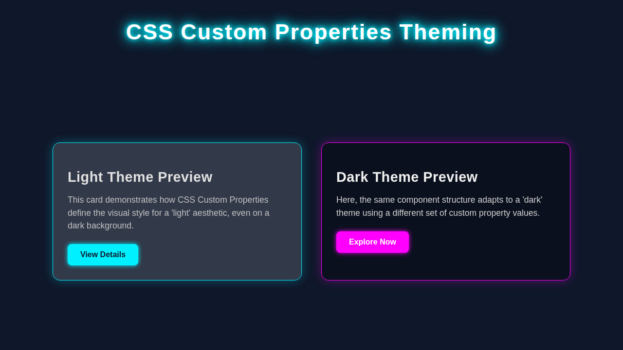
Imagine a button. With one click, your website effortlessly changes from a bright, cheerful light theme to a sleek, eye-friendly dark theme. That is exactly what we are building! This theme switcher uses the power of CSS Custom Properties Theming. It is perfect for modern web applications. Your users will love the control it offers. You will love how simple it is to implement. We will create a clean, functional design. It will showcase the magic behind dynamic styling. Therefore, prepare to impress! This project will give you a core skill. It helps make user interfaces more engaging.
HTML Structure: The Foundation of Our Theme Switcher
First, we need a solid HTML foundation. This structure will hold our content and the theme toggle button. We will keep it super simple and semantic. This way, everything is easy to understand. Here is the basic HTML code you will need:
index.html
<!DOCTYPE html>
<html lang="en">
<head>
    <meta charset="UTF-8">
    <meta name="viewport" content="width=device-width, initial-scale=1.0">
    <title>CSS Custom Properties Theming</title>
    <link rel="stylesheet" href="styles.css">
</head>
<!--
    Theming in action!
    To switch themes, change the class on the <body> tag:
    - For light theme: <body class="theme-light">
    - For dark theme:  <body class="theme-dark">

    In a real application, JavaScript would typically toggle this class
    based on user preference or system settings.
-->
<body class="theme-light">
    <header class="page-header">
        <h1>Theme Showcase</h1>
        <p>Switch `body` class to `.theme-dark` for dark mode!</p>
    </header>

    <main class="main-content">
        <section class="card">
            <h2>Primary Card</h2>
            <p>This card demonstrates the primary background, text, and border colors set by the active theme.</p>
            <button class="primary-button">Learn More</button>
        </section>

        <section class="card secondary-card">
            <h2>Secondary Element</h2>
            <p>This section uses secondary color variables to provide a different visual emphasis, adapting to the theme.</p>
            <button class="secondary-button">Explore</button>
        </section>

        <section class="card">
            <h2>Dynamic Styling</h2>
            <p>All elements on this page will automatically adjust their styling when the theme class on the `body` is changed.</p>
            <button class="primary-button">Get Started</button>
        </section>
    </main>

    <footer class="page-footer">
        <p>© 2023 CSS Theming Example</p>
    </footer>
</body>
</html>
CSS Styling: Bringing Our Theme to Life with Custom Properties
Now for the fun part: styling! We will use CSS Custom Properties to define our theme colors. These are like variables in CSS. This approach makes theme changes super efficient. We define a default light theme first. Then, we add styles for our dark theme. It is a fantastic way to manage your styles. We will also add some basic layout to make it look great. Furthermore, a smooth transition will make theme changes feel fluid. You will see what I mean! This method significantly reduces code repetition. It makes updates simple.
Pro Tip: CSS Custom Properties are incredibly powerful. They let you store values like colors, fonts, or sizes. You can then reuse these values throughout your stylesheet. This makes your CSS more organised and much easier to maintain! Consider them your secret weapon for flexible designs.
styles.css
/* General Reset & Base Styles */
* {
    box-sizing: border-box;
    margin: 0;
    padding: 0;
}

body {
    font-family: Arial, Helvetica, sans-serif;
    line-height: 1.6;
    min-height: 100vh; /* Ensure body takes full viewport height */
    display: flex;
    flex-direction: column;
    transition: background-color 0.3s ease, color 0.3s ease; /* Smooth theme transition */
}

/*
    Theme Definitions using CSS Custom Properties (Variables)
    Each theme class defines a set of variables, allowing components to
    consume these variables and adapt their appearance dynamically.
*/

/* Light Theme Variables */
body.theme-light {
    --color-bg-primary: #f0f2f5;
    --color-bg-secondary: #ffffff;
    --color-text-primary: #333333;
    --color-text-secondary: #555555;
    --color-border: #e0e0e0;
    --color-accent: #007bff;
    --color-accent-hover: #0056b3;
    --color-shadow: rgba(0, 0, 0, 0.1);
}

/* Dark Theme Variables */
body.theme-dark {
    --color-bg-primary: #1a1a2e;
    --color-bg-secondary: #2e3048;
    --color-text-primary: #e0e0e0;
    --color-text-secondary: #cccccc;
    --color-border: #444466;
    --color-accent: #8e44ad; /* A purplish accent */
    --color-accent-hover: #6c3483;
    --color-shadow: rgba(0, 0, 0, 0.3);
}

/*
    Applying Theme Variables to Elements
    Elements use `var(--variable-name)` to inherit their colors and styles
    from the currently active theme defined on the body.
*/
body {
    background-color: var(--color-bg-primary);
    color: var(--color-text-primary);
}

.page-header {
    background-color: var(--color-bg-secondary);
    color: var(--color-text-primary);
    padding: 1.5rem;
    text-align: center;
    border-bottom: 1px solid var(--color-border);
    box-shadow: 0 2px 5px var(--color-shadow);
}

.page-header h1 {
    margin-bottom: 0.5rem;
}

.page-header p {
    color: var(--color-text-secondary);
}

.main-content {
    flex-grow: 1; /* Allows main content to take available space */
    display: flex;
    flex-wrap: wrap; /* Allows cards to wrap on smaller screens */
    gap: 2rem;
    padding: 2rem;
    justify-content: center;
    align-items: flex-start; /* Align items to the top */
    max-width: 1200px; /* Limit content width */
    margin: 0 auto; /* Center the content */
}

.card {
    background-color: var(--color-bg-secondary);
    color: var(--color-text-primary);
    border: 1px solid var(--color-border);
    border-radius: 8px;
    padding: 1.5rem;
    box-shadow: 0 4px 10px var(--color-shadow);
    width: 100%; /* Full width on small screens */
    max-width: 400px; /* Max width for cards */
    transition: background-color 0.3s ease, border-color 0.3s ease, box-shadow 0.3s ease;
}

.card h2 {
    color: var(--color-text-primary);
    margin-bottom: 0.75rem;
}

.card p {
    color: var(--color-text-secondary);
    margin-bottom: 1.5rem;
}

/* Buttons */
.primary-button, .secondary-button {
    padding: 0.75rem 1.25rem;
    border-radius: 5px;
    border: none;
    cursor: pointer;
    font-size: 1rem;
    font-weight: bold;
    transition: background-color 0.2s ease, transform 0.2s ease;
}

.primary-button {
    background-color: var(--color-accent);
    color: #ffffff; /* White text for accent button */
}

.primary-button:hover {
    background-color: var(--color-accent-hover);
    transform: translateY(-1px);
}

.secondary-button {
    background-color: var(--color-border); /* Using border color for a subtle button */
    color: var(--color-text-primary);
    /* margin-left: 0.75rem; Not applied to avoid stacking issues, for demonstration */
}

.secondary-button:hover {
    background-color: var(--color-text-secondary);
    transform: translateY(-1px);
}

.page-footer {
    background-color: var(--color-bg-secondary);
    color: var(--color-text-secondary);
    padding: 1.5rem;
    text-align: center;
    border-top: 1px solid var(--color-border);
    margin-top: auto; /* Push footer to bottom */
}

/* Responsive adjustments */
@media (max-width: 768px) {
    .main-content {
        flex-direction: column;
        align-items: center;
    }
    .card {
        max-width: 90%; /* Wider cards on smaller screens */
    }
}
JavaScript: The Brains Behind the Theme Switch
Our theme needs some interactivity, right? JavaScript will handle the click event on our theme toggle button. It will then dynamically switch between our light and dark themes. Don’t worry if you are new to JS. This part is straightforward. We will target the HTML document. Then, we will toggle a special class. This class will tell our CSS which theme to apply. You will see how a few lines of JavaScript bring our theme switcher to life. This small script brings all the visual changes together. It creates a truly dynamic experience.
How It All Works Together: Unpacking the Theme Switcher Magic
Let me explain what’s happening here. This project combines HTML, CSS, and a tiny bit of JavaScript. Each part plays a crucial role. Together, they create a seamless user experience. We are using a clever technique here. It lets us update multiple styles with a single action. Also, it keeps our code clean and manageable. This is the beauty of modern web development! So, let’s break down each piece further.
Setting Up Our Variables
In our CSS, we define custom properties. These live on the :root selector. The :root selector represents the highest-level element in your HTML. It is basically the <html> tag. Here, we set default values for colors. We have a background color, text color, and button colors. These are our “light” theme values. Any element can then use these variables. For example, background-color: var(--background-color);. This is the foundation of our CSS Custom Properties Theming approach. It makes everything incredibly flexible! These variables are global. They cascade down to all elements. Changing them at the root impacts everything.
The Dark Theme Class
Now, for the dark theme. We create a special CSS rule. It targets the body element. But only when the .dark-theme class is present. Inside this rule, we *redefine* our custom properties. For instance, --background-color changes to a dark grey. --text-color changes to a light white. When JavaScript adds .dark-theme to the body, these new values kick in. The browser automatically applies these changes. It’s truly amazing to see in action. All your elements using var(--background-color) will update instantly. This clever override mechanism is the heart of dynamic theming. It means you don’t need to write separate styles for every single element.
Heads Up: You can learn more about the
:rootpseudo-class on MDN Web Docs. It’s a fundamental concept for global CSS variables! It truly unlocks a new level of CSS control.
JavaScript to Toggle the Class
Our JavaScript code is quite simple. First, it finds our theme toggle button. Then, it listens for a “click” event on that button. When you click it, a function runs. This function gets the body element. It then uses classList.toggle('dark-theme'). The toggle() method is super handy. If .dark-theme is on the body, it removes it. If it is not there, it adds it. This single action is the key. It switches the entire theme! This is a powerful pattern. You can use it for many interactive elements, just like a responsive navbar. This minimal JavaScript snippet handles all the interaction. It keeps your HTML and CSS focused on structure and presentation.
Saving User Preference (Bonus!)
We added a small bonus feature. When you switch themes, we save your preference. We use localStorage for this. localStorage is like a small storage space in your browser. It remembers things even after you close the tab. So, when you revisit the page, your chosen theme will be there. We check localStorage on page load. If a theme is saved, we apply it. This makes the user experience much better. It shows attention to detail! Your users won’t need to re-select their theme every time. This persistence greatly enhances usability.
Also, checking out CSS-Tricks offers even more insights into custom properties. It’s a great resource!
Tips to Customise It: Make It Your Own!
You have just built a fantastic dynamic theme switcher. But don’t stop here! Here are some ideas to make it even better:
- More Themes: Add a “sepia” or “high contrast” theme. You could use more classes like
.sepia-theme. Then, just redefine your custom properties again! This allows for endless creative possibilities. - Theme Selector: Instead of a simple toggle, use a dropdown menu. Let users choose from multiple themes. This adds more control. It also makes your UI more robust.
- Animated Transitions: Make the theme change smoother. You can apply a
transitionproperty to your element’s background or text color. This creates a really polished look. Smooth animations always enhance user experience. - User Settings Page: Integrate this into a larger user settings page. Users could save their preference globally. Perhaps they choose their theme across many parts of your site. Consider how this could scale, especially with concepts like CSS Container Queries Explained for adapting layouts!
Conclusion: You Just Mastered CSS Custom Properties Theming!
Wow! You have just mastered the basics of CSS Custom Properties Theming. You built a fully functional, dynamic theme switcher. You saw how HTML, CSS, and JavaScript work together. This is a fundamental skill for modern web development. It makes your UIs user-friendly and adaptable. Now, go ahead and show off your new skill! Share your project with friends. Experiment with new colors and designs. The web is your canvas!