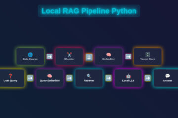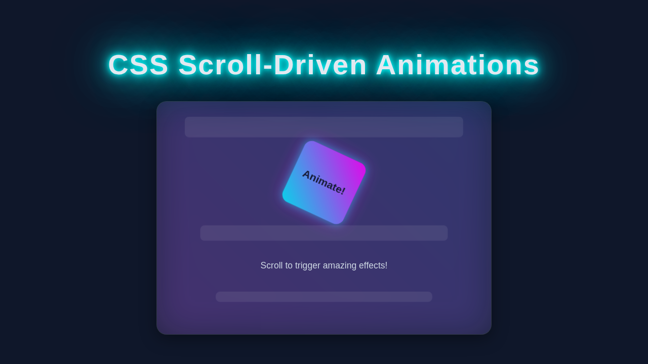
Hey there, fellow coders! Have you ever seen websites where elements beautifully animate as you scroll? It feels magical, right? We used to need JavaScript for those effects. But guess what? Modern CSS changes everything! Today, we’re diving deep into CSS Scroll Animations. You’ll build dynamic, scroll-driven effects using only HTML and CSS. Get ready to impress your users!
What We Are Building
Today, we are building a fantastic portfolio-style layout. Imagine a page with several content sections. As you scroll down, each section will elegantly fade in and slide up. This creates a smooth, engaging user experience. It brings life to static content. It’s a subtle yet powerful effect. Your visitors will love the interactive feel. This technique is perfect for showcasing projects or blog posts. It truly makes your site feel modern and professional.
HTML Structure
Let’s start with the foundation: our HTML. We will keep it super simple. We need a container for everything. Inside, we’ll have several identical content sections. Each section will hold a title and some text. This basic structure helps us see the animation clearly. It also makes our CSS work a breeze.
index.html
<!DOCTYPE html>
<html lang="en">
<head>
    <meta charset="UTF-8">
    <meta name="viewport" content="width=device-width, initial-scale=1.0">
    <title>CSS Scroll-Driven Animations</title>
    <link rel="stylesheet" href="styles.css">
</head>
<body>
    <!-- Header section: Provides a title and introduction -->
    <header>
        <h1>CSS Scroll-Driven Animations</h1>
        <p>Scroll down to see elements animate based on your scroll position!</p>
    </header>

    <!-- Main scroll container: Holds all content and animated elements -->
    <div class="scroll-container">

        <!-- Introductory section -->
        <section class="anim-section intro">
            <h2>Welcome to Scroll Magic!</h2>
            <p>This tutorial demonstrates how to create fluid animations purely with CSS, without any JavaScript. As you scroll through this page, watch how different elements respond to your scroll position.</p>
            <p>Each section below features a different scroll-driven animation. Observe how the elements change as they enter and leave your viewport.</p>
        </section>

        <!-- Section 1: Rotate Animation -->
        <section class="anim-section">
            <div class="anim-box rotate-on-scroll">Rotate Me!</div>
            <p>This box will smoothly rotate 360 degrees as it moves through the viewport. The animation progress is directly tied to the scroll position, giving you precise control.</p>
            <p>Notice how the <code>animation-timeline: view(block);</code> and <code>animation-range: entry 0% exit 100%;</code> work together to trigger the animation across its entire visibility.</p>
        </section>

        <!-- Section 2: Scale and Fade Animation -->
        <section class="anim-section">
            <div class="anim-box scale-on-scroll">Scale Me!</div>
            <p>Watch this element scale up and fade in as it enters the viewport, and then scale back down and fade out as it leaves. This effect is perfect for drawing attention to new content.</p>
            <p>The <code>@keyframes</code> define the scaling and opacity changes, while the <code>animation-timeline</code> links it to the scroll progress.</p>
        </section>

        <!-- Section 3: Blur and Fade Animation -->
        <section class="anim-section">
            <div class="anim-box fade-on-scroll">Reveal Me!</div>
            <p>This element will appear with a blur and then sharpen and fade in as it becomes visible. As you scroll away, it blurs and fades out again, creating a compelling reveal effect.</p>
            <p>The <code>animation-range</code> is set to trigger from when it enters until it completely exits, ensuring a full cycle of blur and fade.</p>
        </section>

        <!-- Section 4: Parallax Text Animation -->
        <section class="anim-section">
            <div class="anim-box parallax-on-scroll">Parallax Text</div>
            <p>This text creates a subtle parallax-like effect by shifting its vertical position as you scroll. It adds a sense of depth and interactivity to static content.</p>
            <p>By animating <code>transform: translateY()</code>, we can make elements appear to move at different speeds relative to the scroll.</p>
        </section>

        <!-- Outro section: Concludes the tutorial -->
        <section class="outro">
            <h2>You've Mastered Scroll-Driven Animations!</h2>
            <p>Congratulations! You've successfully implemented pure CSS scroll-driven animations. This powerful feature allows for highly engaging user interfaces without the complexity of JavaScript.</p>
            <p>Experiment with different <code>animation-range</code> values like <code>cover 0% cover 100%</code>, or specify percentage-based ranges to fine-tune your effects even further.</p>
        </section>

    </div>
</body>
</html>
CSS Styling
Next, we add the magic with CSS. We will style our sections first. Then comes the exciting part: the scroll animations! We define how elements behave initially. Then, we tell them how to animate based on scroll. Get ready for some cool new properties!
styles.css
@charset "UTF-8";

/* Basic Resets & Global Styles */
:root {
    /* Define custom properties for easier theme management if needed */
    --primary-bg: #1a1a2e;
    --secondary-bg: #2a2a4a;
    --text-color: #e0e0e0;
    --highlight-color: #0ff;
    --box-gradient-1: #00c0ff;
    --box-gradient-2: #e000ff;
}

/* Ensure all elements respect the box model */
*, *::before, *::after {
    box-sizing: border-box;
}

body {
    margin: 0;
    padding: 0;
    font-family: Arial, Helvetica, sans-serif; /* Safe font stack */
    background-color: var(--primary-bg); /* Dark background */
    color: var(--text-color); /* Light text color */
    line-height: 1.6;
    overflow-x: hidden; /* Prevent horizontal scroll */
    min-height: 300vh; /* Ensures enough scrollable content for demonstration */
    scroll-behavior: smooth; /* Optional: smooth scroll for user experience */
}

/* Header Styles */
header {
    background-color: #0f172a;
    color: #fff;
    padding: 60px 20px;
    text-align: center;
    box-shadow: 0 4px 8px rgba(0, 0, 0, 0.2);
    position: sticky; /* Keeps header visible at the top */
    top: 0;
    z-index: 100;
    max-width: 100%;
    overflow: hidden;
}

header h1 {
    margin: 0;
    font-size: 2.8em;
    color: var(--highlight-color); /* Neon highlight */
    text-shadow: 0 0 8px rgba(0, 255, 255, 0.7);
}

header p {
    font-size: 1.2em;
    margin-top: 10px;
    color: #a0a0a0;
    max-width: 100%;
}

/* Scroll Container (main content area) */
.scroll-container {
    max-width: 900px;
    margin: 40px auto;
    padding: 20px;
}

/* Section Styling */
.anim-section {
    background-color: var(--secondary-bg);
    border-radius: 12px;
    padding: 40px;
    margin-bottom: 80px; /* Space between sections to enable scroll effect */
    box-shadow: 0 6px 20px rgba(0, 0, 0, 0.3);
    border: 1px solid rgba(255, 255, 255, 0.1);
    display: flex;
    flex-direction: column;
    align-items: center;
    justify-content: center;
    text-align: center;
    min-height: 400px; /* Ensure sections are tall enough for animations */
    overflow: hidden; /* Important for clean layout and containing child elements */
    position: relative; /* For potential pseudo-elements or absolute positioning */
    max-width: 100%;
}

.anim-section:nth-child(odd) {
    background-color: #20203a; /* Slightly different shade for alternating sections */
}

.anim-section h2 {
    font-size: 2em;
    margin-bottom: 20px;
    color: #fff;
}

.anim-section p {
    font-size: 1.1em;
    max-width: 700px;
    margin: 20px auto 0;
    color: #c0c0c0;
    max-width: 100%;
}

/* Animated Box Base Style */
.anim-box {
    width: 200px;
    height: 200px;
    background: linear-gradient(45deg, var(--box-gradient-1), var(--box-gradient-2));
    border-radius: 15px;
    display: flex;
    justify-content: center;
    align-items: center;
    font-size: 1.5em;
    font-weight: bold;
    color: #0f172a; /* Dark text for contrast */
    box-shadow: 0 0 20px rgba(0, 192, 255, 0.5), 0 0 40px rgba(224, 0, 255, 0.3);
    margin: 30px 0;
    will-change: transform, opacity, filter; /* Optimize for animation performance */

    /* Core scroll-driven animation properties */
    animation-timing-function: linear; /* Smooth, consistent speed throughout scroll range */
    animation-fill-mode: both; /* Retains the first keyframe style before, and last after animation */
    animation-duration: auto; /* Duration is implicitly controlled by the scroll range */
}

/* --- Keyframe Animations --- */

/* 1. Rotate Animation: Full 360-degree rotation with a slight scale */
@keyframes rotate-animation {
    from { transform: rotateZ(0deg) scale(0.8); }
    to { transform: rotateZ(360deg) scale(1.1); }
}

/* 2. Scale Animation: Scales in from small, then back out to small, also fading */
@keyframes scale-animation {
    0% { transform: scale(0.5); opacity: 0; }
    50% { transform: scale(1); opacity: 1; }
    100% { transform: scale(0.5); opacity: 0; }
}

/* 3. Fade and Blur Animation: Fades in and unblurs, then fades out and blurs again */
@keyframes fade-animation {
    0% { opacity: 0; filter: blur(10px); }
    50% { opacity: 1; filter: blur(0px); }
    100% { opacity: 0; filter: blur(10px); }
}

/* 4. Parallax Text Animation: Moves vertically to create a parallax illusion */
@keyframes parallax-animation {
    from { transform: translateY(-50px); }
    to { transform: translateY(50px); }
}


/* --- Apply Scroll-Driven Animations to specific elements --- */

/* Rotate on Scroll */
.rotate-on-scroll {
    animation-name: rotate-animation;
    /* 'view(block)' creates a scroll timeline based on the element's visibility
       within its scrollport along the block (vertical) axis. */
    animation-timeline: view(block);
    /* 'entry 0% exit 100%' means the animation progresses from 0% when the element
       starts entering the viewport, to 100% when it fully exits the viewport. */
    animation-range: entry 0% exit 100%;
}

/* Scale on Scroll */
.scale-on-scroll {
    animation-name: scale-animation;
    animation-timeline: view(block);
    /* The full animation (scale up/down, fade in/out) will occur over the element's
       entire journey through the viewport. */
    animation-range: entry 0% exit 100%;
}

/* Fade on Scroll */
.fade-on-scroll {
    animation-name: fade-animation;
    animation-timeline: view(block);
    /* The full fade in and out animation will happen as the element enters and leaves. */
    animation-range: entry 0% exit 100%;
}

/* Parallax on Scroll (Applies a text-specific animation) */
.parallax-on-scroll {
    animation-name: parallax-animation;
    animation-timeline: view(block);
    animation-range: entry 0% exit 100%;
    /* Override default .anim-box styles for text-based parallax */
    background: none;
    box-shadow: none;
    color: var(--box-gradient-1); /* Neon text color */
    font-size: 2.5em;
    letter-spacing: 2px;
    width: auto; /* Allow content to dictate width */
    height: auto; /* Allow content to dictate height */
    padding: 10px 20px;
    border-radius: 0;
}

/* Outro Section Styling (similar to header for consistency) */
.outro {
    background-color: #0f172a;
    color: #fff;
    padding: 80px 20px;
    text-align: center;
    border-radius: 12px;
    margin-top: 80px;
    box-shadow: 0 -4px 8px rgba(0, 0, 0, 0.2);
    max-width: 100%;
    overflow: hidden;
}

.outro h2 {
    font-size: 2.5em;
    color: var(--highlight-color);
    text-shadow: 0 0 8px rgba(0, 255, 255, 0.7);
}

.outro p {
    font-size: 1.2em;
    margin-top: 20px;
    max-width: 700px;
    margin-left: auto;
    margin-right: auto;
    color: #a0a0a0;
    max-width: 100%;
}
How It All Works Together
Alright, you have the code. Now, let’s break down the magic. This section explains every piece of our project. We’ll explore the new CSS features together. You’ll see how pure CSS brings these animations to life. This is where the core of CSS Scroll Animations truly shines.
The Basic Styling
First, let’s talk about the foundational styles. We set a body background color. This gives our page a nice visual base. Then, we center our main .container. We use max-width to keep content readable. margin: auto helps center it easily. Each .section gets some padding. This creates visual breathing room. We also add a border-radius for softer edges. A box-shadow gives a subtle depth effect. Basic styling makes our content look good. It’s the canvas for our animations. For more on crafting responsive layouts, check out our guide on building a Responsive Calculator UI HTML CSS – Build a Modern Layout. It shows how basic styling sets up great designs.
Preparing for Animation
Before animating, we need initial states. We want sections to be invisible first. So, we set opacity: 0 on our .section elements. This makes them completely transparent. We also add a transform: translateY(50px). This moves them slightly down. They will slide up into view. This is their starting point. It’s crucial for the fade-in-slide-up animation. Remember, this state is what users see before scrolling. It prepares the elements for their grand entrance.
Defining Our Animation
Now for the animation itself! We use @keyframes to define fade-in-slide-up. This is a standard CSS animation technique. It specifies different styles at various points. At 0%, elements are transparent and shifted down. At 100%, they become fully opaque. They also return to their original position (translateY(0)). This creates the smooth fade and slide effect. You can control the speed and easing later. Keyframes are like storyboards for movement.
Pro Tip: Understanding
@keyframesis foundational for any CSS animation. You can define as many steps as you need. It gives you incredible control over the animation’s journey. Don’t be afraid to experiment with values!
Introducing animation-timeline & view-timeline
Here is the star of our show: animation-timeline. This amazing property links an animation to a scroll progress. No more JavaScript needed! We set animation-timeline: view() for our sections. The view() function is super powerful. It makes the animation progress as an element enters or leaves the viewport. Specifically, we use view-timeline-axis: block to track vertical scroll. Also, view-timeline-name: --section-reveal gives our timeline a unique name. This helps connect it to the animation. It’s truly a game-changer for CSS Scroll Animations. Learn more about animation-timeline on MDN. It opens up many possibilities! For a deeper dive into scroll-driven animations, check out this excellent article on CSS-Tricks.
Understanding animation-range
The animation-range property refines our animation control. It defines when the animation starts and ends. We use values like cover 0% and cover 50%. cover relates to the element itself. 0% means the top of the element is at the viewport’s edge. 50% means half the element is visible. This allows precise timing. Your animation will start earlier or later. You can fine-tune the effect. Experiment with these values! It dramatically changes the feel. This is where you get creative.
Pro Tip: Experimenting with
animation-rangeis key! Different values create unique timings. Tryentry 0% cover 50%to start when the element enters. Then the animation finishes when it covers 50% of the viewport. This gives you amazing granular control.
Tips to Customise It
You’ve built your first CSS scroll animation! How cool is that? Now, let’s make it truly yours. Here are some ideas to customize and extend it. You can really get creative here.
- Change the Animation Type: Instead of fading and sliding, try rotating elements. Or maybe scale them up as they appear. Just adjust your
@keyframesdefinition. Theanimation-timelinewill still work perfectly. - Add Staggered Effects: Make elements appear one after another. You can use CSS variables for
animation-delay. Then apply different delays to each section. Check out our guide on CSS Variables: Unlock Dynamic Styles & Layouts for a deeper dive. This creates a very sophisticated look. - Animate Backgrounds: Don’t just animate content. Animate the background of sections! Change colors or gradients as you scroll. This adds another layer of visual interest.
- Combine with
scroll-snap: Pair these animations with CSS Scroll Snap. This forces the scroll to land on specific sections. It creates a guided, interactive experience. - Text Reveals: Animate individual words or lines of text. This can be complex. However, it offers stunning results.
Conclusion
Wow, you did it! You just built impressive CSS Scroll Animations with zero JavaScript. This is a huge step in modern web development. You’ve mastered a powerful new CSS module. Your websites will now feel more dynamic and engaging. Remember to practice these concepts. Share your awesome creations with us! We love seeing what you build. Keep coding, keep creating, and keep pushing those boundaries!