Hey! If you have wanted to build a Tailwind Admin Dashboard but had no idea where to start, you are in the right place. We are going to build something awesome today! This tutorial will guide you through creating a sleek, responsive dashboard layout. You’ll use modern HTML, CSS, and Tailwind’s powerful utility classes. Get ready to impress with your new skills!
What We Are Building: A Responsive Tailwind Admin Dashboard
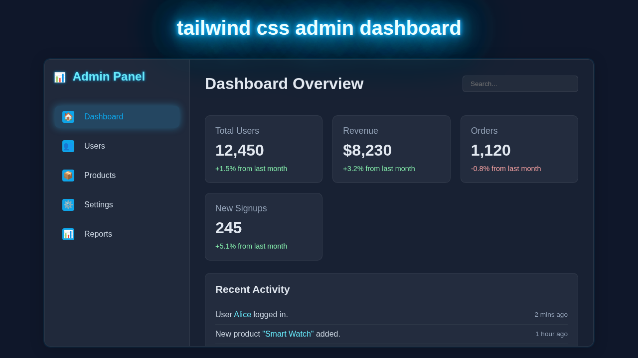
We are going to construct a truly functional and great-looking admin dashboard. This isn’t just a static page. It will respond beautifully across all screen sizes. Imagine a sidebar for navigation and a main content area for your data. We will make it clean, intuitive, and easy to use. This project is perfect for managing any backend system. You can even use it for your personal portfolio projects!
Pro Tip: Admin dashboards are super valuable. They are the control centers for web applications. Mastering their design means you can build powerful tools!
HTML Structure: Laying the Foundation
First, we’ll set up our basic HTML. This structure will define the main layout of our dashboard. We’ll have a wrapper, a sidebar, and a content area. Tailwind’s classes will then bring it all to life. Don’t worry about the styling just yet; focus on the elements!
index.html
<!DOCTYPE html>
<html lang="en">
<head>
    <meta charset="UTF-8">
    <meta name="viewport" content="width=device-width, initial-scale=1.0">
    <title>Tailwind CSS Admin Dashboard</title>
    <!-- Link to your compiled Tailwind CSS file -->
    <link href="./styles.css" rel="stylesheet">
    <!-- Ensure safe fonts -->
    <style>
        body { font-family: Arial, Helvetica, sans-serif; box-sizing: border-box; }
        /* Custom CSS for glassmorphism effects not directly available as Tailwind utilities */
        .glass-effect {
            backdrop-filter: blur(10px);
            background-color: rgba(45, 55, 72, 0.3); /* dark slate-700 with transparency */
            border: 1px solid rgba(255, 255, 255, 0.1);
        }
        .glass-card-effect {
            backdrop-filter: blur(5px);
            background-color: rgba(45, 55, 72, 0.3); /* dark slate-700 with transparency */
            border: 1px solid rgba(255, 255, 255, 0.08);
        }
        /* Custom text shadow for glowing titles/elements */
        .text-glow-sky {
            text-shadow: 0 0 5px #0ea5e9, 0 0 10px #0ea5e9, 0 0 15px #38bdf8;
        }

        /* Hide scrollbar for aesthetics on main content in dashboard */
        .hide-scrollbar::-webkit-scrollbar {
            display: none;
        }
        .hide-scrollbar {
            -ms-overflow-style: none;  /* IE and Edge */
            scrollbar-width: none;  /* Firefox */
        }

        /* Simple icon styling for demonstration, replace with actual SVG icons in production */
        .icon-placeholder {
            display: inline-flex;
            align-items: center;
            justify-content: center;
            width: 1.5rem; /* Equivalent to w-6 */
            height: 1.5rem; /* Equivalent to h-6 */
            border-radius: 0.25rem; /* Equivalent to rounded */
            background-color: #0ea5e9; /* Sky-500 */
            color: white;
            font-size: 0.75rem; /* text-xs */
            margin-right: 0.5rem; /* mr-2 */
            flex-shrink: 0;
        }
        .sidebar-item-link .icon-placeholder { /* For icons within sidebar links */
            width: 1.5rem;
            height: 1.5rem;
            font-size: 1rem;
        }
    </style>
</head>
<body class="bg-slate-900 text-slate-200 min-h-screen flex antialiased">
    <!-- Main Dashboard Container -->
    <div class="flex flex-1 rounded-xl shadow-lg m-4 lg:m-8 overflow-hidden glass-effect max-w-7xl mx-auto w-full">
        <!-- Sidebar -->
        <aside class="w-64 flex-shrink-0 p-6 border-r border-white/10 flex flex-col gap-4 bg-slate-700/40 backdrop-filter backdrop-blur-md">
            <h2 class="text-2xl font-bold text-cyan-300 mb-6 flex items-center text-glow-sky">
                <span class="icon-placeholder !bg-transparent !text-cyan-300 !mr-2">📊</span> Admin Panel
            </h2>
            <nav class="space-y-2">
                <!-- Active Dashboard Link -->
                <a href="#" class="sidebar-item-link group flex items-center p-3 rounded-lg text-slate-300 transition-all duration-200 bg-sky-400/20 text-sky-500 shadow-lg shadow-sky-400/20">
                    <span class="icon-placeholder !bg-sky-500 !text-white">🏠</span> Dashboard
                </a>
                <!-- Other Sidebar Links -->
                <a href="#" class="sidebar-item-link group flex items-center p-3 rounded-lg text-slate-300 hover:bg-sky-400/10 hover:text-cyan-300 transition-all duration-200">
                    <span class="icon-placeholder">👥</span> Users
                </a>
                <a href="#" class="sidebar-item-link group flex items-center p-3 rounded-lg text-slate-300 hover:bg-sky-400/10 hover:text-cyan-300 transition-all duration-200">
                    <span class="icon-placeholder">📦</span> Products
                </a>
                <a href="#" class="sidebar-item-link group flex items-center p-3 rounded-lg text-slate-300 hover:bg-sky-400/10 hover:text-cyan-300 transition-all duration-200">
                    <span class="icon-placeholder">⚙️</span> Settings
                </a>
                <a href="#" class="sidebar-item-link group flex items-center p-3 rounded-lg text-slate-300 hover:bg-sky-400/10 hover:text-cyan-300 transition-all duration-200">
                    <span class="icon-placeholder">📊</span> Reports
                </a>
            </nav>
        </aside>

        <!-- Main Content Area -->
        <main class="flex-1 p-8 overflow-y-auto hide-scrollbar">
            <!-- Header -->
            <header class="flex justify-between items-center mb-8">
                <h1 class="text-3xl font-bold text-slate-100">Dashboard Overview</h1>
                <input type="text" placeholder="Search..." class="bg-white/5 border border-white/10 rounded-md py-2 px-4 text-slate-200 focus:outline-none focus:ring-2 focus:ring-sky-400 focus:border-sky-400 transition-all duration-200 w-64">
            </header>

            <!-- Stat Cards Grid -->
            <div class="grid grid-cols-1 md:grid-cols-2 lg:grid-cols-4 gap-6 mb-8">
                <div class="p-6 rounded-xl glass-card-effect shadow-md hover:shadow-lg hover:shadow-sky-400/10 transition-all duration-200 transform hover:-translate-y-1">
                    <div class="text-slate-400 text-sm mb-2">Total Users</div>
                    <div class="text-4xl font-extrabold text-slate-100">12,450</div>
                    <div class="text-green-300 text-sm mt-2">+1.5% from last month</div>
                </div>
                <div class="p-6 rounded-xl glass-card-effect shadow-md hover:shadow-lg hover:shadow-sky-400/10 transition-all duration-200 transform hover:-translate-y-1">
                    <div class="text-slate-400 text-sm mb-2">Revenue</div>
                    <div class="text-4xl font-extrabold text-slate-100">$8,230</div>
                    <div class="text-green-300 text-sm mt-2">+3.2% from last month</div>
                </div>
                <div class="p-6 rounded-xl glass-card-effect shadow-md hover:shadow-lg hover:shadow-sky-400/10 transition-all duration-200 transform hover:-translate-y-1">
                    <div class="text-slate-400 text-sm mb-2">Orders</div>
                    <div class="text-4xl font-extrabold text-slate-100">1,120</div>
                    <div class="text-red-300 text-sm mt-2">-0.8% from last month</div>
                </div>
                <div class="p-6 rounded-xl glass-card-effect shadow-md hover:shadow-lg hover:shadow-sky-400/10 transition-all duration-200 transform hover:-translate-y-1">
                    <div class="text-slate-400 text-sm mb-2">New Signups</div>
                    <div class="text-4xl font-extrabold text-slate-100">245</div>
                    <div class="text-green-300 text-sm mt-2">+5.1% from last month</div>
                </div>
            </div>

            <!-- Recent Activity Section -->
            <div class="p-6 rounded-xl glass-card-effect shadow-md">
                <h3 class="text-xl font-semibold text-slate-100 mb-6">Recent Activity</h3>
                <div class="divide-y divide-white/5">
                    <div class="flex justify-between items-center py-3">
                        <span class="text-slate-300">User <span class="text-cyan-300">Alice</span> logged in.</span>
                        <span class="text-slate-400 text-sm">2 mins ago</span>
                    </div>
                    <div class="flex justify-between items-center py-3">
                        <span class="text-slate-300">New product <span class="text-cyan-300">"Smart Watch"</span> added.</span>
                        <span class="text-slate-400 text-sm">1 hour ago</span>
                    </div>
                    <div class="flex justify-between items-center py-3">
                        <span class="text-slate-300">Order #<span class="text-cyan-300">12345</span> fulfilled.</span>
                        <span class="text-slate-400 text-sm">3 hours ago</span>
                    </div>
                    <div class="flex justify-between items-center py-3">
                        <span class="text-slate-300">User <span class="text-cyan-300">Bob</span> updated profile.</span>
                        <span class="text-slate-400 text-sm">1 day ago</span>
                    </div>
                </div>
            </div>
        </main>
    </div>
</body>
</html>
CSS Styling: Tailwind’s Magic
Next, we will apply our styles using Tailwind CSS utility classes. These classes provide a fast way to style elements. We’ll use them for layout, colors, spacing, and responsiveness. Furthermore, we will create a few custom CSS rules for specific animations. This makes our dashboard feel dynamic.
styles.css
/* styles.css */

/*
  This file is processed by Tailwind CSS CLI.
  To compile your Tailwind classes, ensure you have Tailwind CSS installed:
  `npm install -D tailwindcss postcss autoprefixer`
  Then initialize: `npx tailwindcss init -p`
  Update your tailwind.config.js `content` section to include HTML files.
  Finally, run the build command:
  `npx tailwindcss -i ./styles.css -o ./dist/styles.css --watch`
  (or integrate into your build process)
*/

@tailwind base;
@tailwind components;
@tailwind utilities;

/*
  Custom CSS to extend Tailwind's capabilities or handle properties not covered by utilities.
  For this tutorial, glassmorphism and custom glow effects are defined inline in index.html's <style> block
  for direct visibility and minimal setup, as Tailwind doesn't natively provide utilities for `backdrop-filter` or complex `text-shadow` without plugins.
  For production, consider using Tailwind plugins (e.g., `tailwind-backdrop-filter`) or extending your `tailwind.config.js` to create custom utilities.
*/
JavaScript: Adding Interactivity
Finally, we will add a small JavaScript snippet. This script will handle the toggling of our sidebar. It is a common feature in admin dashboards. This makes the layout flexible for smaller screens. We want our dashboard to be truly responsive!
How It All Works Together
Let’s break down how these pieces connect. We built a robust structure. Then we added clever styling. Finally, a touch of interactivity made it complete. Each part plays a vital role. You will soon see the full picture.
The Main Layout
Our HTML starts with a main <div> that wraps everything. This wrapper uses Tailwind’s flexbox utilities. For instance, flex and min-h-screen are key. This ensures our dashboard fills the viewport. The sidebar and main content sit side-by-side. The flex direction changes for mobile screens. Thus, it looks great everywhere.
The Responsive Sidebar
The sidebar component is crucial for navigation. It hides or shows based on screen size. On larger screens, it stays visible. However, on small screens, it tucks away. A button then reveals it. We use Tailwind’s responsive prefixes like lg:w-64. This easily handles different widths. Furthermore, the transform and transition classes add smooth animations. This creates a professional user experience. Check out more about Tailwind Dark Mode Tutorial: HTML & CSS Utilities for more on theme switching!
The Content Area
Our main content area fills the remaining space. This is where all your dashboard widgets will live. It uses flex-1 to take up available room. We also apply padding and background colors. This separates it visually from the sidebar. You can easily add cards or charts here. The possibilities are endless. We even ensure smooth scrolling for longer content.
Educator’s Note: The power of utility-first CSS like Tailwind is its composability. You build complex UIs from small, reusable classes. It’s truly efficient!
JavaScript for Toggles
The JavaScript adds a simple toggle function. This allows us to open and close the sidebar. We target specific HTML elements by their IDs. When the menu button is clicked, classes are added or removed. For instance, -translate-x-full and translate-x-0 animate the sidebar. This provides a smooth slide-in/slide-out effect. It is a small but powerful piece of code.
Tips to Customise It
You’ve built a solid foundation. Now it’s time to make it your own! Here are some ideas:
- Add More Widgets: Integrate charts, tables, or data cards into the main content area. Explore libraries like Chart.js or just create more Tailwind Product Card: Build Stunning Cards with HTML & CSS components.
- Implement Dark Mode: Extend this dashboard with a dark theme toggle. It’s a popular feature! We have a great Dark Mode Card with Tailwind CSS: A Responsive UI Tutorial you can adapt.
- Change the Branding: Update the colors, fonts, and logo to match your project’s aesthetic. Tailwind’s configuration file makes this super easy.
- Dynamic Navigation: Connect the sidebar links to actual routes or sections of your application. This makes your dashboard truly interactive and useful.
Conclusion: Your New Tailwind Admin Dashboard!
Wow, you just built a complete responsive Tailwind Admin Dashboard! That’s a huge accomplishment. You learned about HTML structure, Tailwind CSS utilities, and a touch of JavaScript. This project gives you a fantastic starting point for any web application. Experiment with it. Break it apart. Build something amazing! Share your creations with us on social media. We love seeing what you make!