Tailwind Product Card: Build Stunning Cards with HTML & CSS
Hey there, fellow coders! If you’ve ever wanted to build a beautiful, responsive Tailwind Product Card but felt a bit stuck, you are in the perfect spot. We’re going to create something truly awesome today! This tutorial will walk you through building a sleek product card. It will include dark mode, cool hover effects, and a responsive layout. Get ready to impress!
What We Are Building: Your Next Tailwind Product Card
Imagine a modern e-commerce site. Every product needs to look fantastic. We will craft a flexible product card component. This card will display an image, product name, description, price, and action buttons. Plus, it will seamlessly adapt to dark mode. This means it looks great day or night. We’ll also add some subtle hover effects. These effects make the user experience even better. It’s practical, it’s pretty, and it’s a vital skill for any web developer!
HTML Structure: The Foundation of Our Product Card
Our HTML provides the skeleton for the product card. We will use semantic tags to define each part. This makes our code readable and accessible. Don’t worry if some classes look new right now. We’ll explain them all! Here’s the basic structure we’ll use:
index.html
<!DOCTYPE html>
<html lang="en">
<head>
<meta charset="UTF-8">
<meta name="viewport" content="width=device-width, initial-scale=1.0">
<title>Tailwind CSS Product Card</title>
<!--
Tailwind CSS CDN for quick setup and immediate usability.
For production environments, it's recommended to install Tailwind CSS via npm
and build your CSS bundle to optimize for file size and performance.
-->
<script src="https://cdn.tailwindcss.com"></script>
<!--
Link to custom stylesheet. This file can be used for any custom CSS
not easily achievable with Tailwind utilities, or for global styles.
For this component, most styling is done directly with Tailwind utility classes.
-->
<link rel="stylesheet" href="styles.css">
<style>
/* Apply safe fonts globally and ensure border-box sizing */
body {
font-family: Arial, Helvetica, sans-serif;
box-sizing: border-box;
}
*, *::before, *::after {
box-sizing: inherit;
}
</style>
</head>
<body class="bg-gray-100 flex items-center justify-center min-h-screen p-4 overflow-hidden">
<!-- Product Card Component -->
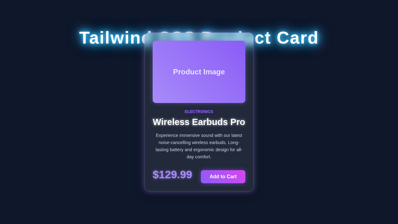
<div class="relative max-w-sm mx-auto bg-white rounded-xl shadow-lg overflow-hidden md:max-w-md transition-all duration-300 hover:shadow-xl">
<!-- Product Image -->
<!-- The 'object-cover object-center' classes ensure the image fills its container while maintaining aspect ratio -->
<img class="w-full h-48 object-cover object-center" src="https://via.placeholder.com/400x300/a78bfa/ffffff?text=Product+Image" alt="Modern Product">
<div class="p-6">
<!-- Product Category/Badge -->
<!-- 'uppercase tracking-wide text-sm text-indigo-500 font-semibold' styles the category text -->
<div class="uppercase tracking-wide text-sm text-indigo-500 font-semibold mb-2">Electronics</div>
<!-- Product Title -->
<!-- 'block mt-1 text-lg leading-tight font-medium text-black hover:underline' styles the title link -->
<a href="#" class="block mt-1 text-lg leading-tight font-medium text-black hover:underline">Wireless Earbuds Pro</a>
<!-- Product Description -->
<!-- 'mt-2 text-gray-500 text-sm' provides a subtle description style -->
<p class="mt-2 text-gray-500 text-sm">Experience immersive sound with our latest noise-cancelling wireless earbuds. Long-lasting battery and ergonomic design for all-day comfort.</p>
<div class="mt-4 flex items-baseline justify-between">
<!-- Product Price -->
<!-- 'text-2xl font-bold text-gray-900' ensures the price stands out -->
<span class="text-2xl font-bold text-gray-900">$129.99</span>
<!-- Call to Action Button -->
<!-- 'px-5 py-2 bg-indigo-600 text-white ...' styles a vibrant, interactive button -->
<button class="px-5 py-2 bg-indigo-600 text-white text-base font-medium rounded-lg hover:bg-indigo-700 focus:outline-none focus:ring-2 focus:ring-indigo-500 focus:ring-offset-2 transition-all duration-300">
Add to Cart
</button>
</div>
</div>
</div>
</body>
</html>CSS Styling with Tailwind CSS: Making It Shine
Tailwind CSS is incredible for rapid development. We will use utility classes directly in our HTML. This approach lets us style elements quickly. It also keeps our CSS file super lean. We’ll cover everything from layout to dark mode transitions. Get ready to see the power of Tailwind! Our minimal custom CSS (for the dark mode toggle) will be injected here:
styles.css
/*
 * styles.css
 * This file is intentionally left mostly empty as this tutorial primarily
 * demonstrates the use of Tailwind CSS utility classes directly in the HTML.
 *
 * You can add custom CSS here if needed, for example:
 * - Global styles that are not easily managed by Tailwind's base/utility system.
 * - Specific custom components using @apply directives (if you are using Tailwind CLI).
 * - Complex animations or custom keyframes not supported by utility classes.
 *
 * For this specific 'Tailwind CSS Product Card' component, all styling is achieved
 * through Tailwind utility classes applied within the 'index.html' file.
 */
JavaScript for Interactivity: Dark Mode Toggle
While Tailwind handles most styling, a little JavaScript brings our dark mode toggle to life. We’ll write a small script to switch between light and dark themes. This script will update the `localStorage`. It also toggles a class on the `` element. It’s simple, yet very effective. Here is the JavaScript:
How It All Works Together: Deconstructing Our Tailwind Product Card
Now, let’s break down each piece of our amazing Tailwind Product Card. Understanding these parts will empower you. You can then build even more complex components. We’ll go section by section. This helps clarify every detail.
The Main Card Container
Our product card starts with a main `div`. This `div` acts as the wrapper. We apply several Tailwind classes here. For instance, `bg-white` sets the background to white. In dark mode, `dark:bg-gray-800` switches it to a dark gray. We add `rounded-lg` for soft corners. A `shadow-md` gives it a nice lift. Furthermore, `overflow-hidden` ensures content stays within bounds. For responsiveness, `w-full` makes it take full width. However, `sm:w-80` limits its width on small screens and up. This provides a clean look on various devices. The `flex flex-col` classes arrange items vertically. Learn more about Flexbox on MDN.
Pro Tip: Tailwind’s `dark:` prefix is your best friend for dark mode. It applies styles only when the `dark` class is present on the `html` element. This makes responsive dark mode a breeze!
The Product Image
An image is crucial for a product card. We’ve included an `img` tag at the top. The `w-full` and `h-48` classes control its dimensions. `object-cover` ensures the image fills its container without distortion. It looks professional. Additionally, `transition-transform` and `duration-300` set up a smooth animation. This animation happens on hover. When you hover, `hover:scale-105` makes the image slightly larger. It’s a subtle but engaging effect!
Product Information and Pricing
Inside the card, we have a `div` for text content. `p-4` adds padding around all sides. This creates breathing room. The product title uses `text-xl` and `font-semibold`. It stands out clearly. `mb-2` adds a margin below. The description uses `text-gray-600` and `dark:text-gray-300`. This ensures good contrast in both modes. We also have `text-sm` for a smaller font. The price is styled with `text-2xl` and `font-bold`. A distinct `text-purple-600` color makes it pop. You can easily change this color. The `mb-4` adds space before the buttons.
Action Buttons and Dark Mode Toggle
Finally, we have our action buttons. These are inside a `div` with `flex justify-between`. This spreads the buttons apart. The “Add to Cart” button uses `bg-purple-600` for its background. `text-white` provides contrast. `py-2 px-4` adds padding. `rounded-md` gives it soft edges. A `hover:bg-purple-700` provides feedback on hover. The “Learn More” button is similar but uses an outline style. This distinction helps users. You can learn more about creating a Dark Mode Card with Tailwind CSS here!
The dark mode toggle button is also styled with Tailwind. Its styles change based on the current theme. We use a simple SVG for the icon. The JavaScript updates the `html` element’s `dark` class. This triggers all our Tailwind dark mode styles. Check out our detailed guide on Tailwind Dark Mode Toggle with HTML & CSS for v4 to master this feature.
Remember: Consistency is key. Keep your button styles unified across your site. This improves user experience significantly.
JavaScript in Action
Our small JavaScript snippet manages the dark mode state. When the button is clicked, it checks the current theme. It then toggles the `dark` class on the `document.documentElement` (the `` tag). It also saves this preference to `localStorage`. This ensures the user’s theme choice persists across visits. On page load, it checks `localStorage`. It applies the saved theme. This offers a seamless experience. If you want to dive deeper into managing themes, exploring our Tailwind Dark Mode Tutorial: HTML & CSS Utilities is a great next step.
Tips to Customise Your Tailwind Product Card
You’ve built an amazing card! But don’t stop here. Customisation is where the real fun begins. Here are some ideas to make it uniquely yours:
- Add More Details: Include star ratings, stock availability, or a brand logo. Tailwind makes it easy to integrate these elements.
- Change the Layout: Experiment with horizontal layouts for larger screens. Use `flex-row` and adjust item spacing. Maybe make the image take up 50% on wider screens.
- Explore Different Hover Effects: Try `hover:shadow-lg` for a more prominent shadow. Or perhaps `hover:translate-y-[-5px]` to lift the card slightly. The possibilities are endless! You can find more CSS transform properties on MDN Web Docs.
- Integrate a Quantity Selector: For e-commerce, a +/- quantity input within the card can be very useful. This enhances direct interaction.
Conclusion: You Just Built a Stunning Tailwind Product Card!
Wow, you did it! You just learned how to build a fully responsive Tailwind Product Card. It includes dark mode, engaging hover effects, and a solid structure. This project showcases the power and flexibility of Tailwind CSS. You’ve mastered key concepts for modern web development. Now you have a fantastic component ready for any project. Don’t be shy! Share your creations with us. Keep building, keep learning, and keep creating amazing things!