Dark Mode Card with Tailwind CSS: A Responsive UI Tutorial
Hey! If you have wanted to build a responsive user profile card but had no idea where to start, you are in the right place. Today, we are going to create a fantastic Dark Mode Card. This project will look great. Furthermore, it will adapt beautifully to any screen size. You will even add a cool dark mode toggle! It is a super practical skill to learn.
What We Are Building
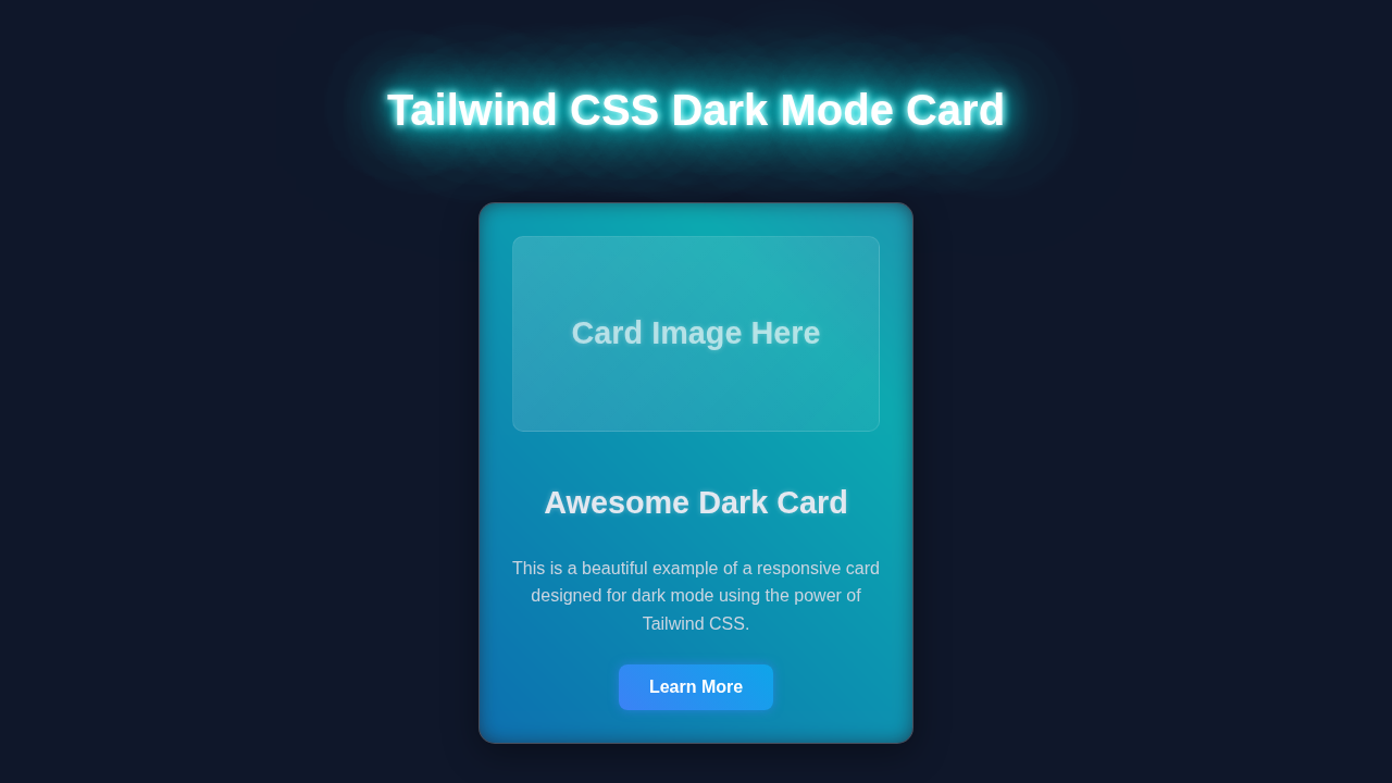
We are going to build a sleek, responsive user profile card. Imagine a small, elegant box that displays key user information. This includes an avatar, name, title, and a short bio. The best part? It will feature a dynamic dark mode toggle. Your card will instantly switch between light and dark themes. This makes for a great user experience. It is perfect for portfolios, dashboards, or any modern web application. You will learn about key Tailwind CSS features along the way. Therefore, your UI skills will level up dramatically!
HTML Structure: The Blueprint of Our Dark Mode Card
Our HTML will be straightforward. We will set up the basic layout for our profile card. This includes sections for the image, text details, and the dark mode toggle. Each element plays a crucial role. Thus, we will keep it semantic and clean. You will quickly see how our page is structured. Let’s dive into the code!
index.html
<!-- index.html -->
<!DOCTYPE html>
<html lang="en" class="dark"> <!-- Add 'dark' class here for default dark mode -->
<head>
    <meta charset="UTF-8">
    <meta name="viewport" content="width=device-width, initial-scale=1.0">
    <title>Tailwind CSS Dark Mode Card</title>

    <!-- Tailwind CSS CDN for quick setup -->
    <!-- For production, use a build process with PostCSS and Tailwind CLI for optimal performance. -->
    <script src="https://cdn.tailwindcss.com"></script>
    <script>
        // Configure Tailwind to enable dark mode based on 'class' on the <html> tag
        tailwind.config = {
            darkMode: 'class',
            theme: {
                extend: {
                    fontFamily: {
                        // Ensure safe fonts are used
                        sans: ['Arial', 'Helvetica', 'sans-serif'],
                    }
                }
            }
        }
    </script>

    <!-- Link to styles.css (optional for CDN setup, mainly for custom CSS or build processes) -->
    <link rel="stylesheet" href="styles.css">
</head>
<body class="flex items-center justify-center min-h-screen bg-gray-100 dark:bg-slate-900 p-4 box-border">
    <!-- Dark Mode Toggle Button -->
    <button id="darkModeToggle" class="absolute top-4 right-4 px-4 py-2 rounded-lg bg-blue-600 text-white shadow-md hover:bg-blue-700 dark:bg-blue-500 dark:hover:bg-blue-600 transition-colors duration-200 focus:outline-none focus:ring-2 focus:ring-blue-500 focus:ring-opacity-50">
        Toggle Dark Mode
    </button>

    <!-- Card Container -->
    <div class="max-w-sm w-full bg-white dark:bg-slate-800 rounded-xl shadow-xl overflow-hidden transform transition-all duration-300 hover:scale-105 border border-gray-200 dark:border-slate-700">
        <!-- Card Image Placeholder -->
        <div class="relative h-48 bg-gray-200 dark:bg-slate-700 flex items-center justify-center p-6">
            <!-- Example SVG placeholder for an image -->
            <svg class="h-24 w-24 text-gray-500 dark:text-slate-400" fill="none" viewBox="0 0 24 24" stroke="currentColor">
                <path stroke-linecap="round" stroke-linejoin="round" stroke-width="2" d="M4 16l4.586-4.586a2 2 0 012.828 0L16 16m-2-2l1.586-1.586a2 2 0 012.828 0L20 14m-6-6h.01M6 20h12a2 2 0 002-2V6a2 2 0 00-2-2H6a2 2 0 00-2 2v12a2 2 0 002 2z" />
            </svg>
            <p class="absolute bottom-4 right-4 text-gray-600 dark:text-slate-300 text-sm">Image Placeholder</p>
        </div>

        <!-- Card Content -->
        <div class="p-6">
            <h2 class="text-3xl font-bold text-gray-900 dark:text-white mb-3 leading-tight">
                Modern Dark Card
            </h2>
            <p class="text-gray-700 dark:text-slate-300 text-base mb-5">
                This responsive card beautifully adapts to both light and dark modes, showcasing Tailwind CSS's powerful utility-first approach.
            </p>
            <div class="flex items-center justify-between">
                <span class="text-lg font-semibold text-blue-600 dark:text-blue-400">
                    $29.99
                </span>
                <button class="px-5 py-2 bg-blue-600 text-white font-medium rounded-lg hover:bg-blue-700 dark:bg-blue-500 dark:hover:bg-blue-600 focus:outline-none focus:ring-2 focus:ring-blue-500 focus:ring-opacity-50 transition-colors duration-200 shadow-md">
                    Add to Cart
                </button>
            </div>
        </div>
    </div>

    <script>
        // Dark mode toggle functionality
        const darkModeToggle = document.getElementById('darkModeToggle');
        const htmlElement = document.documentElement; // This refers to the <html> tag

        // Check for saved theme preference or default to dark if no preference
        const savedTheme = localStorage.getItem('theme');
        if (savedTheme === 'light') {
            htmlElement.classList.remove('dark');
        } else { // Default to dark if no preference or 'dark' saved
            htmlElement.classList.add('dark');
        }

        darkModeToggle.addEventListener('click', () => {
            if (htmlElement.classList.contains('dark')) {
                htmlElement.classList.remove('dark');
                localStorage.setItem('theme', 'light');
            } else {
                htmlElement.classList.add('dark');
                localStorage.setItem('theme', 'dark');
            }
        });
    </script>
</body>
</html>
CSS Styling: Bringing Our Dark Mode Card to Life with Tailwind
Now, let’s add some style to our user profile card. We will use Tailwind CSS utility classes exclusively. This approach is incredibly efficient. It lets us style elements rapidly. We will define colors, spacing, and responsive behaviors. Tailwind makes managing dark mode styles simple. You will see how easy it is to apply conditional styles. For instance, we target the dark: variant. This handles the theme switching. It’s truly powerful!
styles.css
/* styles.css */

/*
   This file is typically used in a Tailwind CSS project with a build process
   (e.g., using PostCSS and Tailwind CLI).
   It imports Tailwind's base styles, components, and utilities.

   For the provided index.html, Tailwind CSS is included via CDN,
   so these @tailwind directives won't be processed directly by the browser.
   You would uncomment these if you were setting up a local build environment.
*/

/* @tailwind base; */
/* @tailwind components; */
/* @tailwind utilities; */

/*
   Add any custom CSS here that cannot be achieved with Tailwind utility classes.
   For this tutorial, we focus on using Tailwind utilities directly in the HTML.
*/

/* Global box-sizing for consistency, often included in base styles */
html {
    box-sizing: border-box;
}
*,
*::before,
*::after {
    box-sizing: inherit;
}
JavaScript: Powering the Dark Mode Toggle
The dark mode functionality needs a touch of JavaScript. We will write a small script to handle the toggle button’s logic. This script will detect user preferences. It will also save their choice using localStorage. This means their preferred mode persists across visits. Your card will remember their setting. It is an essential feature for a good user experience. Don’t worry about this part. The code is minimal and easy to understand.
How It All Works Together
Let’s break down how these pieces create our awesome Dark Mode Card. We built this project step by step. Each section serves a specific purpose. Understanding their interaction is key. We integrate HTML, CSS, and JavaScript seamlessly. This creates a fully functional component.
The HTML Foundation
Firstly, our HTML sets up the container. This is our main div element. Inside, we have an image for the avatar. There is also a section for text. Finally, we include a button for the dark mode toggle. Each part has a clear role. Semantic HTML helps with accessibility. It also makes our code more readable. We rely on this structure. It provides the base for all our styling.
Pro Tip: Always start with clean HTML! Good structure makes styling and scripting much easier down the line. It’s like building a strong foundation for your house.
Tailwind CSS for Styling and Responsiveness
Tailwind CSS is where the magic happens for our design. We use classes like bg-white and dark:bg-gray-800. These toggle the background color. Furthermore, classes like md:flex control responsiveness. This ensures our card looks good on all devices. Tailwind’s utility-first approach saves a lot of time. It eliminates the need for writing custom CSS files. If you’re curious about the benefits, check out our comparison: Tailwind CSS vs Plain CSS.
JavaScript for Dynamic Interaction
The JavaScript handles the actual dark mode switch. When the toggle button is clicked, our script adds or removes the dark class. This class lives on the html element. Tailwind then applies the corresponding dark: utility classes. We also use localStorage. This remembers the user’s preference. This is a common pattern for persistent settings. Learn more about Web Storage API on MDN. It’s super handy for front-end development.
Educator’s Note: Understanding how JavaScript manipulates the DOM is crucial. It bridges the gap between static HTML/CSS and dynamic, interactive web experiences. Keep practicing!
Tips to Customise It
You have built an amazing responsive Dark Mode Card! Now, let’s make it truly yours. Here are some ideas to extend this project:
- Add More Profile Details: Include social media icons or a contact button. You could even add a small portfolio link section.
- Animate the Toggle: Use CSS transitions to make the dark mode switch smoother. A gentle fade or slide would look fantastic.
- Change the Layout: Experiment with different Tailwind Grid or Flexbox layouts. Maybe put the avatar on the side instead of the top.
- Dynamic Content: Integrate with an API to fetch real user data. This would make your card even more powerful and dynamic.
Conclusion
You did it! You successfully built a responsive user profile Dark Mode Card. You used Tailwind CSS like a pro. Furthermore, you added functional dark mode capabilities with JavaScript. This project showcases important web development skills. It demonstrates responsiveness, styling, and interactive elements. You have created a truly modern UI component. Feel free to share your creation online! Show off your new skills. Keep building, keep learning, and keep creating amazing things for the web!