Screen Resolution Checker JS: HTML, CSS & JavaScript Tutorial
Hey there, fellow coders! If you’ve ever wanted to build a real-time Screen Resolution Checker but felt a little lost, you are in the perfect spot. Today, we’re going to create something super useful. You will learn to display your screen and viewport dimensions instantly. This project is a fantastic way to grasp core web development concepts! It shows you how devices truly see your websites.
What We Are Building: Your Personal Screen Resolution Checker
Get ready to build an interactive tool! This project will display crucial screen information. We’ll show your device’s screen width and height. It will also reveal your browser’s viewport dimensions. The viewport changes as you resize your window. So, this tool updates in real-time. It’s incredibly useful for responsive web design. You will gain a clear understanding of these vital metrics. This little app will be your new best friend for front-end development.
HTML Structure: The Foundation of Our Screen Resolution Checker
First, let’s lay the groundwork with HTML. We’ll set up a simple container for our data. Inside, we’ll have distinct areas to display all our screen information. It’s clean, semantic, and easy to understand. Here’s the basic HTML for our project:
index.html
<!DOCTYPE html>
<html lang="en">
<head>
<meta charset="UTF-8">
<meta name="viewport" content="width=device-width, initial-scale=1.0">
<title>Screen Resolution Checker</title>
<link rel="stylesheet" href="styles.css">
</head>
<body>
<div class="container">
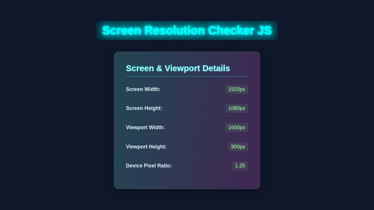
<h1>Screen Resolution & Viewport Checker</h1>
<div class="resolution-card">
<h2>Screen Dimensions</h2>
<p><span class="label">Total Width:</span> <span id="screenWidth" class="value">--</span></p>
<p><span class="label">Total Height:</span> <span id="screenHeight" class="value">--</span></p>
<p class="note"><span>(Physical screen resolution)</span></p>
</div>
<div class="resolution-card">
<h2>Viewport Dimensions</h2>
<p><span class="label">Inner Width:</span> <span id="viewportWidth" class="value">--</span></p>
<p><span class="label">Inner Height:</span> <span id="viewportHeight" class="value">--</span></p>
<p class="note"><span>(Browser window content area)</span></p>
</div>
<div class="resolution-card">
<h2>Device Details</h2>
<p><span class="label">Device Pixel Ratio:</span> <span id="devicePixelRatio" class="value">--</span></p>
<p class="note"><span>(Ratio of physical to CSS pixels)</span></p>
</div>
<p class="footer-note">Resize your browser window to see viewport values update dynamically.</p>
</div>
<script src="script.js" defer></script>
</body>
</html>CSS Styling: Making Our Display Look Great
Next, we’ll add some CSS magic. This will make our checker look professional and user-friendly. We’ll use Flexbox for easy alignment and responsiveness. Our design will be clean and tidy. Don’t worry, the styles are straightforward. Let’s make it shine on any screen size!
styles.css
/* General Resets and Base Styles */
body {
    margin: 0;
    padding: 0;
    font-family: Arial, Helvetica, sans-serif; /* Safe font stack */
    background-color: #f0f2f5; /* Light grey background */
    color: #333;
    display: flex;
    justify-content: center;
    align-items: center;
    min-height: 100vh; /* Full viewport height */
    box-sizing: border-box; /* Include padding and border in element's total width and height */
    overflow-x: hidden; /* Prevent horizontal scroll */
}

.container {
    background-color: #fff;
    padding: 30px;
    border-radius: 12px;
    box-shadow: 0 4px 20px rgba(0, 0, 0, 0.1);
    max-width: 600px; /* Constrain width */
    width: 90%; /* Responsive width */
    text-align: center;
    margin: 20px; /* Add some margin for smaller screens */
    box-sizing: border-box;
}

h1 {
    color: #0056b3; /* Dark blue for main title */
    margin-bottom: 30px;
    font-size: 2.2em;
    font-weight: bold;
    line-height: 1.2;
}

.resolution-card {
    background-color: #e9f5ff; /* Light blue background for cards */
    border: 1px solid #cceeff;
    border-radius: 8px;
    padding: 20px;
    margin-bottom: 25px;
    text-align: left;
    box-shadow: 0 2px 8px rgba(0, 0, 0, 0.05);
    transition: transform 0.2s ease-in-out;
    overflow: hidden; /* Ensure content stays within */
}

.resolution-card:hover {
    transform: translateY(-5px);
}

h2 {
    color: #007bff; /* Brighter blue for card titles */
    margin-top: 0;
    margin-bottom: 15px;
    font-size: 1.5em;
    border-bottom: 1px solid #aaddff;
    padding-bottom: 10px;
}

p {
    display: flex;
    justify-content: space-between;
    align-items: center;
    margin-bottom: 10px;
    font-size: 1.1em;
    line-height: 1.4;
}

p:last-of-type {
    margin-bottom: 0;
}

.label {
    font-weight: bold;
    color: #555;
    flex-grow: 1; /* Allows label to take available space */
}

.value {
    color: #28a745; /* Green for values */
    font-weight: bold;
    background-color: #d4edda;
    padding: 5px 10px;
    border-radius: 5px;
    min-width: 80px; /* Ensure values have a consistent minimum width */
    text-align: right;
}

.note {
    font-size: 0.9em;
    color: #6c757d;
    text-align: right;
    margin-top: -8px; /* Adjust spacing with previous p */
    margin-bottom: 15px;
    justify-content: flex-end; /* Align to the right */
    display: flex;
}

.note span {
    font-style: italic;
    background-color: #f8f9fa;
    padding: 3px 8px;
    border-radius: 4px;
}

.footer-note {
    font-size: 0.9em;
    color: #007bff;
    margin-top: 30px;
    background-color: #e9f5ff;
    padding: 10px;
    border-radius: 8px;
    border: 1px dashed #aaddff;
    text-align: center;
}

/* Responsive adjustments */
@media (max-width: 480px) {
    h1 {
        font-size: 1.8em;
    }

    h2 {
        font-size: 1.3em;
    }

    .container {
        padding: 20px;
        margin: 15px;
    }

    .resolution-card {
        padding: 15px;
    }

    p {
        font-size: 1em;
        flex-direction: column; /* Stack label and value on small screens */
        align-items: flex-start;
    }

    .value {
        margin-top: 5px;
        width: 100%;
        text-align: left;
        box-sizing: border-box;
    }

    .note {
        text-align: left;
        justify-content: flex-start;
    }
}
JavaScript: Bringing Our Screen Resolution Checker to Life
Now for the fun part: JavaScript! This is where our Screen Resolution Checker gets its real-time power. We’ll write simple functions to grab screen data. Then, we’ll update the HTML dynamically. Your checker will react instantly as you resize your browser. This is the cool part of real-time web development! Let’s dive into the code.
script.js
/**
 * script.js
 * Screen Resolution Checker
 * This script dynamically displays the screen's total resolution,
 * the browser's viewport resolution, and the device's pixel ratio.
 * It updates these values on initial load and whenever the window is resized.
 */

document.addEventListener('DOMContentLoaded', () => {
    // Get references to the DOM elements where resolution data will be displayed
    const screenWidthEl = document.getElementById('screenWidth');
    const screenHeightEl = document.getElementById('screenHeight');
    const viewportWidthEl = document.getElementById('viewportWidth');
    const viewportHeightEl = document.getElementById('viewportHeight');
    const devicePixelRatioEl = document.getElementById('devicePixelRatio');

    /**
     * Updates the displayed resolution values in the DOM.
     * Uses window.screen for physical screen dimensions and
     * window.innerWidth/innerHeight for the browser's viewport dimensions.
     * window.devicePixelRatio provides the device pixel ratio.
     */
    function updateResolution() {
        // Screen Dimensions (physical display)
        screenWidthEl.textContent = `${window.screen.width}px`;
        screenHeightEl.textContent = `${window.screen.height}px`;

        // Viewport Dimensions (browser window content area)
        viewportWidthEl.textContent = `${window.innerWidth}px`;
        viewportHeightEl.textContent = `${window.innerHeight}px`;

        // Device Pixel Ratio
        devicePixelRatioEl.textContent = window.devicePixelRatio;
    }

    // Call the function once when the page loads to display initial values
    updateResolution();

    // Add an event listener to update resolution whenever the window is resized
    window.addEventListener('resize', updateResolution);

    // Optional: Add a subtle animation/transition for value updates if desired
    // This could be done with CSS transitions on the .value class
    // by momentarily adding a class like 'highlight' on update.
});
How It All Works Together: Unveiling the Magic
You’ve seen the individual parts. Now, let’s connect the dots. This section explains how HTML, CSS, and JavaScript collaborate. It forms our awesome, real-time checker. Each piece plays a vital role. Understanding this synergy is key to building dynamic web apps.
Setting Up the HTML Skeleton for Data Display
Our HTML provides the basic structure for all our information. We start with a main div element, identified by the ID screen-info-card. This acts as our central display container. Think of it as the main billboard for our data. Inside this card, we strategically place several smaller div elements. Each of these smaller divisions is crucial. It holds a specific piece of information, like the screen width or viewport height. For example, we have IDs such as screenWidth, screenHeight, viewportWidth, and viewportHeight. These unique IDs are incredibly important for our JavaScript. They allow our script to pinpoint exactly where to inject or update the information. Consider them dedicated labels that the JavaScript can easily find and write to. A clear and logical HTML structure not only makes your code easier to read for other developers (and your future self!), but it also forms a robust foundation for larger applications. Just like how good component structuring can significantly improve React Performance in complex applications, a well-organized HTML layout is absolutely crucial for any project’s success and maintainability.
Pro Tip: Always give meaningful IDs and classes to your HTML elements. It makes your code much easier to read and debug. Your future self will thank you for it!
Beautiful CSS for Clarity and Responsiveness
Our CSS handles all the visual appeal of our Screen Resolution Checker. We start by styling the body to ensure our content is perfectly centered on the page. For this, we often use modern CSS techniques like Flexbox or Grid. Flexbox is especially powerful for aligning items effortlessly. Then, we apply styles to the main screen-info-card. It receives a clean background color, ample padding, and a subtle box-shadow. This makes the card visually pop and stand out on the page! Each individual data-item element within the card also gets its own specific styling. We adjust font sizes, colors, and margins. This ensures all the displayed information is highly readable and easy on the eyes. Importantly, we design the layout to be adaptive. This means it looks fantastic on large desktop monitors, medium-sized tablets, and even small mobile phone screens. Achieving good responsiveness is absolutely vital in today’s multi-device web environment! If you want to dive deeper into making layouts with ease, learning more about Flexbox on MDN is an excellent next step.
The JavaScript Brains: Real-time Updates
This is truly where the magic of our real-time checker happens! Our JavaScript file contains a core function named updateScreenInfo(). This function is the engine of our application. It performs two critical tasks. First, it fetches the total screen dimensions of the user’s device. We use window.screen.width and window.screen.height for this. These values represent the physical resolution of the display. Second, it retrieves the current browser viewport dimensions. window.innerWidth and window.innerHeight provide the exact width and height of the browser’s content area. This value dynamically changes as you resize your window! MDN has a fantastic explanation of innerWidth if you want to explore its nuances.
Once we have these crucial dimension values, JavaScript updates our HTML display. It utilizes document.getElementById() to locate each specific display area. For example, it finds the element with the ID screenWidth. Then, it uses the textContent property to insert the numerical value. This is how the numbers magically appear and update on your page! The real-time aspect comes from our event listener. We attach our updateScreenInfo function to the window.addEventListener('resize', ...) event. Every time you resize your browser window, this function automatically executes again. Your displayed numbers update instantly, providing immediate feedback! Finally, we ensure updateScreenInfo() is called once when the page initially loads. This way, users see the correct initial values right away.
Did you know? Understanding how to listen for browser events like ‘resize’ or ‘scroll’ is fundamental. It empowers you to build highly interactive and responsive web applications!
Tips to Customise Your Screen Resolution Checker
You’ve built a solid foundation. Now, let’s think about how you can make it even better! Customization is key to truly owning your projects. Here are a few ideas to extend your new tool:
- Add More Screen Information: The
window.screenobject is a treasure trove of information! Beyond just width and height, you could try displayingscreen.colorDepth(the number of bits per pixel used for colors) orscreen.pixelDepth(the number of bits per pixel for the screen). These properties offer even more granular details about the user’s display capabilities. It’s a great way to provide a truly comprehensive report! - Implement a “Copy to Clipboard” Button: For developers using your tool, efficiency is key. Imagine adding a small button right next to each displayed value. When clicked, this button would instantly copy that specific dimension (e.g., “1920px”) to the user’s clipboard. This simple feature makes your checker incredibly convenient for copying values into CSS or design tools!
- Style with Different Themes: Give your users choices! Experiment with creating a sleek light mode and a cool dark mode for your checker. You could even add a simple toggle button that switches between these themes dynamically. This is a fantastic opportunity to practice managing CSS classes with JavaScript. For inspiration and practical implementation, check out our comprehensive guide on creating a Tailwind Dark Mode Toggle with HTML & JS: A Complete Tutorial.
- Make It a Browser Extension: Ready for a more advanced challenge? Transform your web page into a fully functional browser extension! This would allow users to access your Screen Resolution Checker with a single click from their browser toolbar, making it an always-available utility. It involves learning a bit about manifest files and browser APIs, but it’s an incredibly rewarding project!
- Implement a Real-time Grid Overlay: For true responsive design debugging, imagine adding a transparent grid overlay that dynamically adjusts with the viewport. This visual aid could show common breakpoints or a customizable grid pattern directly over any webpage. It’s a powerful feature that takes your checker to the next level for web developers!
Conclusion: You Built a Real-time Screen Resolution Checker!
Wow, you did it! You just built a functional Screen Resolution Checker. You’ve mastered HTML for structure. You used CSS for beautiful styling. And you harnessed JavaScript for dynamic, real-time updates. This project enhances your understanding of responsive design. You should be really proud of this accomplishment. Go ahead, share your creation with friends and fellow developers! Perhaps even integrate it into another tool, like a Python Telegram Bot Gemini AI: Your Smart Chat Assistant, to send reports. What will you build next with your awesome new skills?