Hello Developers!
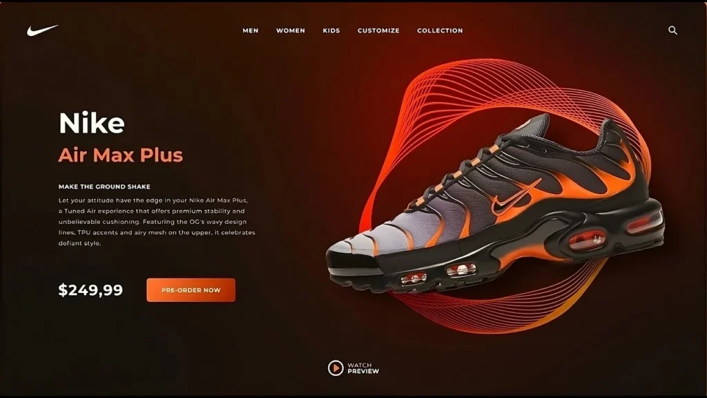
Welcome back to another exciting journey into web design! Today, we’re diving into something sleek, stylish, and absolutely stunning — a Shoes Landing Page. Whether you’re a frontend enthusiast, a beginner in HTML & CSS, or a creative developer looking to build something visually modern, this blog is your go-to guide.

But before we begin, if you’re someone who learns better by watching, feel free to check out the full YouTube video tutorial below:
Why Build a Shoes Landing Page?
Landing pages are essential in modern web development. They serve as the first interaction point between a product and a potential buyer. For a product like sneakers — trendy, dynamic, and fashionable — your landing page must reflect the same energy.
This tutorial walks through building a high-converting Shoes landing page that doesn’t just look good but also tells a story visually and aesthetically.
What You’ll Learn in This Blog
- Creating a clean and minimal layout
- Using creative UI/UX concepts to highlight products
- Structuring the page for maximum conversion
- Adding responsive design for all screen sizes
- Ensuring SEO-friendly layout and performance
Let’s explore each section in detail (excluding the code for now) to truly understand the thoughtful design elements, user flow, and visual storytelling that make this sneaker shoes landing page both modern and compelling.
Prefer visual learning? Watch the video below to see the full step-by-step process of designing this modern Shoes landing page.
The Vision Behind the Design
Before jumping into code, a successful design starts with a clear vision. The idea here is to capture the essence of a premium sneaker brand and convert it into a visually immersive layout.
The use of large typography, bold colors, minimal sections, and hero-centered product visuals help in creating a design that screams style. The design mimics some of the biggest brand trends like Nike and Adidas — bold, clean, and to-the-point.
Some elements you’ll notice:
- Large hero section with shoe image front and center
- Smooth and subtle text animations
- Hover effects on icons and buttons
- Call-to-action (CTA) button placement for maximum engagement
SEO-Friendly Structure: Let’s Talk Essentials
Creating a landing page isn’t just about visuals. For your page to rank well in search engines like Google, you need:
- Proper HTML semantics (header, main, footer)
- Meaningful titles and meta descriptions
- Focus keyword usage (like “Shoes landing page”)
- Mobile-friendly responsive design
- Fast loading time with optimized assets
- Always include descriptive alt text for every image on your shoes landing page to enhance accessibility for screen readers and improve SEO by helping search engines better index your visual content.
This blog is written with those goals in mind.
Key Features of This Shoes Landing Page
Here are some top features of the page designed in the tutorial:
1. Minimalist Hero Section
A fullscreen hero layout featuring the sneaker, brand logo, and a punchy slogan. The CTA button encourages users to take immediate action.
2. Sticky Navbar with Social Icons
A sleek header section fixed at the top. It contains the brand name/logo and links to social media platforms — great for trust-building.
3. Color-Changing Themes
The user can switch between different sneaker color variants by clicking the color icons. This interactivity adds more engagement.
4. Custom Button Animations
CTAs are crucial. The buttons are creatively designed to react on hover and add motion feedback, making the experience dynamic.
5. Modern Typography
Web-safe, modern fonts such as Poppins or Roboto are commonly chosen in shoes landing page designs to create a visually appealing, minimalist appearance that enhances readability across all screen sizes and devices.
6. Full Responsiveness
From large desktops to mobile phones, the design adapts perfectly, ensuring that all users enjoy the experience.
7. Futuristic Footer Section
A slim footer with copyright info, social media links, and quick site links — simple but effective.
Why This Design Works
This Shoes landing page isn’t just eye-candy. It’s been built with marketing and conversion goals in mind. Here’s why it stands out:
- Clear Product Focus: The shoe is the hero. Every element revolves around showcasing it effectively.
- Branding Elements: From fonts to colors, everything aligns with sneaker culture.
- Call-to-Action Visibility: Well-placed buttons and prompts improve click-through rates.
- Visual Hierarchy: Smart use of space, font size, and images guide the user’s eyes exactly where they should go.
Behind the Aesthetic Choices
Color Palette
The color scheme is minimal — dominated by whites, blacks, and grays with pops of color. This keeps the focus on the sneakers.
Font Pairings
Using a bold sans-serif font for headlines and a soft font for body text creates a good visual contrast.
Layout Decisions
The layout follows a Z-pattern reading layout, guiding users from logo to image, then to content and CTA.
Mobile Optimization
The landing page is fully responsive. Key adjustments include:
- Hero image scaling
- Text resizing for readability
- Buttons stretching or stacking
- Navbar collapsing into hamburger menu (optional enhancement)
This ensures that mobile users have an experience as smooth as desktop users.
Tips to Customize Your Own Shoes Landing Page
If you plan to build a similar page or customize this one, here are a few suggestions:
- Use your own images — personalize it with your own sneaker shots.
- Tweak the CTA — align it with your product goals.
- Add a testimonial section — for credibility.
- Integrate with backend — if you want shopping cart functionality.
- Experiment with animation libraries like GSAP or AOS.
Download the Source Code
Ready to try it out yourself?
You can download the complete source code of this project and start customizing it as per your brand’s needs. This is a perfect practice project for those learning frontend web design and trying to build their portfolio.
Whether you’re using it as a personal learning asset or part of a commercial project, this landing page is a fantastic starting point.
Don’t refresh the page or switch tabs until the download completes.
If the Google Drive link does not appear, click here
Final Thoughts
Creating a Shoes landing page like this one is not just about coding — it’s about crafting a digital experience. You’re not just placing images and text; you’re telling a story, evoking emotion, and persuading your visitor to take action.
We hope you enjoyed this breakdown and got inspired to build your own amazing product landing pages. Don’t forget to check out the full video tutorial and give it a like if it helped you.
Till then, happy coding, and keep creating!


