Design System Component Development Using HTML, CSS and JavaScript
Developing robust and reusable Design System Components is absolutely crucial in modern web development. These aren’t just fancy UI elements; they are the bedrock of consistent user experiences and efficient development workflows across large-scale applications. By harnessing the power of HTML, CSS, and JavaScript, we can construct highly versatile components that serve as the building blocks for any digital product. Let’s dive in and craft something amazing together!
What We Are Building: Understanding Design System Components
Today, we’re going to build a versatile ‘User Profile Card’ component. Imagine the profile cards you see on platforms like LinkedIn, GitHub, or social media sites – they’re clean, informative, and visually engaging. Our inspiration comes from the need for a standardized block that can display user information consistently across various parts of an application, from a directory page to a comment section.
Why are design system components trending? Simply put, they solve real-world problems. They reduce design debt, accelerate development cycles, and ensure brand consistency across every touchpoint. Think about a company with multiple products; a shared design system means their buttons, inputs, and cards all look and behave the same way. This component, for instance, could be used on a team page, a user dashboard, or even integrated into search results. Its reusability makes it incredibly valuable.
This approach isn’t just for large enterprises. Even solo developers or small teams benefit immensely from thinking in components. It fosters better code organization and makes future scaling or refactoring a breeze. Our profile card will demonstrate how a seemingly simple element can encapsulate complex design and functional requirements when built with a component-first mindset.
HTML Structure
The foundation of any good component begins with clean, semantic HTML. We’ll wrap our profile card elements within a parent container and define distinct sections for the header and body. This structure provides clear demarcation for styling and accessibility purposes.
<div class="profile-card">
    <div class="profile-header">
        <img src="https://via.placeholder.com/150/0000FF/FFFFFF?text=Avatar" alt="User Avatar" class="profile-avatar">
        <h3 class="profile-name">Jane Doe</h3>
        <p class="profile-title">Lead Frontend Developer</p>
    </div>
    <div class="profile-body">
        <p class="profile-bio">Passionate about crafting pixel-perfect user interfaces and enhancing developer experience. Always learning new web technologies and sharing knowledge with the community.</p>
        <div class="profile-social">
            <a href="#" class="social-link" aria-label="LinkedIn"><i class="fab fa-linkedin"></i></a>
            <a href="#" class="social-link" aria-label="GitHub"><i class="fab fa-github"></i></a>
            <a href="#" class="social-link" aria-label="Twitter"><i class="fab fa-twitter"></i></a>
        </div>
        <button class="profile-action-button">Follow</button>
    </div>
</div>
CSS Styling
Next, we’ll apply CSS to bring our profile card to life. We will focus on creating a visually appealing layout, ensuring readability, and adding a touch of modern design flair. Our styling will emphasize clarity and user engagement.
/* Basic Reset & Global Styles (for demo purposes) */
body {
    font-family: 'Segoe UI', Tahoma, Geneva, Verdana, sans-serif;
    display: flex;
    justify-content: center;
    align-items: center;
    min-height: 100vh;
    background-color: #f0f2f5;
    margin: 0;
    padding: 20px;
    box-sizing: border-box;
}

/* Profile Card Styling */
.profile-card {
    background-color: #ffffff;
    border-radius: 12px;
    box-shadow: 0 4px 20px rgba(0, 0, 0, 0.08);
    width: 100%;
    max-width: 340px;
    text-align: center;
    padding: 30px;
    box-sizing: border-box;
    transition: transform 0.3s ease-in-out;
}

.profile-card:hover {
    transform: translateY(-5px);
}

.profile-header {
    margin-bottom: 25px;
}

.profile-avatar {
    width: 120px;
    height: 120px;
    border-radius: 50%;
    object-fit: cover;
    border: 4px solid #4a90e2;
    margin-bottom: 15px;
    box-shadow: 0 2px 8px rgba(0, 0, 0, 0.1);
}

.profile-name {
    font-size: 1.8em;
    color: #333;
    margin: 0 0 5px;
    font-weight: 700;
}

.profile-title {
    font-size: 1em;
    color: #666;
    margin: 0;
    font-weight: 400;
}

.profile-body {
    text-align: left;
}

.profile-bio {
    font-size: 0.95em;
    color: #555;
    line-height: 1.6;
    margin-top: 0;
    margin-bottom: 25px;
}

.profile-social {
    display: flex;
    justify-content: center;
    gap: 15px;
    margin-bottom: 30px;
}

.social-link {
    color: #4a90e2;
    font-size: 1.5em;
    text-decoration: none;
    transition: color 0.2s ease;
}

.social-link:hover {
    color: #357bd8;
}

.profile-action-button {
    background-color: #4a90e2;
    color: #ffffff;
    border: none;
    border-radius: 8px;
    padding: 12px 25px;
    font-size: 1.1em;
    cursor: pointer;
    transition: background-color 0.2s ease, transform 0.2s ease;
    width: 100%;
    font-weight: 600;
}

.profile-action-button:hover {
    background-color: #357bd8;
    transform: translateY(-2px);
}

.profile-action-button:active {
    transform: translateY(0);
}
Step-by-Step Breakdown
Let’s dissect the code to understand how each piece contributes to our final design system component. We’re building this step-by-step to ensure clarity and maintainability. Remember, component development emphasizes modularity.
Initial Setup & Semantics
Our `div` with the class `profile-card` acts as the main container. Inside, `profile-header` holds the user’s avatar, name, and title. The `profile-body` section contains the bio, social links, and action button. Using semantic HTML tags like `h3` for the name and `p` for the title and bio is not just good practice for readability; it’s vital for accessibility. Screen readers rely on these tags to convey structure. Furthermore, descriptive class names like `profile-avatar` or `social-link` enhance code comprehension for any developer working on the project later on. For our social icons, we’re using Font Awesome. You’d typically include its CDN link in your HTML’s head tag: <link rel="stylesheet" href="https://cdnjs.cloudflare.com/ajax/libs/font-awesome/5.15.4/css/all.min.css">.
Basic Styling & Layout
The `.profile-card` is styled to be a standalone block, with a background, rounded corners, and a subtle `box-shadow` for depth. We’ve set a `max-width` to keep it from stretching too wide on larger screens, ensuring it remains visually appealing. The `padding` gives internal breathing room. Crucially, the `transition` property on `transform` and `box-shadow` provides a smooth hover effect, enhancing the user experience. You can see other useful CSS transition properties on MDN.
Crafting the Avatar and Text
The `.profile-avatar` is central to the card. Its `width`, `height`, and `border-radius: 50%` make it a perfect circle. An `object-fit: cover` ensures the image scales correctly without distortion. We’ve added a vibrant blue border and a small shadow for a polished look. The text elements – `.profile-name` and `.profile-title` – use different font sizes and weights to establish a visual hierarchy. Short paragraphs for description like the `.profile-bio` are critical for readability. When constructing these elements, always consider how they contribute to the overall visual balance.
Social Links and Action Button
The `.profile-social` section uses Flexbox to neatly arrange the social media icons. `justify-content: center` centers them horizontally, and `gap` ensures consistent spacing. Each `.social-link` is styled with a distinct color and a smooth hover transition. The `.profile-action-button` is designed to be prominent and clickable. It has a solid background color, white text, and a distinct border-radius. Interactive elements like buttons should always provide visual feedback, so we’ve included `hover` and `active` states with `transform` to make it feel responsive. For building more complex interactive components, you might want to review this Progress Bar: HTML CSS JavaScript Component Tutorial.
Adding Interactivity with JavaScript
While our current component is visually complete with HTML and CSS, real-world design system components often require dynamic behavior. For example, you might want the ‘Follow’ button to change text to ‘Following’ and disable itself after a click. You could achieve this with a simple JavaScript event listener:
JavaScript allows us to manipulate the DOM, react to user actions, and fetch data dynamically. A click event listener on our button could toggle its text, change its styling, or even trigger an API call to update the user’s follow status on a backend.
You might also want to implement a ‘Share’ button that opens a modal or copies a link. Furthermore, for components that fetch data, JavaScript is essential. For instance, populating a list of users or dynamically loading the avatar image would leverage JavaScript’s capabilities. Remember that building scalable JavaScript applications also benefits from considering LLM Tokens: JavaScript Strategies for Optimization, even if your component interaction is minimal. This ensures efficient resource usage.
Making It Responsive
Responsiveness is non-negotiable for modern web components. Our profile card is inherently mobile-first due to its `max-width` and `padding` setup. However, we can use media queries to fine-tune its appearance on different screen sizes.
@media (max-width: 480px) {
    .profile-card {
        padding: 20px;
        margin: 10px; /* Add some margin on smaller screens */
    }

    .profile-avatar {
        width: 100px;
        height: 100px;
        border-width: 3px;
    }

    .profile-name {
        font-size: 1.6em;
    }

    .profile-title,
    .profile-bio {
        font-size: 0.9em;
    }

    .profile-social {
        gap: 10px;
        margin-bottom: 20px;
    }

    .social-link {
        font-size: 1.3em;
    }

    .profile-action-button {
        padding: 10px 20px;
        font-size: 1em;
    }
}
This media query targets screens with a maximum width of 480 pixels. Inside, we adjust the padding of the card, reduce the avatar size, and slightly decrease font sizes. This ensures the component remains compact and legible on smaller devices without feeling cramped. A mobile-first approach generally leads to better performance and a more robust layout. For additional insights on responsive design, CSS-Tricks offers a wealth of information on layout techniques like Flexbox, which is key to adaptable interfaces. Mastering these techniques is critical for delivering components that look great everywhere.
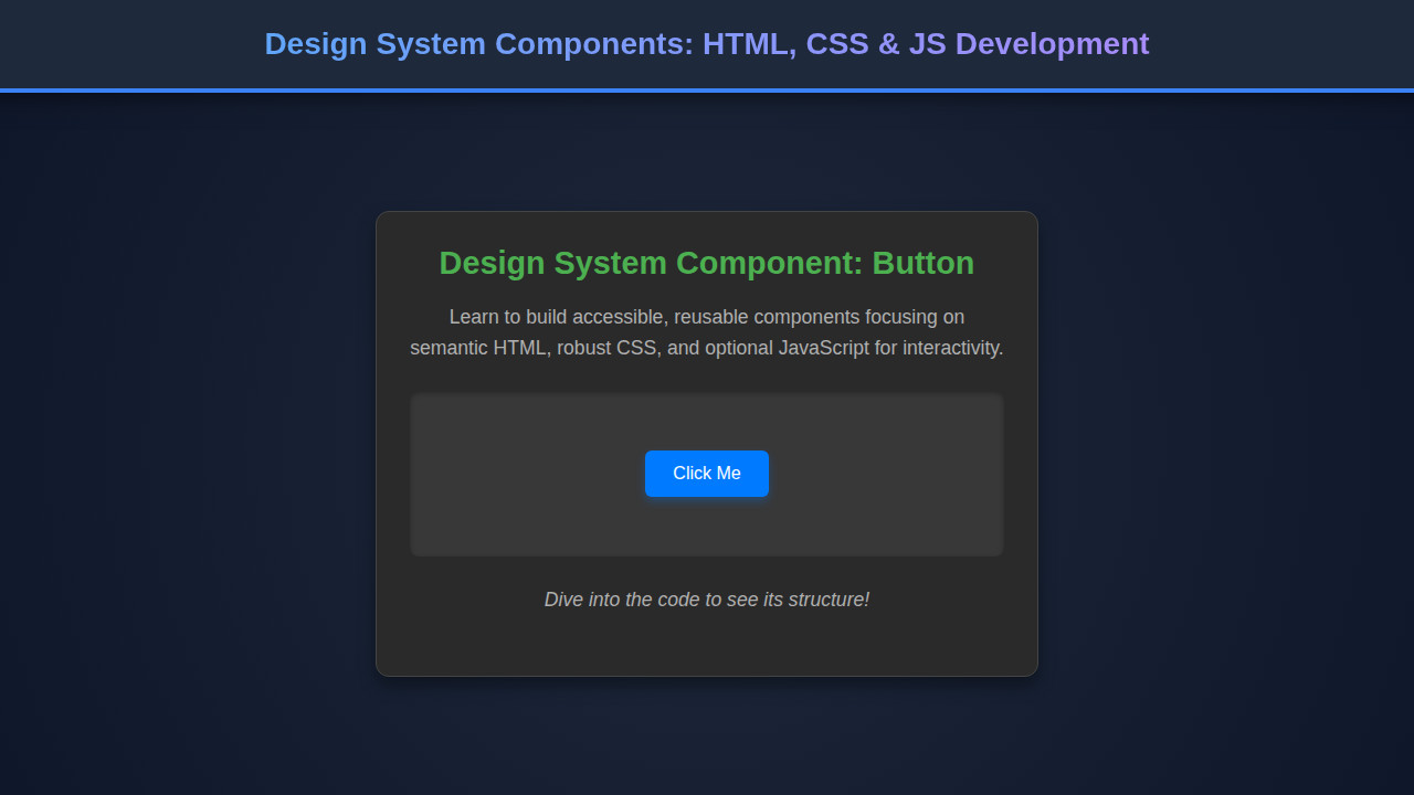
Final Output
By combining our HTML structure with the carefully crafted CSS, we achieve a sleek and functional User Profile Card. Key visual elements include the circular avatar with a subtle border, clear typographic hierarchy for the name and title, an engaging bio, and interactive social media icons. The ‘Follow’ button stands out, inviting user interaction. The overall aesthetic is clean, modern, and professional, ready to be integrated into any web application. Its responsive nature guarantees a consistent experience across desktop, tablet, and mobile devices.
Good design isn’t just about aesthetics; it’s about creating intuitive, accessible, and performant user experiences. Our component embodies these principles through thoughtful structure, styling, and a readiness for dynamic behavior.
Conclusion
We’ve walked through the process of developing a core Design System Component – the User Profile Card – using the fundamental trio of HTML, CSS, and JavaScript. Understanding how to structure, style, and envision interactivity for such components is a foundational skill for any modern web developer. These reusable building blocks not only streamline development but also enforce visual and functional consistency across your entire product ecosystem.
The principles discussed today – semantic HTML, modular CSS, responsiveness, and planned JavaScript interactivity – are transferable to virtually any component you might build, from navigation bars to complex data tables. Embrace component-driven development; it will empower you to build more scalable, maintainable, and delightful user experiences. Start incorporating these ideas into your next project and watch your development workflow transform!