Tailwind Multi-Step Form: Create Responsive Forms with HTML & JS
Hey there, future pro-coder! If you have wanted to build a Tailwind Multi-Step Form but had no idea where to start, you are in the right place. We are going to create something amazing together. This form will guide users through a registration process step-by-step. It looks super professional and works like a charm! Let’s dive in and build a fantastic user experience.
What We Are Building: A Sleek, User-Friendly Multi-Step Form
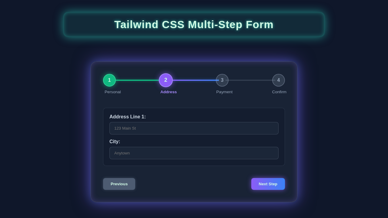
We are going to craft a beautiful registration form. It will break down a long process into smaller, manageable steps. Think about it: nobody likes filling out a giant form all at once. Our form will show one section at a time. Users will click “Next” and “Previous” buttons to navigate. This design makes registration feel much easier. It also vastly improves the user experience. We will use Tailwind CSS for awesome styling. It provides responsive design right out of the box. JavaScript will handle all the step-by-step logic. It manages hiding and showing sections. It also takes care of basic validation. The result? A dynamic and highly responsive form. Get ready to impress your users with this modern web component!
HTML Structure: The Blueprint of Our Form
First, let’s lay down the basic HTML. This structure will hold all our form elements. We will define each step as a separate section. Each section will be hidden or shown with JavaScript. This keeps our form clean and organized. It provides a solid foundation for styling.
index.html
<!DOCTYPE html>
<html lang="en">
<head>
    <meta charset="UTF-8">
    <meta name="viewport" content="width=device-width, initial-scale=1.0">
    <title>Tailwind CSS Multi-Step Form</title>
    <!--
        Tailwind CSS CDN for quick setup.
        In a production environment, it's recommended to install Tailwind CSS
        via npm and use a build process (e.g., PostCSS) to purge unused styles
        and optimize the CSS bundle size.
    -->
    <script src="https://cdn.tailwindcss.com"></script>
    <!-- Custom styles (if any, typically for global resets or specific overrides not handled by Tailwind) -->
    <link rel="stylesheet" href="styles.css">
</head>
<body class="bg-gray-100 flex items-center justify-center min-h-screen p-4 font-[Arial,Helvetica,sans-serif]">
    <!-- Main container for the multi-step form -->
    <div class="w-full max-w-2xl bg-white rounded-xl shadow-2xl p-6 md:p-10 border border-gray-200">
        <h2 class="text-3xl font-bold text-gray-800 mb-8 text-center">Multi-Step Registration Form</h2>

        <!-- Progress Bar and Step Indicators -->
        <div class="mb-10 relative">
            <div class="flex justify-between items-center mb-4">
                <!-- Step Indicator 1 -->
                <div id="step-indicator-1" class="flex items-center justify-center w-10 h-10 rounded-full bg-indigo-600 text-white font-bold text-lg border-2 border-indigo-600 transition-all duration-300 ease-in-out shadow-md">
                    1
                </div>
                <!-- Line between steps -->
                <div class="flex-grow h-1 bg-gray-300 mx-2 relative">
                    <div id="progress-line-1" class="absolute top-0 left-0 h-full w-0 bg-indigo-500 transition-all duration-300 ease-in-out"></div>
                </div>
                <!-- Step Indicator 2 -->
                <div id="step-indicator-2" class="flex items-center justify-center w-10 h-10 rounded-full bg-gray-300 text-gray-700 font-bold text-lg border-2 border-gray-300 transition-all duration-300 ease-in-out shadow-md">
                    2
                </div>
                <!-- Line between steps -->
                <div class="flex-grow h-1 bg-gray-300 mx-2 relative">
                    <div id="progress-line-2" class="absolute top-0 left-0 h-full w-0 bg-indigo-500 transition-all duration-300 ease-in-out"></div>
                </div>
                <!-- Step Indicator 3 -->
                <div id="step-indicator-3" class="flex items-center justify-center w-10 h-10 rounded-full bg-gray-300 text-gray-700 font-bold text-lg border-2 border-gray-300 transition-all duration-300 ease-in-out shadow-md">
                    3
                </div>
                <!-- Line between steps -->
                <div class="flex-grow h-1 bg-gray-300 mx-2 relative">
                    <div id="progress-line-3" class="absolute top-0 left-0 h-full w-0 bg-indigo-500 transition-all duration-300 ease-in-out"></div>
                </div>
                <!-- Step Indicator 4 (Final Step) -->
                <div id="step-indicator-4" class="flex items-center justify-center w-10 h-10 rounded-full bg-gray-300 text-gray-700 font-bold text-lg border-2 border-gray-300 transition-all duration-300 ease-in-out shadow-md">
                    4
                </div>
            </div>
            <div class="flex justify-between text-sm text-gray-600">
                <span class="text-indigo-600 font-medium">Personal Info</span>
                <span>Address Details</span>
                <span>Payment Info</span>
                <span>Confirmation</span>
            </div>
        </div>

        <!-- Form Steps Container -->
        <form id="multi-step-form" class="space-y-6">
            <!-- Step 1: Personal Information -->
            <div id="step-1-content" class="form-step transition-opacity duration-500 ease-in-out">
                <h3 class="text-2xl font-semibold text-gray-700 mb-6">Step 1: Personal Information</h3>
                <div class="mb-4">
                    <label for="fullName" class="block text-gray-700 text-sm font-semibold mb-2">Full Name</label>
                    <input type="text" id="fullName" name="fullName" required
                           class="w-full px-4 py-2 border border-gray-300 rounded-lg focus:outline-none focus:ring-2 focus:ring-indigo-500 focus:border-transparent transition duration-200 ease-in-out"
                           placeholder="John Doe">
                </div>
                <div class="mb-4">
                    <label for="email" class="block text-gray-700 text-sm font-semibold mb-2">Email Address</label>
                    <input type="email" id="email" name="email" required
                           class="w-full px-4 py-2 border border-gray-300 rounded-lg focus:outline-none focus:ring-2 focus:ring-indigo-500 focus:border-transparent transition duration-200 ease-in-out"
                           placeholder="john.doe@example.com">
                </div>
                <div class="mb-4">
                    <label for="phone" class="block text-gray-700 text-sm font-semibold mb-2">Phone Number</label>
                    <input type="tel" id="phone" name="phone"
                           class="w-full px-4 py-2 border border-gray-300 rounded-lg focus:outline-none focus:ring-2 focus:ring-indigo-500 focus:border-transparent transition duration-200 ease-in-out"
                           placeholder="+1 (555) 123-4567">
                </div>
            </div>

            <!-- Step 2: Address Details (initially hidden) -->
            <div id="step-2-content" class="form-step hidden transition-opacity duration-500 ease-in-out">
                <h3 class="text-2xl font-semibold text-gray-700 mb-6">Step 2: Address Details</h3>
                <div class="mb-4">
                    <label for="addressLine1" class="block text-gray-700 text-sm font-semibold mb-2">Address Line 1</label>
                    <input type="text" id="addressLine1" name="addressLine1" required
                           class="w-full px-4 py-2 border border-gray-300 rounded-lg focus:outline-none focus:ring-2 focus:ring-indigo-500 focus:border-transparent transition duration-200 ease-in-out"
                           placeholder="123 Main St">
                </div>
                <div class="mb-4">
                    <label for="addressLine2" class="block text-gray-700 text-sm font-semibold mb-2">Address Line 2 (Optional)</label>
                    <input type="text" id="addressLine2" name="addressLine2"
                           class="w-full px-4 py-2 border border-gray-300 rounded-lg focus:outline-none focus:ring-2 focus:ring-indigo-500 focus:border-transparent transition duration-200 ease-in-out"
                           placeholder="Apt, Suite, Bldg">
                </div>
                <div class="grid grid-cols-1 md:grid-cols-2 gap-4">
                    <div class="mb-4">
                        <label for="city" class="block text-gray-700 text-sm font-semibold mb-2">City</label>
                        <input type="text" id="city" name="city" required
                               class="w-full px-4 py-2 border border-gray-300 rounded-lg focus:outline-none focus:ring-2 focus:ring-indigo-500 focus:border-transparent transition duration-200 ease-in-out"
                               placeholder="Anytown">
                    </div>
                    <div class="mb-4">
                        <label for="zipCode" class="block text-gray-700 text-sm font-semibold mb-2">Zip Code</label>
                        <input type="text" id="zipCode" name="zipCode" required
                               class="w-full px-4 py-2 border border-gray-300 rounded-lg focus:outline-none focus:ring-2 focus:ring-indigo-500 focus:border-transparent transition duration-200 ease-in-out"
                               placeholder="12345">
                    </div>
                </div>
            </div>

            <!-- Step 3: Payment Information (initially hidden) -->
            <div id="step-3-content" class="form-step hidden transition-opacity duration-500 ease-in-out">
                <h3 class="text-2xl font-semibold text-gray-700 mb-6">Step 3: Payment Information</h3>
                <div class="mb-4">
                    <label for="cardNumber" class="block text-gray-700 text-sm font-semibold mb-2">Card Number</label>
                    <input type="text" id="cardNumber" name="cardNumber" required
                           class="w-full px-4 py-2 border border-gray-300 rounded-lg focus:outline-none focus:ring-2 focus:ring-indigo-500 focus:border-transparent transition duration-200 ease-in-out"
                           placeholder="**** **** **** ****">
                </div>
                <div class="grid grid-cols-2 gap-4 mb-4">
                    <div>
                        <label for="expiryDate" class="block text-gray-700 text-sm font-semibold mb-2">Expiry Date</label>
                        <input type="text" id="expiryDate" name="expiryDate" required
                               class="w-full px-4 py-2 border border-gray-300 rounded-lg focus:outline-none focus:ring-2 focus:ring-indigo-500 focus:border-transparent transition duration-200 ease-in-out"
                               placeholder="MM/YY">
                    </div>
                    <div>
                        <label for="cvv" class="block text-gray-700 text-sm font-semibold mb-2">CVV</label>
                        <input type="text" id="cvv" name="cvv" required
                               class="w-full px-4 py-2 border border-gray-300 rounded-lg focus:outline-none focus:ring-2 focus:ring-indigo-500 focus:border-transparent transition duration-200 ease-in-out"
                               placeholder="123">
                    </div>
                </div>
            </div>

            <!-- Step 4: Confirmation (initially hidden) -->
            <div id="step-4-content" class="form-step hidden transition-opacity duration-500 ease-in-out">
                <h3 class="text-2xl font-semibold text-gray-700 mb-6">Step 4: Review & Confirm</h3>
                <p class="text-gray-700 mb-4">Please review your information before submitting:</p>
                <div class="bg-gray-50 p-4 rounded-lg border border-gray-200 text-gray-800">
                    <p><strong>Name:</strong> <span id="confirm-fullName"></span></p>
                    <p><strong>Email:</strong> <span id="confirm-email"></span></p>
                    <p><strong>Phone:</strong> <span id="confirm-phone"></span></p>
                    <p><strong>Address:</strong> <span id="confirm-addressLine1"></span>, <span id="confirm-city"></span>, <span id="confirm-zipCode"></span></p>
                    <p class="mt-4 text-green-600 font-semibold">Payment information is securely processed and not displayed here.</p>
                </div>
                <p class="text-gray-600 mt-6 text-sm">By clicking "Submit", you agree to our terms and conditions.</p>
            </div>

            <!-- Navigation Buttons -->
            <div class="flex justify-between pt-6 border-t border-gray-200 mt-8">
                <button type="button" id="prev-btn"
                        class="px-6 py-3 bg-gray-300 text-gray-800 font-semibold rounded-lg shadow-md hover:bg-gray-400 focus:outline-none focus:ring-2 focus:ring-gray-500 focus:ring-offset-2 transition duration-200 ease-in-out opacity-0 pointer-events-none">
                    Previous
                </button>
                <button type="button" id="next-btn"
                        class="px-8 py-3 bg-indigo-600 text-white font-semibold rounded-lg shadow-md hover:bg-indigo-700 focus:outline-none focus:ring-2 focus:ring-indigo-500 focus:ring-offset-2 transition duration-200 ease-in-out">
                    Next
                </button>
                <button type="submit" id="submit-btn"
                        class="px-8 py-3 bg-green-600 text-white font-semibold rounded-lg shadow-md hover:bg-green-700 focus:outline-none focus:ring-2 focus:ring-green-500 focus:ring-offset-2 transition duration-200 ease-in-out hidden">
                    Submit
                </button>
            </div>
        </form>
    </div>

    <!-- JavaScript for multi-step form logic -->
    <script src="script.js"></script>
</body>
</html>
CSS Styling: Making Our Form Look Amazing with Tailwind CSS
Now for the fun part: styling! We will use Tailwind CSS utility classes. These classes let us quickly add beautiful designs. We can control spacing, colors, and responsiveness. Tailwind makes it simple to create stunning interfaces. You will love how easy it is to make things look good.
styles.css
/*
 * styles.css
 * This file is intentionally minimal, as the design heavily relies on Tailwind CSS utility classes.
 * For production, you would typically configure Tailwind CLI or PostCSS to process your CSS.
 *
 * This file primarily ensures universal box-sizing and a safe font family as per requirements.
 */

/* Ensures consistent box model across all elements */
*, *::before, *::after {
    box-sizing: border-box;
}

/* Sets a safe, system-default font family if Tailwind's default is overridden or not desired.
   Tailwind's default font stack typically includes system fonts, but this ensures compliance. */
body {
    font-family: Arial, Helvetica, sans-serif;
}

/*
 * Note: No further custom CSS is needed for this component, as all styling is handled
 * by Tailwind CSS utility classes directly in the HTML.
 * If you need to add complex custom styles or animations that are not easily
 * achievable with utility classes, you would add them here.
 */
JavaScript: Bringing Our Tailwind Multi-Step Form to Life
Here’s the cool part: JavaScript makes our form interactive. It will manage moving between steps. We need to hide previous steps and show the next one. JavaScript also handles validation. It ensures users complete each step correctly. This provides a smooth and guided experience. Get ready to add some dynamic behavior!
script.js
/**
 * script.js
 * Handles the logic for the multi-step form, including step navigation,
 * progress updates, and basic client-side validation.
 */

document.addEventListener('DOMContentLoaded', () => {
    // --- Element References ---
    const form = document.getElementById('multi-step-form');
    const formSteps = document.querySelectorAll('.form-step');
    const stepIndicators = [
        document.getElementById('step-indicator-1'),
        document.getElementById('step-indicator-2'),
        document.getElementById('step-indicator-3'),
        document.getElementById('step-indicator-4')
    ];
    const progressLines = [
        document.getElementById('progress-line-1'),
        document.getElementById('progress-line-2'),
        document.getElementById('progress-line-3')
    ];
    const prevBtn = document.getElementById('prev-btn');
    const nextBtn = document.getElementById('next-btn');
    const submitBtn = document.getElementById('submit-btn');

    // --- State Variables ---
    let currentStep = 0; // Tracks the current active step (0-indexed)

    // --- Functions ---

    /**
     * Shows a specific step and updates the UI (indicators, progress bar, buttons).
     * @param {number} stepIndex - The index of the step to show.
     */
    function showStep(stepIndex) {
        // 1. Hide all form steps
        formSteps.forEach((step, index) => {
            step.classList.add('hidden'); // Tailwind's 'hidden' utility
            step.classList.remove('opacity-100'); // For fade-out transition
            step.classList.add('opacity-0');     // For fade-out transition
        });

        // 2. Show the current step
        formSteps[stepIndex].classList.remove('hidden');
        // A small delay helps ensure the transition fires correctly after 'hidden' is removed
        setTimeout(() => {
            formSteps[stepIndex].classList.remove('opacity-0');
            formSteps[stepIndex].classList.add('opacity-100');
        }, 50);

        // 3. Update step indicators and progress lines
        stepIndicators.forEach((indicator, index) => {
            if (index < stepIndex) {
                // Completed steps: green background
                indicator.classList.remove('bg-gray-300', 'text-gray-700', 'border-gray-300', 'bg-indigo-600');
                indicator.classList.add('bg-green-500', 'text-white', 'border-green-500');
            } else if (index === stepIndex) {
                // Current step: indigo background
                indicator.classList.remove('bg-gray-300', 'text-gray-700', 'border-gray-300', 'bg-green-500', 'text-white', 'border-green-500');
                indicator.classList.add('bg-indigo-600', 'text-white', 'border-indigo-600');
            } else {
                // Future steps: gray background
                indicator.classList.remove('bg-indigo-600', 'text-white', 'border-indigo-600', 'bg-green-500', 'text-white', 'border-green-500');
                indicator.classList.add('bg-gray-300', 'text-gray-700', 'border-gray-300');
            }
        });

        // Update progress lines
        progressLines.forEach((line, index) => {
            if (index < stepIndex) {
                line.style.width = '100%'; // Line is filled
                line.classList.remove('bg-indigo-500');
                line.classList.add('bg-green-500'); // Completed lines are green
            } else {
                line.style.width = '0%'; // Line is empty
                line.classList.remove('bg-green-500');
                line.classList.add('bg-indigo-500'); // Active lines are indigo, or default gray if not reached
            }
        });


        // 4. Update button visibility
        if (currentStep === 0) {
            prevBtn.classList.add('opacity-0', 'pointer-events-none'); // Hide and disable "Previous"
        } else {
            prevBtn.classList.remove('opacity-0', 'pointer-events-none');
        }

        if (currentStep === formSteps.length - 1) {
            nextBtn.classList.add('hidden'); // Hide "Next"
            submitBtn.classList.remove('hidden'); // Show "Submit"
            updateConfirmationStep(); // Populate confirmation details
        } else {
            nextBtn.classList.remove('hidden');
            submitBtn.classList.add('hidden');
        }
    }

    /**
     * Performs basic client-side validation for the current step's inputs.
     * @param {number} stepIndex - The index of the step to validate.
     * @returns {boolean} - True if all required fields are valid, false otherwise.
     */
    function validateStep(stepIndex) {
        const currentFormStep = formSteps[stepIndex];
        const requiredInputs = currentFormStep.querySelectorAll('[required]');
        let isValid = true;

        requiredInputs.forEach(input => {
            if (!input.value.trim()) {
                isValid = false;
                input.classList.add('border-red-500', 'ring-red-300'); // Highlight invalid fields
                input.focus(); // Focus on the first invalid field
            } else {
                input.classList.remove('border-red-500', 'ring-red-300'); // Remove highlight if valid
            }
        });
        return isValid;
    }

    /**
     * Populates the confirmation step with data from previous steps.
     * This function should be called when navigating to the last step.
     */
    function updateConfirmationStep() {
        document.getElementById('confirm-fullName').textContent = document.getElementById('fullName').value;
        document.getElementById('confirm-email').textContent = document.getElementById('email').value;
        document.getElementById('confirm-phone').textContent = document.getElementById('phone').value || 'N/A';
        document.getElementById('confirm-addressLine1').textContent = document.getElementById('addressLine1').value;
        document.getElementById('confirm-city').textContent = document.getElementById('city').value;
        document.getElementById('confirm-zipCode').textContent = document.getElementById('zipCode').value;
        // Address Line 2 is optional, so check if it exists
        const addressLine2 = document.getElementById('addressLine2').value;
        const confirmAddressSpan = document.getElementById('confirm-addressLine1');
        if (addressLine2) {
            confirmAddressSpan.textContent += `, ${addressLine2}`;
        }
    }

    // --- Event Listeners ---

    // Handle "Next" button click
    nextBtn.addEventListener('click', () => {
        if (validateStep(currentStep)) {
            if (currentStep < formSteps.length - 1) {
                currentStep++;
                showStep(currentStep);
            }
        } else {
            alert('Please fill in all required fields.'); // Provide user feedback
        }
    });

    // Handle "Previous" button click
    prevBtn.addEventListener('click', () => {
        if (currentStep > 0) {
            currentStep--;
            showStep(currentStep);
        }
    });

    // Handle form submission
    form.addEventListener('submit', (event) => {
        event.preventDefault(); // Prevent default form submission
        if (validateStep(currentStep)) {
            // In a real application, you would collect all form data here
            // and send it to a backend server (e.g., using fetch API).
            const formData = new FormData(form);
            const data = Object.fromEntries(formData.entries());
            console.log('Form Submitted!', data);

            // Display a success message
            alert('Form submitted successfully! Check console for data.');
            // Optionally, redirect the user or clear the form
            // form.reset();
            // currentStep = 0;
            // showStep(currentStep);
        } else {
            alert('Please review your information before submitting.');
        }
    });

    // --- Initialization ---
    showStep(currentStep); // Display the first step when the page loads
});
How It All Works Together: The Magic Behind the Scenes
Let’s break down how our form functions. Each part plays a vital role. Together, they create a seamless user journey. We will examine the flow from start to finish. This explanation will make everything clear.
Initial Setup: Getting Things Ready
When the page loads, JavaScript springs into action immediately. First, it identifies all the individual form steps in our HTML. Then, it carefully shows only the very first step to the user. All other subsequent steps remain gracefully hidden from view. A clear progress indicator updates right away. This visually shows the user’s current position within the entire form. This provides immediate visual feedback. It helps users understand exactly where they are in the registration process. We often use display: none or Tailwind’s hidden class for these hidden steps. This ensures a clean, uncluttered starting point for everyone.
Navigating with Buttons: Seamless Transitions
Our “Next” and “Previous” buttons are absolutely crucial for interaction. When you click “Next,” the current active step first hides itself. Then, the subsequent step magically becomes visible to the user. The entire process reverses when you click “Previous.” This allows users to go back and correct mistakes. We attach special event listeners to these buttons in our JavaScript. Importantly, JavaScript intelligently prevents navigation if validation rules fail on the current step. This ensures data integrity. It also gently guides users to complete each part effectively. It truly makes the form feel smart and responsive.
Pro Tip: Managing form state can be tricky. Consider using an object to store user input from each step. This keeps your data organized. You can then submit it all at the end.
Form Validation: Ensuring Quality Input
Validation is super important for any web form, especially a registration one. Before moving to the next step, we carefully check the current step’s inputs. Are all required fields actually filled in by the user? Is the email format correct and valid? Does a password meet complexity requirements? If anything is wrong, our JavaScript will politely stop navigation. A clear error message appears, guiding the user to fix the issue. This critical step prevents incomplete or incorrect submissions. It vastly improves your overall data quality. Remember, good validation makes forms user-friendly and reliable. You can learn more about HTML form validation attributes on MDN. For more tips on creating accessible and user-friendly forms, check out this guide on CSS-Tricks.
Updating the Progress Bar: Visual Motivation
The progress bar keeps users constantly informed. It visually shows them how far they have come in their journey. Each time a user successfully moves to a new step, the bar instantly updates. We calculate the percentage of steps completed. Then, we smoothly adjust the width of the progress bar element using CSS. This simple visual cue is incredibly powerful. It motivates users to finish the process by showing their advancement. It helps manage expectations about the form’s length. Think about how a progress bar works when you install an app or download a tailwind music player. It creates a similar sense of accomplishment and clarity!
Final Submission: The Grand Finale
Once all steps are carefully completed, the final “Submit” button appears. This is the moment of truth! When clicked, our JavaScript gathers all the user data. This includes all inputs from every single step. This consolidated data can then be sent to a server. You might use the fetch API for this, for example. A success message or redirection often follows. This clearly confirms the user’s successful registration. It marks the triumphant end of our multi-step journey. This entire process, from start to finish, is a huge win for user experience!
Friendly Reminder: Building interactive elements like this is a core skill. Keep practicing! You can try building other dynamic components, like a responsive sidebar with dark mode, to hone your skills.
Tips to Customise It: Make It Your Own!
You’ve built an awesome form! Now, how can you make it even better?
- Add More Validation Rules: Implement stronger password checks. Or validate specific input patterns like phone numbers. JavaScript offers many ways to do this.
- Integrate a Progress Bar Component: Instead of a simple width change, use a dedicated progress bar component. Tailwind UI or other libraries offer these. They can add a more polished look. The same attention to detail could make a Product Card Tailwind CSS stand out.
- Save Progress Locally: Use
localStorageto save user input. If they refresh the page, their progress remains. This improves user experience greatly. - Add Animations: Make step transitions smoother. Use Tailwind’s transition utilities. Or add custom CSS animations for a flair. This makes the form feel more dynamic.
- Dynamic Step Names: Show the name of the current step. This could be in the header. It helps users remember their progress.
Conclusion: You Just Mastered the Tailwind Multi-Step Form!
Wow, you did it! You truly did it! You just built a fully functional and stylish Tailwind Multi-Step Form. This is a massive accomplishment, and you should be incredibly proud! You gained hands-on experience with HTML structure. You learned about the power of Tailwind CSS for rapid styling. And you mastered dynamic interactions with JavaScript. These skills are absolutely invaluable for any aspiring web developer. Multi-step forms are fantastic for creating an intuitive user experience. They make even complex registration processes feel simple and achievable. Now you have the confidence and the technical know-how to create them yourself from scratch.
Don’t stop here; your coding adventure is just beginning! Take what you’ve learned and build something uniquely your own. Experiment with different designs, add more features, and push your creativity. Share your amazing creations with the procoder09.com community. We absolutely love seeing what incredible things you build! Keep coding, keep experimenting, and keep exploring new ideas. You are well on your way to becoming an incredible developer!