Responsive Sidebar Dark Mode in HTML & Tailwind CSS
Hey there, fellow coder! If you have wanted to build a beautiful and functional Responsive Sidebar Dark Mode layout but felt a bit lost, you are in the perfect place. We are going to craft an amazing dashboard sidebar today. This project will make your web apps look super professional. Plus, it will adapt flawlessly to any screen size. Get ready to build something awesome!
What We Are Building
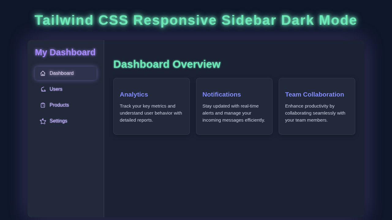
We are diving into creating a sleek, dynamic dashboard sidebar. Imagine a navigation system that looks great on big monitors. Then, it neatly tucks away on smaller mobile screens. Our sidebar will feature essential navigation links. It will also have a cool dark mode toggle. This makes your user interface super flexible. Your users will love switching between light and dark themes. This kind of feature is a hallmark of modern web design. It is also incredibly useful for dashboards and admin panels.
You’ll learn how to combine HTML for structure. Then, we’ll use Tailwind CSS for lightning-fast styling. Finally, a sprinkle of JavaScript will add interactivity. This includes opening and closing the sidebar. It also handles the exciting dark mode functionality. You’ll gain practical skills for any future project. For example, check out how we used Tailwind to create a Tailwind Music Player: Build with HTML & Tailwind CSS Utility, it uses similar principles!
HTML Structure: The Foundation of Our Sidebar
First, we need a solid HTML foundation. This structure will hold all our sidebar elements. It includes the main content area and a header. We will also add our navigation links. Don’t worry about the styling yet; that comes later with Tailwind. Here is the basic HTML markup we will use:
index.html
<!DOCTYPE html>
<html lang="en" class="light"> <!-- Default to light theme, script.js will check local storage/prefers-color-scheme -->
<head>
    <meta charset="UTF-8">
    <meta name="viewport" content="width=device-width, initial-scale=1.0">
    <title>Tailwind CSS Responsive Sidebar Dark Mode</title>
    <link rel="stylesheet" href="styles.css">
    <!--
        IMPORTANT: For Tailwind CSS to work, you need to have it set up in your project.
        Typically, you'd run 'npx tailwindcss -i ./input.css -o ./styles.css --watch'
        where input.css contains: @tailwind base; @tailwind components; @tailwind utilities;
    -->
</head>
<body class="bg-gray-100 dark:bg-gray-900 text-gray-900 dark:text-gray-100 min-h-screen flex font-[Arial,Helvetica,sans-serif]">
    <!-- Main application layout container -->
    <div class="flex-1 flex flex-col md:flex-row">

        <!-- Sidebar: Fixed position for mobile, relative for desktop -->
        <aside id="sidebar" class="fixed inset-y-0 left-0 z-50 w-64 bg-white dark:bg-gray-800 shadow-lg
                      md:relative md:translate-x-0
                      transform transition-transform duration-300 ease-in-out
                      -translate-x-full md:flex md:flex-col p-4 space-y-6">

            <!-- Sidebar Header/Logo -->
            <div class="flex items-center justify-between md:justify-center mb-6">
                <div class="text-2xl font-bold text-indigo-600 dark:text-indigo-400">
                    My Dashboard
                </div>
                <!-- Close button for mobile sidebar (visible only on small screens) -->
                <button id="mobileSidebarClose" class="md:hidden text-gray-500 dark:text-gray-400 hover:text-gray-700 dark:hover:text-gray-200 focus:outline-none">
                    <svg class="w-6 h-6" fill="none" stroke="currentColor" viewBox="0 0 24 24" xmlns="http://www.w3.org/2000/svg"><path stroke-linecap="round" stroke-linejoin="round" stroke-width="2" d="M6 18L18 6M6 6l12 12"></path></svg>
                </button>
            </div>

            <!-- Navigation Links -->
            <nav class="space-y-2 flex-1">
                <a href="#" class="flex items-center px-4 py-2 text-gray-700 dark:text-gray-300 hover:bg-indigo-50 dark:hover:bg-gray-700 hover:text-indigo-600 dark:hover:text-indigo-400 rounded-lg transition duration-200">
                    <svg class="w-5 h-5 mr-3" fill="none" stroke="currentColor" viewBox="0 0 24 24" xmlns="http://www.w3.org/2000/svg"><path stroke-linecap="round" stroke-linejoin="round" stroke-width="2" d="M3 12l2-2m0 0l7-7 7 7M5 10v10a1 1 0 001 1h3m10-11l2 2m-2-2v10a1 1 0 01-1 1h-3m-6 0a1 1 0 001-1v-4a1 1 0 011-1h2a1 1 0 011 1v4a1 1 0 001 1m-6 0h6"></path></svg>
                    Dashboard
                </a>
                <a href="#" class="flex items-center px-4 py-2 text-gray-700 dark:text-gray-300 hover:bg-indigo-50 dark:hover:bg-gray-700 hover:text-indigo-600 dark:hover:text-indigo-400 rounded-lg transition duration-200">
                    <svg class="w-5 h-5 mr-3" fill="none" stroke="currentColor" viewBox="0 0 24 24" xmlns="http://www.w3.org/2000/svg"><path stroke-linecap="round" stroke-linejoin="round" stroke-width="2" d="M17 20h5v-2a3 3 0 00-5.356-1.857M17 20H7m10 0v-2c0-.653-.105-1.299-.3-1.9M7 20h4v-2a3 3 0 00-5.356-1.857M7 20v-2c0-.653.105-1.299.3-1.9m0 0A7.002 7.002 0 0112 5a7.002 7.002 0 014.7-1.9M12 4v1"></path></svg>
                    Users
                </a>
                <a href="#" class="flex items-center px-4 py-2 text-gray-700 dark:text-gray-300 hover:bg-indigo-50 dark:hover:bg-gray-700 hover:text-indigo-600 dark:hover:text-indigo-400 rounded-lg transition duration-200">
                    <svg class="w-5 h-5 mr-3" fill="none" stroke="currentColor" viewBox="0 0 24 24" xmlns="http://www.w3.org/2000/svg"><path stroke-linecap="round" stroke-linejoin="round" stroke-width="2" d="M9 5H7a2 2 0 00-2 2v12a2 2 0 002 2h10a2 2 0 002-2V7a2 2 0 00-2-2h-2M9 5a2 2 0 002 2h2a2 2 0 002-2M9 5a2 2 0 012-2h2a2 2 0 012 2m-3 7h3m-3 4h3m-6-4h.01M9 16h.01"></path></svg>
                    Products
                </a>
                <a href="#" class="flex items-center px-4 py-2 text-gray-700 dark:text-gray-300 hover:bg-indigo-50 dark:hover:bg-gray-700 hover:text-indigo-600 dark:hover:text-indigo-400 rounded-lg transition duration-200">
                    <svg class="w-5 h-5 mr-3" fill="none" stroke="currentColor" viewBox="0 0 24 24" xmlns="http://www.w3.org/2000/svg"><path stroke-linecap="round" stroke-linejoin="round" stroke-width="2" d="M10.325 4.317c.515-1.129 1.93-1.129 2.445 0l2.454 5.378a1.5 1.5 0 001.693.856l5.77-.824c1.236-.176 1.737 1.401.766 2.05l-4.14 3.737a1.5 1.5 0 00-.472 1.597l1.246 5.645c.27.994-.852 1.758-1.745 1.258L12 20.25l-5.186 2.372c-.893.5-2.015-.264-1.745-1.258l1.246-5.645a1.5 1.5 0 00-.472-1.597l-4.14-3.737c-.971-.649-.47-2.226.766-2.05l5.77.824a1.5 1.5 0 001.693-.856l2.454-5.378z"></path></svg>
                    Settings
                </a>
            </nav>

            <!-- Dark Mode Toggle Button -->
            <div class="mt-auto p-4 border-t border-gray-200 dark:border-gray-700">
                <button id="darkModeToggle" class="w-full flex items-center justify-center px-4 py-2 bg-gray-100 dark:bg-gray-700 text-gray-700 dark:text-gray-200 rounded-lg hover:bg-gray-200 dark:hover:bg-gray-600 transition duration-200 focus:outline-none">
                    <span class="mr-2">Toggle Theme</span>
                    <!-- Sun icon for light mode -->
                    <svg class="w-5 h-5 dark:hidden" fill="none" stroke="currentColor" viewBox="0 0 24 24" xmlns="http://www.w3.org/2000/svg"><path stroke-linecap="round" stroke-linejoin="round" stroke-width="2" d="M12 3v1m0 16v1m9-9h1M3 12H2m15.354 7.646l-.707.707M6.343 6.343l-.707-.707m12.728 0l-.707-.707M6.343 17.657l-.707.707M16 12a4 4 0 11-8 0 4 4 0 018 0z"></path></svg>
                    <!-- Moon icon for dark mode -->
                    <svg class="w-5 h-5 hidden dark:block" fill="none" stroke="currentColor" viewBox="0 0 24 24" xmlns="http://www.w3.org/2000/svg"><path stroke-linecap="round" stroke-linejoin="round" stroke-width="2" d="M20.354 15.354A9 9 0 018.646 3.646 9.003 9.003 0 0012 21a9.003 9.003 0 008.354-5.646z"></path></svg>
                </button>
            </div>
        </aside>

        <!-- Main Content Area -->
        <div class="flex-1 flex flex-col md:ml-64"> <!-- On desktop, push content to the right by sidebar width -->

            <!-- Header for mobile (with hamburger icon) -->
            <header class="bg-white dark:bg-gray-800 shadow-sm p-4 flex items-center justify-between md:hidden">
                <button id="mobileSidebarOpen" class="text-gray-500 dark:text-gray-400 hover:text-gray-700 dark:hover:text-gray-200 focus:outline-none">
                    <svg class="w-6 h-6" fill="none" stroke="currentColor" viewBox="0 0 24 24" xmlns="http://www.w3.org/2000/svg"><path stroke-linecap="round" stroke-linejoin="round" stroke-width="2" d="M4 6h16M4 12h16M4 18h16"></path></svg>
                </button>
                <div class="text-xl font-semibold text-gray-800 dark:text-gray-100">
                    Dashboard
                </div>
                <div></div> <!-- Placeholder for right alignment (if needed) -->
            </header>

            <!-- Main content section with example cards -->
            <main class="flex-1 p-6 overflow-y-auto">
                <h1 class="text-3xl font-bold mb-6 text-gray-800 dark:text-gray-100">Welcome to your Dashboard!</h1>
                <div class="grid grid-cols-1 md:grid-cols-2 lg:grid-cols-3 gap-6">
                    <!-- Example Card 1 -->
                    <div class="bg-white dark:bg-gray-800 p-6 rounded-lg shadow-md">
                        <h2 class="text-xl font-semibold mb-2 text-gray-800 dark:text-gray-100">Card Title 1</h2>
                        <p class="text-gray-700 dark:text-gray-300">This is some example content for the first card. It demonstrates a basic layout within the main content area.</p>
                    </div>
                    <!-- Example Card 2 -->
                    <div class="bg-white dark:bg-gray-800 p-6 rounded-lg shadow-md">
                        <h2 class="text-xl font-semibold mb-2 text-gray-800 dark:text-gray-100">Card Title 2</h2>
                        <p class="text-gray-700 dark:text-gray-300">Here's more content, showcasing how cards adapt to different screen sizes thanks to Tailwind's responsive grid.</p>
                    </div>
                    <!-- Example Card 3 -->
                    <div class="bg-white dark:bg-gray-800 p-6 rounded-lg shadow-md">
                        <h2 class="text-xl font-semibold mb-2 text-gray-800 dark:text-gray-100">Card Title 3</h2>
                        <p class="text-gray-700 dark:text-gray-300">Dark mode ensures a comfortable viewing experience, dynamically changing based on user preference or system settings.</p>
                    </div>
                    <!-- Example Card 4 -->
                    <div class="bg-white dark:bg-gray-800 p-6 rounded-lg shadow-md">
                        <h2 class="text-xl font-semibold mb-2 text-gray-800 dark:text-gray-100">Card Title 4</h2>
                        <p class="text-gray-700 dark:text-gray-300">This sidebar is fully responsive, collapsing on smaller screens and expanding for desktop views, enhancing user experience across devices.</p>
                    </div>
                </div>
            </main>
        </div>
    </div>

    <script src="script.js"></script>
</body>
</html>
CSS Styling: Powering Up with Tailwind CSS
Now, for the exciting part: making it beautiful! We will use Tailwind CSS to style our project. Tailwind provides utility-first classes. These let us style elements directly in our HTML. It means no more writing custom CSS selectors. We will define colors, spacing, and responsive behaviors. Here is how we integrate Tailwind and any minor custom styles:
styles.css
/*
    This file typically serves as the entry point for your Tailwind CSS build.
    It imports Tailwind's base, components, and utility styles.
    Any custom CSS, including global resets or custom components, can also be added here.
*/

@tailwind base;
@tailwind components;
@tailwind utilities;

/*
    Ensure box-sizing is border-box for all elements for consistent layout behavior.
    This is usually part of Tailwind's 'preflight' base styles, but explicitly including it is good practice.
*/
*,
*::before,
*::after {
    box-sizing: border-box;
}

/*
    Define a safe font stack for the entire body.
    This ensures consistent typography across different operating systems.
*/
body {
    font-family: Arial, Helvetica, sans-serif;
}

/*
    Custom Scrollbar Styles (optional, but enhances aesthetics for dark mode)
    These styles are specific to WebKit browsers (Chrome, Safari, Edge).
*/
::-webkit-scrollbar {
    width: 8px;
    height: 8px;
}

::-webkit-scrollbar-track {
    background: #1e293b; /* Corresponds to Tailwind's slate-800 */
    border-radius: 4px;
}

::-webkit-scrollbar-thumb {
    background: #475569; /* Corresponds to Tailwind's slate-600 */
    border-radius: 4px;
}

::-webkit-scrollbar-thumb:hover {
    background: #64748b; /* Corresponds to Tailwind's slate-500 */
}
Pro Tip: Tailwind CSS is fantastic for rapid development. It helps you build responsive designs quickly. You apply classes like
flex,p-4, ormd:w-64right in your HTML. This keeps your stylesheet lean and clean!
We’ll use specific classes to make our sidebar responsive. For instance, we’ll hide it by default on small screens. Then, it will appear as an overlay. On larger screens, it will sit neatly beside the content. Moreover, the dark mode styling is also handled by Tailwind’s dynamic classes. This makes switching themes a breeze.
JavaScript: Bringing Interactivity to Our Responsive Sidebar Dark Mode
Next, we add a touch of JavaScript. This is what brings our sidebar to life! It will handle two main features. First, it allows the sidebar to toggle open and closed. This is crucial for mobile responsiveness. Second, it manages the dark mode switch. This stores the user’s preference. Therefore, the theme persists even after they leave. Let’s look at the JavaScript code:
script.js
// script.js

document.addEventListener('DOMContentLoaded', () => {
    // Get references to DOM elements
    const mobileSidebarOpen = document.getElementById('mobileSidebarOpen');
    const mobileSidebarClose = document.getElementById('mobileSidebarClose');
    const sidebar = document.getElementById('sidebar');
    const darkModeToggle = document.getElementById('darkModeToggle');
    const html = document.documentElement; // Reference to the <html> element

    // --- Sidebar Toggle Functionality ---
    // Event listener for opening the sidebar on mobile
    if (mobileSidebarOpen) {
        mobileSidebarOpen.addEventListener('click', () => {
            sidebar.classList.remove('-translate-x-full'); // Show sidebar
        });
    }

    // Event listener for closing the sidebar on mobile
    if (mobileSidebarClose) {
        mobileSidebarClose.addEventListener('click', () => {
            sidebar.classList.add('-translate-x-full'); // Hide sidebar
        });
    }

    // --- Dark Mode Toggle Functionality ---
    if (darkModeToggle) {
        darkModeToggle.addEventListener('click', () => {
            // Toggle 'dark' class on the <html> element
            if (html.classList.contains('dark')) {
                html.classList.remove('dark');
                localStorage.setItem('theme', 'light'); // Save preference
            } else {
                html.classList.add('dark');
                localStorage.setItem('theme', 'dark'); // Save preference
            }
        });
    }

    // --- Apply Saved Theme on Page Load ---
    const savedTheme = localStorage.getItem('theme');
    // Check for saved theme preference or system preference
    if (savedTheme === 'dark' || (!savedTheme && window.matchMedia('(prefers-color-scheme: dark)').matches)) {
        html.classList.add('dark');
    } else {
        html.classList.remove('dark');
    }
});
Heads Up: JavaScript makes your website interactive. It helps respond to user actions. For instance, clicking a button or changing a theme. It creates a dynamic and engaging user experience.
The JavaScript ensures a smooth user experience. When you click the menu icon, the sidebar slides in. Clicking the dark mode toggle instantly changes the theme. It even remembers your choice! This is an essential part of any modern web application.
How It All Works Together
Let’s tie everything together. We will explore how our HTML, Tailwind, and JavaScript collaborate. They create a fully functional and Responsive Sidebar Dark Mode dashboard. Each part plays a vital role. Understanding this synergy is key. You’ll see the power of modern web development!
The Main Layout
Our main layout uses a flexible box structure. This is made possible with Tailwind’s flex utility. The sidebar and main content area are siblings. On desktop, they sit side-by-side. The sidebar has a fixed width. The main content takes up the remaining space. This creates a clean and organized look. Furthermore, the overall container uses min-h-screen. This ensures it always fills the viewport height. This is important for a consistent user experience. For another great layout example, check out our Product Card Tailwind CSS: Build Stunning HTML Designs. It shows how simple cards can form complex layouts.
Sidebar Navigation
The navigation links are simple anchor tags. We style them with Tailwind classes. These provide consistent padding and hover effects. When the sidebar is closed on mobile, a hamburger icon appears. Clicking this icon triggers the JavaScript. The sidebar then smoothly slides into view. This provides a great mobile experience. It keeps navigation accessible without cluttering the screen. Also, icons next to the text enhance usability. They make options easily recognizable. You can find many icon libraries online, like Font Awesome or Heroicons. This design principle is also visible in our User Profile Card with Tailwind CSS & HTML – Modern UI project, where good navigation improves interaction.
Dark Mode Magic
The dark mode functionality is quite clever. Tailwind CSS supports a dark: prefix. This applies styles only when dark mode is active. Our JavaScript toggles a dark class on the <html> element. When this class is present, Tailwind applies the `dark:` prefixed styles. For instance, `dark:bg-gray-900` changes the background in dark mode. Moreover, the JavaScript checks your browser’s local storage. It remembers your last choice. So, your theme preference is saved. Isn’t that neat? You can learn more about managing CSS with JavaScript for dynamic themes on MDN Web Docs.
Responsiveness on Small Screens
This is where Tailwind truly shines. We use responsive prefixes like sm:, md:, and lg:. These classes change styles at different breakpoints. For example, the sidebar is initially hidden on small screens. We use -translate-x-full and hidden. When the hamburger menu is clicked, JavaScript removes these classes. It adds translate-x-0 and block. This reveals the sidebar. On medium screens and up, the sidebar is always visible. It uses `md:block` and `md:relative` to stay in place. This ensures a consistent look. It provides an optimal user experience across all devices. For more about responsive design principles, check out CSS-Tricks.
Tips to Customise It
You’ve built a fantastic foundation! Now, it’s time to make it your own. Here are some ideas:
- Add More Pages: Create new HTML files for “Dashboard,” “Settings,” etc. Link them up in your sidebar.
- Theme Customisation: Explore Tailwind’s configuration file. You can define your own color palette. Make it match your brand!
- Profile Section: Integrate a user profile picture and name at the top or bottom of the sidebar. This makes it more personal.
- Search Bar: Add a search input field within the header or sidebar. This improves user navigation for larger dashboards.
Conclusion
Wow, you did it! You just built a fully functional and awesome Responsive Sidebar Dark Mode for your web projects. You mastered HTML for structure. Then, you styled it beautifully with Tailwind CSS. You even added dynamic interactivity with JavaScript. That’s a huge accomplishment! Feel proud of what you’ve created. This project provides a solid base for any dashboard or admin panel. Keep experimenting and building amazing things. Share your creations with the procoder09.com community!