Hey there, future web design wizard!
If you’ve ever wanted to craft a sleek Product Card Tailwind design but felt stuck, you’re in the perfect spot. We’re about to build something amazing! This tutorial will guide you, step-by-step, to create a fully responsive product card. You will be so proud of your new skills!
What We Are Building
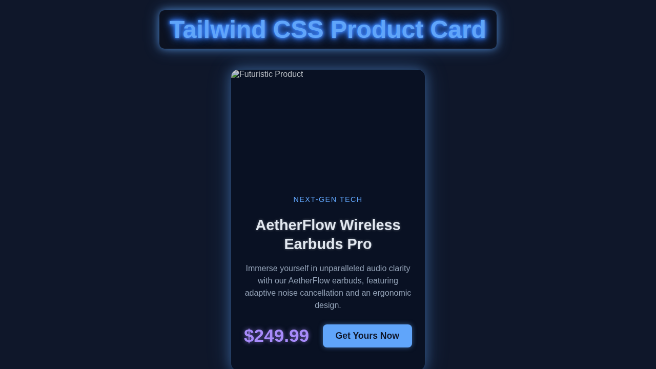
Imagine an online store. Every product needs a neat little display! We are creating exactly that. Our product card will look fantastic on any device. It will beautifully showcase an image, product name, description, price, and an ‘Add to Cart’ button. This is a core component for any e-commerce site. You will learn tons about responsive design!
This project is perfect for honing your Tailwind CSS skills. You will see how easily we can create complex layouts. Furthermore, this card design is versatile. You can adapt it for many other purposes too!
HTML Structure: The Foundation of Our Product Card Tailwind
Let’s kick things off with the backbone of our card: the HTML. We will set up a simple, semantic structure. This foundation will hold all our content neatly. You will see how easy it is to organize our product details. Every element has its place.
index.html
<!DOCTYPE html>
<html lang="en">
<head>
    <meta charset="UTF-8">
    <meta name="viewport" content="width=device-width, initial-scale=1.0">
    <title>Tailwind CSS Product Card</title>
    <!-- Link to your custom CSS (if any, typically for global styles or Tailwind build) -->
    <link rel="stylesheet" href="./styles.css">
    <!-- Tailwind CSS CDN for quick setup. In a real project, you'd use a build process. -->
    <script src="https://cdn.tailwindcss.com"></script>
    <script>
        // Optional: Tailwind configuration if needed
        tailwind.config = {
            theme: {
                extend: {
                    fontFamily: {
                        // Ensure safe fonts are prioritized. Tailwind's default font-sans is good.
                        sans: ['Arial', 'Helvetica', 'sans-serif'],
                    }
                }
            }
        }
    </script>
</head>
<body class="bg-gray-50 dark:bg-gray-900 flex items-center justify-center min-h-screen p-4 font-sans text-gray-900 dark:text-gray-100">

    <!-- Product Card Component -->
    <!--
        This card features a modern design suitable for e-commerce product listings.
        It uses Tailwind CSS utility classes for responsive layout, styling, and interactivity.
        - max-w-sm: Sets a maximum width for the card (small screens).
        - md:max-w-md: Adjusts max width for medium screens and above.
        - bg-white/70 dark:bg-gray-800/70: Semi-transparent background for a subtle effect, dark mode support.
        - backdrop-blur-md: Applies a blur effect to content behind the card (glassmorphism touch).
        - rounded-xl: Rounded corners.
        - shadow-lg: Large shadow for depth.
        - overflow-hidden: Ensures content like images don't break the rounded corners.
        - flex flex-col md:flex-row: Stacks content vertically on small screens, horizontally on medium and up.
    -->
    <div class="max-w-sm md:max-w-md lg:max-w-lg mx-auto bg-white/70 dark:bg-gray-800/70 backdrop-blur-md rounded-xl shadow-lg overflow-hidden transition-all duration-300 hover:shadow-xl hover:scale-[1.01] my-8">
        <div class="md:flex">
            <!-- Product Image Section -->
            <div class="md:flex-shrink-0">
                <!--
                    Image settings:
                    - h-56 w-full: Height for small screens, full width.
                    - object-cover: Ensures image covers the area, cropping if necessary.
                    - md:h-full md:w-48: Adjusts height to full parent height and fixed width for medium screens.
                    - rounded-t-xl md:rounded-l-xl md:rounded-t-none: Responsive rounded corners.
                -->
                <img class="h-56 w-full object-cover rounded-t-xl md:h-full md:w-48 md:rounded-l-xl md:rounded-t-none" src="https://via.placeholder.com/800x600/6366F1/FFFFFF?text=Product+Hero" alt="Product Image">
            </div>

            <!-- Product Details Section -->
            <div class="p-6 flex flex-col justify-between">
                <div>
                    <!-- Category Tag -->
                    <div class="uppercase tracking-wide text-sm text-indigo-600 dark:text-indigo-400 font-semibold">Electronics</div>

                    <!-- Product Title -->
                    <a href="#" class="block mt-1 text-2xl leading-tight font-extrabold text-gray-900 dark:text-white hover:text-indigo-600 dark:hover:text-indigo-400 transition-colors duration-200">
                        AuraFlow Noise-Cancelling Headphones
                    </a>

                    <!-- Product Description -->
                    <p class="mt-2 text-gray-600 dark:text-gray-300 text-base">
                        Experience superior sound quality and ultimate comfort. Perfect for immersive listening on the go.
                    </p>
                </div>

                <!-- Price and Add to Cart Section -->
                <div class="mt-4 pt-4 border-t border-gray-200 dark:border-gray-700 flex items-center justify-between">
                    <!-- Product Price -->
                    <span class="text-3xl font-bold text-gray-900 dark:text-white">$199.99</span>

                    <!-- Add to Cart Button -->
                    <button class="px-5 py-2 bg-indigo-600 text-white text-lg font-medium rounded-lg hover:bg-indigo-700 focus:outline-none focus:ring-2 focus:ring-indigo-500 focus:ring-offset-2 dark:focus:ring-offset-gray-900 transition-colors duration-200">
                        Add to Cart
                    </button>
                </div>
            </div>
        </div>
    </div>

</body>
</html>
See? It’s just basic HTML elements. We have a main container for the card. Inside, there’s a spot for the image. Then, we have a division for all the text and buttons. This clean structure helps Tailwind CSS work its magic. We are ready for the styling!
CSS Styling: Bringing It to Life with Tailwind CSS
Now for the fun part: making it look good! We will use Tailwind CSS utility classes. These classes let us style our card super fast. No custom CSS files needed here! You will love the power and speed of utility-first styling. It truly makes development quicker.
styles.css
/*
 * styles.css
 * This file is primarily for global styles or custom CSS not directly handled by Tailwind utility classes.
 * For this tutorial, most styling is done via Tailwind classes in index.html.
 */

/*
 * Ensure box-sizing is border-box for all elements for consistent layout behavior.
 * This is usually set by Tailwind's preflight, but good to ensure.
 */
*,
*::before,
*::after {
    box-sizing: border-box;
}

/*
 * Set a safe default font family.
 * Tailwind's `font-sans` includes Arial, Helvetica, sans-serif,
 * but explicitly defining it here ensures compliance with the "safe fonts only" rule.
 */
body {
    font-family: Arial, Helvetica, sans-serif;
}

/*
 * You can add custom utility classes or base styles here if needed.
 * For example, if you wanted a custom glowing effect that Tailwind doesn't easily provide:
 */
/*
.custom-glow {
    box-shadow: 0 0 10px rgba(99, 102, 241, 0.7);
}
.custom-glow:hover {
    box-shadow: 0 0 20px rgba(99, 102, 241, 0.9);
}
*/

/*
 * If you were using a Tailwind build process (e.g., PostCSS),
 * you would typically include the Tailwind directives here:
 *
 * @tailwind base;
 * @tailwind components;
 * @tailwind utilities;
 */
Isn’t that amazing? We didn’t write a single line of traditional CSS! Every style comes from a small, reusable Tailwind class. This approach is powerful. It keeps our styles consistent and our development fast. Consequently, you can build beautiful UIs in record time.
JavaScript: Is It Needed?
For this specific responsive Product Card Tailwind tutorial, we do not need any JavaScript. Our goal is to create a visually appealing and responsive static component. All the magic happens with HTML and Tailwind CSS! If you wanted interactive features, like an ‘add to favorites’ toggle, then you would introduce JavaScript. But for now, let’s keep it simple and focused on design.
How It All Works Together
Let me explain what’s happening here. We built our card using a combination of thoughtful HTML and powerful Tailwind CSS classes. Each class plays a vital role. Together, they create a stunning, responsive layout. Let’s break it down piece by piece.
The Card Wrapper: Setting the Stage
Our main <div> element acts as the card’s container. It holds everything together. We apply classes like max-w-xs to limit its width. This ensures it doesn’t get too wide on large screens. Then, rounded-lg gives us nice rounded corners. A shadow-lg adds depth, making the card pop! The overflow-hidden class is crucial. It keeps the image within the rounded borders. Finally, bg-white sets the background color. We use mx-auto to center the card horizontally. Lastly, my-8 adds some vertical margin for spacing. This creates a clean, professional look.
Pro Tip: Tailwind’s spacing utilities (like
m-8orp-4) are super consistent. They follow a default scale. This helps you maintain visual harmony across your designs!
The Product Image: Visual Impact
The image is often the first thing people see! We make sure it looks great. The <img> tag gets w-full to take up all available width. We set a fixed height with h-48. This gives our card a consistent look. The most important class here is object-cover. This class tells the image to fill its container while maintaining its aspect ratio. It crops parts of the image if necessary. This prevents distortion. You can learn more about object-fit on MDN. It is a very handy CSS property!
The Content Area: Details and Text
Below the image, we have another <div> for the product details. We add p-4 for generous padding all around. This prevents text from sticking to the edges. We use flex and flex-col here. This makes its children stack vertically. A gap-2 class adds consistent spacing between these stacked items. This ensures readability. We give the product title text-xl and font-semibold for prominence. The description gets text-sm and text-gray-600. This provides a subtle contrast. It helps distinguish between primary and secondary information.
Price and Button: Call to Action
This section is vital for any product card! We use a flex container again. But this time, justify-between pushes the price to one side and the button to the other. Also, items-center vertically aligns them. The mt-4 adds space above this section. This separates it from the description. The price text is styled to be bold and a bit larger. The ‘Add to Cart’ button is a classic. We apply bg-blue-600 for a vibrant blue background. hover:bg-blue-700 adds a nice interactive touch. Other classes like text-white, font-bold, py-2, px-4, and rounded make it look professional and clickable. This provides clear feedback to the user. Flexbox is incredibly powerful for these types of layouts.
Tips to Customise It
You have built a fantastic Product Card with Tailwind CSS! Now, let’s think about how you can make it truly your own. Customisation is key to great design.
- Change Colors and Fonts: Experiment with Tailwind’s color palette. Change the button color, text colors, or even the card’s background. Adjust font sizes or switch to a different font family for a unique feel.
- Add More Features: Think about what else a product card needs. Maybe a ‘favorite’ icon? Or a star rating? You could even add a quick-view button. Consider looking at other Tailwind product card examples for inspiration.
- Responsive Variations: Explore different layouts for different screen sizes. Perhaps on mobile, you want the image to be larger and the text smaller. Tailwind’s responsive prefixes (like
md:orlg:) make this super easy to implement. - Hover Effects: Add more sophisticated hover effects to the entire card. Make it scale up slightly. Or perhaps change its shadow when a user hovers over it. This adds a polished, interactive feel.
- Explore Other Components: Remember, the skills you learned here apply to many other UI elements. You can use similar techniques to build a User Profile Card with Tailwind CSS, for instance.
Conclusion
You just built a stunning, responsive product card using Tailwind CSS and HTML! That is a huge accomplishment. You have mastered essential concepts like flexbox, utility-first styling, and responsive design. This project is a fantastic addition to your portfolio. It shows off your frontend skills.
Keep Going: Every line of code you write makes you a better developer. Don’t stop experimenting! Share what you have built with friends. Keep learning and creating!
What will you build next? The possibilities are endless. Happy coding!