React Dark Mode with Context API: A Complete Tutorial
Hey there, fellow coders! If you’ve ever wanted to build a seamless React Dark Mode feature for your apps but felt a bit lost, you are absolutely in the right place. We’re diving deep into creating a fantastic dark mode toggle today. This is a super cool feature that improves user experience. Also, it’s a brilliant way to learn about React’s Context API. It’s truly a game-changer for managing global state!
What We Are Building
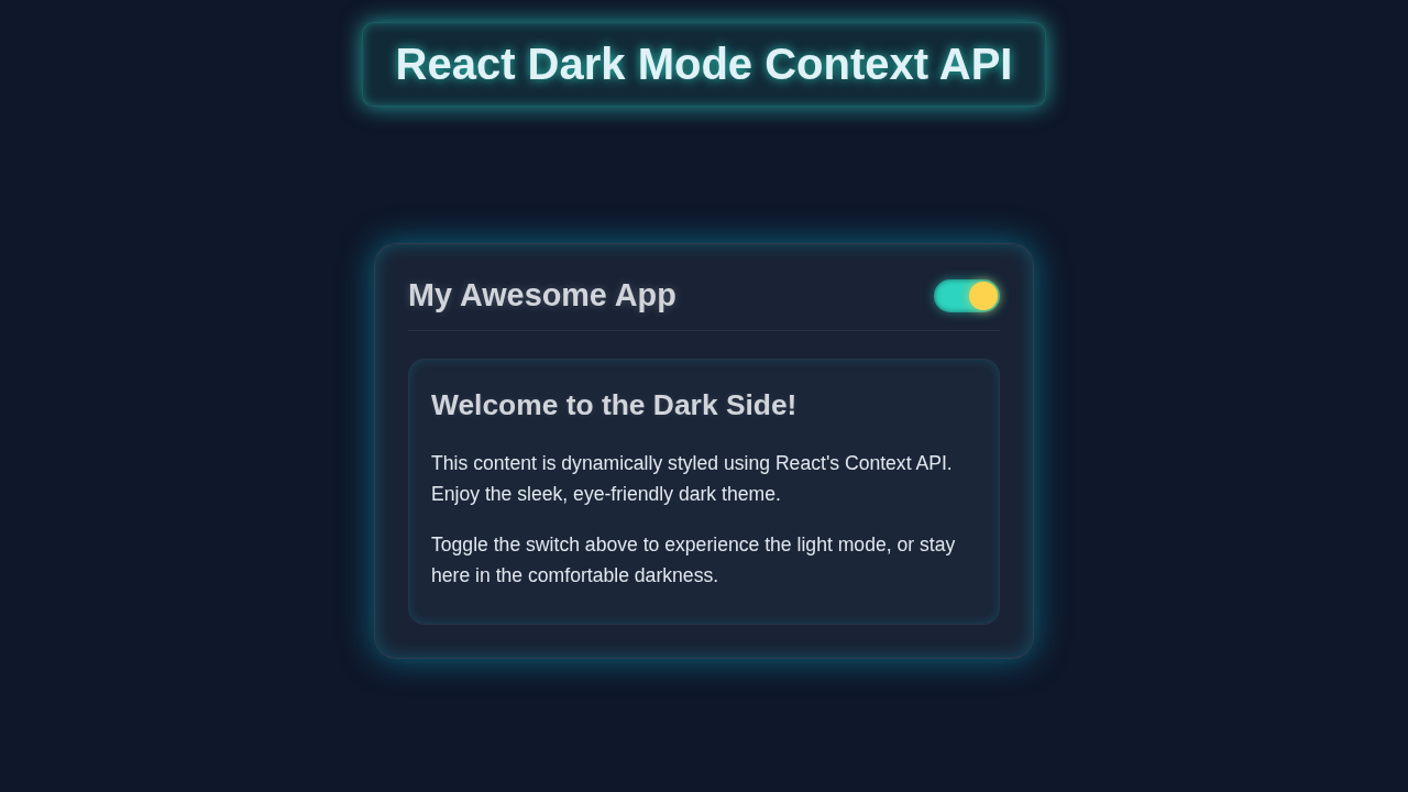
Today, we’re going to build a functional and stylish dark mode toggle. Imagine a simple button that, with one click, switches your entire application’s theme. Pretty neat, right? This isn’t just a visual trick, however. It’s a fundamental application of React’s Context API. You will learn how to make state available everywhere. Consequently, you can style components based on a global setting. This project is highly useful for any modern web application. It also lets users personalize their experience. We’ll make it clean, efficient, and easy to understand.
HTML Structure (Our React Components)
Our React app will have a root App component. This component will then wrap our main content and the toggle button. We’ll set up a provider for our theme context here. This allows all nested components to access the theme state. We are essentially preparing our application’s foundation. It will make dark mode accessible everywhere. Here’s how we’ll structure our basic React components:
CSS Styling
Styling is where our dark mode truly shines (or dims!). We will use CSS variables for our colors. This is a powerful technique. It allows us to swap color palettes easily. We’ll define distinct variables for light and dark themes. Then, we apply them dynamically. This ensures a smooth transition between modes. It also keeps our CSS super clean. You’ll love how straightforward this approach is. Let’s make our app look amazing:
src/App.css
/* Global Reset and Box Sizing */
html, body, #root {
  height: 100%;
  margin: 0;
  padding: 0;
  box-sizing: border-box;
}

*, *::before, *::after {
  box-sizing: inherit;
}

body {
  font-family: Arial, Helvetica, sans-serif;
  transition: background-color 0.3s ease, color 0.3s ease;
  overflow: hidden; /* Ensure no scrollbars on the main body */
}

/* CSS Variables for Themes */
/* Light Theme Variables */
body.light {
  --background-color: #f8fafc; /* Tailwind slate-50 */
  --text-color: #1e293b;     /* Tailwind slate-800 */
  --card-background: #ffffff;
  --card-border: #e2e8f0;    /* Tailwind slate-200 */
  --header-background: #f1f5f9; /* Tailwind slate-100 */
  --button-background: #0ea5e9; /* Tailwind sky-500 */
  --button-text: #ffffff;
  --toggle-track-background: #cbd5e1; /* Tailwind slate-300 */
  --toggle-handle-background: #ffffff;
  --toggle-handle-shadow: rgba(0, 0, 0, 0.2);
  --accent-color: #0ea5e9; /* Sky Blue */
}

/* Dark Theme Variables */
body.dark {
  --background-color: #1e293b; /* Tailwind slate-800 */
  --text-color: #e2e8f0;     /* Tailwind slate-200 */
  --card-background: #334155; /* Tailwind slate-700 */
  --card-border: #475569;    /* Tailwind slate-600 */
  --header-background: #1e293b; /* Tailwind slate-800 */
  --button-background: #2dd4bf; /* Tailwind teal-400 */
  --button-text: #1e293b;
  --toggle-track-background: #2dd4bf; /* Tailwind teal-400 */
  --toggle-handle-background: #fcd34d; /* Tailwind amber-300 */
  --toggle-handle-shadow: rgba(252, 211, 77, 0.7); /* Amber glow */
  --accent-color: #2dd4bf; /* Teal */
}

/* Apply variables to root elements */
body {
  background-color: var(--background-color);
  color: var(--text-color);
}

#root {
  display: flex;
  justify-content: center;
  align-items: center;
  padding: 20px;
  min-height: 100%; /* Ensure #root also takes full height */
  width: 100%; /* Ensure #root also takes full width */
}

.app-container {
  display: flex;
  flex-direction: column;
  width: 100%;
  max-width: 800px;
  min-height: 500px;
  background-color: var(--card-background);
  border: 1px solid var(--card-border);
  border-radius: 12px;
  box-shadow: 0 4px 20px rgba(0, 0, 0, 0.1);
  overflow: hidden; /* Prevent content overflow within the app card */
  transition: background-color 0.3s ease, border-color 0.3s ease, box-shadow 0.3s ease;
}

.app-header {
  display: flex;
  justify-content: space-between;
  align-items: center;
  padding: 20px 30px;
  background-color: var(--header-background);
  border-bottom: 1px solid var(--card-border);
  transition: background-color 0.3s ease, border-color 0.3s ease;
}

.app-header h1 {
  margin: 0;
  font-size: 1.8em;
  color: var(--text-color);
  transition: color 0.3s ease;
}

.app-main {
  flex-grow: 1;
  padding: 30px;
  overflow-y: auto; /* Allow scrolling for main content if it overflows */
}

.app-footer {
  padding: 15px 30px;
  border-top: 1px solid var(--card-border);
  text-align: center;
  font-size: 0.9em;
  color: var(--text-color);
  transition: color 0.3s ease, border-color 0.3s ease;
}

/* Theme Toggle styles */
.theme-toggle {
  width: 60px;
  height: 30px;
  background-color: var(--toggle-track-background);
  border-radius: 15px;
  position: relative;
  cursor: pointer;
  border: none;
  outline: none;
  padding: 0;
  transition: background-color 0.3s ease;
  box-shadow: inset 0 0 5px rgba(0, 0, 0, 0.2);
}

.toggle-handle {
  content: '';
  position: absolute;
  width: 26px;
  height: 26px;
  border-radius: 50%;
  background-color: var(--toggle-handle-background);
  top: 2px;
  left: 2px;
  transition: transform 0.3s ease, background-color 0.3s ease, box-shadow 0.3s ease;
  box-shadow: 0 2px 5px var(--toggle-handle-shadow);
}

.theme-toggle.dark-mode .toggle-handle {
  transform: translateX(30px); /* Move handle to the right for dark mode */
}

/* Content Section styles */
.content-section {
  line-height: 1.6;
}

.content-title {
  font-size: 1.6em;
  margin-bottom: 20px;
  color: var(--text-color);
  transition: color 0.3s ease;
}

.content-paragraph {
  margin-bottom: 15px;
  color: var(--text-color);
  transition: color 0.3s ease;
}

.content-paragraph strong {
  color: var(--accent-color);
}

.example-card {
  background-color: var(--header-background); /* Slightly different background */
  border: 1px solid var(--card-border);
  border-radius: 8px;
  padding: 20px;
  margin-top: 30px;
  transition: background-color 0.3s ease, border-color 0.3s ease;
}

.example-card h3 {
  margin-top: 0;
  font-size: 1.3em;
  color: var(--text-color);
  transition: color 0.3s ease;
}

.example-card p {
  margin-bottom: 15px;
  color: var(--text-color);
  transition: color 0.3s ease;
}

.example-button {
  background-color: var(--button-background);
  color: var(--button-text);
  border: none;
  padding: 10px 20px;
  border-radius: 5px;
  cursor: pointer;
  font-size: 1em;
  transition: background-color 0.3s ease, color 0.3s ease;
  box-shadow: 0 2px 5px rgba(0, 0, 0, 0.2);
}

.example-button:hover {
  filter: brightness(1.1); /* Slightly brighten on hover */
}

/* Responsive adjustments */
@media (max-width: 768px) {
  #root {
    padding: 10px; /* Reduce padding on smaller screens */
  }
  .app-header {
    flex-direction: column;
    gap: 15px;
    text-align: center;
    padding: 15px 20px;
  }
  .app-header h1 {
    font-size: 1.5em;
  }
  .app-main {
    padding: 20px;
  }
  .content-title {
    font-size: 1.4em;
  }
  .example-card {
    margin-top: 20px;
  }
}
React Components and Context API (JavaScript)
Now for the brain of our operation: the React JavaScript code! This is where the magic of the Context API happens. We’ll create a context, a provider, and a custom hook. These elements will work together. They will manage our theme state globally. Then, any component can consume this state. It can toggle dark mode with ease. This powerful pattern eliminates prop drilling. It makes your code cleaner and more maintainable. Let’s get started with the core logic:
src/index.js
import React from 'react';
import ReactDOM from 'react-dom/client';
import App from './App';
import './App.css'; // Global styles for the app

const root = ReactDOM.createRoot(document.getElementById('root'));
root.render(
  <React.StrictMode>
    <App />
  </React.StrictMode>
);
src/App.js
import React from 'react';
import { ThemeProvider, useTheme } from './context/ThemeContext';
import ThemeToggle from './components/ThemeToggle';
import ContentSection from './components/ContentSection';
import './App.css'; // Import the global styles

/**
 * Main Application Component
 * Wraps the entire application with the ThemeProvider
 * and renders the theme toggle and content sections.
 */
function App() {
  return (
    // ThemeProvider makes theme context available to all children
    <ThemeProvider>
      <AppContent /> {/* Render a sub-component to consume the theme */}
    </ThemeProvider>
  );
}

/**
 * AppContent Component
 * This component consumes the theme context and applies theme-specific classes.
 * It must be rendered *inside* ThemeProvider to access the context.
 */
function AppContent() {
  const { theme } = useTheme(); // Now AppContent can use the theme context

  return (
    <div className={`app-container ${theme}-theme`}>
      <header className="app-header">
        <h1>React Theme Switcher</h1>
        <ThemeToggle />
      </header>
      <main className="app-main">
        <ContentSection />
      </main>
      <footer className="app-footer">
        <p>© 2023 React Dark Mode Tutorial</p>
      </footer>
    </div>
  );
}

export default App;
src/context/ThemeContext.js
import React, { createContext, useContext, useState, useEffect } from 'react';

// 1. Create the Theme Context
// It will hold the current theme ('light' or 'dark') and a function to toggle it.
const ThemeContext = createContext(null);

// 2. Create a custom hook to use the theme context
// This hook provides a convenient way for components to access the theme.
export const useTheme = () => {
  const context = useContext(ThemeContext);
  if (!context) {
    throw new Error('useTheme must be used within a ThemeProvider');
  }
  return context;
};

// 3. Create the Theme Provider component
// This component wraps your application and provides the theme context to all its children.
export const ThemeProvider = ({ children }) => {
  // Initialize theme from localStorage or default to 'light'
  // Use a function for initial state to prevent re-running localStorage read on every render
  const [theme, setTheme] = useState(() => {
    const savedTheme = localStorage.getItem('theme');
    // Check for user's system preference if no theme is saved
    if (savedTheme) {
      return savedTheme;
    } else if (window.matchMedia && window.matchMedia('(prefers-color-scheme: dark)').matches) {
      return 'dark'; // Default to dark if system prefers it
    }
    return 'light'; // Default to light otherwise
  });

  // Effect to update localStorage whenever the theme changes
  // And to apply the theme class to the body element for global CSS variables.
  useEffect(() => {
    localStorage.setItem('theme', theme);
    document.body.className = theme; // Apply 'light' or 'dark' class to body
  }, [theme]);

  // Function to toggle between 'light' and 'dark' themes
  const toggleTheme = () => {
    setTheme((prevTheme) => (prevTheme === 'light' ? 'dark' : 'light'));
  };

  // The value provided to consumers of this context
  const contextValue = { theme, toggleTheme };

  return (
    <ThemeContext.Provider value={contextValue}>
      {children}
    </ThemeContext.Provider>
  );
};
src/components/ThemeToggle.js
import React from 'react';
import { useTheme } from '../context/ThemeContext';
// No component-specific CSS import here, as styling is handled via App.css and body classes.

/**
 * ThemeToggle Component
 * A button/switch to toggle between light and dark themes.
 * It uses the `useTheme` hook to access the current theme and the toggle function.
 */
function ThemeToggle() {
  const { theme, toggleTheme } = useTheme();

  return (
    <button
      className={`theme-toggle ${theme === 'dark' ? 'dark-mode' : 'light-mode'}`}
      onClick={toggleTheme}
      aria-label="Toggle theme"
      title={`Switch to ${theme === 'dark' ? 'light' : 'dark'} mode`}
    >
      <span className="toggle-handle"></span>
    </button>
  );
}

export default ThemeToggle;
src/components/ContentSection.js
import React from 'react';
import { useTheme } from '../context/ThemeContext';
// No specific CSS import here, as it relies on global App.css and body class for styling.

/**
 * ContentSection Component
 * Displays some sample content and dynamically adjusts its appearance
 * based on the current theme provided by ThemeContext.
 */
function ContentSection() {
  const { theme } = useTheme(); // Access the current theme

  return (
    <section className="content-section">
      <h2 className="content-title">Welcome to Our {theme === 'light' ? 'Light' : 'Dark'} Themed App!</h2>
      <p className="content-paragraph">
        This application demonstrates how to implement a theme switcher using React's Context API.
        The current theme is <strong>{theme} mode</strong>.
      </p>
      <p className="content-paragraph">
        All UI elements adapt their styles automatically based on the selected theme,
        providing a seamless user experience. Enjoy browsing!
      </p>
      <div className="example-card">
        <h3>Example Card</h3>
        <p>This card also respects the current theme.</p>
        <button className="example-button">Learn More</button>
      </div>
    </section>
  );
}

export default ContentSection;
How It All Works Together
Let’s break down how these pieces combine to create our awesome dark mode toggle. It’s really quite clever!
The Theme Context
First, we create our ThemeContext. This is like a special container for our theme information. It holds two important things: the current theme state ('light' or 'dark') and a function to change it (toggleTheme). We initialize it with default values. This means our app has a starting point.
Pro Tip: Think of Context API as a global blackboard. Any component can write on it or read from it, making sharing data across your app super simple without passing props through every single component!
The Theme Provider
Next, we have the ThemeProvider component. This component wraps our entire application. It’s responsible for managing the actual theme state. Inside, it uses React’s useState hook. This hook holds our current theme. It also defines the toggleTheme function. The ThemeProvider then makes these values available to all its children. It uses the ThemeContext.Provider component. This is how global state is achieved!
The useTheme Custom Hook
To make accessing our theme context even easier, we create a custom hook called useTheme. This hook simply calls useContext(ThemeContext). It provides a clean way for any component to grab the current theme and the toggleTheme function. It simplifies our component code. Plus, it makes it highly readable. You’ll find custom hooks incredibly useful for many features, like our React Live Search Component Tutorial with Hooks.
The App Component and Styles
The App component is our main entry point. It wraps everything with the ThemeProvider. This ensures our theme context is available everywhere. It also includes the ThemeToggle component. This button actually changes the theme. When toggleTheme is called, the body element’s data-theme attribute updates. Our CSS then picks up this attribute. It swaps our CSS variables. See how smoothly the styles change?
Heads Up: Using
data-attributeslikedata-theme="dark"on thebodyorhtmlelement is a fantastic and clean way to control global styles. You can learn more about data-attributes on MDN!
The ThemeToggle Component
Finally, the ThemeToggle component is a simple button. It uses our useTheme hook. It gets the current theme and the toggleTheme function. When you click it, toggleTheme fires. This updates the global state. Then, our entire application re-renders with the new theme. This is the beauty of React’s reactive nature!
Tips to Customise It
You’ve built a solid React Dark Mode toggle! Now, let’s make it even better:
- Save User Preference: Use
localStorageto remember the user’s chosen theme. This way, their preference persists even after they close and reopen your app. - Animated Transitions: Add CSS transitions to your color changes. This will make the theme switch feel smoother and more polished.
- Icon Changes: Make the toggle button show a sun icon for light mode and a moon icon for dark mode. This provides clear visual feedback.
- More Themes: Expand your
ThemeContextto support more than just light and dark. You could add a ‘sepia’ or ‘high contrast’ theme! For more advanced global state management, explore how we handle complex data in our React CRUD App Tutorial: Build a Full CRUD Application with JSX. - Accessibility Enhancements: Add
aria-labelattributes to your toggle button. This will make it more accessible for users with screen readers. For example, use “Toggle dark mode” or “Toggle light mode.” You can find more tips on dark mode accessibility on CSS-Tricks.
Conclusion
You did it! You’ve successfully built a powerful React Dark Mode toggle using the Context API. Give yourself a huge pat on the back. This project truly elevates your understanding of global state management in React. It’s also a highly sought-after feature. You’ve learned how to create context, provide global state, and consume it efficiently. This knowledge will serve you well in many future projects, like building a robust React Password Strength Indicator with Hooks Tutorial. Now go forth and add dark mode to all your applications. Don’t forget to share your creations with the procoder09.com community!