Hey! If you’ve ever wanted to build a beautiful Glassmorphism Card but felt lost, you are in the perfect spot. Today, we’re going to create something truly eye-catching. We will use the power of Tailwind CSS. Get ready to add a cool frosted-glass effect to your projects!
What We Are Building
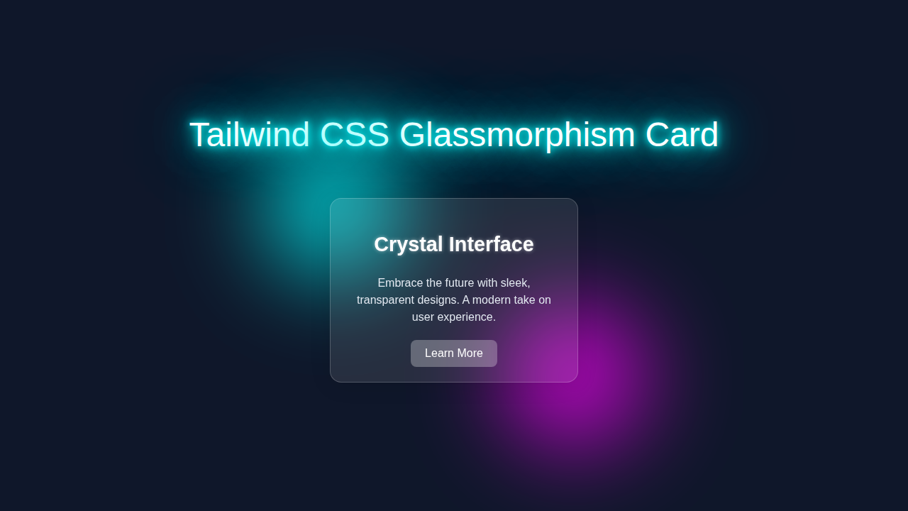
Imagine a sleek, semi-transparent card. It shows hints of the background behind it. This is exactly what a glassmorphism card is! It uses a frosted-glass effect. This effect makes your UI elements feel modern. It also adds depth. We will build a complete, stylish card. It will have a title, some text, and a button. You’ll love how it looks!
HTML Structure
Our HTML will be super clean. We use semantic tags for good structure. Tailwind CSS will then do all the heavy lifting. This keeps our HTML easy to read. It’s like building with powerful LEGO bricks. Here’s our simple HTML layout:
index.html
<!DOCTYPE html>
<html lang="en">
<head>
    <meta charset="UTF-8">
    <meta name="viewport" content="width=device-width, initial-scale=1.0">
    <title>Tailwind CSS Glassmorphism Card</title>
    <!-- Link to your compiled Tailwind CSS -->
    <link href="./styles.css" rel="stylesheet">
    <style>
        /*
           Ensures safe system fonts are used globally.
           Tailwind's 'font-sans' utility typically defaults to a safe stack including Arial, Helvetica.
        */
        body {
            font-family: Arial, Helvetica, sans-serif;
        }
        /*
           Tailwind's Preflight (included in @tailwind base) sets box-sizing to border-box globally.
           Overflow and max-width are handled by utility classes on specific elements.
        */
    </style>
</head>
<body class="bg-gradient-to-br from-slate-900 via-slate-800 to-gray-950 flex items-center justify-center min-h-screen p-4 overflow-hidden">

    <!--
        Glassmorphism Card Component

        -   'relative z-10': Positions the card above any potential background elements and ensures z-index context.
        -   'w-full max-w-sm mx-auto': Makes the card responsive, centered horizontally, with a max-width.
        -   'p-6': Padding inside the card.
        -   'bg-white/10': Translucent white background (10% opacity).
        -   'backdrop-blur-lg': Applies the core glassmorphism blur effect to content behind the card.
        -   'border border-white/20': A subtle, translucent white border (20% opacity).
        -   'rounded-xl': Large rounded corners.
        -   'shadow-xl': A pronounced shadow for depth.
        -   'text-slate-100': Light text color for contrast on the dark background.
        -   'overflow-hidden': Ensures content respects rounded corners and prevents scrollbars inside the card.
    -->
    <div class="relative z-10 w-full max-w-sm mx-auto p-6 bg-white/10 backdrop-blur-lg border border-white/20 rounded-xl shadow-xl text-slate-100 overflow-hidden">
        <div class="flex flex-col items-center text-center">
            <h2 class="text-3xl font-semibold mb-3 text-white">
                Crystal Card
            </h2>
            <p class="text-lg mb-6 leading-relaxed">
                A sleek, transparent design that brings depth and elegance to your user interfaces.
                Experience the future of UI.
            </p>
            <button class="
                px-6 py-3
                bg-white/20
                hover:bg-white/30
                text-white
                font-medium
                rounded-lg
                transition duration-300 ease-in-out
                transform hover:-translate-y-0.5 hover:shadow-lg
                focus:outline-none focus:ring-2 focus:ring-white focus:ring-opacity-50
            ">
                Explore Features
            </button>
        </div>
    </div>

</body>
</html>
CSS Styling
Now for the fun part: styling! Tailwind CSS makes this incredibly easy. We’ll use utility classes directly in our HTML. This approach lets us rapidly style components. We achieve the glassmorphism effect with a few key properties. These properties include a backdrop-filter. This is where the magic happens. We might add a tiny bit of custom CSS for the background, too. Don’t worry, it’s minimal! Check it out:
styles.css
/* styles.css */

/*
   Tailwind CSS directives.

   This file is where Tailwind CSS will inject its base styles,
   component styles, and utility classes after compilation.

   To compile your Tailwind CSS, you typically use PostCSS:
   1. Make sure you have Node.js installed.
   2. Create a `tailwind.config.js` file (npx tailwindcss init).
   3. Install PostCSS and Tailwind CSS: `npm install -D tailwindcss postcss autoprefixer`.
   4. Create a `postcss.config.js`:
      module.exports = {
          plugins: {
              tailwindcss: {},
              autoprefixer: {},
          },
      };
   5. Add a build script to your `package.json`:
      "scripts": {
          "build:css": "postcss styles.css -o dist/styles.css"
      }
   6. Run `npm run build:css` to generate the output CSS file.

   For this tutorial, 'index.html' links to './styles.css',
   assuming this file will be processed by Tailwind CSS.
*/

@tailwind base;
@tailwind components;
@tailwind utilities;

/*
   No additional custom CSS is strictly required for the Glassmorphism card itself,
   as all the core effects (transparency, blur, borders, shadows) are covered
   by Tailwind's utility classes.

   If you need specific custom styles that cannot be achieved with Tailwind utilities
   (e.g., highly custom gradients, complex animations not covered by built-in classes),
   you would add them here. Remember to adhere to safe font rules and avoid CDNs.
*/
JavaScript
Good news! For this awesome Glassmorphism Card, we don’t need any JavaScript. Our effect is purely visual. It’s all done with HTML and CSS magic. This keeps our project lightweight. You can always add JS later for interactivity, of course.
How It All Works Together
Let’s break down each piece of our amazing glassmorphism creation. Understanding each step helps you build more confidently.
Setting Up Your Project
First, ensure you have Tailwind CSS set up. If you are new to Tailwind, check out our guide on Tailwind CSS vs Plain CSS – Modern Web Styling Comparison. This setup is crucial. It lets you use all those amazing utility classes. We also need a basic index.html file. This file will hold all our code.
We link our Tailwind CSS stylesheet there. We add our basic body markup. A simple background helps showcase the card. This setup is your foundation.
The Card Container
Our main div acts as the card’s container. This is where all the content lives. We give it a fixed width and height for consistency. We also center it on the page. We use flex and justify-center for this. Adding rounded-xl gives us nice, soft corners. A p-8 ensures good internal spacing. This creates a comfortable box for our content.
Achieving the Glass Effect
Here’s the cool part: the glassmorphism effect! We use bg-white/10. This creates a semi-transparent white background. The key is the backdrop-filter property. This CSS property applies graphical effects. It applies effects behind an element. We use backdrop-blur-lg from Tailwind. This blurs whatever is behind our card. That’s the frosted-glass look! We also add a subtle border-white/20 for definition. It outlines our card beautifully. This makes it pop.
For more details on CSS filters and what they can do, check out the MDN Web Docs on backdrop-filter. It is a powerful CSS property!
Card Content and Styling
Inside our card, we have a title, some text, and a button. Each of these elements gets styled with Tailwind classes. The title uses text-2xl for size. font-bold makes it stand out. mb-4 adds space below it. The paragraph text uses text-white/80 for readability. It also has a smaller font size. Our button is a bg-blue-500. It has text-white for contrast. py-2 px-4 provides comfortable padding. rounded gives it soft edges. A hover:bg-blue-600 makes it interactive. It changes color when you hover over it. This provides great user feedback.
Adding Depth with Shadows
To make our card feel even more dimensional, we add shadows. We use shadow-xl. This gives a strong, noticeable shadow. This shadow helps lift the card. It makes it feel like it’s floating. This is a common trick in UI design. It creates a sense of depth. It truly enhances the glass effect. You can learn more about various shadow techniques on CSS-Tricks.
You’re doing great! Building these small, focused components helps you master modern web development. Keep experimenting!
Tips to Customise It
You just built an awesome Glassmorphism Card! But don’t stop there. Here are some ideas to make it uniquely yours:
- Change the background: Experiment with different background images or gradients. A dynamic background really makes the glass effect shine. Maybe try a subtle animation for extra flair!
- Adjust the blur: Play with Tailwind’s
backdrop-blurclasses. Trysm,md,xl, or even2xl. See how it changes the frosted look. You can make it more or less transparent. - Add an icon: Integrate an icon library like Font Awesome. Place a cool icon next to the title. This can add visual interest. It also helps convey meaning quickly.
- Make it responsive: Use Tailwind’s responsive prefixes like
md:w-1/2. This ensures your card looks great on all screen sizes. Check out our guide on building a Responsive Navbar with Tailwind CSS: HTML & Utility Classes for more on responsive design! - Implement dark mode: Imagine your card adapting to a dark theme! Use Tailwind’s dark mode features. This is a fantastic accessibility improvement. Our Tailwind Dark Mode Tutorial can help you get started.
Conclusion
Wow, you did it! You just built a truly stunning Glassmorphism Card using Tailwind CSS. You learned about backdrop-filter. You saw how powerful utility classes are. This technique is super popular in modern UI. It makes your designs feel premium. Now, share your creation! Show us what you built. Keep exploring and happy coding, proCoder!