Pure CSS Illustration: Create Scenic Art with HTML & CSS Only
Hey there, future CSS artist! If you’ve ever admired those stunning graphics made without a single image file, you’re in the right place. We are diving into the magical world of Pure CSS Illustration today. We’ll build a beautiful, browser-native scenic landscape from scratch. It’s super cool because you’ll see how much power your HTML and CSS actually have!
What We Are Building: A Serene CSS Landscape
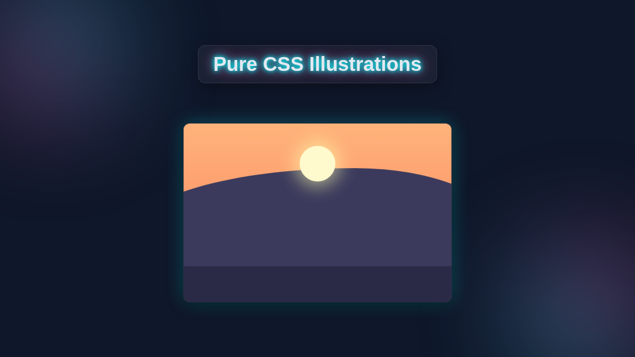
Imagine a peaceful scene. We are crafting just that! Our illustration will feature a bright sun, fluffy clouds, gently rolling hills, and even a charming little house. All of this comes to life with HTML elements and pure CSS properties. No external images or JavaScript are needed for this stunning Pure CSS Illustration. This project will truly boost your understanding of CSS positioning, shaping, and layering. It’s a fantastic way to stretch your creative muscles!
HTML Structure: Our Digital Canvas
Our HTML acts as the basic skeleton. We’ll set up a main container div. Inside, we’ll place separate divs for each part of our scene. Think of each div as a building block. We will create specific elements for the sky, sun, ground, mountains, and our cozy house. It will look pretty simple, but CSS will transform it!
index.html
<!DOCTYPE html>
<html lang="en">
<head>
    <meta charset="UTF-8">
    <meta name="viewport" content="width=device-width, initial-scale=1.0">
    <title>Pure CSS Illustration Tutorial</title>
    <!-- Link to our stylesheet -->
    <link rel="stylesheet" href="styles.css">
</head>
<body>
    <h1>Pure CSS Mountain Sunset Illustration</h1>

    <!-- Wrapper to center the illustration on the page -->
    <div class="illustration-wrapper">
        <!-- Main container for our illustration -->
        <div class="illustration-container">
            <!-- Sky background with a gradient -->
            <div class="sky"></div>
            <!-- The sun, a simple circle -->
            <div class="sun"></div>
            <!-- Mountain layers from back to front to create depth -->
            <div class="mountain mountain-far-back"></div>
            <div class="mountain mountain-back"></div>
            <div class="mountain mountain-front"></div>
            <!-- Ground layer at the very bottom -->
            <div class="ground"></div>
        </div>
    </div>
</body>
</html>
CSS Styling: Bringing Our Scene to Life
This is where the true artistry happens! Our CSS rules will define the size, shape, color, and position of every single element. We’ll use amazing properties like position: absolute; to place items exactly where we want them. You’ll also see border-radius for creating curves and circles. Gradients will make our sky and ground look vibrant. Let’s get creative with our styles!
styles.css
/* General Reset & Base Styles */
* {
    box-sizing: border-box; /* Ensures padding and border are included in the element's total width and height */
}

body {
    margin: 0;
    padding: 0;
    font-family: Arial, Helvetica, sans-serif; /* Safe, widely available fonts */
    background-color: #f0f2f5; /* Light background for the tutorial page */
    display: flex;
    flex-direction: column;
    justify-content: flex-start; /* Align content to the top of the viewport */
    align-items: center;
    min-height: 100vh; /* Ensures the body takes at least the full viewport height */
    color: #333;
    line-height: 1.6;
    overflow-x: hidden; /* Prevent horizontal scrollbar on smaller screens */
}

h1 {
    margin-top: 40px;
    margin-bottom: 30px;
    color: #2c3e50;
    text-align: center;
    max-width: 90%; /* Ensure heading doesn't overflow */
}

.illustration-wrapper {
    display: flex;
    justify-content: center;
    align-items: center;
    padding: 20px;
    max-width: 100%; /* Ensure wrapper doesn't exceed viewport width */
    margin-bottom: 40px;
}

/* The Illustration Container */
.illustration-container {
    width: 600px; /* Fixed width for the illustration canvas */
    height: 400px; /* Fixed height for the illustration canvas */
    position: relative; /* Crucial for positioning child elements within it */
    overflow: hidden; /* Hides any parts of child elements that extend beyond the container */
    border-radius: 15px; /* Softly rounded corners for the overall illustration */
    box-shadow: 0 10px 30px rgba(0, 0, 0, 0.1); /* Subtle shadow for depth */
    background-color: #fff; /* Fallback background, though sky will cover it */
    max-width: 95%; /* Responsive safety for smaller screens */
}

/* Sky - The backdrop of our scene */
.sky {
    position: absolute;
    width: 100%;
    height: 100%;
    /* A beautiful sunset gradient from a warm orange to a softer peach */
    background: linear-gradient(to top, #ff7e5f 0%, #feb47b 100%);
}

/* Sun - A glowing circle in the sky */
.sun {
    position: absolute;
    width: 80px;
    height: 80px;
    border-radius: 50%; /* Makes the div a perfect circle */
    background-color: #fffacd; /* Light yellow color for the sun */
    top: 50px; /* Position from the top of the container */
    left: 50%; /* Center horizontally */
    transform: translateX(-50%); /* Adjust for accurate horizontal centering */
    box-shadow: 0 0 40px 10px rgba(255, 255, 173, 0.6); /* Soft, glowing effect around the sun */
    z-index: 10; /* Ensures the sun appears above the mountains if they overlap */
}

/* Mountain Base Styles - Common properties for all mountain layers */
.mountain {
    position: absolute;
    bottom: 0; /* Align mountains to the bottom of the container */
    left: 0;
    width: 100%; /* Mountains span the full width of the container initially */
    /* Using border-radius to create organic, hilly shapes */
    border-top-left-radius: 50% 100px;
    border-top-right-radius: 50% 100px;
}

/* Mountain Layer 1: Far Back */
.mountain-far-back {
    height: 200px; /* Height of this mountain layer */
    background-color: #5d5c80; /* A lighter shade of purple-blue for distance */
    z-index: 1; /* Position behind other mountains */
    /* Adjusting position and width to create depth and variation */
    transform: translateX(-10%) scaleX(1.1); /* Slightly offset and wider */
    bottom: 30px; /* Slightly lifted from the very bottom to show ground */
}

/* Mountain Layer 2: Middle Distance */
.mountain-back {
    height: 250px;
    background-color: #4b4a6d; /* A slightly darker shade */
    z-index: 2; /* In front of the far-back mountain */
    transform: translateX(10%) scaleX(1.2); /* Slightly offset in the other direction and wider */
    bottom: 10px;
}

/* Mountain Layer 3: Front */
.mountain-front {
    height: 300px;
    background-color: #3b3a5d; /* The darkest shade, closest to the viewer */
    z-index: 3; /* Foremost mountain layer */
    /* More pronounced curves and wider span for the closest mountain */
    left: -20%; /* Shifted left to create a different peak arrangement */
    width: 140%; /* Made wider to stretch across the view */
    border-top-left-radius: 60% 150px;
    border-top-right-radius: 40% 150px;
}

/* Ground - The base of the landscape */
.ground {
    position: absolute;
    width: 100%;
    height: 80px; /* Height of the ground area */
    background-color: #2a2a47; /* Darkest color for the ground */
    bottom: 0;
    left: 0;
    z-index: 4; /* Ensures ground is on top of all mountains */
}
JavaScript? Not Today!
You might be wondering about JavaScript. Guess what? For this particular project, we don’t need it at all! Our goal is to create a truly pure CSS illustration. Every shape, every color, every position is handled by just HTML and CSS. This really highlights the amazing capabilities of these core web technologies.
How It All Works Together: Building Our Scene Step-by-Step
Now, let’s break down how these HTML elements and CSS properties unite. We’ll walk through each component of our scenic illustration. You’ll see how simple boxes become complex shapes and layered elements.
The Canvas: Setting Our Stage
First, we style the body and our main container (.illustration-container). We give our container a fixed width and height. This establishes our drawing area. Then, we add overflow: hidden; to this container. This is important! It ensures that any elements extending beyond its boundaries are clipped. This gives us clean edges for our scene.
Pro Tip: Using
overflow: hidden;on a parent container is a secret weapon for keeping complex CSS shapes within bounds, especially when using largeborder-radiusvalues to create hills or clouds!
Crafting the Sky and Sun
Our .sky element fills the top part of our container. We use a linear-gradient to give it a soft, natural sky color. This gradient transitions smoothly from one shade to another. Next, the .sun is a simple circular div. We achieve its perfect round shape with border-radius: 50%;. Then, position: absolute; helps us place it precisely in the corner of our sky. A subtle box-shadow adds a beautiful, glowing effect around it. Understanding how CSS positioning works is key here.
Building the Ground and Mountains
The .ground element sits at the bottom of our scene. It uses another linear-gradient to show varied green tones. This makes it look like natural terrain. For the mountains, we use multiple .mountain divs. Each mountain div is positioned absolutely. We then apply a huge border-radius to its bottom corners. This creates those lovely, rolling hill shapes. Combining these with clever position and z-index values allows them to overlap realistically. Want to create more unique shapes? Explore how we used CSS Pie Slice Art Tutorial: HTML & CSS Only (No JS) in another tutorial!
Adding a Cozy House
Our .house-body is a simple rectangle. It forms the main structure of the house. We then use a pseudo-element, ::before, to create the roof. This is done by giving the pseudo-element zero width and height. Then, we apply thick borders. One border will have a color, and the others are transparent. This cleverly forms a triangle! Inside the house, small divs create windows and a door. Each is positioned absolutely relative to the .house container. This layering gives the house depth and detail. It’s a great example of how basic shapes combine for intricate designs.
Did you know? Pseudo-elements like
::beforeand::afterare incredibly powerful! They let you add extra content and styling without touching your HTML, perfect for details like roofs or shadows.
Details: Fluffy Clouds and Evergreen Trees
The .cloud elements are made of several overlapping circles. Each circle gets a border-radius: 50%; and a white background. By grouping them within a parent .clouds div and positioning them absolutely, we achieve that soft, puffy cloud look. For the trees, the .tree-trunk is a simple brown rectangle. The .tree-leaves is a larger circle, made with border-radius: 50%; again. You can see similar techniques for more complex shapes in our Pure CSS Ramen Bowl: HTML & CSS Noodle Art Tutorial. We position the leaves directly above the trunk. These small details really bring our Pure CSS Illustration to life!
Tips to Customise It: Make It Your Own!
You’ve built an amazing scene! Now, let’s explore ways to make it unique. Customization is where the real fun begins.
- Change the Colors: Experiment with different sky gradients for a sunset or nighttime scene. Adjust the mountain and ground colors too!
- Add More Elements: How about some birds in the sky? Maybe a small river winding through the hills? You could even add stars for a night scene.
- Introduce Animations: Make the clouds slowly drift across the sky. Or perhaps make the sun subtly pulse. Check out CSS-Tricks for inspiration on animations and transforms!
- Explore Responsiveness: Think about how your illustration looks on different screen sizes. You could use modern techniques like CSS Container Queries Explained: Visual Guide to adapt elements.
Conclusion: Your Pure CSS Illustration Masterpiece!
Wow, you did it! You’ve just crafted a beautiful and detailed illustration using nothing but HTML and CSS. This Pure CSS Illustration project shows the incredible creative power you have as a web developer. You’ve learned so much about positioning, shaping, and layering. Feel proud of what you’ve created. Share your masterpiece with the world! Keep experimenting and building. Your CSS skills are truly growing!