Pure CSS Ramen Bowl: HTML & CSS Noodle Art Tutorial
Hey there, fellow coders! Have you wanted to build a beautiful Pure CSS Ramen bowl? Had no idea where to start? You are in the right place today! We are going on a fun and delicious journey together. We will transform simple HTML elements into a delicious-looking ramen scene. This isn’t just about food. It’s about pushing the boundaries of what you can create with code. Get ready to flex those creative CSS muscles. It is going to be super cool!
What We Are Building
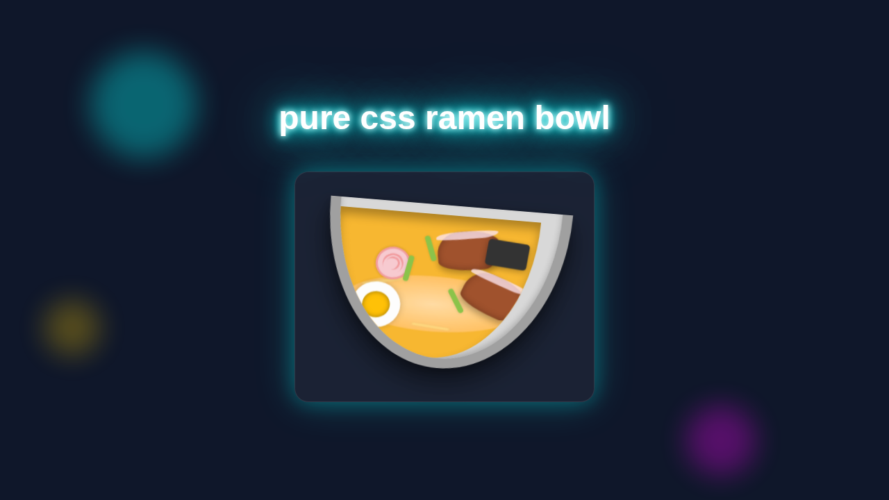
What exactly are we crafting with our Pure CSS Ramen, you ask? We are designing a complete, mouth-watering ramen bowl using only HTML and CSS! Imagine a steaming bowl, perfectly shaped noodles, and vibrant, detailed toppings. This project will truly showcase the power and versatility of CSS. You will learn about border-radius for curves, box-shadow for depth, and clever positioning techniques. These are all essential CSS properties. This isn’t just about ramen. It’s about mastering fundamental CSS skills in a creative and engaging way. It will also significantly boost your confidence. You can create amazing art purely with code.
HTML Structure
First things first, let’s lay down our HTML foundation. Think of this as preparing your ingredients before cooking. We will use simple div elements for each part of our ramen bowl. Each div will get a specific class. This helps us target them precisely with CSS. Don’t worry about this part. The structure is quite straightforward.
index.html
<!DOCTYPE html>
<html lang="en">
<head>
    <meta charset="UTF-8">
    <meta name="viewport" content="width=device-width, initial-scale=1.0">
    <title>Pure CSS Ramen Bowl</title>
    <link rel="stylesheet" href="styles.css">
</head>
<body>
    <div class="ramen-bowl-container">
        <div class="bowl">
            <div class="soup">
                <div class="noodles">
                    <!-- Individual noodle strands for added detail -->
                    <span class="noodle-strand s1"></span>
                    <span class="noodle-strand s2"></span>
                    <span class="noodle-strand s3"></span>
                </div>
                <div class="topping narutomaki">
                    <div class="swirl"></div>
                </div>
                <div class="topping chashu ch1"></div>
                <div class="topping chashu ch2"></div>
                <div class="topping egg">
                    <div class="egg-yolk"></div>
                </div>
                <div class="topping nori"></div>
                <div class="topping green-onion g1"></div>
                <div class="topping green-onion g2"></div>
                <div class="topping green-onion g3"></div>
            </div>
        </div>
    </div>
</body>
</html>
CSS Styling
Now for the exciting part: bringing our ramen to life with CSS! This is where we add all the color, shape, and depth. We will use various CSS properties. These include background-color, border-radius, box-shadow, and transform. Each property plays a vital role. It makes our ramen look realistic and appealing. We will tackle each element step-by-step. You will see how simple styles combine for a stunning result. Get ready to make some noodle magic!
styles.css
/* Basic Reset & Box-Sizing */
*, *::before, *::after {
    box-sizing: border-box;
    margin: 0;
    padding: 0;
}

/* Body Styles for the Tutorial */
body {
    font-family: Arial, Helvetica, sans-serif; /* Safe fonts for broad compatibility */
    display: flex;
    justify-content: center;
    align-items: center;
    min-height: 100vh;
    background-color: #f0f0f0; /* A light background for the tutorial page */
    overflow: hidden; /* Prevent scrollbars if content overflows */
}

/* Ramen Bowl Container - Sets up the 3D perspective and overall tilt */
.ramen-bowl-container {
    position: relative;
    width: 350px; /* Fixed width of the bowl */
    height: 250px; /* Visible height of the bowl */
    perspective: 1000px; /* Creates a 3D viewing context for children */
    transform: rotateX(20deg) rotateZ(5deg); /* Applies a subtle 3D tilt to the entire bowl */
    filter: drop-shadow(0 20px 20px rgba(0, 0, 0, 0.3)); /* Adds a shadow beneath the bowl */
}

/* The Bowl Itself - Outer structure and rim */
.bowl {
    position: absolute;
    width: 100%;
    height: 100%;
    background-color: #d8d8d8; /* Light grey color for the bowl ceramic */
    border-radius: 0 0 50% 50% / 0 0 100% 100%; /* Creates the rounded bottom shape */
    border: 15px solid #a0a0a0; /* Defines the thick rim of the bowl */
    border-top: none; /* No top border, as the soup will fill this space */
    z-index: 10;
    overflow: hidden; /* Ensures contents stay within the bowl's rounded shape */
    box-shadow: 0 -5px 10px rgba(0, 0, 0, 0.1) inset, /* Inner shadow for the top rim */
                0 5px 15px rgba(0, 0, 0, 0.15); /* Outer shadow for depth */
}

/* Soup - The liquid base of the ramen */
.soup {
    position: absolute;
    top: 0;
    left: 0;
    width: calc(100% - 30px); /* Adjusts for the 15px border on left/right */
    height: calc(100% - 15px); /* Adjusts for the bottom border thickness */
    background-color: #f7b731; /* Golden-yellow color for the broth */
    border-radius: 0 0 50% 50% / 0 0 100% 100%; /* Matches the bowl's bottom curve */
    transform: translateY(15px); /* Moves the soup down to sit inside the bowl rim */
    z-index: 11; /* Places soup above the bowl, but below toppings */
    overflow: hidden; /* Keeps noodles and toppings contained within the soup's shape */
    box-shadow: inset 0 10px 15px rgba(0, 0, 0, 0.2); /* Inner shadow for soup depth */
}

/* Noodles - The main mass of noodles */
.noodles {
    position: absolute;
    top: 30%;
    left: 10%;
    width: 80%;
    height: 70%;
    /* Gradient to simulate varying noodle texture and depth */
    background: radial-gradient(ellipse at center, #ffe0b2 0%, #ffcc80 50%, #ffb74d 100%);
    border-radius: 50%; /* Forms a circular clump of noodles */
    z-index: 12; /* Above soup */
    opacity: 0.9; /* Slightly transparent to blend with soup */
    filter: blur(1px); /* Softens the noodle mass for a more realistic look */
    transform: rotateX(60deg) scale(1.1) translateY(-10px); /* Adds volume and pushes them slightly out */
    display: block; /* Important for containing pseudo elements like noodle strands */
}

/* Individual Noodle Strands - Add more distinct noodle shapes */
.noodle-strand {
    position: absolute;
    background-color: #ffde8a; /* A lighter noodle color for contrast */
    border-radius: 50%; /* Default for smooth ends */
    z-index: 13; /* Above the noodle clump */
    opacity: 0.9;
    box-shadow: 0 0 3px rgba(0,0,0,0.1); /* Subtle shadow for definition */
}
.s1 {
    width: 60px; height: 8px;
    top: 20px; left: 20px;
    transform: rotate(-25deg);
    border-radius: 4px 30px 30px 4px; /* Creates a curved strand */
}
.s2 {
    width: 70px; height: 10px;
    top: 50px; right: 15px;
    transform: rotate(35deg);
    border-radius: 5px 35px 35px 5px; /* Another curved strand */
}
.s3 {
    width: 50px; height: 7px;
    bottom: 10px; left: 50%;
    transform: translateX(-50%) rotate(10deg);
    border-radius: 3.5px 25px 25px 3.5px; /* A third curved strand */
}

/* Toppings Base Style - Shared properties for all toppings */
.topping {
    position: absolute;
    z-index: 15; /* Ensures all toppings are on top of soup and noodles */
}

/* Narutomaki (fish cake with swirl) */
.narutomaki {
    width: 50px;
    height: 50px;
    background-color: #f7cad0; /* Light pink */
    border-radius: 50%; /* Circular shape */
    border: 3px solid #f29c9f; /* Slightly darker pink edge */
    top: 25%;
    left: 20%;
    transform: rotate(15deg); /* Slight rotation for a natural look */
    overflow: hidden; /* Hides the swirl's overflow */
    box-shadow: 0 0 5px rgba(0,0,0,0.1);
}
.narutomaki .swirl {
    position: absolute;
    top: 50%;
    left: 50%;
    width: 30px;
    height: 30px;
    border-top: 3px solid #f29c9f; /* Creates the top part of the swirl */
    border-left: 3px solid #f29c9f; /* Creates the left part of the swirl */
    border-radius: 50%; /* Rounds the swirl */
    transform: translate(-50%, -50%) rotate(45deg); /* Centers and rotates the swirl */
}
.narutomaki .swirl::before {
    content: '';
    position: absolute;
    width: 20px;
    height: 20px;
    border-top: 3px solid #f29c9f;
    border-left: 3px solid #f29c9f;
    border-radius: 50%;
    transform: translate(2px, 2px) rotate(45deg); /* Creates the inner part of the swirl */
}

/* Chashu (pork slice) */
.chashu {
    width: 90px;
    height: 60px;
    background-color: #a0522d; /* Sienna brown for the meat part */
    border-radius: 40% 60% 30% 70% / 60% 40% 70% 30%; /* Irregular, organic shape */
    box-shadow: inset 0 0 10px rgba(0,0,0,0.3); /* Inner shading for texture */
}
.chashu::before { /* Fatty part of the chashu */
    content: '';
    position: absolute;
    top: 0;
    left: 0;
    width: 100%;
    height: 20%;
    background-color: #fce4ec; /* Very light pink/cream for fat */
    border-radius: inherit; /* Inherits the irregular shape */
    opacity: 0.8;
}
.chashu.ch1 {
    top: 10%;
    left: 50%;
    transform: rotate(-10deg); /* Positions and rotates the first slice */
}
.chashu.ch2 {
    top: 40%;
    right: 5%;
    transform: rotate(20deg); /* Positions and rotates the second slice */
}

/* Egg (Ajitama - marinated soft-boiled egg) */
.egg {
    width: 70px;
    height: 70px;
    background-color: #fdfdfd; /* Off-white for the egg white */
    border-radius: 50%; /* Half-egg shape (though we draw a full circle and use overflow) */
    top: 50%;
    left: 10%;
    transform: rotate(-5deg); /* Slight rotation */
    overflow: hidden; /* Hides the part of the yolk that would be outside */
    box-shadow: 0 0 5px rgba(0,0,0,0.1);
}
.egg-yolk {
    position: absolute;
    width: 40px;
    height: 40px;
    background-color: #ffc107; /* Orange-yellow for the yolk */
    border-radius: 50%;
    top: 50%;
    left: 50%;
    transform: translate(-50%, -50%); /* Centers the yolk within the egg white */
    box-shadow: inset 0 0 5px rgba(0,0,0,0.3); /* Inner shadow for yolk depth */
}

/* Nori (seaweed) */
.nori {
    width: 60px;
    height: 40px;
    background-color: #333; /* Dark grey/black for seaweed */
    border-radius: 5px; /* Slightly rounded corners */
    top: 15%;
    right: 5%;
    transform: rotate(5deg); /* Slight rotation */
    box-shadow: 0 3px 5px rgba(0,0,0,0.2); /* Adds a subtle lift */
}

/* Green Onion */
.green-onion {
    width: 8px;
    height: 40px;
    background-color: #8bc34a; /* Light green for spring onions */
    border-radius: 4px; /* Rounded ends */
    box-shadow: 0 0 5px rgba(0,0,0,0.1);
}
.green-onion.g1 {
    top: 15%;
    left: 45%;
    transform: rotate(-20deg);
}
.green-onion.g2 {
    top: 30%;
    left: 35%;
    transform: rotate(10deg);
}
.green-onion.g3 {
    top: 50%;
    left: 60%;
    transform: rotate(-30deg);
}
How It All Works Together
Let’s unravel the magic behind our Pure CSS Ramen bowl. We’ve meticulously laid out the HTML and carefully applied the CSS. Now, we’ll see exactly how each individual piece contributes to the delicious final picture. This detailed breakdown helps you understand the building blocks. It shows you how simple rules combine for complex visuals.
Pro Tip: Visualizing your elements as distinct layers helps greatly in CSS art. Each
divis like a piece of paper you can shape and color!
The Container and Bowl
Our main .ramen-bowl div acts as the primary stage. It holds all the ingredients together. We give it a position: relative. This means all child elements can be positioned accurately inside it. Then, border-radius helps us sculpt that classic, inviting bowl shape. A well-placed box-shadow adds crucial depth. It makes it truly pop off the screen. This is important for achieving a convincing 3D feel. MDN has a great guide on border-radius if you want to dive deeper into its versatility!
Crafting the Soup and Broth
Inside the bowl, we carefully place the .soup and .broth elements. These use similar sizing and border-radius values. They sit slightly smaller and on top of each other. The .soup forms the initial light liquid base. The .broth adds a darker, more defined layer on top. This creates a realistic liquid appearance. It adds important visual interest and dimension too. We achieve this clever layering with strategic z-index values and careful positioning. This makes elements stack correctly, just like in a real ramen bowl.
Making the Noodles
Ah, the star of the show: the delicious .noodles! This is where things get really fun. We use multiple small div elements. Each one represents a single, tantalizing noodle strand. We position them absolutely within the .soup layer. This keeps them perfectly contained. Each individual noodle div gets a subtle border-radius. This creates a soft, curvy, and authentic look. We also apply transform: rotate() to each noodle. This makes them appear wonderfully tangled and organic. This technique adds great visual variety. It makes them truly look like actual noodles happily swirling in a bowl.
Adding Delicious Toppings
Next, we add our yummy and colorful toppings. These include .egg, .narutomaki, .green-onion, and .seaweed. Each topping is a simple div element. We style each one to mimic its real-life counterpart. For example, the .egg uses a perfect border-radius: 50% for its classic roundness. It also holds a smaller inner div for the yolk. The .narutomaki needs creative ::before and ::after pseudo-elements. This helps us generate its unique and iconic swirl pattern. Position all these elements strategically. This makes the Pure CSS Ramen look balanced and appealing. These small, thoughtful details truly elevate the entire design.
Enhancing Depth with Shadows
We liberally use the box-shadow property throughout this project. It is super important for achieving realism. You will clearly see it on the bowl itself. You also see it subtly applied to individual toppings. Shadows help lift elements off their background. They effectively create a sense of three-dimensionality. CSS-Tricks has a deep dive into box-shadow if you want to explore more complex shadow effects! This property is definitely a game-changer. It makes our flat shapes look chunky, substantial, and real.
Educator’s Note: The power of CSS comes from combining simple properties in clever ways. Don’t be afraid to experiment with values to get the look you want!
Overall Composition
Finally, observe how all these elements fit together. Each piece is placed within the parent container. The z-index property is key here. It controls the stacking order of overlapping elements. This makes sure the noodles are under the egg. It also ensures the egg is over the soup. This careful layering builds a cohesive and believable scene. It’s just like arranging ingredients in a real, delicious ramen bowl! Consider exploring the CSS :has() Selector Practical Uses in your next project. It lets you style elements based on their children. This opens up even more creative possibilities for sophisticated composition!
Tips to Customise It
You have built an awesome Pure CSS Ramen bowl! Now, let’s make it uniquely yours.
- Change the Toppings: Add some new
.chopsticksor.mushrooms! You can create newdivelements for these. Then, style them with different shapes and colors. Don’t be afraid to be creative here! - Adjust the Colors: Try a spicy red broth. Or maybe a light, creamy white one. Experiment with different
background-colorvalues. Change the bowl’s exterior color too. - Animate the Steam: Use
keyframesto add a subtleopacityortransformanimation. Make some gentle steam rise from your delicious bowl. This would add a dynamic touch! You could even learn more about CSS Button Animations Tutorial to see animation principles in action. - Make it Interactive: Can you make the egg wobble slightly on hover? Or change the broth color when the bowl is clicked? This could be a fun challenge. Perhaps even try to integrate this UI into a larger project, like a HTML CSS Calculator UI Design for a themed interface. The possibilities for customization are endless!
Conclusion
Wow, you did it! You just built a fantastic Pure CSS Ramen bowl entirely from scratch. That’s a huge accomplishment! You have learned so much about positioning, border-radius usage, and box-shadow application. These are truly fundamental CSS skills. They will serve you well in any future web project you tackle. You transformed simple divs into a work of art. This shows your growing proficiency and talent. Now, go share your delicious creation with the world! Show off your new Pure CSS Ramen art on social media. Tag us @procoder09. We cannot wait to see what you create next! Keep coding and always keep creating!