Tailwind CSS Dark Mode Toggle Tutorial with HTML & JS
Hey there, pro-coder-to-be! Ever wanted to add that super cool Dark Mode Toggle to your website? It’s a fantastic feature that modern users love. Today, we will build one from scratch using Tailwind CSS and a little JavaScript. Get ready to make your projects shine, day or night!
What We Are Building
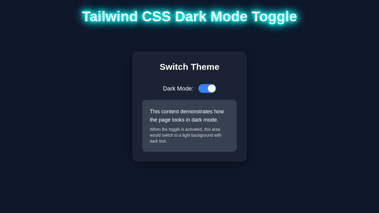
Imagine this: your user visits your awesome new website. They see a sleek toggle switch, just like magic! With a click, the entire site transforms from bright to a calm, eye-friendly dark theme. This is exactly what we are creating today. It is more than just a cool visual trick. Dark mode helps reduce eye strain. It also saves battery life on OLED screens. Plus, it just looks incredibly professional. We will craft a beautiful, interactive Dark Mode Toggle that you can drop into any project. Let’s make your web apps super user-friendly!
HTML Structure
First up, let’s lay the groundwork for our switch. We will craft a simple HTML container. This container will hold all the visual parts of our toggle. It is the basic structure that Tailwind CSS will then beautify. We will use a main div element. This div will have a special ID so we can target it with JavaScript. Inside, another span element acts as the draggable ‘thumb’. You can think of it as the actual switch handle. We also include two SVG icons, a sun and a moon. These make our toggle visually intuitive. They show whether light or dark mode is active. This setup keeps our code clean and easy to understand.
index.html
<!-- index.html -->
<!DOCTYPE html>
<html lang="en">
<head>
    <meta charset="UTF-8">
    <meta name="viewport" content="width=device-width, initial-scale=1.0">
    <title>Tailwind CSS Dark Mode Toggle</title>
    <!--
        Link to your compiled Tailwind CSS file.
        For local development with Tailwind CLI or PostCSS setup, ensure your 'output.css' is linked here.
        Generate 'output.css' by running: npx tailwindcss -i ./input.css -o ./output.css --watch
    -->
    <link href="./output.css" rel="stylesheet">
    <script src="./script.js" defer></script>
    <style>
        /* Apply safe fonts globally */
        body { font-family: Arial, Helvetica, sans-serif; }
        /* Ensure box-sizing for all elements for consistent layout */
        *, *::before, *::after { box-sizing: border-box; }
        /* Prevent horizontal scrollbars if component gets too wide */
        html, body { overflow-x: hidden; }
    </style>
</head>
<body class="flex flex-col items-center justify-center min-h-screen
             bg-gray-100 dark:bg-gray-900
             text-gray-900 dark:text-gray-100
             transition-colors duration-300">

    <div class="p-8 rounded-lg shadow-xl
                bg-white dark:bg-gray-800
                border border-gray-200 dark:border-gray-700
                max-w-md w-full text-center
                transition-colors duration-300">
        <h1 class="text-3xl font-bold mb-6">Theme Switcher</h1>

        <div class="flex items-center justify-center space-x-4 mb-8">
            <span class="text-xl font-medium">Light Mode</span>
            <!--
                The theme-toggle button uses 'data-theme' attribute managed by JavaScript
                to control its internal state (thumb position, icon visibility).
                The 'group' class allows child elements to react to the parent's 'data-theme' state.
            -->
            <button id="theme-toggle" class="relative inline-flex items-center h-8 w-16 rounded-full focus:outline-none focus:ring-2 focus:ring-blue-500 focus:ring-offset-2 transition-colors duration-300
                                           bg-gray-300 dark:bg-blue-600 group">
                <!-- Sun Icon: Visible in 'light' mode, hidden in 'dark' mode -->
                <svg class="absolute left-1 h-6 w-6 text-yellow-500 transition-opacity duration-300
                            group-data-[theme='light']:opacity-100 group-data-[theme='dark']:opacity-0"
                     fill="none" viewBox="0 0 24 24" stroke="currentColor">
                    <path stroke-linecap="round" stroke-linejoin="round" stroke-width="2" d="M12 3v1m0 16v1m9-9h1M3 12H2m15.325-4.275l.707-.707M3.975 19.025l.707-.707m0-11.314l-.707-.707M19.025 3.975l-.707-.707"/>
                </svg>
                <!-- Moon Icon: Visible in 'dark' mode, hidden in 'light' mode -->
                <svg class="absolute right-1 h-6 w-6 text-indigo-300 transition-opacity duration-300
                            group-data-[theme='light']:opacity-0 group-data-[theme='dark']:opacity-100"
                     fill="none" viewBox="0 0 24 24" stroke="currentColor">
                    <path stroke-linecap="round" stroke-linejoin="round" stroke-width="2" d="M20.354 15.354A9 9 0 018.646 3.646 9.003 9.003 0 0012 21a9.003 9.003 0 008.354-5.646z" />
                </svg>
                <!-- Toggle Thumb: Positioned based on 'data-theme' -->
                <span class="inline-block h-7 w-7 transform rounded-full bg-white shadow-md ring-0 transition-transform duration-300
                             group-data-[theme='light']:-translate-x-0.5
                             group-data-[theme='dark']:translate-x-8"></span>
            </button>
            <span class="text-xl font-medium">Dark Mode</span>
        </div>

        <div class="mt-6 p-6 rounded-md
                    bg-gray-50 dark:bg-gray-700
                    text-gray-800 dark:text-gray-200
                    border border-gray-100 dark:border-gray-600
                    transition-colors duration-300">
            <p class="text-lg">This is some sample content. Observe how its background and text colors change when you toggle the theme.</p>
            <p class="text-sm text-gray-600 dark:text-gray-400 mt-2">The entire page background, card, and this content block will adapt.</p>
        </div>
    </div>

    <!-- Instructions for Tailwind CSS Setup -->
    <div class="mt-8 text-center text-gray-700 dark:text-gray-300 text-sm max-w-prose mx-auto px-4">
        <p>
            <strong>Note:</strong> To make Tailwind CSS utilities work, you need to set up your Tailwind CLI or build process.
            <br>
            1. Initialize a Node.js project (if you haven't): <code class="bg-gray-200 dark:bg-gray-700 px-1 rounded">npm init -y</code>
            <br>
            2. Install Tailwind CSS and its peer dependencies: <code class="bg-gray-200 dark:bg-gray-700 px-1 rounded">npm install -D tailwindcss postcss autoprefixer</code>
            <br>
            3. Initialize Tailwind: <code class="bg-gray-200 dark:bg-gray-700 px-1 rounded">npx tailwindcss init -p</code> (This creates <code class="bg-gray-200 dark:bg-gray-700 px-1 rounded">tailwind.config.js</code> and <code class="bg-gray-200 dark:bg-gray-700 px-1 rounded">postcss.config.js</code>)
            <br>
            4. Update <code class="bg-gray-200 dark:bg-gray-700 px-1 rounded">tailwind.config.js</code> (see provided file).
            <br>
            5. Create an <code class="bg-gray-200 dark:bg-gray-700 px-1 rounded">input.css</code> file in your project root with:
            <pre class="bg-gray-200 dark:bg-gray-700 p-2 mt-1 rounded text-left"><code>@tailwind base;
@tailwind components;
@tailwind utilities;</code></pre>
            <br>
            6. Run Tailwind CLI to watch for changes and build your output.css:
            <code class="bg-gray-200 dark:bg-gray-700 px-1 rounded">npx tailwindcss -i ./input.css -o ./output.css --watch</code>
            <br>
            Then, open <code class="bg-gray-200 dark:bg-gray-700 px-1 rounded">index.html</code> in your browser.
        </p>
    </div>

</body>
</html>
CSS Styling
Now for the fun part: making our toggle look fantastic with Tailwind CSS! We will apply utility classes directly to our HTML elements. This approach makes styling incredibly efficient. No separate CSS file is needed for these basic styles. We will define the overall size and shape of our switch. This includes its rounded corners and background color. The dark:bg- classes are key here. They apply different styles when the dark class is present on the html tag. We will also add smooth transition properties. These ensure our toggle animates beautifully when clicked. This gives a professional, polished user experience. It really brings the switch to life. Tailwind CSS helps us achieve stunning designs rapidly. If you’re interested in more advanced Tailwind techniques, check out our post on Tailwind CSS v4: The Future of Utility-First Design.
JavaScript
The brains behind our beautiful switch is JavaScript. It handles all the interactive magic. We need to tell our toggle what to do when a user clicks it. JavaScript will listen for this interaction. It then changes a special class on our main html element. This class change triggers all the Tailwind dark: styles. It’s how the entire page instantly changes themes. We will also make sure the user’s choice is remembered. This happens using localStorage. So, if they leave your site and come back, their preferred theme is still active. This makes for a truly user-friendly experience. It’s exciting to see the power of JavaScript in action!
script.js
// script.js
document.addEventListener('DOMContentLoaded', () => {
    const themeToggleBtn = document.getElementById('theme-toggle');
    const htmlElement = document.documentElement; // Target the <html> element for dark mode class

    /**
     * Sets the theme for the page and updates localStorage and the toggle button's state.
     * @param {string} theme - 'light' or 'dark'
     */
    const setTheme = (theme) => {
        if (theme === 'dark') {
            htmlElement.classList.add('dark');
            themeToggleBtn.setAttribute('data-theme', 'dark'); // Update button state for styling
            themeToggleBtn.setAttribute('aria-pressed', 'true'); // For accessibility
            localStorage.setItem('theme', 'dark');
        } else {
            htmlElement.classList.remove('dark');
            themeToggleBtn.setAttribute('data-theme', 'light'); // Update button state for styling
            themeToggleBtn.setAttribute('aria-pressed', 'false'); // For accessibility
            localStorage.setItem('theme', 'light');
        }
    };

    // Get the user's preferred theme from localStorage or system preference
    const storedTheme = localStorage.getItem('theme');
    const systemPrefersDark = window.matchMedia('(prefers-color-scheme: dark)').matches;

    // Initialize theme on page load
    if (storedTheme) {
        // If a theme is stored in localStorage, use it
        setTheme(storedTheme);
    } else if (systemPrefersDark) {
        // If no theme is stored, use system preference
        setTheme('dark');
    } else {
        // Default to light mode
        setTheme('light');
    }

    // Toggle theme on button click
    themeToggleBtn.addEventListener('click', () => {
        const currentTheme = htmlElement.classList.contains('dark') ? 'dark' : 'light';
        if (currentTheme === 'dark') {
            setTheme('light');
        } else {
            setTheme('dark');
        }
    });

    // Optional: Listen for system theme changes
    // This will update the theme if the user changes their system preference while the page is open,
    // but only if they haven't explicitly set a preference in localStorage.
    window.matchMedia('(prefers-color-scheme: dark)').addEventListener('change', (event) => {
        if (!localStorage.getItem('theme')) {
            setTheme(event.matches ? 'dark' : 'light');
        }
    });
});
tailwind.config.js
// tailwind.config.js
module.exports = {
  // Configure dark mode to be based on the presence of a 'dark' class on the <html> element.
  // When the 'dark' class is present, Tailwind will apply 'dark:' prefixed utilities.
  darkMode: 'class',

  // Specify files to scan for Tailwind classes.
  // This ensures that Tailwind generates CSS for all utilities used in these files.
  content: [
    './index.html', // Scan your main HTML file
    './script.js',  // Scan your JavaScript file if you dynamically add/remove classes
    // Add any other files that contain Tailwind class names (e.g., './src/**/*.{html,js,ts,jsx,tsx}')
  ],
  theme: {
    extend: {
      // You can extend Tailwind's default theme here.
      // For example, custom colors, font sizes, spacing, etc.
    },
  },
  plugins: [
    // Add any Tailwind plugins here (e.g., forms, typography).
    // require('@tailwindcss/forms'),
    // require('@tailwindcss/typography'),
  ],
}
How It All Works Together
Here’s the cool part: understanding how these three pieces fit. Each part plays a vital role. Together, they create a seamless dark mode experience. Let me explain what’s happening here.
Did You Know? Tailwind CSS’s
dark:prefix automatically handles media queries. It makes creating dark mode a breeze when combined with JavaScript!
The HTML Foundation
Our HTML provides the basic structure. We start with a main div element. This div acts as the container for our entire toggle. It has the id="theme-toggle". This ID is super important. Our JavaScript uses it to find and interact with the button. Inside this container, we place a span element. This span is visually styled to look like the movable ‘thumb’ of the switch. We also nest two SVG icons: a sun and a moon. These icons provide clear visual cues for the user. They immediately indicate whether light or dark mode is active. Tailwind CSS classes are applied directly to these elements. For example, dark:bg-gray-800 is a class that only applies its style when the dark class is present on the html tag. It’s a clever way to manage conditional styling. This setup ensures our component is both functional and semantic.
Styling with Tailwind CSS
Tailwind CSS takes our basic HTML structure and transforms it. We use a series of utility classes. These classes define everything from the toggle’s size to its colors. For instance, relative positions our elements correctly. Classes like w-14 and h-8 set the width and height. rounded-full gives it that familiar pill shape. The bg-gray-200 sets the default light background. Now, here is the cool part for dark mode! The dark:bg-gray-800 class automatically applies a dark background. This happens only when the dark class is present on the html tag. We also add transform and transition-transform classes to the thumb. These create a smooth, animated slide when the toggle is activated. This makes the user experience feel polished and modern. If you want to dive deeper into responsive design with Tailwind, check out this post on Responsive Portfolio: Build a Developer Portfolio with Tailwind CSS & HTML. It’s truly amazing what you can build with just utility classes!
JavaScript for Interaction
Our JavaScript code brings the entire component to life. First, it identifies our toggle button using its id. Then, it attaches an ‘event listener’ to this button. This listener waits for a ‘click’ event. When you click the toggle, a function executes. This function is the heart of our dark mode logic. It inspects the document.documentElement. This is our <html> tag. It checks if the dark class is currently applied. If it is, JavaScript removes the dark class. If not, it adds the dark class. This simple toggle operation is incredibly powerful. All your Tailwind dark: classes immediately respond to this change! Furthermore, we use localStorage to save the user’s preference. This ensures that their choice persists even after they close and reopen the browser. You can learn more about localStorage on MDN. Finally, we include logic to check for the user’s system-wide dark mode preference. This is done with window.matchMedia('(prefers-color-scheme: dark)'). It sets the initial theme accordingly. This makes our Dark Mode Toggle robust and user-friendly.
Pro-Tip: The
document.documentElementrefers to the<html>element of your page. Toggling classes here is a powerful way to apply global themes!
Tips to Customise It
You’ve built a fantastic Dark Mode Toggle! Now, how can you make it even more your own? Here are a few ideas to get you started. Experiment with these to truly personalize your switch.
- Change the Colors: Play with different Tailwind color palettes. Maybe a deep indigo for dark mode? Or a soft cream for light mode? Just tweak the
bg-andtext-classes to match your site’s aesthetic. - Add More Icons: Instead of a simple moon and sun, try different icons! Perhaps a lightbulb or a star? Font Awesome or Heroicons are great resources for a wider selection.
- Animate the Icons: You could add a subtle rotation or fade effect to the icons when switching. This makes the transition even more dynamic and engaging. CSS transitions are your friend here.
- Expand the Theming: Instead of just two modes, create multiple themes! Think about ‘sepia’ or ‘high contrast’ options. You would manage more classes with your JavaScript. This adds huge flexibility to your site. You can also explore CSS-Tricks for more dark mode ideas.
- Integrate with a Framework: Are you building with React or Vue? Integrate this logic into a reusable component within your chosen framework. This makes it easily deployable across your entire app.
Conclusion
Wow, you did it! You just built a fully functional and beautiful Dark Mode Toggle with Tailwind CSS and JavaScript. Give yourself a huge pat on the back. This is a crucial skill for any modern web developer. You now know how to manage global themes dynamically. It shows great attention to user experience. Feel proud of this accomplishment! Now, go ahead and integrate this into your next project. Share your creations with us on social media! We love seeing what you build. Keep learning, keep coding, and keep making awesome things!