CSS clamp fluid typography tutorial with HTML & CSS
Hey there, fellow web builder! If you’ve ever dreamt of creating websites with text that just flows beautifully across any screen size, you’re in for a treat. Today, we’re diving deep into CSS clamp typography to build a super responsive fluid font system. It’s seriously cool stuff. Your designs will look fantastic on phones, tablets, and huge monitors!
What We Are Building: Your New Fluid Typography Powerhouse!
Imagine text that perfectly adapts. No more fiddling with tons of media queries! We are building a system that automatically scales your font sizes. This means crisp, readable text for everyone. It stays just right. Your users will love the seamless experience. This approach saves so much development time. Furthermore, it makes your sites feel truly professional. Get ready to empower your designs with incredible flexibility.
HTML Structure: The Canvas for Our Fluid Text
Let’s start with some basic HTML. We will create a simple page structure. This gives us elements to apply our clever CSS to. It’s nothing too complicated, just a few headings and paragraphs. This setup helps us see the fluid typography in action. It’s the perfect starting point.
index.html
<!DOCTYPE html>
<html lang="en">
<head>
    <meta charset="UTF-8">
    <meta name="viewport" content="width=device-width, initial-scale=1.0">
    <title>CSS Clamp Fluid Typography</title>
    <link rel="stylesheet" href="styles.css">
</head>
<body>
    <div class="container">
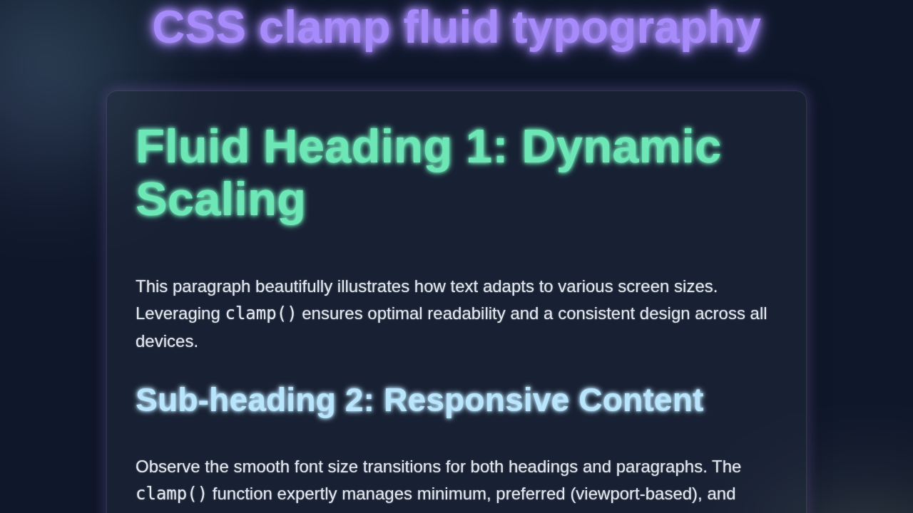
        <h1>Fluid Heading 1 - Experience Responsive Text</h1>
        <p>This paragraph demonstrates how text scales beautifully across different screen sizes using CSS clamp(). It ensures optimal readability and design consistency without complex media queries.</p>
        <h2>Sub-heading 2 - Dynamic Sizing Example</h2>
        <p>Notice how this sub-heading and paragraph also adapt their font sizes. The clamp() function takes three values: a minimum size, a preferred size (often using viewport units), and a maximum size.</p>
        <p>It's an incredibly powerful tool for modern responsive web design, providing smooth transitions and excellent control over typography.</p>
    </div>
</body>
</html>
CSS Styling: Bringing Fluidity with clamp() and Variables
Now for the real magic! Our CSS will define our fluid typography system. We’ll use CSS custom properties (variables) for easy management. This keeps everything organized. Then the clamp() function will work its wonders on our font sizes. Prepare to be amazed by the responsive power you’re about to unleash!
styles.css
/*
    CSS Clamp Fluid Typography Tutorial
    Author: AI Assistant
    Description: Demonstrates how to create fluid, responsive typography using the CSS clamp() function.
    This ensures text scales smoothly between a minimum and maximum size, adapting to the viewport
    without the need for multiple media queries.
*/

/* --- Global Resets & Base Styles --- */
html {
    /* Set base font size for rem units. 100% means 16px by default in most browsers. */
    font-size: 100%;
    /* Prevent horizontal scrollbar if viewport units cause overflow */
    overflow-x: hidden;
}

body {
    font-family: Arial, Helvetica, sans-serif; /* Safe, widely available fonts */
    line-height: 1.6;
    margin: 0;
    padding: 20px;
    background-color: #f4f7f6; /* Light background for the tutorial example */
    color: #333;
    /* Allow vertical scroll if content exceeds viewport height */
    overflow-y: auto;
    box-sizing: border-box; /* Include padding and border in the element's total dimensions */
}

/* Ensure all elements calculate box model consistently */
*, *::before, *::after {
    box-sizing: border-box;
}

/* --- Container Styling --- */
.container {
    max-width: 900px; /* Maximum width for the content area */
    margin: 0 auto; /* Center the container horizontally */
    padding: 30px;
    background-color: #ffffff;
    border-radius: 8px;
    box-shadow: 0 4px 15px rgba(0, 0, 0, 0.1); /* Subtle shadow for depth */
    overflow: hidden; /* Ensures child elements are contained and clears floats if any */
    margin-bottom: 50px; /* Space below the container */
}

/* --- Fluid Typography with clamp() --- */

/*
   How clamp() works:
   clamp(MIN_SIZE, FLUID_VW_SIZE, MAX_SIZE)

   - MIN_SIZE: The smallest font size allowed. The text will never be smaller than this.
   - FLUID_VW_SIZE: The ideal font size, which scales with the viewport width (vw).
                    Adding a 'rem' value to 'vw' (e.g., '2vw + 1rem') provides a base
                    size at very small viewports and makes the scaling less aggressive
                    at larger sizes, creating smoother transitions. This is the 'preferred' size.
   - MAX_SIZE: The largest font size allowed. The text will never be larger than this.

   The browser calculates the FLUID_VW_SIZE. If it's less than MIN_SIZE, MIN_SIZE is used.
   If it's greater than MAX_SIZE, MAX_SIZE is used. Otherwise, FLUID_VW_SIZE is used.
   This creates a smooth, adaptive font size that stays within defined bounds.
*/

h1 {
    /* Fluid H1: Minimum 2.5rem (approx. 40px), scales with 4vw + 1rem, maximum 5rem (approx. 80px) */
    font-size: clamp(2.5rem, 4vw + 1rem, 5rem);
    color: #0056b3; /* A vibrant blue */
    margin-top: 0;
    margin-bottom: 0.5em;
}

h2 {
    /* Fluid H2: Minimum 2rem (approx. 32px), scales with 3vw + 0.5rem, maximum 4rem (approx. 64px) */
    font-size: clamp(2rem, 3vw + 0.5rem, 4rem);
    color: #007bff; /* A slightly lighter blue */
    margin-top: 1em;
    margin-bottom: 0.4em;
}

p {
    /* Fluid Paragraph: Minimum 1rem (approx. 16px), scales with 1.5vw + 0.5rem, maximum 1.5rem (approx. 24px) */
    font-size: clamp(1rem, 1.5vw + 0.5rem, 1.5rem);
    margin-bottom: 1em;
    color: #555; /* A dark grey for readability */
}

/*
   No additional media queries are strictly necessary as clamp() handles the responsiveness.
   However, you might use them for layout changes or to override specific clamp() behavior
   at extreme screen sizes if needed.
*/
How CSS Clamp Typography Makes Magic
Okay, let’s break down what’s happening. This is where clamp() truly shines. It allows us to set a minimum, preferred, and maximum value for our font sizes. This ensures your text is always legible and aesthetically pleasing. It’s a game-changer for responsive design. Moreover, it simplifies your CSS immensely.
“Think of
clamp()like a smart gatekeeper for your values. It ensures your font size never goes below a certain point and never exceeds another, always trying to hit your preferred size in between!”
Understanding clamp()
The clamp() function takes three critical values. It’s written as clamp(MIN, PREFERRED, MAX). Let me explain what each part does. First, MIN is the absolute smallest the font size will ever be. Your text will never shrink below this. Second, MAX is the absolute largest the font size will ever be. It ensures your text doesn’t become too overwhelming on large screens. Third, PREFERRED is the ideal size. This value will scale up or down. It adapts beautifully with the viewport width. For example: clamp(1rem, 2vw + 1rem, 2.5rem). Here, 2vw + 1rem is a common preferred value. vw stands for viewport width. This means the font size will grow or shrink relative to the screen. It always stays between 1rem and 2.5rem. This flexibility is incredible.
The Power of CSS Variables
We are using CSS custom properties, often called variables. They make our code super organized. We define them once at the :root level. Then we can use them anywhere in our stylesheet! This makes updates incredibly easy. Want to change your base font size globally? Just edit one variable. This creates a single source of truth for your styles. It’s a massive time-saver. Furthermore, it makes your CSS much more maintainable. You can learn even more about these powerful tools at the MDN Web Docs on CSS Custom Properties. They provide excellent documentation.
Responsive Design Without Media Queries
This system inherently builds responsiveness into your designs. You don’t need endless @media queries for every breakpoint. The magic vw unit inside clamp() does all the heavy lifting. It ensures your text scales gracefully and automatically. This works across various screen sizes. It’s a clean and incredibly efficient approach to adaptive layouts. Your code becomes leaner and easier to manage. This method also results in smoother transitions. Consider checking out CSS Logical Properties: Visual Guide & Layout Preview for another way to think about flexible, adaptable layouts in modern web development. It expands your responsive toolkit.
“You’ve just unlocked a powerful secret weapon for responsive design! This fluid typography system will save you hours of tweaking and improve user experience.”
Tips to Customise It: Make It Your Own!
You’ve built a solid foundation. Now let’s talk about making this system truly yours! Here are some ideas to extend and personalize your fluid typography. Get creative and experiment!
-
Experiment with
vwvalues: Don’t be afraid to tweak thevwmultiplier in yourclamp()functions. It makes a huge difference! Try1vw,2vw, or even0.5vw. Small adjustments can create very different scaling effects. Find what feels right for your specific design. This gives you ultimate control over the fluidity of your text. -
Add more font scales: Right now, we might have a couple of sizes. But you can define variables for all your typographic elements. Think
h1,h2,h3,h4,h5,h6,p, and even smaller text for captions. This provides a complete, consistent typography scale across your entire site. All easily managed from your:root! It ensures design harmony. -
Integrate with other CSS properties: The fluid values aren’t just for font sizes! You can apply these responsive principles to
line-height,padding,margin, and evengapproperties. Imagine a site where everything scales harmoniously, not just your text! It creates a truly dynamic and immersive user experience. Your whole layout becomes more adaptable. -
Consider
font-weightvariables: Beyond size,font-weightcan also be a variable. Define variables like--fw-light: 300;or--fw-bold: 700;. This simplifies changing your site’s typographic style globally. It’s another layer of easy customization that enhances your design system. Consistency is key, and variables help achieve it. -
Animate properties with custom properties: Want to get truly advanced? You can animate custom properties! Imagine a hover effect that smoothly scales text using these fluid values. It’s a next-level interaction that adds polish. For cool animations with custom properties, check out CSS @property Animation: Enhance UI with Custom Property Effects (HTML/CSS). If you’re looking for smooth transitions, CSS @property Transition: Animate Custom Properties with HTML/CSS provides even more options. And for a general dive, CSS-Tricks on Custom Property Animation is excellent too. These techniques really make your UI pop!
Conclusion: You Did It!
Wow, look at what you’ve built! You now have a solid understanding of CSS clamp typography. You can create beautiful, adaptable text. This skill is a game-changer for modern web development. It allows for truly flexible designs. You are now equipped to build even more amazing, responsive websites. Go forth and make the web a more fluid place. Share your creations with us! We can’t wait to see them. Keep coding and keep learning!