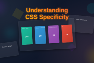
Hey there, awesome coder! If you’ve been dreaming of creating a sleek and functional Tailwind Dashboard Layout but felt a bit stuck, you’ve landed in the perfect spot. We’re going to build a fantastic, responsive dashboard from scratch. This project will use the power of Tailwind CSS, Flexbox, and Grid. Get ready to transform your ideas into a stunning user interface!
What We Are Building
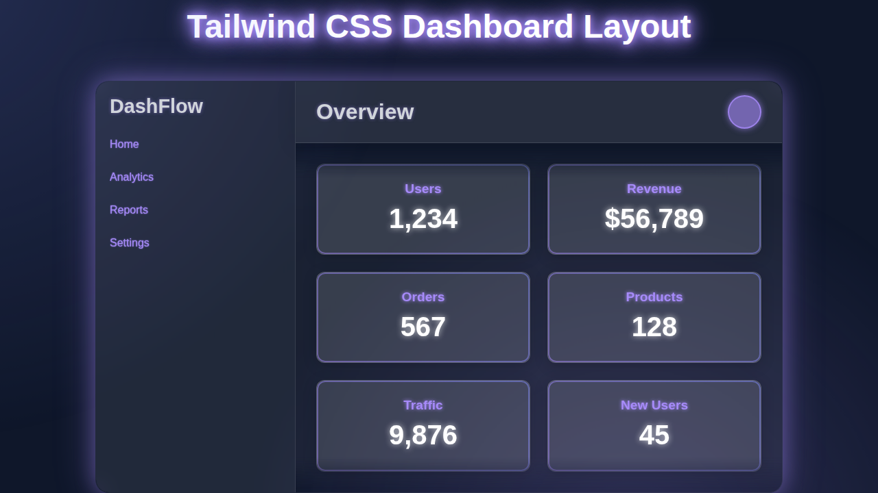
Imagine a dynamic dashboard. It’s got a fixed header, a collapsible sidebar, and a main content area filled with useful information cards. We’ll design it to look great on any screen size. From a huge desktop monitor down to a small mobile phone. This isn’t just theory; we’re building a real, practical layout you can adapt for countless projects. Think admin panels, personal portfolios, or even a simple project management tool. It’s going to be so much fun!
HTML Structure: The Foundation
Every great building starts with a solid foundation. Our dashboard is no different. We’ll lay out the main components using semantic HTML. This includes a <div> for our overall container, then separate sections for the header, sidebar, and the main content. This structure makes everything clear and manageable. Don’t worry, Tailwind CSS will help us style it all beautifully.
index.html
<!DOCTYPE html>
<html lang="en">
<head>
    <meta charset="UTF-8">
    <meta name="viewport" content="width=device-width, initial-scale=1.0">
    <title>Tailwind CSS Dashboard Layout</title>
    <!--
        Include Tailwind CSS via CDN.
        This allows direct use of utility classes without a build step.
        For production, it's recommended to install Tailwind locally for better performance and customization.
    -->
    <script src="https://cdn.tailwindcss.com"></script>
    <!--
        Custom styles (styles.css) are linked here if you have any custom CSS
        not covered by Tailwind utility classes or for local Tailwind builds.
        For this pure utility-class tutorial, styles.css is intentionally minimal.
    -->
    <link rel="stylesheet" href="styles.css">
    <style>
        /* Ensure safe font usage and basic box model */
        body {
            font-family: Arial, Helvetica, sans-serif;
            box-sizing: border-box;
            margin: 0;
            padding: 0;
        }
        *, *::before, *::after {
            box-sizing: inherit;
        }
    </style>
</head>
<body class="bg-gray-100 font-sans antialiased">
    <div class="flex h-screen overflow-hidden">
        <!-- Sidebar -->
        <aside class="w-64 bg-gray-800 text-white flex-shrink-0">
            <div class="p-4 text-2xl font-bold border-b border-gray-700 bg-gray-900">
                <a href="#" class="text-white hover:text-indigo-400 transition duration-200">DashFlow</a>
            </div>
            <nav class="mt-4">
                <a href="#" class="flex items-center py-2 px-4 text-gray-300 hover:bg-gray-700 hover:text-white rounded-md mx-2 transition duration-200">
                    <svg class="h-5 w-5 mr-3" fill="currentColor" viewBox="0 0 20 20">
                        <path d="M10.707 2.293a1 1 0 00-1.414 0l-7 7a1 1 0 001.414 1.414L4 10.414V17a1 1 0 001 1h2a1 1 0 001-1v-2a1 1 0 011-1h2a1 1 0 011 1v2a1 1 0 001 1h2a1 1 0 001-1v-6.586l.293.293a1 1 0 001.414-1.414l-7-7z"></path>
                    </svg>
                    Home
                </a>
                <a href="#" class="flex items-center py-2 px-4 text-gray-300 hover:bg-gray-700 hover:text-white rounded-md mx-2 transition duration-200">
                    <svg class="h-5 w-5 mr-3" fill="currentColor" viewBox="0 0 20 20">
                        <path d="M2 11a1 1 0 011-1h2a1 1 0 011 1v5a1 1 0 01-1 1H3a1 1 0 01-1-1v-5zM8 7a1 1 0 011-1h2a1 1 0 011 1v9a1 1 0 01-1 1H9a1 1 0 01-1-1V7zM14 3a1 1 0 011-1h2a1 1 0 011 1v13a1 1 0 01-1 1h-2a1 1 0 01-1-1V3z"></path>
                    </svg>
                    Analytics
                </a>
                <a href="#" class="flex items-center py-2 px-4 text-gray-300 hover:bg-gray-700 hover:text-white rounded-md mx-2 transition duration-200">
                    <svg class="h-5 w-5 mr-3" fill="currentColor" viewBox="0 0 20 20">
                        <path fill-rule="evenodd" d="M4 4a2 2 0 00-2 2v4a2 2 0 002 2V6h10a2 2 0 002 2v4a2 2 0 002 2V6a2 2 0 00-2-2H4zm10 8a2 2 0 012-2h2v4a2 2 0 01-2 2h-2v-4z" clip-rule="evenodd"></path>
                        <path d="M11.967 11.233A5.4 5.4 0 0112 10a5.4 5.4 0 01-3.233 4.967l1.372 1.372a1 1 0 001.414 0l.707-.707a1 1 0 000-1.414l-1.414-1.414z"></path>
                    </svg>
                    Reports
                </a>
                <a href="#" class="flex items-center py-2 px-4 text-gray-300 hover:bg-gray-700 hover:text-white rounded-md mx-2 transition duration-200">
                    <svg class="h-5 w-5 mr-3" fill="currentColor" viewBox="0 0 20 20">
                        <path fill-rule="evenodd" d="M11.49 4.09A2 2 0 0013.5 2h-3.003c-1.125 0-2.072.846-2.28 1.909L7.02 6.574A.75.75 0 016.324 7H4.5A2.5 2.5 0 002 9.5v5A2.5 2.5 0 004.5 17h11A2.5 2.5 0 0018 14.5v-5A2.5 2.5 0 0015.5 7h-1.824a.75.75 0 01-.696-.426l-1.19-2.717zM12 11a1 1 0 100 2 1 1 0 000-2z" clip-rule="evenodd"></path>
                    </svg>
                    Settings
                </a>
            </nav>
        </aside>

        <!-- Main content area -->
        <div class="flex-1 flex flex-col overflow-hidden">
            <!-- Header -->
            <header class="flex justify-between items-center p-4 bg-white border-b border-gray-200 shadow-sm">
                <h1 class="text-2xl font-semibold text-gray-800">Overview</h1>
                <div class="flex items-center space-x-4">
                    <span class="text-gray-600">John Doe</span>
                    <!-- Placeholder for user avatar -->
                    <img src="https://via.placeholder.com/40" alt="User Avatar" class="w-10 h-10 rounded-full border-2 border-indigo-400 shadow-md">
                </div>
            </header>

            <!-- Page content -->
            <main class="flex-1 overflow-x-hidden overflow-y-auto bg-gray-200 p-6">
                <!-- Dashboard Statistics Cards -->
                <div class="grid grid-cols-1 md:grid-cols-2 lg:grid-cols-3 xl:grid-cols-4 gap-6 mb-8">
                    <div class="bg-white p-6 rounded-lg shadow-md hover:shadow-lg transition duration-200 ease-in-out">
                        <h2 class="text-lg font-semibold text-gray-700">Total Users</h2>
                        <p class="text-4xl font-bold text-gray-900 mt-2">1,234</p>
                        <p class="text-sm text-green-500 mt-1">+12% from last month</p>
                    </div>
                    <div class="bg-white p-6 rounded-lg shadow-md hover:shadow-lg transition duration-200 ease-in-out">
                        <h2 class="text-lg font-semibold text-gray-700">Revenue</h2>
                        <p class="text-4xl font-bold text-gray-900 mt-2">$56,789</p>
                        <p class="text-sm text-green-500 mt-1">+8% from last month</p>
                    </div>
                    <div class="bg-white p-6 rounded-lg shadow-md hover:shadow-lg transition duration-200 ease-in-out">
                        <h2 class="text-lg font-semibold text-gray-700">Orders</h2>
                        <p class="text-4xl font-bold text-gray-900 mt-2">567</p>
                        <p class="text-sm text-red-500 mt-1">-3% from last month</p>
                    </div>
                    <div class="bg-white p-6 rounded-lg shadow-md hover:shadow-lg transition duration-200 ease-in-out">
                        <h2 class="text-lg font-semibold text-gray-700">Page Views</h2>
                        <p class="text-4xl font-bold text-gray-900 mt-2">89,123</p>
                        <p class="text-sm text-green-500 mt-1">+15% from last month</p>
                    </div>
                </div>

                <!-- Example Table/List Card -->
                <div class="bg-white p-6 rounded-lg shadow-md mb-8">
                    <h2 class="text-xl font-semibold text-gray-800 mb-4">Recent Activity</h2>
                    <ul class="divide-y divide-gray-200">
                        <li class="py-3 flex justify-between items-center">
                            <span class="text-gray-700 flex items-center">
                                <svg class="h-5 w-5 text-indigo-500 mr-2" fill="currentColor" viewBox="0 0 20 20">
                                    <path fill-rule="evenodd" d="M10 9a3 3 0 100-6 3 3 0 000 6zm-7 9a7 7 0 1114 0H3z" clip-rule="evenodd"></path>
                                </svg>
                                New user registered: <span class="font-medium ml-1">Jane Doe</span>
                            </span>
                            <span class="text-sm text-gray-500">2 hours ago</span>
                        </li>
                        <li class="py-3 flex justify-between items-center">
                            <span class="text-gray-700 flex items-center">
                                <svg class="h-5 w-5 text-green-500 mr-2" fill="currentColor" viewBox="0 0 20 20">
                                    <path fill-rule="evenodd" d="M10 18a8 8 0 100-16 8 8 0 000 16zm3.707-9.293a1 1 0 00-1.414-1.414L9 10.586 7.707 9.293a1 1 0 00-1.414 1.414l2 2a1 1 0 001.414 0l4-4z" clip-rule="evenodd"></path>
                                </svg>
                                Order #1234 completed
                            </span>
                            <span class="text-sm text-gray-500">5 hours ago</span>
                        </li>
                        <li class="py-3 flex justify-between items-center">
                            <span class="text-gray-700 flex items-center">
                                <svg class="h-5 w-5 text-yellow-500 mr-2" fill="currentColor" viewBox="0 0 20 20">
                                    <path fill-rule="evenodd" d="M8.257 3.099c.765-1.3 2.647-1.3 3.412 0l7.25 12.499A1.5 1.5 0 0118 17H2a1.5 1.5 0 01-1.257-2.402l7.25-12.499zM11 13a1 1 0 11-2 0 1 1 0 012 0zm-1-8a1 1 0 00-1 1v3a1 1 0 002 0V6a1 1 0 00-1-1z" clip-rule="evenodd"></path>
                                </svg>
                                Product "X" low stock alert
                            </span>
                            <span class="text-sm text-gray-500">1 day ago</span>
                        </li>
                        <li class="py-3 flex justify-between items-center">
                            <span class="text-gray-700 flex items-center">
                                <svg class="h-5 w-5 text-blue-500 mr-2" fill="currentColor" viewBox="0 0 20 20">
                                    <path d="M9 12a2 2 0 100-4 2 2 0 000 4z"></path>
                                    <path fill-rule="evenodd" d="M.458 10C1.732 5.943 5.522 3 10 3s8.268 2.943 9.542 7c-1.274 4.057-5.064 7-9.542 7S1.732 14.057.458 10zM14 10a4 4 0 11-8 0 4 4 0 018 0z" clip-rule="evenodd"></path>
                                </svg>
                                Admin viewed user profile: <span class="font-medium ml-1">Mike Smith</span>
                            </span>
                            <span class="text-sm text-gray-500">3 days ago</span>
                        </li>
                    </ul>
                </div>

                <!-- Another example card or chart placeholder -->
                <div class="bg-white p-6 rounded-lg shadow-md">
                    <h2 class="text-xl font-semibold text-gray-800 mb-4">Sales Performance</h2>
                    <div class="h-64 bg-gray-100 rounded-md flex items-center justify-center text-gray-400">
                        [Chart Placeholder]
                    </div>
                </div>
            </main>
        </div>
    </div>
</body>
</html>
CSS Styling: Bringing It to Life with Tailwind Utilities
Now, for the really cool part! We’ll use Tailwind CSS utility classes to style our HTML. No custom CSS files needed here. We’ll leverage classes like flex, grid, and responsive prefixes like md: and lg:. These utilities help us achieve a fully responsive design effortlessly. We’ll tackle everything from layout to spacing and colors. It’s amazing how powerful these small classes become!
styles.css
/*
    styles.css

    This file is typically used for custom CSS or to import Tailwind CSS directives
    when building Tailwind locally.

    For this tutorial, Tailwind CSS is included via a CDN script in index.html,
    allowing direct use of its utility classes without a build step.
    Therefore, this file is intentionally left empty as all styling is done
    using Tailwind's utility classes directly in the HTML.

    If you were setting up Tailwind CSS locally, this file would typically contain:
    @tailwind base;
    @tailwind components;
    @tailwind utilities;

    And you would compile your CSS using a command like:
    npx tailwindcss -i ./styles.css -o ./output.css --watch
    Then link output.css in your HTML instead of the CDN.
*/
JavaScript: Adding a Touch of Interactivity
A static dashboard isn’t very fun, is it? We’ll add a tiny sprinkle of JavaScript. This will make our sidebar toggle open and closed. It’s a common feature in modern dashboards. This adds a layer of professionalism and improves user experience. Don’t worry, it’s super simple JavaScript, perfect for beginners!
How It All Works Together
Let’s dive deeper into the mechanics of our awesome Tailwind Dashboard Layout. Each piece plays a crucial role. We combine HTML, Tailwind CSS, and a little JavaScript. This creates a powerful, flexible, and interactive experience for users. Understanding these relationships is key to becoming a better web developer. So, let’s break it down step-by-step.
The Outer Container: Flexbox Master
Our entire dashboard lives inside a main container. We apply min-h-screen to this container. This ensures it always takes up at least the full height of the viewport. Then, we use flex and flex-col on it. This sets up a column-based layout by default. It means our header will stack above our main content area. This is a crucial starting point for our layout. We want elements to stack vertically on small screens. The flexibility of Flexbox is perfect here. You can learn more about Flexbox fundamentals on MDN if you want to dive deeper.
The Header: Always Visible
The header sits at the top. It provides navigation and branding. We use flex and justify-between to spread out our logo and user profile. The header has a fixed height and a distinct background color. This gives it prominence. On mobile, it stays at the top, clear and accessible. It’s a simple yet effective component. This ensures vital controls are always in view. Consider adding a responsive button inside for a mobile-friendly menu toggle. Our goal is a smooth user experience always.
The Main Content Wrapper: Sidebar and Core Area
Below the header, we have a wrapper for both the sidebar and the main content. This is where Flexbox shines again. We use flex-1 on this wrapper. This makes it fill the remaining vertical space. Inside, we apply flex and relative. This allows the sidebar and main content to sit side-by-side. On larger screens, they are peers. On smaller screens, they might rearrange. This responsive behavior is critical for our layout. It ensures optimal viewing on any device. We are building a truly adaptive interface.
The Sidebar: Navigation Hub
The sidebar is your primary navigation hub. It’s a fixed-width element on larger screens. We use classes like w-64 and bg-gray-800 for its appearance. On mobile, however, we initially hide it with hidden. When the sidebar is toggled, it becomes visible. We achieve this with a combination of Tailwind classes and our small JavaScript snippet. This allows for a clean interface on small devices. Remember to check out our previous post on Responsive Navbar Dark Mode with Tailwind CSS & HTML for more ideas on navigation.
Pro Tip: When designing for responsiveness, always think mobile-first. Start with how your layout looks on the smallest screen, then progressively add styles for larger breakpoints. Tailwind’s utility-first approach makes this incredibly intuitive!
The Main Content Area: Dynamic Data Display
This is the heart of your dashboard. This area is where all the interesting data lives. We set it up with flex-1 so it takes up all available horizontal space. Inside, we use CSS Grid for our data cards. Classes like grid, grid-cols-1, and responsive modifiers like md:grid-cols-2 and lg:grid-cols-3 are perfect here. They help us arrange content beautifully. This creates a flexible and organized display. Each card can then be styled individually. We can add padding, shadows, and background colors easily. This makes for a visually appealing and informative layout. For an alternative way to filter and display content, you might find our tutorial on Tailwind Product Filter: Build with HTML & Tailwind CSS Utilities very helpful!
Making It Responsive: Adapting to Any Screen
Responsiveness is not an afterthought here; it’s built-in. Tailwind CSS excels at this with its utility-first approach. We use prefixes like md: and lg: to apply styles only above specific breakpoints. For example, the sidebar is hidden by default but becomes md:block on medium screens. This ensures a great user experience on all devices. Your Tailwind Dashboard Layout will look pixel-perfect everywhere. It truly is a modern approach to web development.
Interactivity with JavaScript: The Sidebar Toggle
Our small JavaScript snippet handles the sidebar’s visibility. When the menu button is clicked, it toggles a class on the sidebar and the main content area. This class might change `translate-x-0` and `translate-x-full` for sliding animations. Or it could toggle `hidden` and `block` for instant visibility changes. This adds a smooth, professional touch. It makes your dashboard feel dynamic and interactive. Don’t forget, simple JS can make a huge difference in user experience!
Learning Tip: Don’t just copy the code! Experiment with changing Tailwind classes. See how
flex-wrapor differentgrid-cols-values impact the layout. This hands-on approach solidifies your understanding. It really is the best way to learn.
Tips to Customise It
You’ve built an amazing foundation! Now, let’s talk about making this Tailwind Dashboard Layout uniquely yours:
- Add More Cards: Create different types of data display cards. Use icons, charts, or progress bars. Tailwind makes styling new components a breeze.
- Integrate a Chart Library: Libraries like Chart.js or ApexCharts can bring your data to life. Embed them easily within your grid cards. This adds visual impact.
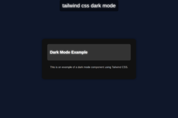
- Implement Dark Mode: Extend your dashboard with a dark mode toggle. Tailwind CSS has excellent support for dark mode using media queries or class toggles. It’s a popular feature.
- Refine Sidebar Navigation: Add sub-menus, active states, or icons to your sidebar links. This enhances usability. You can even build a multi-level navigation.
- Think About Scalability: As you add more components, consider how you manage your Tailwind classes. Check out our guide on Tailwind CSS Scalability: Inline Styles & Best Practices for expert advice.
Conclusion
Wow, you did it! You’ve successfully built a robust and responsive Tailwind Dashboard Layout using Flexbox, Grid, and a touch of JavaScript. You’ve mastered key Tailwind CSS utilities and responsive design principles. This project is a fantastic addition to your developer toolkit. You now have a solid template for future dashboards and admin panels. Keep experimenting, keep building, and most importantly, keep sharing your amazing creations! We can’t wait to see what you build next. Happy coding!