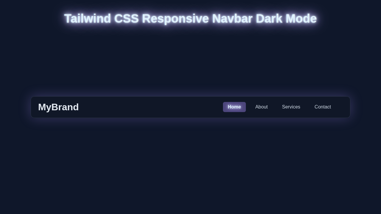
Hey there, fellow coder! You want to build a really slick Responsive Navbar Dark Mode component. Perhaps you felt unsure where to start. You are absolutely in the right place! We’re diving deep today. We will craft an amazing navigation bar. It will look absolutely fantastic on any device. Plus, it comes with a super cool dark mode toggle. Get ready to make your projects not just functional, but also incredibly user-friendly and stylish!
What We Are Building
Imagine a navigation bar that just works. It adapts perfectly to desktops, tablets, and phones without a hitch. On larger screens, you’ll see elegant navigation links laid out clearly. Your users can find what they need instantly. On smaller screens, these links transform. They become a neat, collapsible hamburger menu. This keeps your interface clean. We’re also adding a dynamic dark mode toggle. Your users can switch between light and dark themes with a single, satisfying click! This kind of interactive navbar is essential for any modern website. It significantly boosts user experience. Moreover, it beautifully showcases your front-end development skills. You will build a foundation for many future projects!
HTML Structure: The Backbone of Our Navbar
First things first, let’s set up our HTML. This forms the essential structure for our entire navbar. We will use semantic HTML tags. This improves accessibility and SEO. Don’t worry, the setup is quite straightforward. Pay close attention to the classes we add to each element. These are absolutely crucial for Tailwind CSS to work its styling magic. Remember, a well-structured HTML document is the foundation. It supports a robust and maintainable component. For more insights on organizing your Tailwind styles, you can check out our guide on Tailwind CSS Scalability: Inline Styles & Best Practices. It helps keep your codebase clean.
index.html
<!DOCTYPE html>
<html lang="en" class="dark"> <!-- Add 'dark' class here for default dark mode, or remove for light mode default -->
<head>
    <meta charset="UTF-8">
    <meta name="viewport" content="width=device-width, initial-scale=1.0">
    <title>Responsive Navbar Dark Mode</title>
    <!-- Link to the compiled Tailwind CSS. Run `npx tailwindcss -i ./input.css -o ./output.css --watch` to generate this file. -->
    <link href="./output.css" rel="stylesheet">
    <!-- Safe fonts for production. Tailwind uses system fonts by default, which include Arial, Helvetica, sans-serif. -->
    <style>
        body { font-family: Arial, Helvetica, sans-serif; box-sizing: border-box; }
    </style>
</head>
<body class="bg-gray-50 dark:bg-slate-900 transition-colors duration-300 overflow-x-hidden">
    <nav class="bg-white dark:bg-gray-900 shadow-lg fixed w-full z-10 transition-colors duration-300">
        <div class="container mx-auto px-4 py-3 flex justify-between items-center max-w-full">
            <!-- Logo/Brand -->
            <a href="#" class="text-2xl font-bold text-gray-900 dark:text-sky-200">
                MyBrand
            </a>

            <!-- Desktop Navigation and Dark Mode Toggle -->
            <div class="hidden md:flex space-x-6 items-center">
                <a href="#home" class="text-gray-600 dark:text-slate-300 hover:text-sky-600 dark:hover:text-sky-400 text-lg font-medium transition-colors duration-300">Home</a>
                <a href="#about" class="text-gray-600 dark:text-slate-300 hover:text-sky-600 dark:hover:text-sky-400 text-lg font-medium transition-colors duration-300">About</a>
                <a href="#services" class="text-gray-600 dark:text-slate-300 hover:text-sky-600 dark:hover:text-sky-400 text-lg font-medium transition-colors duration-300">Services</a>
                <a href="#contact" class="text-gray-600 dark:text-slate-300 hover:text-sky-600 dark:hover:text-sky-400 text-lg font-medium transition-colors duration-300">Contact</a>

                <!-- Dark Mode Toggle (Desktop) -->
                <button id="darkModeToggleDesktop" class="p-2 rounded-md focus:outline-none focus:ring-2 focus:ring-sky-500 dark:focus:ring-sky-400 transition-colors duration-300">
                    <svg class="w-6 h-6 text-gray-700 dark:text-yellow-400" fill="currentColor" viewBox="0 0 20 20" xmlns="http://www.w3.org/2000/svg">
                        <!-- Moon icon for dark mode -->
                        <path d="M17.293 13.293A8 8 0 016.707 2.707a8.001 8.001 0 1010.586 10.586z"></path>
                    </svg>
                </button>
            </div>

            <!-- Mobile Menu Button & Dark Mode Toggle -->
            <div class="md:hidden flex items-center space-x-2">
                <!-- Dark Mode Toggle (Mobile) -->
                <button id="darkModeToggleMobile" class="p-2 rounded-md focus:outline-none focus:ring-2 focus:ring-sky-500 dark:focus:ring-sky-400 transition-colors duration-300">
                    <svg class="w-6 h-6 text-gray-700 dark:text-yellow-400" fill="currentColor" viewBox="0 0 20 20" xmlns="http://www.w3.org/2000/svg">
                        <!-- Moon icon for dark mode -->
                        <path d="M17.293 13.293A8 8 0 016.707 2.707a8.001 8.001 0 1010.586 10.586z"></path>
                    </svg>
                </button>
                <button id="mobileMenuButton" class="p-2 rounded-md text-gray-700 dark:text-sky-200 focus:outline-none focus:ring-2 focus:ring-sky-500 dark:focus:ring-sky-400 transition-colors duration-300">
                    <svg class="w-6 h-6" fill="currentColor" viewBox="0 0 20 20" xmlns="http://www.w3.org/2000/svg">
                        <!-- Hamburger icon -->
                        <path fill-rule="evenodd" d="M3 5a1 1 0 011-1h12a1 1 0 110 2H4a1 1 0 01-1-1zM3 10a1 1 0 011-1h12a1 1 0 110 2H4a1 1 0 01-1-1zM3 15a1 1 0 011-1h12a1 1 0 110 2H4a1 1 0 01-1-1z" clip-rule="evenodd"></path>
                    </svg>
                </button>
            </div>
        </div>

        <!-- Mobile Menu (initially hidden) -->
        <div id="mobileMenu" class="hidden md:hidden bg-white dark:bg-gray-800 absolute top-full left-0 w-full py-2 shadow-lg transition-colors duration-300">
            <a href="#home" class="block px-4 py-2 text-gray-700 dark:text-slate-200 hover:bg-gray-100 dark:hover:bg-gray-700 text-lg transition-colors duration-300">Home</a>
            <a href="#about" class="block px-4 py-2 text-gray-700 dark:text-slate-200 hover:bg-gray-100 dark:hover:bg-gray-700 text-lg transition-colors duration-300">About</a>
            <a href="#services" class="block px-4 py-2 text-gray-700 dark:text-slate-200 hover:bg-gray-100 dark:hover:bg-gray-700 text-lg transition-colors duration-300">Services</a>
            <a href="#contact" class="block px-4 py-2 text-gray-700 dark:text-slate-200 hover:bg-gray-100 dark:hover:bg-gray-700 text-lg transition-colors duration-300">Contact</a>
        </div>
    </nav>

    <!-- Dummy content to show scrollability / placement -->
    <div class="mt-24 p-8 text-center min-h-[120vh]">
        <h1 class="text-4xl font-bold text-gray-900 dark:text-sky-100 mb-4">Welcome to My Awesome Website!</h1>
        <p class="text-xl text-gray-700 dark:text-slate-300">This is a responsive navbar with dark mode functionality.</p>
        <div class="p-10 my-10 bg-gradient-to-br from-purple-100 to-indigo-100 dark:from-gray-800 dark:to-gray-700 rounded-lg shadow-lg max-w-2xl mx-auto">
            <p class="text-lg text-gray-800 dark:text-slate-200">Scroll down to see the fixed navbar in action!</p>
            <p class="text-lg text-gray-800 dark:text-slate-200 mt-2">Change window size to test responsiveness.</p>
        </div>
        <div class="h-[800px]"></div> <!-- Spacer for scroll -->
        <p class="text-gray-600 dark:text-slate-400">End of content.</p>
    </div>

    <script src="./script.js"></script>
</body>
</html>
CSS Styling with Tailwind CSS
Here’s the cool part about using Tailwind: most of our styling happens right in the HTML! Tailwind CSS is a utility-first framework. This means we apply pre-defined classes directly to our elements. You won’t find much custom CSS code here. This approach makes development incredibly fast. It also keeps our styles perfectly consistent across the entire project. We will include a small inline <style> block. This ensures smooth transitions for some dynamic elements. For instance, when the dark mode activates, the change will be fluid. Remember, Tailwind handles almost everything else seamlessly! This keeps our code clean, efficient, and highly readable. It truly simplifies styling.
input.css
/* input.css */
/* These are the Tailwind CSS directives that will be processed by the Tailwind CLI.
   To generate the output.css file, you need to have Tailwind CSS installed.
   1. Initialize Tailwind: `npm install -D tailwindcss postcss autoprefixer` then `npx tailwindcss init -p`
   2. Run the build command: `npx tailwindcss -i ./input.css -o ./output.css --watch`
   This command will compile your Tailwind classes from input.css into output.css and watch for changes.
*/

@tailwind base;
@tailwind components;
@tailwind utilities;

/* Add any custom CSS here if needed, but for a utility-first approach, try to use Tailwind classes. */
JavaScript for Interactivity
Our beautiful navbar needs some dynamic life! JavaScript is the key to making it interactive. We will implement two main pieces of functionality today. First, we need a toggle for our mobile menu. This will make it appear and disappear smoothly. Second, we’ll build a toggle for our dark mode. It will switch the website’s theme instantly. We will use simple, clean JavaScript for both. It’s easy to understand, even for beginners. You’ll be amazed at how little code we need to achieve these powerful effects. This ensures our Responsive Navbar Dark Mode is not just pretty, but fully functional and engaging!
tailwind.config.js
/** @type {import('tailwindcss').Config} */
module.exports = {
  // Configure dark mode to toggle with a 'dark' class on the root HTML element.
  darkMode: 'class',
  // Define files where Tailwind CSS should scan for utility classes.
  content: [
    './index.html',
    './script.js', // Include JS file if you're manipulating classes with JS
  ],
  theme: {
    extend: {
      // Define safe system fonts to ensure consistent rendering without external requests.
      fontFamily: {
        sans: ['Arial', 'Helvetica', 'sans-serif'],
      },
    },
  },
  plugins: [],
}
script.js
// script.js

document.addEventListener('DOMContentLoaded', () => {
    const htmlElement = document.documentElement;
    const mobileMenuButton = document.getElementById('mobileMenuButton');
    const mobileMenu = document.getElementById('mobileMenu');
    const darkModeToggleDesktop = document.getElementById('darkModeToggleDesktop');
    const darkModeToggleMobile = document.getElementById('darkModeToggleMobile');

    // --- Dark Mode Functionality ---

    // Function to set the dark mode preference
    const setDarkMode = (isDark) => {
        if (isDark) {
            htmlElement.classList.add('dark');
            localStorage.setItem('theme', 'dark');
        } else {
            htmlElement.classList.remove('dark');
            localStorage.setItem('theme', 'light');
        }
    };

    // Check for saved theme preference or system preference on load
    const savedTheme = localStorage.getItem('theme');
    if (savedTheme) {
        setDarkMode(savedTheme === 'dark');
    } else if (window.matchMedia('(prefers-color-scheme: dark)').matches) {
        // If no preference saved, use system preference
        setDarkMode(true);
    } else {
        setDarkMode(false); // Default to light mode if no preference or system is light
    }

    // Event listeners for dark mode toggles
    darkModeToggleDesktop.addEventListener('click', () => {
        setDarkMode(!htmlElement.classList.contains('dark'));
    });
    darkModeToggleMobile.addEventListener('click', () => {
        setDarkMode(!htmlElement.classList.contains('dark'));
    });

    // --- Mobile Menu Functionality ---

    if (mobileMenuButton) {
        mobileMenuButton.addEventListener('click', () => {
            mobileMenu.classList.toggle('hidden');
        });
    }

    // Close mobile menu when a link is clicked
    if (mobileMenu) {
        mobileMenu.querySelectorAll('a').forEach(link => {
            link.addEventListener('click', () => {
                mobileMenu.classList.add('hidden');
            });
        });
    }

    // Close mobile menu if window is resized above mobile breakpoint
    window.addEventListener('resize', () => {
        if (window.innerWidth >= 768) { // Tailwind's 'md' breakpoint
            mobileMenu.classList.add('hidden');
        }
    });
});
How It All Works Together
Let’s pull back the curtain. We will break down the magic behind this component. Each part plays a vital role. Understanding this helps you troubleshoot and customize later. We combine well-structured HTML, intelligent Tailwind CSS classes, and precise JavaScript. This creates a powerful, flexible, and visually appealing navbar. You’ll see how smoothly everything integrates. It’s truly a testament to modern, efficient web development practices.
The Mobile Menu Magic
Our mobile menu is cleverly designed. It starts completely hidden on smaller screens. We achieve this using Tailwind’s hidden class by default. However, for larger screens (medium breakpoint and up), we apply md:flex. This makes it visible and a flex container. When a user clicks the hamburger menu button, JavaScript steps in. It precisely toggles the hidden class on the mobile menu container. This action instantly reveals or conceals the menu. This approach is very efficient. It leverages Tailwind’s responsive utilities perfectly. You get a sleek, user-friendly mobile experience instantly. This is the beauty and power of utility-first CSS in action!
Pro Tip: Tailwind’s responsive prefixes (like
sm:,md:,lg:) are incredibly powerful. They let you define styles that only apply at specific screen sizes. Master them to build truly adaptive and robust layouts with ease!
Dark Mode Toggle Explained
The dark mode toggle is both elegant and user-friendly. When you click the sun/moon icon, JavaScript takes immediate action. It intelligently adds or removes a dark class from the very top <html> element of your page. Tailwind CSS then uses its brilliant dark: variants. For example, a class like bg-white dark:bg-gray-800 means a white background normally. It automatically becomes a sophisticated gray-800 in dark mode. We also save your preference in localStorage. This ensures your website remembers your theme choice. It persists even after you close and reopen your browser! Want a deeper dive into dark mode? Check out our dedicated guide on Tailwind CSS Dark Mode Toggle: HTML & JS Tutorial. It covers everything in detail.
Tailwind’s Responsive Power in Detail
Tailwind CSS makes achieving responsiveness incredibly simple and intuitive. We strategically use classes like flex, hidden, and justify-between. Then, we enhance these with responsive prefixes, such as md:. For example, md:hidden will hide an element specifically on medium screens and larger. Conversely, md:flex transforms an element into a flex container from medium screens upwards. This granular control is fantastic for crafting precise layouts. You can truly customize your design for any device size. It completely removes the need for writing complex media queries in separate CSS files. This keeps your stylesheet lean, focused, and incredibly manageable. To understand the foundational concepts, explore CSS media queries on MDN. This gives you a deeper perspective.
Tips to Customise It
You’ve just built a fantastic Responsive Navbar Dark Mode! It’s a great achievement. Now, let’s explore how you can make it truly and uniquely yours. Here are a few exciting ideas to help you get started. Experimenting with these will deepen your understanding significantly. Personalizing your projects is a fantastic way to learn new things and solidify your skills.
- Add More Navigation Links: It’s simple! Just duplicate an existing
<li>element within your menu. Then, change the text and the corresponding link. You can expand your navigation effortlessly to accommodate more pages or features. - Change Colors & Fonts: Tailwind makes this a breeze. Modify the existing utility classes! For instance, try
bg-blue-600instead ofbg-indigo-600for a different primary color. Experiment withtext-xlfor larger text or differentfont-sansclasses. You can even customize yourtailwind.config.jsfile for global design changes. - Integrate a User Profile Dropdown: Enhance functionality by adding a small dropdown menu for user-specific options. This might include ‘Settings’, ‘Profile’, or ‘Logout’. You can reuse similar JavaScript toggling logic for this. It adds a professional touch.
- Add Subtle Animations: Make your navbar feel even more dynamic. Use Tailwind’s built-in animation classes, such as
animate-fade-in, for menu transitions. Or, add custom CSS transitions to element visibility. This adds a polished and engaging feel to your design.
Challenge Yourself: Don’t let this project stop here! Try integrating this responsive navbar into another one of your projects. Perhaps a landing page you’re working on, or even a blog layout like our Glassmorphism Sidebar with HTML & Tailwind CSS – Complete Tutorial. Apply your new skills to something real!
Conclusion
Wow, you truly did it! You successfully built a fully functional, stylish, and interactive Responsive Navbar Dark Mode component. You expertly utilized Tailwind CSS, clean HTML, and a touch of JavaScript. This is a huge, impressive step in your web development journey. You now possess crucial skills. Understanding responsive design and implementing dark mode are modern necessities. Feel incredibly proud of your accomplishment! Share your amazing creation with the procoder09.com community. We absolutely love seeing what you build. Keep coding, keep creating, and most importantly, keep learning!