Hello, future web wizard! Have you ever built a cool component, like a user profile card, and then wished it could just… adjust itself? I mean, truly adjust, no matter where you placed it? You’re not alone if you’ve felt that frustration.
It’s a common challenge in web design. You want your elements to be smart. You want them to adapt gracefully to any space. Well, get ready for a game-changer: CSS Container Queries Explained is here. This new superpower lets your components think for themselves. It gives them the flexibility they truly deserve.
CSS Container Queries Explained: What Are They Really?
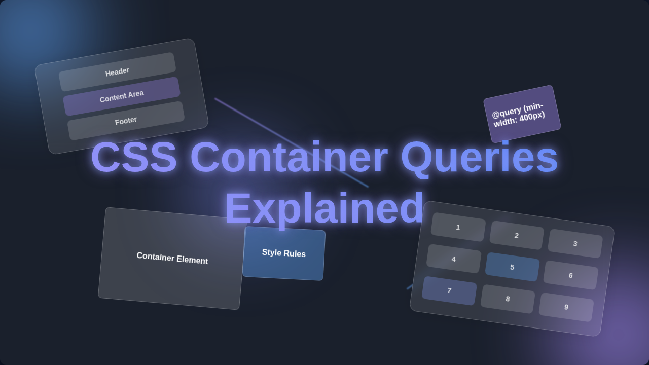
Think of it like this. Instead of your page components reacting only to the entire browser window, they now listen to their *parent container*. That’s right! A ‘container’ is just an element that holds other elements. It’s like a small box holding your content. Now, your little profile card can shrink or expand based on the actual space it has. It doesn’t care about the whole page. This is a huge step forward for responsive design. This approach makes your layouts incredibly flexible. You can create truly modular designs now. Your components will feel much more independent.
Why Component-Based Responsiveness Matters to You
Why should you care about this new superpower? You’ve probably used media queries before. Media queries let you change styles based on the *viewport size*. This means the whole browser window. But what if you have a sidebar that’s tiny, and your main content area is huge? Both respond to the same viewport. This can make building flexible components tricky. Container queries solve this challenge. They bring true component-based responsiveness. Your components become smarter and more independent. This makes your CSS cleaner and your workflow faster. Imagine building one component that works perfectly everywhere. Sound good? You bet it does! You’ll save so much time and effort.
How CSS Container Queries Actually Work: A Deeper Dive
So, how does this magic happen? First, you declare a container. You tell a parent element, ‘Hey, you’re a container!’ You do this with a special CSS property called container-type. Let’s say you have a div acting as a wrapper. You set container-type: inline-size; on it. This marks it as a queryable container. This tells the browser to track its width. You’re making it a watchable space. Learn more about the container-type property on MDN. Then, inside that container, you write your query. It uses the @container rule. This looks a bit like a media query. But it targets min-width or max-width of the *container itself*. For example, you could say: ‘If my container is at least 400 pixels wide, then change my image size.’ Your image inside that container only cares about its direct parent’s width. It doesn’t care about the whole page. You give your components the context they need. This is incredibly powerful for complex layouts.
Imagine you have a series of picture frames. Before container queries, all your pictures changed size based on the size of the *entire wall* they were on. If the wall was small, every picture shrunk. Now, with container queries, each picture frame can say, ‘Hey, if *I* am smaller than 10 inches, then put a smaller photo inside me.’ The frame itself dictates the rules for its contents. This is what container-type does for your parent elements. It makes them independent sizing supervisors. Then, @container is how you write those specific rules for the items *inside* that frame. You’re giving your components their own personal rulebook. It’s like giving each frame its own personal art curator!
Clearing Up Common Confusions: CSS Container Queries Explained vs. Media Queries
You might be thinking, ‘Isn’t this just media queries again?’ That’s a common thought. But here’s the crucial difference. Media queries are global. They react to the *browser’s viewport*. Container queries are local. They react to the *parent element’s size*. Consider a classic responsive navbar. With media queries, your navbar might change when the browser window shrinks. But what if that navbar lives inside a tiny widget on a huge screen? A media query won’t help it. A container query will! It lets that widget adapt based on its own confined space. You’re giving your components autonomy. This truly separates concerns, making your CSS more modular. You’re building truly independent pieces now. This leads to much more predictable behavior.
Practical Use Cases and Examples for Your Projects
So, where can you use this magic? Everywhere you have a component! Imagine product cards on an e-commerce site. On a large screen, your card might show the image, title, price, and a detailed description all in a row. But what if that same card appears in a narrow sidebar? With container queries, the card can detect its reduced space. It might then stack the description below the price. Or perhaps it hides the description entirely. This happens only because its parent container got smaller. The component adapts smartly. You define how it behaves. You set the rules for its flexibility.
Think about a blog post layout with different content modules. You might have an author bio component. On a wide display, it shows the author’s picture, name, and a lengthy bio side-by-side. If it ends up in a very narrow column, the picture might stack above the name. The bio text could shrink or even disappear. This responsiveness happens without affecting other components on the page. It’s all self-contained. You can create amazing effects like a Glassmorphism card that changes its visual density based on its container’s width. Or perhaps dynamic adjustments for CSS popover positioning.
Pro Tip: Think of container queries like a personalized stylist for your components. Instead of fitting into a single, page-wide outfit, they get custom adjustments based on their specific closet space.
Key Takeaways for Mastering CSS Container Queries
- Component-Centric Design: Container queries let you style elements based on their *parent container’s size*, not the entire viewport.
- Declare a Container: You need to set
container-typeon a parent element to make it queryable. - Use
@container: This is the rule you use to write your queries inside the designated container. Explore the@containerrule in detail on MDN. - Local Control: This gives your components true independence. They can adapt themselves without relying on global page changes.
- Cleaner CSS: You’ll write more modular and reusable styles. This reduces complexity and future headaches.
Container queries empower you to design components once, then let them magically adapt to *any* layout space. This makes your development workflow much smoother and more predictable.
Your Journey to Smarter Layouts Starts Now!
See? That wasn’t so scary, was it? CSS Container Queries are a powerful addition to your responsive design toolkit. They let you build more robust and flexible web components than ever before. You’re no longer limited by the browser window alone. You now have granular control over your individual pieces. Start experimenting with them in your next project. Play around with different layouts. You’ll quickly see how intuitive and effective they are. Your future self will thank you for mastering this skill. Keep learning, keep building, and remember: you’ve got this!