Hey there, awesome coder! If you’ve been wanting to build a super slick and flexible responsive navbar but felt a bit lost on where to start, you are in the perfect place. Today, we’re going to build one together! We will use the magic of Tailwind CSS to make it look fantastic and behave perfectly on any screen size. It’s going to be a fun project. You’ll gain valuable skills along the way!
What We Are Building: Your Next Responsive Navbar!
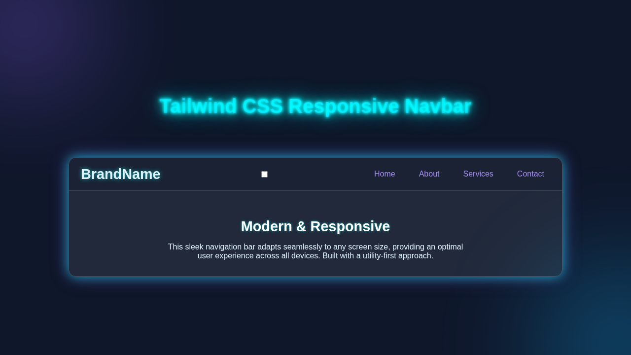
We’re crafting a modern navigation bar that shines on every device. Imagine a clean, sleek menu for desktop users. Then picture a neat, collapsing menu for mobile users. This means your visitors get a great experience, no matter how they browse. We’ll make it snappy and intuitive. It will use Tailwind CSS for all the styling. This keeps our CSS super clean.
HTML Structure: The Bones of Our Navbar
First, we lay down the HTML foundation. This is the basic blueprint for our navbar. We’ll have a main container, a logo, and our navigation links. Plus, we will include a special button for our mobile menu. This button will only appear on smaller screens.
index.html
<!DOCTYPE html>
<html lang="en">
<head>
    <meta charset="UTF-8">
    <meta name="viewport" content="width=device-width, initial-scale=1.0">
    <title>Responsive Navbar</title>
    <link rel="stylesheet" href="styles.css">
</head>
<body>
    <nav class="navbar">
        <div class="container">
            <a href="#" class="navbar-brand">
                MyBrand
            </a>

            <!-- Checkbox for toggling the mobile menu. Hidden visually but accessible. -->
            <input type="checkbox" id="menu-toggle" class="menu-toggle-checkbox">

            <!-- Label acts as the hamburger icon, linked to the checkbox -->
            <label for="menu-toggle" class="hamburger-menu">
                <span class="hamburger-line"></span>
                <span class="hamburger-line"></span>
                <span class="hamburger-line"></span>
            </label>

            <ul class="navbar-nav" id="nav-links">
                <li><a href="#" class="nav-link">Home</a></li>
                <li><a href="#" class="nav-link">About</a></li>
                <li><a href="#" class="nav-link">Services</a></li>
                <li><a href="#" class="nav-link">Contact</a></li>
            </ul>
        </div>
    </nav>

    <!-- Placeholder content to demonstrate the navbar's integration -->
    <div class="content-placeholder">
        <h1>Welcome to My Website!</h1>
        <p>This is a section where your main page content would reside. The navbar above provides seamless navigation across different sections.</p>
        <p>Try resizing your browser window to see the responsive behavior of the navbar.</p>
    </div>
</body>
</html>
CSS Styling: Making It Beautiful with Tailwind CSS
Now for the exciting part: styling! We’re using Tailwind CSS utility classes directly in our HTML. This means no more huge, custom CSS files. Tailwind helps us design quickly. It ensures our navbar looks great and is fully responsive. You’ll see classes like flex, hidden, and md:flex doing all the heavy lifting.
Pro Tip: Tailwind CSS is all about utility classes. Instead of writing custom CSS rules, you apply pre-defined classes like
p-4for padding orbg-blue-500for a background color. This speeds up development a lot!
styles.css
/*
  Tailwind CSS Responsive Navbar (HTML & CSS Only)

  This stylesheet provides the styling for a responsive navbar,
  mimicking Tailwind CSS utility classes using pure CSS.
  It uses the "checkbox hack" for mobile menu toggling, eliminating the need for JavaScript.
*/

/* 1. Basic Reset & Box-sizing */
* {
    box-sizing: border-box;
    margin: 0;
    padding: 0;
    font-family: Arial, Helvetica, sans-serif; /* Using safe web fonts */
}

body {
    background-color: #f0f2f5;
    line-height: 1.6;
    color: #333;
    overflow-x: hidden; /* Prevent horizontal scrollbars */
}

/* 2. Navbar Container */
.navbar {
    background-color: #2563eb; /* Tailwind blue-600 */
    padding: 1rem 0; /* Vertical padding */
    position: relative;
    z-index: 10;
    width: 100%;
}

.navbar .container {
    display: flex; /* flex */
    justify-content: space-between; /* justify-between */
    align-items: center; /* items-center */
    max-width: 1280px; /* max-w-7xl equivalent */
    margin: 0 auto; /* Center the container */
    padding: 0 1rem; /* px-4 */
}

/* 3. Navbar Brand/Logo */
.navbar-brand {
    color: #fff; /* text-white */
    font-size: 1.5rem; /* text-2xl */
    font-weight: bold; /* font-bold */
    text-decoration: none;
    line-height: 1; /* Ensure brand name doesn't affect alignment */
}

/* 4. Hamburger Menu Icon (Mobile Only) */
.hamburger-menu {
    display: flex; /* flex */
    flex-direction: column; /* flex-col */
    justify-content: space-between; /* justify-between */
    width: 30px;
    height: 20px;
    cursor: pointer;
    z-index: 20; /* Ensure it's above other elements when open */
}

.hamburger-line {
    display: block;
    width: 100%;
    height: 3px;
    background-color: #fff; /* text-white */
    transition: all 0.3s ease-in-out;
}

/* Hide the actual checkbox input visually */
.menu-toggle-checkbox {
    position: absolute;
    opacity: 0;
    pointer-events: none; /* Make it non-interactive for mouse, only triggered by label */
}

/* 5. Navigation Links (Mobile-first: hidden by default, stacked vertically) */
.navbar-nav {
    display: none; /* hidden by default on mobile */
    flex-direction: column; /* flex-col */
    position: absolute;
    top: 100%; /* Position below the main nav bar */
    left: 0;
    width: 100%; /* w-full */
    background-color: #2563eb; /* bg-blue-600 */
    list-style: none;
    padding: 0;
    text-align: center;
    box-shadow: 0 4px 6px rgba(0, 0, 0, 0.1); /* shadow-md */
}

.navbar-nav li {
    padding: 0;
}

.nav-link {
    display: block; /* block */
    color: #fff; /* text-white */
    padding: 1rem 0; /* py-4 */
    text-decoration: none;
    transition: background-color 0.3s ease;
}

.nav-link:hover {
    background-color: rgba(255, 255, 255, 0.1); /* hover:bg-blue-700 equivalent */
}

/* 6. Checkbox Hack: Show menu when checkbox is checked */
.menu-toggle-checkbox:checked ~ .navbar-nav {
    display: flex; /* Display as flex column when checked */
}

/* 7. Hamburger Icon Animation when menu is open */
.menu-toggle-checkbox:checked ~ .hamburger-menu .hamburger-line:nth-child(1) {
    transform: translateY(8px) rotate(45deg);
}
.menu-toggle-checkbox:checked ~ .hamburger-menu .hamburger-line:nth-child(2) {
    opacity: 0;
}
.menu-toggle-checkbox:checked ~ .hamburger-menu .hamburger-line:nth-child(3) {
    transform: translateY(-8px) rotate(-45deg);
}

/* 8. Responsive Styles (Medium screens and up - md breakpoint) */
@media (min-width: 768px) { /* Equivalent to Tailwind's md breakpoint */
    /* Hide hamburger menu on desktop */
    .hamburger-menu {
        display: none; /* md:hidden */
    }

    /* Display nav links horizontally on desktop */
    .navbar-nav {
        display: flex; /* md:flex */
        flex-direction: row; /* md:flex-row */
        position: static; /* md:static */
        width: auto; /* md:w-auto */
        background-color: transparent; /* md:bg-transparent */
        box-shadow: none; /* md:shadow-none */
    }

    /* Spacing between desktop nav links */
    .navbar-nav li {
        margin-left: 1.5rem; /* md:ml-6 */
    }
    .navbar-nav li:first-child {
        margin-left: 0;
    }

    /* Styling for desktop nav links */
    .nav-link {
        padding: 0.5rem 0.75rem; /* md:px-3 md:py-2 */
        border-radius: 0.25rem; /* md:rounded */
        transition: background-color 0.3s ease, color 0.3s ease;
    }

    .nav-link:hover {
        background-color: rgba(255, 255, 255, 0.1); /* md:hover:bg-blue-700 equivalent */
        color: #fff;
    }

    /* Adjust container padding for larger screens */
    .navbar .container {
        padding: 0 1.5rem; /* md:px-6 */
    }
}

/* 9. Placeholder for content below the navbar (for tutorial demonstration) */
.content-placeholder {
    max-width: 1280px;
    margin: 2rem auto;
    padding: 1.5rem;
    background-color: #fff;
    border-radius: 8px;
    box-shadow: 0 2px 8px rgba(0,0,0,0.05);
}
.content-placeholder h1 {
    font-size: 2rem;
    margin-bottom: 1rem;
    color: #333;
}
.content-placeholder p {
    font-size: 1rem;
    color: #555;
    margin-bottom: 0.5rem;
}
JavaScript: Bringing Our Navbar to Life
Our mobile menu needs some interactivity. This is where JavaScript steps in. We will write a small script. It will toggle the visibility of our navigation links on smaller screens. This makes our hamburger menu button functional. Don’t worry, it’s straightforward!
How Our Responsive Navbar Comes Alive
Let’s break down how all these pieces fit together. You’ll see the power of combining HTML, Tailwind CSS, and a little JavaScript.
The Main Container and Basic Layout
Our navbar starts with a <nav> element. We give it a dark background using bg-gray-800. Then we add some padding with p-4. The text-white class makes our text bright and visible. We use flex justify-between items-center to arrange its contents. This places the logo on one side and the menu items on the other. This ensures everything stays centered vertically. It’s clean and efficient!
The Logo and Desktop Navigation
The logo is simply an <a> tag. It has some basic text styling. Our main navigation links live inside a <div>. On larger screens (md: breakpoint and up), this div is displayed as a flex container. This arranges the links side-by-side. On smaller screens, however, these links are hidden. This is where the magic of responsiveness starts. We use space-x-4 to add horizontal spacing between our links. This keeps them from looking cramped. You can make your links more interactive, maybe with a cool Glassmorphism Card CSS Tutorial effect elsewhere on your site!
The Mobile Menu Button
This button is crucial for small screens. We give it an ID of 'mobile-menu-button'. This lets our JavaScript find it easily. We set it to hidden on medium screens and up (md:hidden). It becomes block on smaller screens. This ensures it only appears when needed. It’s a simple SVG icon. This keeps our file size small. It gives us a crisp, scalable icon.
The Mobile Navigation Menu
The actual mobile menu is another <div>. It has the ID 'mobile-menu'. By default, it’s hidden. When the mobile button is clicked, our JavaScript will remove this hidden class. This reveals the menu. We position it absolutely using absolute top-full left-0 w-full bg-gray-700 z-10. This places it right below the main navbar. It spans the full width of the screen. We add transition-all duration-300 ease-in-out. This gives us a smooth sliding animation. Each link inside it is a block element. This makes them stack vertically. You can even implement advanced features, like those found in an Accessible CSS Dropdown Menu Tutorial, within these mobile links.
JavaScript in Action
Our JavaScript listens for clicks on the 'mobile-menu-button'. When a click happens, it toggles the 'hidden' class on our 'mobile-menu' element. If hidden is present, it removes it, making the menu visible. If hidden is absent, it adds it back, hiding the menu. This simple script gives us full control over the mobile menu’s state. It makes the menu interactive. For more complex interactions, you might explore custom events or advanced DOM manipulation. You can learn more about Element.classList on MDN.
Remember: Writing clear and concise JavaScript is a superpower. Every line should have a purpose. Start small and build up!
Tips to Customise It
You’ve built a fantastic responsive navbar! But the fun doesn’t stop here. Here are some ideas to make it even more yours:
- Change Colors and Fonts: Experiment with different Tailwind CSS color classes. Try new font styles. Make it match your brand!
- Add More Links: Simply add more
<a>tags within your navigation divs. The responsive layout will handle them. - Include a Search Bar: Integrate a search input field. You can make it appear conditionally. Maybe only on desktop or as an icon on mobile.
- User Profile Dropdown: Add a small user icon. When clicked, it could reveal a dropdown menu. This is perfect for user settings or a login/logout button. For inspiration, check out how to manage CSS Popover Positioning.
Conclusion
Wow, you did it! You just built a fully functional and beautiful responsive navbar using Tailwind CSS and a dash of JavaScript. That’s a huge achievement! This project teaches you core web development principles. It shows you the power of modern CSS frameworks. You’re now equipped to create navigation that looks great everywhere. Keep experimenting, keep building, and don’t forget to show off your awesome work!