CSS Popover Positioning: Pure HTML & CSS Tutorial
Hey there, awesome coder! If you’ve ever wanted to add cool interactive elements to your websites without touching JavaScript, you are in the perfect spot. Today, we’re diving deep into CSS Popover Positioning. We’ll build elegant tooltips and popovers. These are super useful UI components. Plus, we will do it all with pure HTML and CSS. Get ready to impress!
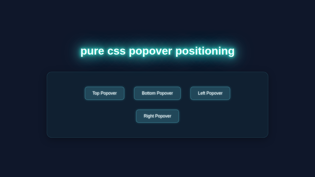
What We Are Building: Interactive Popovers and Tooltips!
We are going to create stylish popovers and tooltips. They will appear right when you hover over certain elements. Imagine a small info box popping up next to a button! Or a detailed description showing up for an image. These elements add a professional touch to any website. They also give users helpful context. Best of all, they enhance user experience. You’ll build them from scratch.
HTML Structure: Setting Up Our Content
First, we need some basic HTML. This structure will hold both our trigger element and the popover content. We’ll use a parent container. Inside, we will place our main content and the hidden popover itself. It’s quite simple, really!
index.html
<!DOCTYPE html>
<html lang="en">
<head>
    <meta charset="UTF-8">
    <meta name="viewport" content="width=device-width, initial-scale=1.0">
    <title>CSS Popover Positioning</title>
    <link rel="stylesheet" href="styles.css">
</head>
<body>
    <div class="container">
        <h1>Pure CSS Popover Positioning</h1>
        <p>Hover over the buttons below to see popovers appear in different positions.</p>

        <div class="popover-wrapper">
            <button class="popover-btn">Top Popover</button>
            <div class="popover popover-top">
                <p>This popover appears on top.</p>
                <div class="popover-arrow"></div>
            </div>
        </div>

        <div class="popover-wrapper">
            <button class="popover-btn">Bottom Popover</button>
            <div class="popover popover-bottom">
                <p>This popover appears at the bottom.</p>
                <div class="popover-arrow"></div>
            </div>
        </div>

        <div class="popover-wrapper">
            <button class="popover-btn">Left Popover</button>
            <div class="popover popover-left">
                <p>This popover appears on the left.</p>
                <div class="popover-arrow"></div>
            </div>
        </div>

        <div class="popover-wrapper">
            <button class="popover-btn">Right Popover</button>
            <div class="popover popover-right">
                <p>This popover appears on the right.</p>
                <div class="popover-arrow"></div>
            </div>
        </div>
    </div>
</body>
</html>
CSS Styling: Mastering CSS Popover Positioning
This is where the real magic happens! We’ll use CSS to hide our popover initially. Then, we will reveal it on hover. We’ll also perfectly position it relative to its parent. This section is key for CSS Popover Positioning. Let’s make it look fantastic!
styles.css
/* Basic Reset & Body Styling */
body {
    font-family: Arial, Helvetica, sans-serif;
    margin: 0;
    padding: 20px; /* Add some padding for better visibility */
    background-color: #f4f7f6; /* Light background for the tutorial */
    display: flex;
    justify-content: center;
    align-items: flex-start; /* Align items to start for typical content flow */
    min-height: 100vh;
    box-sizing: border-box;
}

.container {
    max-width: 900px;
    width: 100%;
    padding: 30px;
    background-color: #ffffff;
    border-radius: 12px;
    box-shadow: 0 8px 20px rgba(0, 0, 0, 0.1);
    text-align: center;
    overflow: hidden; /* Ensure no overflow */
    box-sizing: border-box;
}

h1 {
    color: #2c3e50;
    margin-bottom: 15px;
    font-size: 2.2em;
}

p {
    color: #34495e;
    line-height: 1.6;
    margin-bottom: 30px;
    font-size: 1.1em;
}

/* Popover Wrapper - crucial for positioning */
.popover-wrapper {
    position: relative; /* All popovers are positioned relative to their wrapper */
    display: inline-block; /* Allows buttons to sit side-by-side */
    margin: 15px;
    box-sizing: border-box;
}

/* Popover Button */
.popover-btn {
    padding: 12px 25px;
    background-color: #3498db;
    color: white;
    border: none;
    border-radius: 8px;
    cursor: pointer;
    font-size: 1em;
    transition: background-color 0.3s ease, transform 0.2s ease;
    box-shadow: 0 4px 10px rgba(0, 0, 0, 0.1);
    outline: none;
    box-sizing: border-box;
}

.popover-btn:hover {
    background-color: #2980b9;
    transform: translateY(-2px);
}

/* Popover Content */
.popover {
    position: absolute; /* Positioned relative to .popover-wrapper */
    background-color: #333;
    color: white;
    padding: 12px 18px;
    border-radius: 8px;
    white-space: nowrap; /* Prevent text wrapping inside popover */
    opacity: 0; /* Hidden by default */
    visibility: hidden; /* Hidden by default */
    transition: opacity 0.3s ease, visibility 0.3s ease, transform 0.3s ease; /* Smooth animation */
    z-index: 10; /* Ensure popover is above other content */
    box-shadow: 0 6px 15px rgba(0, 0, 0, 0.2);
    min-width: 150px; /* Ensure popover has a readable width */
    text-align: left;
    font-size: 0.9em;
    box-sizing: border-box;
}

/* Show popover on wrapper hover */
.popover-wrapper:hover .popover {
    opacity: 1;
    visibility: visible;
    transform: translateY(0) translateX(0) scale(1) !important; /* Override initial transform */
}

/* Popover Arrow */
.popover-arrow {
    content: '';
    position: absolute;
    width: 0;
    height: 0;
    border-style: solid;
    z-index: 11; /* Ensure arrow is above popover background but behind text */
}

/* Positioning for Top Popover */
.popover-top {
    bottom: 100%; /* Position above the button */
    left: 50%;
    transform: translateX(-50%) translateY(10px) scale(0.8); /* Start slightly below and smaller */
    margin-bottom: 10px; /* Space between popover and button */
}

.popover-wrapper:hover .popover-top {
    transform: translateX(-50%) translateY(0) scale(1);
}

.popover-top .popover-arrow {
    border-width: 8px 8px 0 8px; /* Top border only */
    border-color: #333 transparent transparent transparent; /* Arrow points up */
    top: 100%; /* Position at the bottom of the popover */
    left: 50%;
    transform: translateX(-50%);
}

/* Positioning for Bottom Popover */
.popover-bottom {
    top: 100%; /* Position below the button */
    left: 50%;
    transform: translateX(-50%) translateY(-10px) scale(0.8); /* Start slightly above and smaller */
    margin-top: 10px; /* Space between popover and button */
}

.popover-wrapper:hover .popover-bottom {
    transform: translateX(-50%) translateY(0) scale(1);
}

.popover-bottom .popover-arrow {
    border-width: 0 8px 8px 8px; /* Bottom border only */
    border-color: transparent transparent #333 transparent; /* Arrow points down */
    bottom: 100%; /* Position at the top of the popover */
    left: 50%;
    transform: translateX(-50%);
}

/* Positioning for Left Popover */
.popover-left {
    top: 50%;
    right: 100%; /* Position to the left of the button */
    transform: translateY(-50%) translateX(10px) scale(0.8); /* Start slightly to the right and smaller */
    margin-right: 10px; /* Space between popover and button */
}

.popover-wrapper:hover .popover-left {
    transform: translateY(-50%) translateX(0) scale(1);
}

.popover-left .popover-arrow {
    border-width: 8px 0 8px 8px; /* Left border only */
    border-color: transparent transparent transparent #333; /* Arrow points left */
    left: 100%; /* Position at the right of the popover */
    top: 50%;
    transform: translateY(-50%);
}

/* Positioning for Right Popover */
.popover-right {
    top: 50%;
    left: 100%; /* Position to the right of the button */
    transform: translateY(-50%) translateX(-10px) scale(0.8); /* Start slightly to the left and smaller */
    margin-left: 10px; /* Space between popover and button */
}

.popover-wrapper:hover .popover-right {
    transform: translateY(-50%) translateX(0) scale(1);
}

.popover-right .popover-arrow {
    border-width: 8px 8px 8px 0; /* Right border only */
    border-color: transparent #333 transparent transparent; /* Arrow points right */
    right: 100%; /* Position at the left of the popover */
    top: 50%;
    transform: translateY(-50%);
}

/* Responsive adjustments */
@media (max-width: 768px) {
    .container {
        padding: 20px;
    }
    h1 {
        font-size: 1.8em;
    }
    p {
        font-size: 1em;
    }
    .popover-wrapper {
        margin: 10px 5px;
    }
    .popover {
        padding: 10px 15px;
        min-width: unset; /* Allow popover width to adapt */
        font-size: 0.85em;
    }
}

@media (max-width: 480px) {
    .popover-wrapper {
        display: block; /* Stack buttons vertically */
        margin: 10px auto;
        width: fit-content; /* Center block elements */
    }
    .popover-btn {
        width: 100%;
        max-width: 200px; /* Limit button width */
    }
    /* Adjust popover positioning for smaller screens if needed,
       though current setup should generally work well.
       For instance, if popovers go off screen, you might adjust left/right values. */
}
JavaScript (Nah, Not Today!): Pure CSS Power
Guess what? We don’t need any JavaScript for this tutorial! That’s right. Our popovers and tooltips will work beautifully using only HTML and CSS. This means faster load times. It also simplifies your code. Sometimes, pure CSS is the best way to go. You will love this approach!
How It All Works Together: Unpacking Our Pure CSS UI
Let’s break down the different parts of our project. You will see how HTML and CSS work in harmony. Each piece has a specific role. Understanding these roles is crucial. It helps you build even better UIs.
The Base Element: Our Trigger
Every popover or tooltip needs a trigger. This is the element you interact with. It could be a button, a link, or even a simple span. We wrap this trigger in a container. This container is essential for our positioning. It acts as the anchor for the popover.
The Popover/Tooltip Content: Hidden Until Needed
The popover content itself starts off hidden. We use CSS properties like opacity: 0 and visibility: hidden. These ensure it doesn’t clutter the page. It patiently waits for your command. Then, it springs into action when triggered. This creates a clean initial user interface.
Pro Tip: Accessibility is super important! Always consider how users with assistive technologies will interact with your popovers. We’re keeping it simple here, but real-world apps might need ARIA attributes.
CSS Positioning Magic: Absolute and Relative
This is the core of CSS Popover Positioning. We apply position: relative to our trigger’s parent container. This establishes a positioning context. Then, we use position: absolute on the popover content. This takes the popover out of the normal document flow. Now, we can place it precisely. We use properties like top, left, or transform. Want to learn more about positioning? Check out the MDN Web Docs on CSS position. A quick aside: Did you know you can also create awesome CSS Scroll Animations: Mastering Scroll-Driven Effects with HTML & CSS for even more interactive UIs?
The :hover State: Making it Appear
The :hover pseudo-class is our secret weapon. When you hover over the trigger element, we target the popover. We change its opacity to 1. We also set its visibility to visible. Add a transition property for a smooth fade-in effect. This makes the popover appear gracefully. It’s a much nicer user experience than a sudden pop!
You’re doing great! Building these small, focused UI components really helps solidify your CSS knowledge. Keep experimenting!
Adding an Arrow: A Little Design Touch
Many popovers have a small arrow. This points back to the trigger. It visually connects the two elements. We create this arrow using CSS pseudo-elements, like ::before or ::after. You can style them with borders to form a triangle shape. Then, simply position them carefully. Learn more about these handy elements on CSS-Tricks. Understanding topics like Mastering CSS Specificity: A Visual Guide will also make managing complex CSS selectors for these elements much easier.
Tips to Customise It: Make It Your Own!
Now that you have the basics, let your creativity flow! Here are some ideas to expand your project:
- Different Positions: Experiment with placing popovers on the left, right, or bottom. Adjust your
top,left, andtransformproperties. - Fancy Animations: Instead of just fading, add a subtle scale animation. Or try a slide-in effect. Use
transformandtransitionfor cool results. - Themed Popovers: Create light and dark versions. Use CSS custom properties for easy theme switching. Make your popovers match your brand.
- Hover Delay: Add a
transition-delay. This prevents popovers from appearing too quickly. It gives users a moment before revealing extra info.
Conclusion: You Just Mastered Pure CSS Popover Positioning!
Woohoo! You’ve successfully built dynamic, interactive popovers and tooltips. All without a single line of JavaScript. You now understand the power of CSS Popover Positioning. This skill is incredibly valuable. It helps you craft richer user interfaces. You’re becoming a true CSS wizard! Don’t stop here. Keep experimenting. Try combining what you learned with an Accessible CSS Dropdown Menu Tutorial (HTML & CSS Only). Share your awesome creations with the procoder09.com community!