Accessible CSS Dropdown Menu Tutorial (HTML & CSS Only)
Hey! If you’ve wanted to build a custom menu but felt lost, you are in the right place. Today, we’re going to build an Accessible CSS Dropdown menu. It will look fantastic, boasting a sleek design. Plus, it will work perfectly for everyone, no matter how they browse the web. Get ready to level up your front-end skills with a truly valuable component!
What We Are Building: A Smart & Accessible Dropdown
We are crafting a sleek, highly functional, and user-friendly dropdown menu. Imagine a key navigation item on your website. When a user hovers over it or clicks it, a tidy list of related links smoothly appears. This isn’t just about making things look good, though. It’s fundamentally about making sure everyone can use it. That includes users who navigate solely with a keyboard. It also helps those who rely on screen readers. We will make it beautiful, robust, and thoughtful. This project will teach you a crucial skill for any modern web developer.
HTML Structure: The Solid Foundation
First things first, we will set up our HTML. This forms the absolute backbone of our entire dropdown menu. We will use standard semantic elements to ensure clarity and accessibility. Think of it as laying the groundwork for a sturdy house. We will wrap our main navigation in a nav element. Inside, an unordered list ul will hold our menu items. Each list item li will contain our dropdown trigger element (often a button or link) and the hidden menu. Don’t worry, it’s actually much simpler and cleaner than it sounds! Here’s the code:
index.html
<!DOCTYPE html>
<html lang="en">
<head>
<meta charset="UTF-8">
<meta name="viewport" content="width=device-width, initial-scale=1.0">
<title>Accessible Custom Dropdown Menu</title>
<link rel="stylesheet" href="styles.css">
</head>
<body>
<div class="page-container">
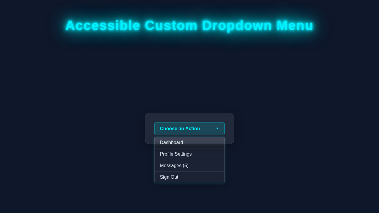
<h1>Accessible Custom Dropdown Menu</h1>
<!-- Main wrapper for the custom dropdown -->
<!-- aria-label provides a helpful description for screen reader users -->
<nav class="custom-dropdown-wrapper" aria-label="Main Navigation">
<!-- Hidden checkbox acts as the toggle mechanism for the dropdown state -->
<!-- aria-controls links the checkbox to the menu it controls -->
<input type="checkbox" id="dropdown-toggle" class="dropdown-toggle" aria-controls="dropdown-menu">
<!-- Label acts as the visible dropdown trigger (button) -->
<!-- tabindex="0" makes the label keyboard focusable -->
<!-- aria-haspopup="menu" informs screen readers that this element opens a menu -->
<!-- aria-expanded defaults to "false" as the menu is initially closed -->
<label for="dropdown-toggle" class="dropdown-trigger" tabindex="0" aria-haspopup="menu" aria-expanded="false">
Choose an Action
<!-- SVG for a visual arrow indicator, rotates when dropdown is open -->
<svg class="dropdown-arrow" width="16" height="16" viewBox="0 0 16 16" fill="currentColor" xmlns="http://www.w3.org/2000/svg">
<path d="M4.94 6.94L8 10.06L11.06 6.94L12 7.88L8 11.88L4 7.88L4.94 6.94Z"/>
</svg>
</label>
<!-- The actual dropdown menu -->
<!-- role="menu" identifies this ul as a menu to assistive technologies -->
<ul id="dropdown-menu" class="dropdown-menu" role="menu">
<!-- Each list item (li) acts as a container for a menu item -->
<!-- role="none" on li can sometimes prevent redundant announcements if the a tag is already defined with role="menuitem" -->
<li role="none"><a href="#dashboard" role="menuitem">Dashboard</a></li>
<li role="none"><a href="#profile" role="menuitem">Profile Settings</a></li>
<li role="none"><a href="#messages" role="menuitem">Messages (5)</a></li>
<li role="none"><a href="#logout" role="menuitem">Sign Out</a></li>
</ul>
</nav>
<p class="description">This dropdown is built purely with HTML and CSS, prioritizing keyboard navigation and screen reader compatibility. Use the tab key to navigate, and spacebar/enter to toggle the dropdown. Once open, continue tabbing to navigate through options.</p>
</div>
</body>
</html>
CSS Styling: Making It Pop with an Accessible CSS Dropdown
Now, let’s bring our dropdown to life with some amazing CSS. This is where the magic happens visually! We will carefully style the main navigation components. Crucially, we will hide the dropdown menu by default using clever CSS properties. Then, we will use a neat trick to reveal it smoothly on hover or when its content receives focus. This particular method makes our Accessible CSS Dropdown truly interactive and visually appealing without relying purely on JavaScript for its basic toggle. You will see firsthand how clean, powerful, and expressive CSS can be when building interactive elements!
styles.css
/* Universal box-sizing for consistent layout across all elements */
*, *::before, *::after {
    box-sizing: border-box;
}

/* Basic body styling for a clean, readable page */
body {
    font-family: Arial, Helvetica, sans-serif; /* Safe, widely available fonts */
    margin: 0;
    padding: 20px;
    background-color: #f4f7f6; /* Light background for production code */
    color: #333;
    line-height: 1.6;
    display: flex;
    justify-content: center;
    align-items: flex-start; /* Aligns content to the top */
    min-height: 100vh; /* Ensures content takes full viewport height */
    overflow-x: hidden; /* Prevents horizontal scrollbar */
}

/* Container for page content */
.page-container {
    max-width: 800px;
    width: 100%;
    padding: 20px;
    background-color: #ffffff;
    border-radius: 8px;
    box-shadow: 0 4px 10px rgba(0, 0, 0, 0.1);
}

h1 {
    text-align: center;
    color: #2c3e50;
    margin-bottom: 40px;
}

/* Description box for user guidance */
.description {
    margin-top: 40px;
    padding: 15px;
    background-color: #e8f0fe;
    border-left: 5px solid #3498db;
    border-radius: 4px;
    color: #2c3e50;
    font-size: 0.95em;
}

/* Custom Dropdown Wrapper */
.custom-dropdown-wrapper {
    position: relative;
    display: inline-block; /* Allows width to adapt to content or be set explicitly */
    width: 250px; /* Fixed width for demonstration purposes */
    margin: 20px auto; /* Centers the dropdown horizontally */
    text-align: left; /* Ensures dropdown contents align left */
    z-index: 100; /* Ensures dropdown appears above other content */
}

/* Visually hide the checkbox but keep it accessible for screen readers and keyboard navigation */
.dropdown-toggle {
    position: absolute;
    width: 1px;
    height: 1px;
    padding: 0;
    margin: -1px;
    overflow: hidden;
    clip: rect(0, 0, 0, 0); /* Older way to hide element */
    white-space: nowrap;
    border: 0;
}

/* Style the dropdown trigger (the label associated with the checkbox) */
.dropdown-trigger {
    display: flex;
    justify-content: space-between;
    align-items: center;
    padding: 12px 18px;
    background-color: #3498db;
    color: #ffffff;
    border: none;
    border-radius: 6px;
    cursor: pointer;
    font-size: 1em;
    font-weight: bold;
    outline: none; /* Remove default browser outline */
    transition: background-color 0.2s ease, box-shadow 0.2s ease;
    -webkit-appearance: none; /* Removes default button styling for consistency */
    -moz-appearance: none;
    appearance: none;
    width: 100%; /* Make trigger fill wrapper width */
}

/* Hover and focus styles for the dropdown trigger */
.dropdown-trigger:hover,
.dropdown-toggle:focus + .dropdown-trigger { /* When checkbox is focused, apply style to its label */
    background-color: #2980b9;
    box-shadow: 0 0 0 3px rgba(52, 152, 219, 0.5); /* Custom focus indicator */
}

/* Rotate the arrow icon when the dropdown is open */
.dropdown-toggle:checked + .dropdown-trigger .dropdown-arrow {
    transform: rotate(180deg);
}

.dropdown-arrow {
    margin-left: 10px;
    transition: transform 0.2s ease;
}

/* Style the dropdown menu itself */
.dropdown-menu {
    list-style: none;
    padding: 0;
    margin: 5px 0 0 0; /* Space below the trigger */
    background-color: #ffffff;
    border: 1px solid #ddd;
    border-radius: 6px;
    box-shadow: 0 8px 16px rgba(0, 0, 0, 0.2);
    position: absolute;
    top: 100%; /* Position directly below the trigger */
    left: 0;
    width: 100%;
    max-height: 0; /* Initially hidden by setting max-height to 0 */
    overflow: hidden; /* Ensures content is clipped when max-height is 0 */
    opacity: 0; /* Makes it visually invisible */
    visibility: hidden; /* Hides it from screen readers when collapsed */
    transition: max-height 0.3s ease-out, opacity 0.3s ease-out, visibility 0.3s ease-out; /* Smooth collapse transition */
    z-index: 10;
}

/* Show the dropdown menu */
/* This is crucial for accessibility:
   - .dropdown-toggle:checked ~ .dropdown-menu: Opens/closes when the label is clicked or spacebar/enter is pressed on the focused label.
   - .custom-dropdown-wrapper:focus-within .dropdown-menu: Keeps the menu open when any element inside the dropdown wrapper (including menu items) is focused. This allows keyboard navigation through menu items. */
.custom-dropdown-wrapper:focus-within .dropdown-menu,
.dropdown-toggle:checked ~ .dropdown-menu {
    max-height: 300px; /* Arbitrary height sufficient to show all items */
    opacity: 1;
    visibility: visible;
    transition: max-height 0.3s ease-in, opacity 0.3s ease-in, visibility 0.3s ease-in; /* Smooth expand transition */
}

/* Style individual dropdown items */
.dropdown-menu li {
    padding: 0;
}

.dropdown-menu a {
    display: block;
    padding: 10px 18px;
    text-decoration: none;
    color: #333;
    transition: background-color 0.2s ease, color 0.2s ease;
}

/* Hover and focus styles for individual menu items */
.dropdown-menu a:hover,
.dropdown-menu a:focus { /* Crucial for keyboard navigation highlighting */
    background-color: #f0f0f0;
    color: #3498db;
    outline: none; /* Remove default browser outline */
}

/* Add a bottom border to all but the last item for visual separation */
.dropdown-menu li:not(:last-child) a {
    border-bottom: 1px solid #eee;
}

/* Ensure SVG path uses current text color */
.dropdown-arrow path {
    fill: currentColor;
}
JavaScript: Enhancing Accessibility and Interaction
Even though our SEO title highlights HTML & CSS, we are adding a small, but mighty, touch of JavaScript. This isn’t for basic visuals. Instead, it’s purely for enhancing keyboard navigation and accessibility. This minimal script intelligently toggles the dropdown’s visibility when necessary. It also expertly manages crucial ARIA attributes. This ensures our dropdown works perfectly and predictably for all users, including those who don’t use a mouse. It’s the final piece to guarantee universal access!
How It All Works Together: A Step-by-Step Breakdown
Let’s piece together all these incredible parts! We have HTML providing the rock-solid structure. CSS handles all the gorgeous visual styles. Finally, JavaScript adds that essential layer of interactive accessibility. Understanding how these three technologies synergize is absolutely key to becoming a proficient web developer. This section breaks down each layer in detail, showing exactly how they combine to create a powerful, flexible, and accessible component.
The Semantic HTML Foundation
Our HTML provides the essential skeleton for the dropdown menu. We often start with a div element. Give it a descriptive class like dropdown. This acts as our main wrapper and context provider. Inside this, we place a button or an a tag. This element serves as the visual trigger that users interact with. Following this trigger, an unordered list (ul) will neatly hold all our individual menu links. Each li inside contains an a tag for navigation. Importantly, we add aria-haspopup="true" to the trigger element. This tells screen readers that activating this element will open a pop-up. Also, aria-expanded="false" indicates its current closed state. You can learn even more about these powerful ARIA attributes and their importance on MDN Web Docs. This careful semantic structure is absolutely crucial for building truly accessible and understandable web components.
Visual Flair and Behavior with CSS Styling
Our CSS makes the dropdown truly shine and handles its initial hidden state beautifully. We begin by applying position: relative; to the main .dropdown container. This is very important. It ensures that our absolutely positioned menu list will be anchored correctly within its parent. The nested ul menu gets position: absolute;. We then initially hide it using opacity: 0; and visibility: hidden;. Using these properties, rather than display: none;, allows for smooth CSS transitions. When the parent .dropdown is hovered over, or when its contents gain focus (using :focus-within), we then reveal the menu. We set opacity: 1; and visibility: visible;. A graceful transition property makes it open and close with a lovely animation. We also add padding, background-color, and a subtle box-shadow for visual appeal. This styling ensures our Accessible CSS Dropdown not only works but looks professional and provides a fantastic user experience.
Enhancing Interaction with JavaScript
The JavaScript component might be small, but it elevates our dropdown’s accessibility significantly. It focuses specifically on users who rely on keyboards or assistive technologies. When a user navigates to the dropdown trigger with the Tab key, and then presses Enter or Space, the script intelligently steps in. It toggles the aria-expanded attribute. This changes its value from false to true (and vice-versa). Simultaneously, it applies an active class to the dropdown menu. This makes the menu visually appear or disappear. It provides a clear visual cue. The script also handles critical keyboard navigation within the open menu. Users can Tab through the individual links seamlessly. Pressing the Escape key closes the menu quickly. Clicking anywhere outside the dropdown area also gracefully closes it. This comprehensive approach ensures a robust, intuitive, and truly user-friendly experience for everyone.
Pro Tip: Always test your dropdown with a keyboard! Navigate using the
Tab,Shift + Tab,Enter, andEscapekeys. This rigorous testing helps ensure it’s truly accessible for all users, not just those with a mouse. Accessibility should always be a top priority!
Why Accessibility Matters: A Core Principle
Building accessible components is not just about following rules. It’s a fundamental principle of inclusive web design. It’s about ensuring everyone can use and enjoy your creations. Screen readers, for instance, announce aria-haspopup. They tell users exactly what to expect when they interact with an element. aria-expanded informs them of the menu’s current state. This provides absolutely vital context for users who cannot see the screen. Without these thoughtful additions, keyboard users or visually impaired users might find your website impossible to navigate. Our combined approach with HTML, CSS, and JavaScript guarantees a broad reach. It makes your websites usable by more people, enriching their online experience. This is a core value in modern, ethical web development, and something you should always strive for. For a deeper dive into making your components accessible, check out the MDN ARIA Authoring Practices Guide.
Tips to Customise It: Make It Your Own!
You’ve successfully built a solid and accessible dropdown foundation. Congratulations! Now, let’s explore some exciting ideas to make it uniquely yours and truly stand out:
- Add Smooth Animations: Experiment with CSS
transitionproperties for a smoother opening and closing effect. You could animate opacity, transform, or height! For even more dynamic effects, you might explore CSS Scroll Animations: Mastering Scroll-Driven Effects with HTML & CSS. - Create Nested Dropdowns: Challenge yourself by building sub-menus. Each item within your main dropdown could potentially have its own nested dropdown. This is a common and powerful navigation pattern. It requires careful HTML structuring and CSS planning.
- Implement Different Triggers: Instead of just hover, consider making the dropdown activate with a click-only trigger. This might involve adjusting the JavaScript slightly to handle click events more exclusively. It offers users more direct control.
- Ensure Responsive Design: It’s crucial that your dropdown looks and functions perfectly on mobile devices. Use CSS media queries to adapt its layout, size, or even behavior for smaller screens. This is absolutely vital for any modern website. Think about how a Responsive Calculator UI HTML CSS – Build a Modern Layout adapts to different screen sizes and apply those principles here.
- Explore Theming Options: Introduce CSS custom properties (variables) to easily change colors, fonts, and spacing. This allows for quick theming of your dropdown. It’s perfect for matching different brand styles.
Another Pro Tip: Don’t be afraid to experiment! The best way to learn is by doing. Try different CSS properties, tweak the JavaScript, and see what amazing variations you can create. Practice makes perfect!
Conclusion: Your New Accessible CSS Dropdown Mastery!
Wow, you truly did it! You just built a fully functional, beautifully styled, and most importantly, an Accessible CSS Dropdown menu. This fantastic project combined the power of HTML, the elegance of CSS, and a small, but vital, dash of JavaScript for a robust and inclusive solution. You gained valuable insights into modern web accessibility, detailed styling techniques, and fundamental interactivity principles. You can now build complex UI elements with confidence and a deeper understanding of user needs. Share your awesome new dropdown with the world! Show off your impressive skills and keep that coding spirit alive! If you enjoyed understanding how different CSS rules interact and influence each other, why not check out Mastering CSS Specificity: A Visual Guide next? Keep learning, keep building!