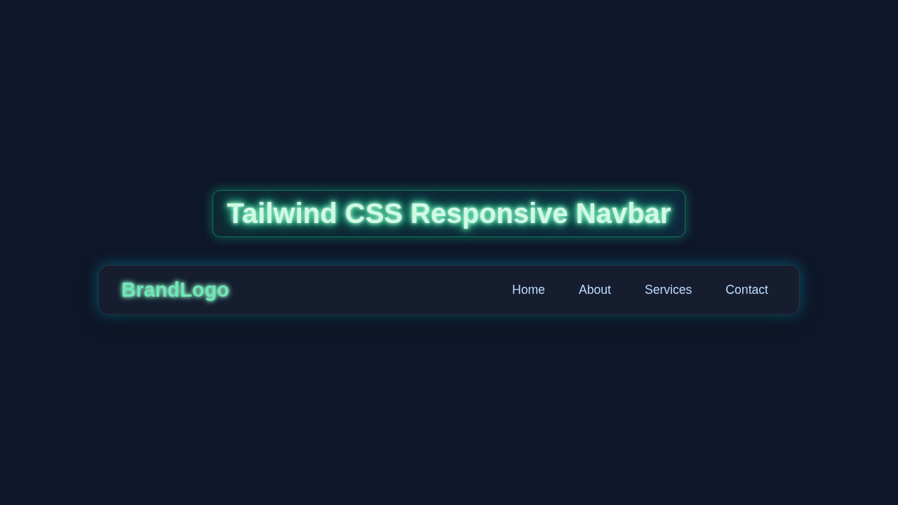
Tailwind Responsive Navbar: Build with HTML & CSS Only
Hey there, fellow coders! If you’ve wanted to build a Tailwind Responsive Navbar, you are in the perfect spot. Today, we will craft a fantastic navigation bar. It will look amazing on any device. Big or small, your site will shine. Plus, we will do it using just HTML and Tailwind CSS! No tricky JavaScript needed for the basic responsive magic. Get ready to make your projects look super professional!
What We Are Building
We are going to build a slick navigation bar. This navbar adapts beautifully to any screen size. On larger screens, you’ll see a clean, horizontally aligned menu. But on smaller devices? A neat hamburger icon appears! Tapping it will reveal your navigation links. This is super useful for user experience. Your visitors will always find their way easily. It makes your website feel polished and modern. We’ll leverage Tailwind CSS power to achieve this. Get excited, this is going to be awesome!
HTML Structure
First, let’s lay down the bones of our navbar. We will create a <nav> element. Inside, there will be a logo or site title. Then, we will add our navigation links. We also need a hidden checkbox and a label for our mobile menu toggle. This ‘checkbox hack’ lets us create interactive UI with just CSS. It’s a clever trick, actually! Don’t worry, the code will make perfect sense.
index.html
<!DOCTYPE html>
<html lang="en">
<head>
    <meta charset="UTF-8">
    <meta name="viewport" content="width=device-width, initial-scale=1.0">
    <title>Responsive Navbar</title>
    <link rel="stylesheet" href="styles.css">
</head>
<body>
    <!-- Header section containing the navigation bar -->
    <header class="bg-gray-800 text-white p-4">
        <nav class="container mx-auto flex items-center justify-between">
            <!-- Brand Logo -->
            <a href="#" class="text-2xl font-bold">BrandLogo</a>

            <!-- Mobile Menu Toggle (Checkbox Hack)
                 This input is visually hidden but used to toggle the mobile menu.
                 The label acts as the clickable hamburger icon. -->
            <input type="checkbox" id="menu-toggle" class="hidden">
            <label for="menu-toggle" class="lg:hidden block cursor-pointer">
                <!-- Hamburger Icon SVG -->
                <svg class="w-6 h-6 text-white" fill="none" stroke="currentColor" viewBox="0 0 24 24" xmlns="http://www.w3.org/2000/svg">
                    <path stroke-linecap="round" stroke-linejoin="round" stroke-width="2" d="M4 6h16M4 12h16M4 18h16"></path>
                </svg>
            </label>

            <!-- Navigation Links -->
            <ul class="nav-links hidden lg:flex space-x-4">
                <li><a href="#" class="block px-3 py-2 rounded hover:bg-gray-700">Home</a></li>
                <li><a href="#" class="block px-3 py-2 rounded hover:bg-gray-700">About</a></li>
                <li><a href="#" class="block px-3 py-2 rounded hover:bg-gray-700">Services</a></li>
                <li><a href="#" class="block px-3 py-2 rounded hover:bg-gray-700">Contact</a></li>
            </ul>
        </nav>
    </header>

    <!-- Main content area for demonstration -->
    <main class="container mx-auto p-4 text-center">
        <h1 class="text-3xl font-bold mt-8">Responsive Navbar Example</h1>
        <p class="mt-4 text-lg">Resize your browser window to see the responsive behavior.</p>
        <p class="mt-2 text-md text-gray-600">On smaller screens, the menu will collapse into a hamburger icon.</p>
    </main>
</body>
</html>
CSS Styling
Next, we will bring our navbar to life with Tailwind CSS. Tailwind is a utility-first framework. It provides pre-defined classes for almost everything. We will use these classes for layout, colors, spacing, and more. This keeps our stylesheet super lean. For our mobile menu toggle, we will add a few lines of custom CSS. This makes the hamburger icon work its magic. Remember, this tutorial is about a responsive Tailwind Responsive Navbar with HTML and CSS only. Tailwind handles the responsiveness directly!
styles.css
/*
 * Tailwind CSS Responsive Navbar Tutorial
 * This CSS file provides Tailwind-like utility classes
 * and responsive behavior using only HTML and CSS (no JavaScript).
 */

/* 1. Base styles and resets */
* {
    box-sizing: border-box; /* Ensure padding and border are included in element's total width and height */
    margin: 0;
    padding: 0;
}

body {
    font-family: Arial, Helvetica, sans-serif; /* Safe, widely available font stack */
    line-height: 1.5;
    background-color: #f4f7f6; /* Light background for the tutorial page */
    color: #333;
    -webkit-font-smoothing: antialiased;
    -moz-osx-font-smoothing: grayscale;
}

a {
    text-decoration: none;
    color: inherit; /* Inherit color from parent by default */
}

ul {
    list-style: none;
}

/* 2. Tailwind-like Utility Classes */

/* Container for max-width and centering */
.container {
    max-width: 1280px; /* Mimics Tailwind's max-w-7xl */
    margin-left: auto;
    margin-right: auto;
    padding-left: 1rem; /* px-4 */
    padding-right: 1rem; /* px-4 */
}

/* Flexbox Utilities */
.flex {
    display: flex;
}
.items-center {
    align-items: center;
}
.justify-between {
    justify-content: space-between;
}

/* Spacing Utilities */
.p-4 {
    padding: 1rem; /* 16px */
}
.px-3 {
    padding-left: 0.75rem; /* 12px */
    padding-right: 0.75rem; /* 12px */
}
.py-2 {
    padding-top: 0.5rem; /* 8px */
    padding-bottom: 0.5rem; /* 8px */
}
.space-x-4 > * + * { /* Equivalent to Tailwind's space-x-4 for horizontal spacing */
    margin-left: 1rem;
}
.mt-2 {
    margin-top: 0.5rem; /* 8px */
}
.mt-4 {
    margin-top: 1rem; /* 16px */
}
.mt-8 {
    margin-top: 2rem; /* 32px */
}

/* Typography Utilities */
.text-white {
    color: #fff;
}
.text-gray-600 {
    color: #718096; /* A medium gray */
}
.text-2xl {
    font-size: 1.5rem; /* 24px */
    line-height: 2rem; /* 32px */
}
.text-3xl {
    font-size: 1.875rem; /* 30px */
    line-height: 2.25rem; /* 36px */
}
.text-lg {
    font-size: 1.125rem; /* 18px */
    line-height: 1.75rem; /* 28px */
}
.text-md {
    font-size: 1rem; /* 16px */
    line-height: 1.5rem; /* 24px */
}
.font-bold {
    font-weight: 700;
}
.text-center {
    text-align: center;
}

/* Background and Hover Utilities */
.bg-gray-800 {
    background-color: #2d3748; /* Dark gray */
}
.hover\:bg-gray-700:hover {
    background-color: #4a5568; /* Slightly lighter gray on hover */
}

/* Border Radius Utility */
.rounded {
    border-radius: 0.25rem; /* 4px */
}

/* Display Utilities */
.hidden {
    display: none;
}
.block {
    display: block;
}

/* Cursor Utility */
.cursor-pointer {
    cursor: pointer;
}

/* SVG Icon Sizing */
.w-6 {
    width: 1.5rem; /* 24px */
}
.h-6 {
    height: 1.5rem; /* 24px */
}

/* 3. Specific Navbar Styling and Mobile Menu Logic */

header {
    width: 100%;
    z-index: 1000;
    box-shadow: 0 2px 4px rgba(0,0,0,0.1);
}

nav {
    position: relative; /* Essential for positioning the mobile menu dropdown */
}

/* Mobile Navigation Links Overlay */
.nav-links {
    position: absolute;
    top: 100%; /* Position right below the navbar */
    left: 0;
    width: 100%;
    background-color: #2d3748; /* Same as header background */
    flex-direction: column;
    padding: 1rem 0;
    /* Initial state for hidden mobile menu, will be overridden by checkbox hack */
    max-height: 0;
    overflow: hidden; /* Hide content that exceeds max-height */
    opacity: 0;
    transition: max-height 0.3s ease-in-out, opacity 0.3s ease-in-out; /* Smooth transition */
    z-index: 999; /* Ensure menu appears above other page content */
    border-bottom-left-radius: 0.25rem;
    border-bottom-right-radius: 0.25rem;
}

.nav-links li {
    width: 100%; /* Full width for each mobile link item */
}

.nav-links li a {
    padding: 0.75rem 1rem; /* Generous padding for easier tapping */
    display: block; /* Make links block-level for full tap area */
    text-align: center; /* Center text in mobile menu */
}

/* Checkbox Hack: Show nav-links when the hidden checkbox is checked */
#menu-toggle:checked ~ .nav-links {
    max-height: 200px; /* Sufficient height to show all links (adjust as needed) */
    opacity: 1;
}

/* 4. Responsive Breakpoints */

/* Medium screens (e.g., tablets) - equivalent to Tailwind's 'md:' breakpoint */
@media (min-width: 768px) {
    .container {
        padding-left: 1.5rem; /* md:px-6 */
        padding-right: 1.5rem; /* md:px-6 */
    }
}

/* Large screens (e.g., desktops) - equivalent to Tailwind's 'lg:' breakpoint */
@media (min-width: 1024px) {
    .lg\:hidden { /* Hide hamburger icon on desktop */
        display: none;
    }
    .lg\:flex { /* Show nav-links as a flex row on desktop */
        display: flex;
    }
    /* Reset mobile-specific styles for desktop navigation */
    .nav-links {
        position: static; /* No absolute positioning on desktop */
        top: auto;
        left: auto;
        width: auto;
        background-color: transparent; /* No background for desktop */
        flex-direction: row; /* Display links in a row */
        padding: 0;
        max-height: none; /* Always visible */
        overflow: visible;
        opacity: 1;
        transition: none; /* No transition needed for desktop */
        border-radius: 0;
    }
    .nav-links li {
        width: auto;
    }
    .nav-links li a {
        padding: 0.5rem 0.75rem; /* Revert to standard desktop padding */
        text-align: left;
    }
}
JavaScript
For this Tailwind Responsive Navbar, we are aiming for an HTML and CSS-only solution. So, you won’t find any JavaScript code here! We leverage a neat CSS trick called the ‘checkbox hack’ for our mobile menu. It provides interactive functionality without needing a single line of JS. This is a powerful technique to know. Therefore, our JavaScript section remains completely empty today. Pretty cool, right?
How It All Works Together
Now, let’s connect all the pieces. We just built a robust navigation system. It adapts gracefully to different screen sizes. Understanding the interplay of HTML and Tailwind is key. We use Tailwind’s responsive utility classes a lot. These classes change styles based on breakpoints. Media queries are built right in!
HTML Base
Our HTML provides the basic structure. We have a <nav> container. Inside, a brand or logo element sits proudly. Then, we find our main navigation links. These are typically wrapped in a <ul> or <div>. For the mobile menu, we use a hidden <input type="checkbox">. Its corresponding <label> acts as our hamburger icon. This label is crucial for the CSS toggle magic. Without it, the menu won’t open. This setup is quite minimal and effective. It forms the backbone of our entire responsive design.
Tailwind’s Responsive Magic
Tailwind CSS truly makes responsiveness simple. We apply classes like hidden and md:flex to our elements. The hidden class ensures an element is not visible by default. Then, md:flex tells the element to become a flex container on medium screens and larger. So, the mobile menu links are hidden on desktop. Conversely, the desktop links might be hidden on mobile. The hamburger icon itself is md:hidden. It only appears on smaller screens. This method gives us precise control. You decide what shows where! This makes creating adaptive layouts a breeze.
Pro Tip: Tailwind’s default breakpoints are
sm(640px),md(768px),lg(1024px),xl(1280px), and2xl(1536px). You can customize these in yourtailwind.config.jsfile for even more control! This allows your design to perfectly match your project’s needs.
The Checkbox Hack Explained
The ‘checkbox hack’ is a pure CSS way to toggle elements. The hidden <input type="checkbox"> has an id. The <label> element has a for attribute matching that id. When you click the label, the checkbox state changes. We use the :checked pseudo-class in our CSS. This targets elements based on the checkbox’s state. So, when the checkbox is checked (meaning the hamburger icon is tapped), our mobile menu appears! This is a simple, elegant solution. It avoids JavaScript entirely. Find out more about the :checked pseudo-class on MDN Web Docs. It’s truly a secret weapon for front-end developers.
Custom CSS for Appearance
While Tailwind does most of the heavy lifting, we need a touch of custom CSS. This custom CSS primarily styles our hamburger icon. It also controls the mobile menu’s sliding animation. We use CSS transforms for smooth movement. We also use position: fixed for the mobile menu. This keeps it visible while scrolling. Furthermore, z-index ensures it sits above other content. Remember, our custom CSS is minimal. It focuses only on the interactive parts. This approach keeps your project tidy. Take a look at this CSS-Tricks guide on Grid if you want to explore more layout options beyond flexbox for future projects.
Tips to Customise It
You’ve built a fantastic Tailwind Responsive Navbar! But the journey doesn’t end here. Now, you can make it truly yours. Here are some ideas to get creative and extend your project:
Change the colors: Adjust Tailwind’s bg- and text- classes. Match your brand’s aesthetic. Explore new color palettes easily. You can even generate custom themes!
Add more links: Simply include more <a> tags in your navigation. Make sure they fit nicely. Test on all screen sizes to ensure a smooth user experience. Consistency is key.
Animate the hamburger icon: Transform the three lines into an ‘X’ when open. This adds a delightful touch. It provides great user feedback. Subtle animations enhance polish.
Integrate a dropdown menu: For sub-links, add a dropdown. You could use Tailwind’s group and group-hover utilities. Or, combine with a pure CSS approach for CSS Dynamic UI: Mastering :has() & :is() Selectors (HTML/CSS) for advanced effects. This adds depth to your navigation.
Fancy hover effects: Make your navigation links pop! Check out ideas like Dim Cards Hover CSS for inspiration. Or, animate text with a simple transition class. Small details make a big difference.
Add a search bar: Integrate a search input within the navbar. Position it responsively. It enhances user functionality greatly. This is a common feature for many websites.
Include loading animations: If your page loads content dynamically, consider adding Loading Animations with HTML and CSS to improve perceived performance. It keeps users engaged during waits.
Keep experimenting with Tailwind’s utility classes! They offer endless possibilities for customization and design freedom. Don’t be afraid to try new things and push your creative boundaries!
Conclusion
Wow, you did it! You just built a fully functional and stylish Tailwind Responsive Navbar. You learned to combine HTML, Tailwind CSS, and a clever CSS hack. This powerful combination gives you dynamic UI. Without writing any JavaScript for the toggle, too! That’s a huge win for performance and simplicity. You should be really proud of this accomplishment. Now go show off your new skill! Share your creations with us on social media. Happy coding, and keep building amazing things!