Tailwind CSS vs Plain CSS: A Visual Comparison
Hey there, awesome dev!
You’ve probably been tinkering with HTML and CSS for a bit now, right?
You’ve learned how to make things look good on the web.
Then, suddenly, everyone starts talking about something called “Tailwind CSS.”
And you wonder, what’s the deal?
Is your trusty Plain CSS suddenly old news?
Today, we’re diving into the big question: Tailwind CSS vs Plain CSS.
You’re not alone if you feel a little confused.
Many self-taught beginners hear conflicting advice.
You might think one is clearly better than the other.
But here’s the thing: it’s not always so straightforward.
Let’s bust some myths and get you crystal clear on your styling choices.
Ready to sort through the noise?
Myth #1: Tailwind CSS Makes Your HTML a Jumbled Mess
You’ve probably seen examples of Tailwind CSS in action.
Maybe you gasped a little.
“Wait, all those classes are directly in the HTML?” you might have thought.
It looks like a long string of words right there in your HTML tags.
You’re used to keeping your HTML clean and your CSS in separate files, aren’t you?
So, the idea of adding dozens of utility classes directly to your markup can feel super weird.
It seems like a step backward, almost.
But let’s bust this myth right now.
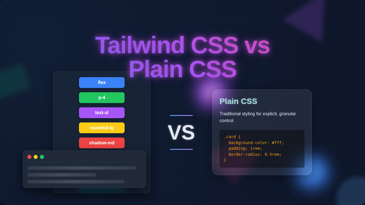
Here’s the truth: Tailwind CSS actually organizes your styling differently.
Instead of switching between your HTML file and a separate CSS file to see how something looks, all the styling instructions are right there.
This approach is called “utility-first.”
It means you apply small, single-purpose classes directly to your elements.
Think about building a house.
Instead of calling a painter, then a roofer, then a plumber for separate jobs, you have a multi-talented person who can do it all for one element.
You might apply classes like text-blue-500 for text color, p-4 for padding, and rounded-lg for rounded corners.
Yes, your HTML tags will have more classes.
However, you gain incredible speed.
You also reduce the need to invent new class names constantly.
And that’s a huge win!
When you want to build a reusable part of your site, like a cool button or a card component, you can group these utility classes.
This keeps your code maintainable and your styling consistent.
You’ll find that once you get used to it, your development workflow speeds up dramatically.
“Tailwind CSS moves the styling details from separate files right into your HTML. It feels messy at first, but it actually keeps your focus on one place: the element you’re styling.”
If you’re curious how these utility classes can manage complex features, you should definitely check out a Tailwind Dark Mode Tutorial to see it in action.
Myth #2: Plain CSS Gives You More Control Than Tailwind CSS
You might be thinking, “But I can write any CSS I want with Plain CSS!”
And you’d be absolutely right.
When you’re writing standard CSS, you have limitless power.
You define every property, every value, exactly as you like.
Doesn’t that mean more control?
This is another big misconception we need to clear up about Tailwind CSS vs Plain CSS.
Here’s the surprising truth: Tailwind CSS is just Plain CSS.
It’s not some magical, proprietary language.
It’s a framework that generates a massive collection of CSS utility classes for you.
These classes map directly to standard CSS properties.
For example, when you use display: block; in Plain CSS, Tailwind offers you a class like block.
When you want to arrange items horizontally, you might write display: flex; and then adjust how content flows.
Tailwind gives you classes like flex and justify-center to achieve the same visual outcome rapidly.
The core difference is that Tailwind provides a constrained system.
Instead of picking any random color or spacing value, you choose from a predefined scale.
This might seem like less control at first.
However, it actually promotes consistency across your entire project.
You get a beautiful, cohesive design without even trying!
Think of it like building with LEGOs versus carving wood.
With wood, you can make anything imaginable, but it takes time and precision.
With LEGOs, you have specific pieces, but they snap together quickly and always fit perfectly.
You can even customize Tailwind’s default values.
You can extend its theme with your own colors, fonts, and spacing scales.
So, you still have ultimate control, but with a powerful system guiding you towards consistency.
Understanding fundamental CSS properties, like the CSS display property, is crucial for both approaches.
It helps you understand what Tailwind classes are actually doing behind the scenes.
Building something like a Responsive Landing Page with HTML and Tailwind CSS Utility Classes truly showcases how much control and flexibility you retain.
Myth #3: Tailwind CSS vs Plain CSS: One Is for Big Projects, One Is for Small
Okay, let’s tackle another common belief.
You might hear people say, “Tailwind is great for large applications.”
Or perhaps, “Plain CSS is better for tiny websites.”
This myth suggests that project size dictates your styling choice.
And frankly, it’s not entirely accurate.
Both Tailwind CSS and Plain CSS can be used effectively for projects of any scale.
It’s less about size and more about your team, your workflow, and your maintenance strategy.
For a small project, Plain CSS gives you complete freedom without needing to set up a framework.
You can write just enough CSS to get the job done.
However, if you’re building many similar components, even on a small site, Tailwind’s utility classes can speed things up immensely.
You avoid writing repetitive custom CSS for every little variation.
Consider a personal portfolio site.
You could use Plain CSS to hand-craft every detail.
Or, you could use Tailwind to quickly assemble beautiful sections with consistent spacing and typography.
For larger projects, managing Plain CSS can become a beast.
You might end up with huge, complex stylesheets.
Renaming classes, dealing with specificity issues, and onboarding new developers can be tough.
Tailwind CSS, in contrast, offers a predictable way to style.
It acts like a consistent design system.
This means your team can work together without stepping on each other’s toes.
New developers can jump in and immediately understand how elements are styled.
It really simplifies collaboration.
So, the true decider isn’t project size.
It’s about whether you prefer to build from scratch every time or use a highly efficient, constrained system.
“The choice between Tailwind CSS and Plain CSS isn’t about project size, but about your team’s workflow and how you want to manage styling consistency and speed over time.”
Understanding layout techniques like Flexbox is invaluable, no matter your styling choice.
You’ll see these concepts applied in both traditional CSS and through Tailwind’s utility classes.
Building something interactive, like a Responsive Navbar with Tailwind CSS, shows its power for common UI patterns.
The Real Talk: Your Styling Strategy Matters Most
So, we’ve busted some myths.
You’ve seen that neither Tailwind CSS nor Plain CSS is inherently “better” than the other.
They are different tools for different preferences.
Plain CSS gives you total freedom.
You define every single rule yourself.
This means you need a strong understanding of CSS concepts.
You also need a good system for organizing your stylesheets.
Tailwind CSS gives you a powerful, pre-built system of utility classes.
It aims for rapid development and design consistency.
It shifts your focus from writing *new* CSS to *applying* existing, well-tested classes.
It’s like having a huge palette of perfectly matched colors and brush sizes.
You don’t mix the paint yourself; you just pick the right one.
You might find yourself spending less time debugging strange CSS conflicts.
Instead, you’re focused on building beautiful layouts quickly.
However, the learning curve can be a bit steep initially.
You need to learn Tailwind’s class names and how they map to CSS properties.
But trust me, it clicks eventually!
So, What’s the Best Way Forward for You?
You’re a self-taught beginner, and that’s awesome!
My advice? Don’t pick a side just yet.
First, make sure you have a solid grasp of fundamental CSS concepts.
Understand things like the box model, flexbox, grid, and specificity.
These are the building blocks of all web styling.
Then, explore both options.
Try building a small project with Plain CSS.
Then, try rebuilding a similar project using Tailwind CSS.
You’ll quickly discover which approach resonates more with your personal workflow.
You’ll see which one helps you build faster and with less frustration.
The web development world is full of amazing tools.
The best tool is always the one that helps *you* build amazing things.
Keep learning, keep building, and have fun making the web beautiful!
You’ve got this.