Hey there, fellow coder! Have you been wanting to build a super slick Responsive Navbar Tailwind component but felt a bit lost? Well, you’re in the perfect spot! Today, we’re diving into creating a fully functional, mobile-friendly navigation bar. It will look great on any device.
This project uses the power of Tailwind CSS for styling. We will add a touch of JavaScript for interactivity. Get ready to level up your frontend skills with this practical tutorial!
What We Are Building: Your Next Responsive Navbar Tailwind Gem!
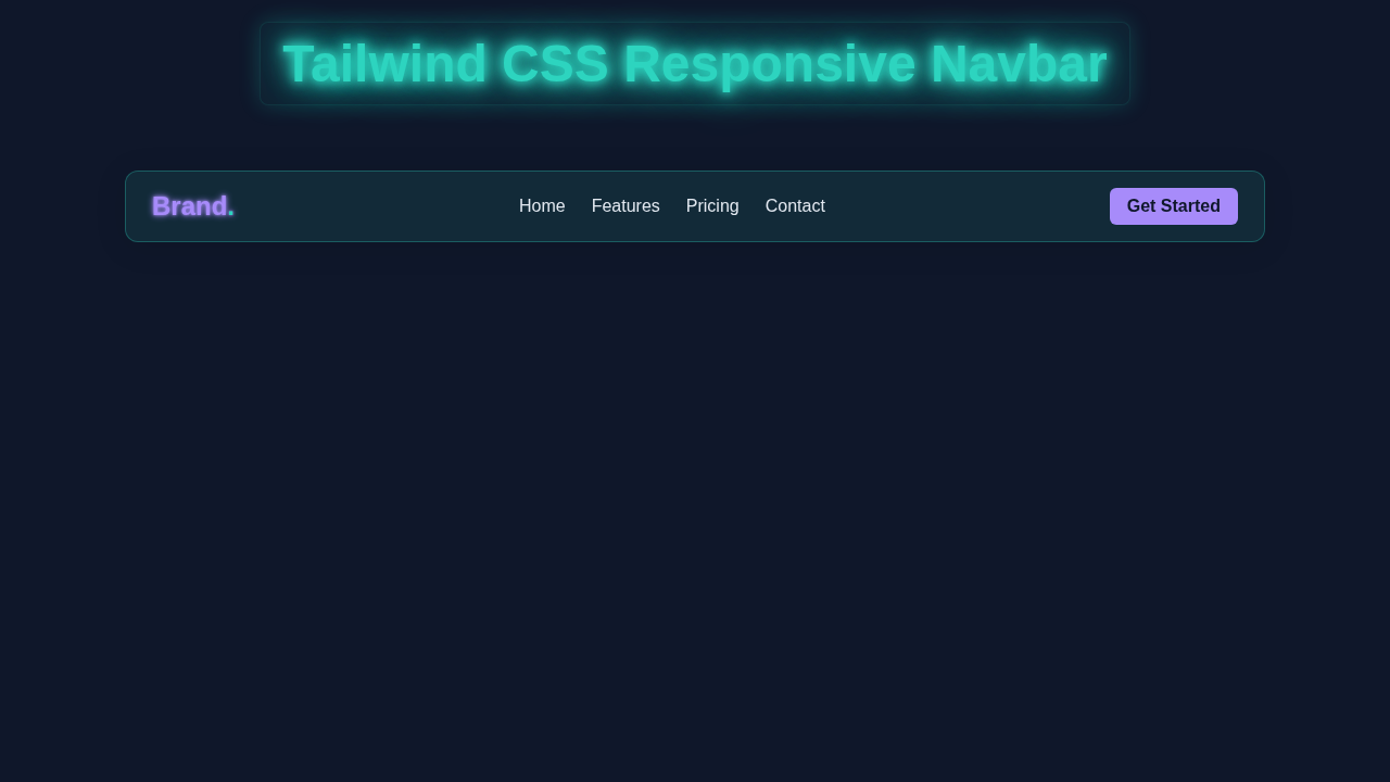
Imagine a navigation bar that just works everywhere. That’s exactly what we are making! Our navbar will feature a clean design for desktops. Then, it will gracefully transform into a compact menu for mobile screens. A clickable ‘hamburger’ icon will toggle the mobile menu. This ensures a seamless user experience. It’s truly a must-have for any modern website. Plus, it showcases the brilliance of responsive web design principles!
HTML Structure: The Backbone of Our Navbar
First, we need to lay down the basic HTML. This structure will provide the foundation for our navigation links. It also includes the crucial button for our mobile menu. We keep it semantic and straightforward. This makes it easy to understand and work with.
index.html
<!DOCTYPE html>
<html lang="en">
<head>
    <meta charset="UTF-8">
    <meta name="viewport" content="width=device-width, initial-scale=1.0">
    <title>Tailwind CSS Responsive Navbar</title>
    <!-- Link to your compiled Tailwind CSS -->
    <link rel="stylesheet" href="styles.css">
    <style>
        /* Basic reset for box-sizing */
        *, *::before, *::after {
            box-sizing: border-box;
        }
        /* Tailwind's `font-sans` typically defaults to system UI fonts (Arial, Helvetica, sans-serif) */
    </style>
</head>
<body class="font-sans bg-slate-900 text-slate-200 min-h-screen overflow-x-hidden">
    <header class="w-full">
        <!--
            The navigation bar itself.
            Uses a container for max-width, flexbox for alignment,
            and responsive padding.
        -->
        <nav class="container mx-auto px-4 sm:px-6 lg:px-8 h-16 flex items-center justify-between relative z-10">
            <!-- Logo / Brand Name -->
            <a href="#" class="text-2xl font-bold text-violet-400">
                Brand<span class="text-teal-400">.</span>
            </a>

            <!-- Desktop Navigation Links - Hidden on small screens (md:hidden) -->
            <div class="hidden md:flex space-x-6">
                <a href="#" class="text-slate-200 hover:text-teal-400 font-medium transition duration-300">Home</a>
                <a href="#" class="text-slate-200 hover:text-teal-400 font-medium transition duration-300">Features</a>
                <a href="#" class="text-slate-200 hover:text-teal-400 font-medium transition duration-300">Pricing</a>
                <a href="#" class="text-slate-200 hover:text-teal-400 font-medium transition duration-300">Contact</a>
            </div>

            <!-- Desktop Call to Action Button - Hidden on small screens (md:hidden) -->
            <a href="#" class="hidden md:block bg-violet-400 text-slate-900 py-2 px-4 rounded-md font-semibold hover:bg-violet-500 transition duration-300">
                Get Started
            </a>

            <!-- Mobile Menu Button (Hamburger Icon) - Visible only on small screens (md:hidden) -->
            <button id="menu-button" class="md:hidden flex flex-col justify-around w-8 h-7 relative z-20 focus:outline-none" aria-label="Toggle navigation" aria-expanded="false">
                <span class="block w-full h-0.5 bg-slate-200 rounded-sm transition duration-300 ease-in-out"></span>
                <span class="block w-full h-0.5 bg-slate-200 rounded-sm transition duration-300 ease-in-out"></span>
                <span class="block w-full h-0.5 bg-slate-200 rounded-sm transition duration-300 ease-in-out"></span>
            </button>
        </nav>

        <!--
            Mobile Navigation Menu - Hidden by default and revealed with JavaScript.
            Uses absolute positioning to overlay content, blur for a frosted effect,
            and CSS transitions for smooth entry/exit.
        -->
        <div id="mobile-menu" class="md:hidden absolute top-16 left-0 w-full bg-slate-800/95 backdrop-blur-md pb-4 hidden flex-col items-start px-4 z-0 transition-all duration-300 ease-in-out opacity-0 translate-y-[-10px]">
            <a href="#" class="block w-full py-3 text-slate-200 hover:text-teal-400 transition duration-300 border-b border-slate-700">Home</a>
            <a href="#" class="block w-full py-3 text-slate-200 hover:text-teal-400 transition duration-300 border-b border-slate-700">Features</a>
            <a href="#" class="block w-full py-3 text-slate-200 hover:text-teal-400 transition duration-300 border-b border-slate-700">Pricing</a>
            <a href="#" class="block w-full py-3 text-slate-200 hover:text-teal-400 transition duration-300 border-b border-slate-700">Contact</a>
            <!-- Call to Action Button for mobile menu -->
            <a href="#" class="mt-4 bg-violet-400 text-slate-900 py-2 px-4 rounded-md font-semibold hover:bg-violet-500 transition duration-300 self-start">
                Get Started
            </a>
        </div>
    </header>

    <!-- Main Content for demonstration purposes -->
    <main class="container mx-auto px-4 sm:px-6 lg:px-8 mt-10">
        <h1 class="text-4xl font-bold text-center text-teal-400 mb-6">Welcome to Our Site!</h1>
        <p class="text-lg text-center text-slate-300 max-w-2xl mx-auto">
            This is a demonstration of a responsive navigation bar built with Tailwind CSS.
            Resize your browser window to see it in action! On smaller screens, the desktop links
            will be replaced by a hamburger menu that toggles the mobile navigation.
            The `box-sizing: border-box;` is applied globally to ensure consistent sizing behavior.
        </p>
    </main>

    <!-- Link to your JavaScript file for menu toggling -->
    <script src="script.js"></script>
</body>
</html>
CSS Styling: With Tailwind CSS
Now, for the styling! We will use Tailwind CSS utility classes. These classes let us style directly in our HTML. They are incredibly powerful for rapid development. Tailwind helps us create responsive layouts without writing custom CSS files. It’s super efficient for designing our Responsive Navbar Tailwind.
styles.css
/*
  This file is the input for Tailwind CSS.
  It contains the directives Tailwind needs to inject its base styles,
  components, and utility classes. It should be linked in your `index.html`.

  To generate the output CSS (e.g., to 'styles.css' in the same directory),
  you would typically run a command in your terminal like:

  For development (watches for changes):
  `npx tailwindcss -i ./styles.css -o ./styles.css --watch`

  For production (minifies the output):
  `npx tailwindcss -i ./styles.css -o ./styles.css --minify`

  Ensure you have Tailwind CSS installed in your project:
  `npm install -D tailwindcss`
  `npx tailwindcss init` (to create tailwind.config.js)

  And configure your `tailwind.config.js` to scan your HTML files:
  module.exports = {
    content: ["./*.html"],
    theme: {
      extend: {},
    },
    plugins: [],
  }
*/

@tailwind base;
@tailwind components;
@tailwind utilities;

/*
  Optional: You can add custom CSS here or use @layer directives.
  For this tutorial, we primarily rely on Tailwind's utility classes
  and a minimal global reset for box-sizing is handled inline in index.html for simplicity.
*/
JavaScript: Adding the Interactive Magic
Finally, we add the interactivity. A small snippet of JavaScript will handle our mobile menu toggle. It makes the ‘hamburger’ icon work. This JS will show or hide the navigation links on smaller screens. This ensures a smooth user experience for all visitors. It’s a fundamental part of building any dynamic website component.
script.js
document.addEventListener('DOMContentLoaded', () => {
    const menuButton = document.getElementById('menu-button');
    const mobileMenu = document.getElementById('mobile-menu');

    // Function to set the mobile menu's visual state with transitions
    const toggleMobileMenu = (show) => {
        if (show) {
            mobileMenu.classList.remove('hidden');
            // Allow DOM to render 'display: flex' before applying transition styles
            setTimeout(() => {
                mobileMenu.classList.remove('opacity-0', 'translate-y-[-10px]');
                mobileMenu.classList.add('opacity-100', 'translate-y-0');
            }, 10); // Small delay for browser repaint
        } else {
            mobileMenu.classList.remove('opacity-100', 'translate-y-0');
            mobileMenu.classList.add('opacity-0', 'translate-y-[-10px]');
            // Hide element after transition completes (300ms matches Tailwind's duration-300)
            setTimeout(() => {
                mobileMenu.classList.add('hidden');
            }, 300);
        }
    };

    // Event listener for the hamburger menu button
    menuButton.addEventListener('click', () => {
        const isExpanded = menuButton.getAttribute('aria-expanded') === 'true';
        menuButton.setAttribute('aria-expanded', !isExpanded); // Toggle ARIA attribute
        toggleMobileMenu(!isExpanded); // Toggle menu visibility
    });

    // Optional: Close mobile menu when a navigation link is clicked
    mobileMenu.querySelectorAll('a').forEach(link => {
        link.addEventListener('click', () => {
            if (!mobileMenu.classList.contains('hidden')) {
                // If menu is open, simulate a click on the button to close it
                menuButton.click();
            }
        });
    });

    // Close mobile menu on window resize if it becomes a desktop view
    window.addEventListener('resize', () => {
        // Check if window width is at or above the 'md' breakpoint (768px in Tailwind by default)
        if (window.innerWidth >= 768 && !mobileMenu.classList.contains('hidden')) {
            // Force close without transition for instant switch to desktop layout
            mobileMenu.classList.add('hidden', 'opacity-0', 'translate-y-[-10px]');
            mobileMenu.classList.remove('opacity-100', 'translate-y-0');
            menuButton.setAttribute('aria-expanded', 'false');
        }
    });
});
How This Responsive Navbar Tailwind Magic Works
Let’s break down how all these pieces fit together. It’s exciting to see a project come alive! We’ve got HTML, Tailwind, and a bit of JS working in harmony. This creates a fully interactive navigation.
The HTML Foundation
Our HTML sets up the main navigation (`nav` tag). Inside, we have our logo/brand link. Then, there’s a button. This button is for our mobile menu toggle. It only appears on small screens. Next, we have a `div` that holds all our navigation links. This `div` is what we will show or hide.
Pro Tip: Accessibility Matters!
Always remember to add ARIA attributes likearia-controlsandaria-expanded. These are crucial for screen readers. They tell users about the state of our interactive elements. Learn more aboutaria-expandedon MDN. It makes your site usable for everyone.
Tailwind CSS Responsive Styling
Tailwind does the heavy lifting for our design. We use classes like flex and justify-between for layout. md:hidden makes the hamburger icon disappear on medium screens and up. Conversely, hidden hides our nav links by default. Then, md:flex makes them visible on larger screens. This is how we get that seamless desktop-to-mobile transition. If you’re keen on optimizing your Tailwind setup, check out our guide on Tailwind CSS v4 Configuration.
JavaScript for the Toggle Effect
Our JavaScript is straightforward. First, we select the menu button and the navigation links container. When the button is clicked, we toggle the `hidden` class on the nav links `div`. If it has `hidden`, it becomes visible. If it’s visible, it becomes `hidden`. We also update the `aria-expanded` attribute. This informs assistive technologies about the menu’s state. It’s a simple yet powerful interaction! For more JS fun, like building a Tailwind Dark Mode Toggle, stay tuned to our blog.
Keep Learning:
Experimentation is key! Don’t be afraid to change a few values. See what happens. That’s how you truly understand these concepts. Every project is a chance to learn something new.
Tips to Customise It
You’ve built a solid foundation! Now, make it your own. Here are some ideas:
- Add Sub-menus: Extend your navigation items to include dropdown sub-menus.
- Change Colors & Fonts: Easily swap out Tailwind’s color classes. Try different font families too.
- Animate the Toggle: Use Tailwind’s transition classes. Make the menu slide in smoothly.
- Add Active States: Highlight the current page’s link. Use a bit of extra JavaScript for this.
Conclusion
Fantastic job! You’ve successfully built a fully responsive navigation bar. This uses Tailwind CSS and a sprinkle of JavaScript. You now have a key component for any modern website. This Responsive Navbar Tailwind project enhances your skills. It also adds a great piece to your developer toolkit. Share your creations with us! We love seeing what you build. Keep coding, keep creating, and keep learning!