Sparkly Spoiler Text Effect with Pure HTML & CSS
Hey there, awesome coders! If you’ve ever wanted to add a touch of mystery and magic to your web content, you’re in the right place. Today, we’re going to build a fantastic Sparkly Spoiler Text effect. It’s perfect for hiding plot twists or secret messages. And the best part? We’ll achieve this dazzling effect with pure HTML and CSS. Get ready to sprinkle some magic onto your pages!
What We Are Building: The Sparkly Spoiler Text
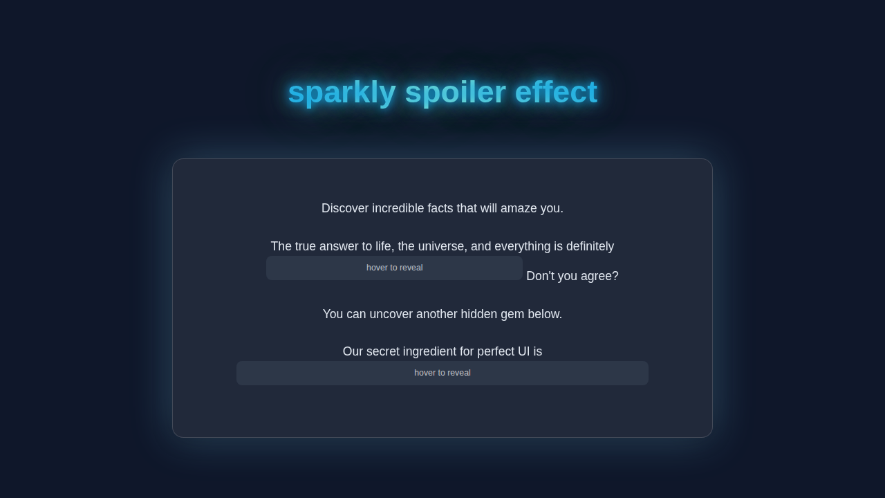
We are creating a super cool effect that hides text behind a shimmering, sparkly veil. Imagine hovering over a sentence and watching a subtle glittery cover vanish. Then your secret message pops into view! This CSS Progress Circle Tutorial: HTML & Pure CSS Only demonstrates other fun CSS possibilities. This Sparkly Spoiler Text effect is ideal for forums, blogs, or any interactive content. It adds a delightful interactive element without any heavy JavaScript. Your readers will love discovering your hidden gems!
HTML Structure: Setting the Stage
Our HTML is super simple. We’ll use a <span> element to wrap our secret text. This keeps things inline and neat. The magic truly happens in our CSS, but the HTML gives us a solid foundation.
index.html
<!DOCTYPE html>
<html lang="en">
<head>
    <meta charset="UTF-8">
    <meta name="viewport" content="width=device-width, initial-scale=1.0">
    <title>Sparkly Spoiler Effect</title>
    <link rel="stylesheet" href="styles.css">
</head>
<body>
    <div class="container">
        <h1>Uncover the Secrets!</h1>
        <p>
            Did you know that the actual origin of the "chicken or the egg" dilemma is
            <span class="spoiler">the chicken came first, because the egg it came from was laid by a proto-chicken.</span>
            Mind-blowing, right?
        </p>
        <p>
            Another fun fact: The best way to learn CSS is to
            <span class="spoiler">practice daily and build small projects.</span>
        </p>
        <p>
            Can you guess the answer? <span class="spoiler">It's 42!</span>
        </p>
    </div>
</body>
</html>
CSS Styling: Unleashing the Sparkle!
Now for the fun part: the CSS! This is where we’ll hide our text, create the sparkling cover, and animate its reveal. We’ll use CSS pseudo-elements and transitions to make everything smooth and magical. Don’t worry about any complex concepts. I’ll explain everything clearly.
styles.css
/*
    styles.css for Sparkly Spoiler Effect
    Author: Elite UI/UX Developer
    Description: Provides a stylish, pure CSS spoiler effect that reveals text with a sparkly animation on hover.
    Technology: HTML & CSS (No JavaScript)
*/

/* --- Base Styles & Resets --- */
body {
    font-family: Arial, Helvetica, sans-serif; /* Safe, standard font stack */
    margin: 0;
    padding: 20px;
    background-color: #1a202c; /* Dark background for contrast */
    color: #e2e8f0; /* Light text color */
    display: flex;
    justify-content: center;
    align-items: flex-start; /* Align content to top, but centered horizontally */
    min-height: 100vh;
    box-sizing: border-box; /* Include padding and border in the element's total width and height */
    line-height: 1.6;
}

.container {
    max-width: 800px;
    width: 100%; /* Ensure it takes full width up to max-width */
    padding: 30px;
    background-color: #2d3748; /* Slightly lighter dark background for the container */
    border-radius: 12px;
    box-shadow: 0 8px 25px rgba(0, 0, 0, 0.4); /* Subtle shadow for depth */
    text-align: left;
    overflow: hidden; /* Important for clean layout, especially with relative elements */
}

h1 {
    color: #90cdf4; /* Light blue heading */
    margin-top: 0;
    margin-bottom: 30px;
    text-align: center;
}

p {
    margin-bottom: 1em;
}

/* --- Sparkly Spoiler Effect Styles --- */
.spoiler {
    /* Custom CSS property for the initial cover color, easy to change */
    --spoiler-cover-color: #4a5568; /* A muted dark gray-blue */

    background-color: var(--spoiler-cover-color);
    color: transparent; /* Hides the actual text color, allowing background-color to cover it */
    padding: 0.2em 0.5em; /* Padding around the spoiler text */
    border-radius: 6px; /* Slightly rounded corners */
    cursor: pointer; /* Indicates interactivity */
    transition:
        background-color 0.4s ease-out, /* Smooth transition for the cover disappearing */
        color 0.4s ease-out; /* Smooth transition for text color when it reveals, though it becomes transparent */
    display: inline-block; /* Allows padding and margin, and keeps it inline with text */
    user-select: none; /* Prevents users from accidentally selecting and revealing the text */
    position: relative; /* Needed for ::after pseudo-element positioning */
    z-index: 1; /* Ensures the spoiler element is above other content if layers overlap */
    white-space: nowrap; /* Prevents the spoiler text from wrapping, keeping it on one line */
    overflow: hidden; /* Crucial for containing the hint text and sparkle effect without affecting surrounding layout */
}

/* Hint text for the spoiler */
.spoiler::after {
    content: "hover to reveal"; /* Text displayed when spoiler is covered */
    position: absolute;
    top: 0;
    left: 0;
    right: 0;
    bottom: 0;
    display: flex;
    align-items: center;
    justify-content: center;
    color: rgba(255, 255, 255, 0.7); /* Slightly transparent white for the hint */
    font-size: 0.8em; /* Smaller font size for the hint */
    opacity: 1;
    transition: opacity 0.4s ease-out; /* Smooth fade-out for the hint */
    pointer-events: none; /* Allows hover events to pass through to the .spoiler element */
    z-index: 2; /* Ensures hint is on top of the background-color */
    background-color: var(--spoiler-cover-color); /* Matches the spoiler background to fully cover */
    border-radius: 6px; /* Matches spoiler border-radius */
}

/* State when hovering over the spoiler */
.spoiler:hover {
    background-color: transparent; /* Makes the background transparent to reveal the sparkly text */

    /* Apply sparkly effect to text by using background as text fill */
    -webkit-background-clip: text; /* For WebKit browsers (Chrome, Safari) */
    background-clip: text; /* Clips the background to the shape of the text */
    color: transparent; /* Makes the actual text color transparent, letting the background show through */

    /* The sparkly gradient background definition */
    background-image: linear-gradient(
        90deg,
        #a7f3d0 0%, /* Mint green */
        #e0f2fe 25%, /* Lightest blue */
        #a7f3d0 50%,
        #e0f2fe 75%,
        #a7f3d0 100%
    );
    background-size: 300% auto; /* Make gradient 3 times wider than the text for continuous animation */
    /* animation properties: name, duration, timing-function, iteration-count */
    animation: sparkle-shine 2s linear infinite; /* Animates the background position */
}

/* Hide the hint text on hover */
.spoiler:hover::after {
    opacity: 0; /* Fades out the hint text */
}

/* Keyframe animation for the sparkly effect */
@keyframes sparkle-shine {
    from {
        background-position: 0% center; /* Start gradient from the left */
    }
    to {
        background-position: -200% center; /* Move gradient across the text to the left by 200% */
                                            /* (200% because background-size is 300%, and we want it to shift by its own width) */
    }
}

/* Ensure images and other media are responsive */
img, video {
    max-width: 100%;
    height: auto;
    display: block; /* Remove extra space below images */
}

/* Basic accessibility improvements */
[role="button"], button, input[type="button"], input[type="submit"], input[type="reset"] {
    cursor: pointer;
}
JavaScript (No JavaScript Needed!)
Guess what? We don’t need a single line of JavaScript for this effect! This is the beauty of modern CSS. We’re keeping things light and efficient. Pure HTML and CSS means faster loading and simpler maintenance.
How It All Works Together: Unveiling the Magic
Let’s break down how our Sparkly Spoiler Text effect comes to life. Each piece of our code plays a vital role. Understanding these parts will help you customize the effect later. It’s like learning a secret recipe!
The HTML Foundation: Your Secret Wrapper
Our HTML starts with a <span> tag. We give it a class, .sparkly-spoiler. This class is our main target for all the CSS. Inside this span, you place your hidden message. This structure is both semantic and easy to manage. You could also use a <div> if you needed a block-level element. However, for inline text, <span> is perfect. We want to keep our HTML as clean as possible. This simple setup allows us to focus on the styling. It makes your code super readable too.
Pro Tip: Keeping HTML minimal for presentational effects is a great practice. It separates content from style, making your code easier to maintain and understand. Always aim for semantic HTML first!
Hiding the Secrets: Initial Styling
First, we style our .sparkly-spoiler. We set its position: relative;. This is crucial for positioning our sparkling cover later. We also set display: inline-block;. This allows us to apply padding and margins, making the spoiler area clearer. The actual text color is made transparent. The background is a solid, dark color. This makes the text completely invisible at first. We also add a smooth transition to the text color. This ensures a nice fade-in effect when revealed. This initial state is key to the mystery.
The Sparkly Cover: Our `::before` Element
Now, for the sparkle! We use the ::before pseudo-element. It attaches a child element *before* our content. This ::before element becomes our shimmering cover. We position it absolutely over our span. This ensures it completely hides the text. We give it a background using a radial-gradient. This gradient creates the sparkling effect. It uses multiple colors and sizes to resemble glitter. We then animate its background-position. This makes the sparkle appear to constantly shift and twinkle. You can learn more about pseudo-elements on MDN Web Docs.
The Grand Reveal: `:hover` Magic
This is where the magic happens! When you hover over the .sparkly-spoiler, two things change. First, the text color becomes visible. It fades in beautifully thanks to our transition. Second, the ::before pseudo-element disappears. We achieve this by setting its opacity to 0 and its visibility to hidden. We also add a transition to these properties. This makes the sparkling cover smoothly fade out. The combination of these transitions creates a satisfying reveal. It shows your secret message in a fun, interactive way. This simple hover effect brings our Sparkly Spoiler Text to life.
Pro Tip: Transitions are your best friend for smooth UI effects. They make elements change gracefully over time. Experiment with different durations and timing functions for unique feels!
Tips to Customise It
You’ve built a great Sparkly Spoiler Text effect! But don’t stop there. Here are some ideas to make it uniquely yours:
- Change the Sparkle Pattern: Experiment with different
background-imagevalues for the::beforeelement. Try different gradient types or even small repeating images. You could even explore background-position animations from CSS-Tricks for more complex shimmer effects. - Adjust Colors and Fonts: Play with the text color, background color, and the colors in your radial gradient. Match it to your website’s theme. Feel free to use different font families too!
- Speed Up or Slow Down: Modify the
transition-durationfor both the text and the::beforeelement. Make the reveal snappier or more dramatic. - Add More Interaction: Instead of just
:hover, you could wrap the spoiler in a<label>and use a hidden checkbox with the:checkedpseudo-class for a click-to-reveal effect. This is similar to techniques you might use with CSS Breakpoint Units for responsive designs. - Border Fun: Add a subtle border to your
.sparkly-spoiler. You can even animate the border color or thickness on hover.
Conclusion: You Did It!
Fantastic job, fellow coder! You’ve just created a stunning Sparkly Spoiler Text effect using nothing but HTML and CSS. You now have a powerful tool to hide and reveal content in a fun way. No complex JavaScript was needed at all! This project highlights the amazing capabilities of pure CSS. You’re building truly interactive web experiences. Keep experimenting, keep building, and don’t forget to share your amazing creations with the procoder09.com community! What secrets will you hide next? Perhaps a cool HTML/CSS Kanban Board Layout: Drag & Drop Prep (No JS Functionality) that only reveals certain tasks on hover?