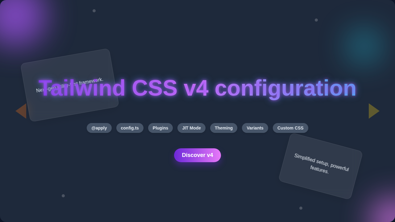
Tailwind CSS v4 Configuration: Setup Guide & Features
Hey, remember that feeling? You finally understood how to organize your components. Your CSS was clean. You had mastered your `tailwind.config.js` file, right? It was your personal control panel for all things design. Every color, every spacing unit, precisely where you expected it.
But then you hear about Tailwind CSS v4 configuration changes. It feels like someone moved all your furniture. Everything you knew about setup and customization? It might be shifting. You’re probably wondering: what does this even mean for your workflow?
The frustration is real. Why does everything always change? Building a website sometimes feels like chasing a moving target. These shifts happen because technology evolves. Developers constantly seek faster, more efficient ways to build.
Here’s the lightbulb moment: it’s not about learning an entirely new system. Instead, it is about understanding a new philosophy. Tailwind CSS v4 is streamlining things. It is making your setup simpler, and your projects potentially faster. Think of it as an upgrade, not a complete reboot of your skills. You’ve got this!
The Core Shift in Tailwind CSS v4 Configuration
So, what exactly is different? The big news for Tailwind CSS v4 configuration is less JavaScript. Previously, your configuration file was a JavaScript object. You defined everything there. Now, the emphasis moves towards native CSS features.
Tailwind v4 aims for speed. It also seeks a more direct connection to how browsers understand styles. This means you will interact more directly with CSS itself. Instead of writing complex JavaScript instructions, you might be declaring things in a way that feels more like traditional CSS. It’s a lean, mean, styling machine.
Consider this analogy: imagine you used to tell a very smart robot exactly how to mix paint colors. You gave it a long list of instructions in its own special language. Now, with v4, you’re just putting the color swatches on the table. The paint mixing still happens, but the instructions are clearer. They are more universal.
Consequently, the role of your configuration file changes. It becomes less about defining every single utility. It’s more about pointing Tailwind to where your custom elements live. This new approach might feel different at first. However, it promises a more intuitive and performant development experience. Are you ready to dive in?
Getting Started with Tailwind CSS v4 Configuration
Okay, let’s talk setup. How do you actually get a new project running? First, you will still install Tailwind using a package manager. This is like downloading a new app for your phone. It sets up the core tools you need.
Then, the Tailwind CSS v4 configuration process becomes quite minimal. You might not even have a `tailwind.config.js` file in the same way. Instead, you could use a dedicated CSS file. This file will import Tailwind’s base styles. It will also include any custom definitions you add.
The crucial `content` array still exists. It tells Tailwind which files to scan. This ensures only the utility classes you actually use end up in your final CSS bundle. Imagine a super-efficient librarian. It only puts books on your shelf if you’ve actually checked them out.
Integrating into your build process means setting up a watcher. This tool observes your files for changes. When you save a file, it automatically rebuilds your CSS. This keeps your styles always up-to-date. If you’re building a responsive landing page, getting this initial setup right is your first step towards a smooth workflow. It’s foundational to everything else.
Embracing the New Theme and Customization Approach
Customization is where the v4 changes really shine. How do you change your brand colors? What about your font sizes or spacing units? V4 leans heavily on CSS variables, also known as custom properties. These are values you define once and reuse throughout your stylesheet. Think of them as placeholders for your design choices.
For instance, you might declare a `–primary-color` variable. Then, you set its value to your brand’s specific blue. Tailwind’s engine can then use this variable directly. You don’t need to dive into a JavaScript object to update your color palette anymore. You simply adjust the CSS variable.
This approach makes customization feel more native to the web. It’s less about a framework’s specific syntax. It’s more about standard CSS practices. If you need to understand CSS variables better, check out the MDN Web Docs on Custom Properties. They offer a great deep dive.
Pro Tip: Embrace CSS variables for your core design tokens. They make your styles more portable and easier to manage. Your design system will thank you!
Changing your default font? Same idea. Define a CSS variable for your font stack. Then, Tailwind can pick it up. This method streamlines your theming process. It also empowers you with the full flexibility of CSS. You get granular control over your design elements. Moreover, it feels incredibly powerful once it clicks.
Plugins and Beyond: Extending Tailwind v4
What if you need something truly custom? How do plugins work in this new world? Tailwind v4 aims for a more integrated plugin experience. Less reliance on JavaScript files for extending functionality means a lighter footprint. It also means potentially faster compile times.
You might encounter a different way to define custom utilities. Instead of complex JS functions, you might use a simpler syntax. This syntax could live directly within your CSS. For example, if you wanted a special `fancy-shadow` utility, you’d define its properties more directly. This makes the extension process feel less abstract.
The community also plays a big role. First-party plugins, those officially supported by Tailwind, will adapt quickly. Community-made plugins will also evolve. They will follow the new best practices. Building a responsive navbar often means extending Tailwind to get that perfect look. V4 makes this streamlined by focusing on direct CSS capabilities.
Furthermore, this shift encourages you to think about what can be achieved with pure CSS. Often, you might reach for a plugin when a clever use of CSS variables or a simple utility class could do the job. V4 pushes you towards these native solutions. This makes your code more robust. It also reduces external dependencies.
Thinking Differently: A Mindset Shift
This whole experience is less about new syntax. It is more about a new way of thinking. Tailwind CSS v4 is pushing you towards a more atomic CSS approach. It also encourages a deeper understanding of native CSS features. You are gaining more direct control. Less abstraction means you see exactly what’s happening.
Is it harder? Not really. It’s just different. You’re still benefiting from the power of utility-first CSS. This means applying small, single-purpose classes directly in your HTML. You are just configuring those utilities in a more modern way. This leads to smaller file sizes. It also leads to faster loading times for your users.
Consider the benefits. Your build process might be quicker. Your understanding of CSS will deepen. Your projects could become even more performant. For a deeper dive into the philosophy, read up on Utility-First CSS concepts on CSS-Tricks. It helps clarify the core ideas.
Actionable Insight: Approach v4 with a curious mind, not a fearful one. Experiment with the new setup. You’ll discover its advantages quickly!
This shift isn’t about abandoning your current knowledge. It’s about building upon it. You’ve already mastered the concepts of utility classes and design systems. Now, you’re just upgrading your toolset. It is an exciting time for web development.
What to Do Next: Your Path Forward
So, what should you do now? Don’t panic! The best way to learn is by doing. Try setting up a small project with Tailwind CSS v4. Explore the documentation as it becomes available. Experiment with the new configuration methods.
Remember, you are a self-taught developer. You thrive on curiosity and hands-on learning. This is just another challenge you can conquer. If you’ve mastered a CSS progress circle with pure CSS, you already understand this kind of direct styling. The principles are similar.
The future of styling is exciting. It is also dynamic. Embrace these changes. They are designed to make your life easier in the long run. Your skills will only grow stronger. Keep building, keep learning, and keep creating amazing things for the web!