Hey there, amazing coders! If you’ve ever wanted to build a stunning CSS Progress Circle but felt a bit lost, you’ve landed in just the right spot. Today, we’re diving deep into creating a beautiful, responsive progress indicator. It’s all done with just pure HTML and CSS, no fancy JavaScript needed for the core visual! How cool is that?
What We Are Building: Your Next Favorite UI Element
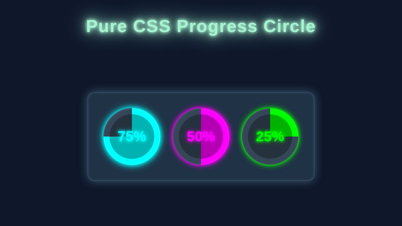
Imagine showing a user how much of a task is complete. Or perhaps displaying skill levels on a portfolio page. That’s exactly what our CSS Progress Circle will do! We’re crafting a circular loader that fills up to a specific percentage. It will look sleek, modern, and best of all, be entirely responsive. This means it looks great on any screen size. We will build this powerful UI component from the ground up. You will learn some cool CSS tricks along the way. Get ready to impress!
HTML Structure: The Foundation of Our Circle
First, we need the basic structure for our progress circle. Our HTML will be surprisingly simple. We’ll use a main `div` element with a class like `progress-circle`. This container will hold all the magic. Inside it, we’ll place a `span` element. This `span` will display our percentage text. We use a CSS custom property (variable) on the `div` to set the progress percentage. This clean setup makes styling much easier, you’ll see!
index.html
<!DOCTYPE html>
<html lang="en">
<head>
    <meta charset="UTF-8">
    <meta name="viewport" content="width=device-width, initial-scale=1.0">
    <title>Pure CSS Progress Circle</title>
    <!-- Link to our stylesheet -->
    <link rel="stylesheet" href="styles.css">
</head>
<body>
    <header>
        <h1>Pure CSS Progress Circle</h1>
        <p>A customizable progress circle built entirely with HTML and CSS.</p>
    </header>

    <div class="container">
        <!-- Example 1: Default progress circle (75%) -->
        <div class="progress-circle" style="--progress: 75;">
            <div class="progress-circle-inner">
                <span class="progress-text">75%</span>
            </div>
        </div>

        <!-- Example 2: Custom size and colors (50%) -->
        <div class="progress-circle" style="--progress: 50; --size: 150px; --progress-color: #2196F3; --track-color: #a7d9f7; --text-color: #1976D2;">
            <div class="progress-circle-inner">
                <span class="progress-text">50%</span>
            </div>
        </div>

        <!-- Example 3: Different background and border thickness (25%) -->
        <div class="progress-circle" style="--progress: 25; --progress-color: #FFC107; --bg-color: #424242; --text-color: #FFECB3; --border-thickness: 10px;">
            <div class="progress-circle-inner">
                <span class="progress-text">25%</span>
            </div>
        </div>

        <!-- Example 4: Animated progress from 0% to 100% on hover -->
        <div class="progress-circle hover-animate" style="--progress: 0; --progress-color: #8BC34A; --track-color: #e0f2f1; --text-color: #689F38;">
            <div class="progress-circle-inner">
                <span class="progress-text">0%</span>
            </div>
        </div>
    </div>
</body>
</html>
CSS Styling: Bringing Our Progress Circle to Life
Here’s the cool part where we bring our simple HTML to life! We’ll use CSS to transform our basic elements into a vibrant, animated progress circle. This section will introduce you to `conic-gradient`, a powerful CSS function. It creates radial gradients that rotate around a center point. Don’t worry if this sounds complex. We’ll break down each property. Then, you’ll understand exactly how it all works.
We’ll start by defining some CSS custom properties. These variables will help us manage colors, sizes, and the progress value easily. For instance, `–size` will control the circle’s dimensions. `–progress` will dictate how much of the circle is filled. Next, we’ll style the main `progress-circle` container. This is where `conic-gradient` comes into play. It will create the colored fill based on our `–progress` variable. We’ll also ensure it’s perfectly round with `border-radius: 50%`. We use `display: grid` and `place-items: center` to easily center its content. This makes sure our percentage text sits perfectly in the middle. Finally, we’ll style the inner `span` element to display the percentage clearly. This involves setting its background color to create the inner ‘hole’ of the progress ring. You will learn to use `calc()` for dynamic sizing. This keeps the circle responsive and tidy.
styles.css
/* Global Reset & Body Styling */
body {
    font-family: Arial, Helvetica, sans-serif; /* Safe fonts */
    display: flex;
    flex-direction: column;
    justify-content: center;
    align-items: center;
    min-height: 100vh;
    margin: 0;
    background-color: #f0f2f5; /* Light background for the tutorial */
    color: #333;
    box-sizing: border-box; /* Ensures padding and border are included in the element's total width and height */
    overflow-x: hidden; /* Prevent horizontal scrollbars */
}

header {
    text-align: center;
    margin-bottom: 40px;
    padding: 0 20px;
}

h1 {
    margin-bottom: 10px;
    color: #2c3e50;
    font-size: 2.5em;
}

p {
    font-size: 1.1em;
    color: #666;
}

.container {
    display: flex;
    gap: 40px; /* Space between progress circles */
    flex-wrap: wrap;
    justify-content: center;
    padding: 20px;
    max-width: 100%; /* Ensures container respects available width */
}

/* Progress Circle Component Styles */
.progress-circle {
    /* --- CSS Variables for easy customization --- */
    --size: 200px; /* Default size of the circle */
    --progress: 0; /* Current progress percentage (0-100). Set inline in HTML for static values. */
    --track-color: #e0e0e0; /* Color of the empty track */
    --progress-color: #007bff; /* Color of the progress arc */
    --bg-color: #ffffff; /* Background color of the inner circle */
    --text-color: #333333; /* Color of the percentage text */
    --border-thickness: 15px; /* Thickness of the progress arc */
    --animation-duration: 1s; /* Duration for hover animation */

    position: relative;
    width: var(--size);
    height: var(--size);
    border-radius: 50%; /* Makes the element a perfect circle */
    display: flex;
    justify-content: center;
    align-items: center;
    overflow: hidden; /* Important for clean edges, especially if progress is less than 100% or for animations */

    /* The magic happens here:
       1. conic-gradient creates the progress arc and the track.
       2. radial-gradient creates the inner circle (with --bg-color) and a transparent outer part
          that allows the conic-gradient to show only in the ring area.
       The radial-gradient is placed on top of the conic-gradient.
       This effectively 'cuts out' the center and colors it with --bg-color.
    */
    background:
        radial-gradient(
            closest-side,
            var(--bg-color) calc(100% - var(--border-thickness)), /* Solid inner circle, its radius is 'size - thickness' */
            transparent calc(100% - var(--border-thickness) + 1px) /* Transparent beyond, reveals conic-gradient */
        ),
        conic-gradient(
            var(--progress-color) calc(var(--progress) * 1%), /* Progress color fills up to '--progress' percent */
            var(--track-color) 0 /* Track color fills the remaining part of the circle */
        );
    box-shadow: 0 4px 8px rgba(0, 0, 0, 0.1); /* Subtle shadow for depth */
    transition: box-shadow 0.3s ease; /* Smooth transition for hover effects */
}

/* Hover effect for an example circle */
.progress-circle.hover-animate {
    --progress: 0; /* Start at 0% for animation */
    transition: --progress var(--animation-duration) ease-out;
}

.progress-circle.hover-animate:hover {
    --progress: 100; /* Animate to 100% on hover */
}

.progress-circle.hover-animate .progress-text {
    transition: transform var(--animation-duration) ease-out, color var(--animation-duration) ease-out;
}

.progress-circle.hover-animate:hover .progress-text {
    transform: scale(1.1); /* Scale text slightly on hover */
    color: var(--progress-color); /* Change text color to match progress */
}

/* Inner element for text positioning */
.progress-circle-inner {
    /* This element is simply for positioning the text.
       It is a child of .progress-circle, which has display:flex, so it will be centered. */
    display: flex;
    justify-content: center;
    align-items: center;
    /* No need for specific width/height/background as the main circle handles the visual ring part. */
    z-index: 2; /* Ensures text is always rendered above the background gradients */
}

/* Progress Text Styles */
.progress-text {
    font-size: calc(var(--size) / 5); /* Responsive font size based on circle size */
    font-weight: bold;
    color: var(--text-color);
    user-select: none; /* Prevent text selection for better UI experience */
}
How It All Works Together: Unveiling the Magic
Let’s connect the dots! Our HTML provides the containers. Then, our CSS works its magic. We layer elements and use clever transformations. This makes our progress circle look amazing. Here’s a detailed breakdown of the process.
Setting the Stage: The Outer Circle and Variables
First, we establish the outer ring. This provides a visual boundary for our progress. We apply `width` and `height` to our `div.progress-circle`. These dimensions are controlled by the `–size` CSS variable. A `border-radius: 50%` makes it perfectly round. The base `background-color` for the empty part of the circle is set here. We also use `display: grid` and `place-items: center`. These powerful CSS properties easily center any content inside our circle. This means the percentage label will always be perfectly aligned. It’s a clean and efficient way to handle positioning. Remember, CSS variables are key here. They allow you to update `–size`, `–progress-color`, and `–bg-color` easily. This makes your component super flexible!
The Magic of Conic-Gradient: Filling the Circle
This is where the real cleverness comes in! We use the `conic-gradient` property directly on our `progress-circle` element. A `conic-gradient` starts from a central point. Then, it sweeps around in a circular fashion. We tell it to fill from `0%` up to `calc(var(–progress) * 1%)` with our `–progress-color`. After that, it fills the rest of the circle with our `–bg-color`. For example, if `–progress` is `75`, the first `75%` of the circle gets the `–progress-color`. The remaining `25%` gets the `–bg-color`. This creates the smooth, filling effect you see. It’s a modern and elegant way to achieve progress circles with pure CSS. You can find excellent resources on MDN’s conic-gradient documentation to dive deeper into this fascinating property.
Pro Tip: Using CSS variables (custom properties) for colors and sizes makes your components super flexible! You can change the entire look with just a few lines of code. It’s a game-changer for maintainability and theming.
Centering the Progress Text: The Inner Label
Lastly, we need to display the actual percentage. Our `span.progress-circle__label` element takes care of this. We create an inner circle with a solid background. This acts as a mask, covering the center of our `conic-gradient` circle. It makes the progress ring visible. We use the `::before` pseudo-element for this. Its `width` and `height` are calculated using `calc()` to be slightly smaller than the main circle. This leaves a visible ring. The `font-size` and `color` are also styled. This ensures readability and a clean aesthetic. Because the main `div` uses `display: grid`, our `span` is automatically centered. This ensures your numbers always look good. It’s the final touch that makes our component truly functional. For more ideas on flexible layouts and centering, consider exploring how a HTML/CSS Kanban Board Layout uses positioning for its cards.
Tips to Customise It: Make It Your Own!
You’ve built an awesome CSS Progress Circle! Now, let’s make it truly yours. Here are some ideas:
- Different Colors: Easily change the `–progress-color` and `–bg-color` CSS variables. You can even make it dynamic based on the progress value! Imagine a red circle for low progress and green for high progress.
- Custom Sizes and Thickness: Adjust the `–size` variable to control the overall dimensions. You can also modify the `–border-width` variable. This changes the thickness of the progress ring.
- Add Animations: While our core is pure CSS, you could add simple CSS `transition` properties. Animate the `–progress` variable for a smooth filling effect. Or, animate the number count with JavaScript.
- Gradient Fills: Instead of a solid color for `–progress-color`, try a `linear-gradient`! This adds a really premium feel to your design. You can create vibrant, multi-color rings.
Pro Tip: Experiment with `filter` properties like `drop-shadow()` to give your circle a subtle depth effect. This can make it pop off the page! You can learn more about CSS filter functions on CSS-Tricks.
Conclusion: You Did It!
Wow! You just built a fully responsive and beautiful CSS Progress Circle. You used nothing but pure HTML and CSS. That’s a huge achievement! We covered setting up the HTML. Then we tackled the clever CSS tricks using `conic-gradient` for the fill effect. You now have a fantastic component. It’s perfect for your next project. Go ahead and show it off! Share your creations with us on social media. We can’t wait to see what you build!
Keep coding, keep learning, and remember that building small, focused components like this one is a fantastic way to sharpen your skills. It strengthens your understanding of core CSS concepts. If you’re looking for other cool UI components to practice with, check out our guide on creating a Retro Terminal UI with HTML & CSS. Or, dive into a fun GeoCities Card Design tutorial for more styling adventures!
